You can edit the properties for an image, including its size, position, borders, margins, and more.
 how to edit image properties
- Open a topic where the image is inserted, and right-click the image.
- Select Image Properties. The Image Properties dialog opens.
- You can use the General tab to make the following changes:
You can select a different image file. You can do this in various ways:
You can select an image file already in the project by finding and choosing it in the Select File Area. Use the buttons in the local toolbar to view all files in a list, view files in their folder structure, etc.

Shows all of the files in a list in the area below. If you click the button again, it switches to a folder tree view. In the list, you can click the File, Type, or Path column headers to sort the list alphabetically by that column data.

Shows or hides the folders that the files are stored in.

Shows or hides the files. If you click this button when the Show Folders button
is selected, the area splits into two. The folder is shown on the left side, and the files and subfolders within it are shown on the right.
If the Show Files button
is the only one selected, you can click this button to move up one folder level.
Lets you filter the kinds of files shown below. Depending on the task you are performing, this field may already be populated with the most appropriate file type(s).
You can click
 to find and select an image file outside of the project.
 If you want to select an image file that you recently inserted somewhere in your project, click the down arrow in the field next to
and select the file from the list.If you want to apply a specific style class to the image, you can select it from the Style Class field. For more information see About Styles and Stylesheets.
exampleexample
Let's say that you have created in your stylesheet a class of the img style called "button" (i.e., img.button) and you have set a maximum size on that style class. The idea is that you want to use that style class whenever you insert an image of a button, ensuring that the image always displays in a very small size. Rather than using the default parent img style when you insert the image, you select img.button from the Style Class drop-down.
- In the Screen Tip field, you can type a phrase that will appear when the end user hovers over the image.
In the Alternate Text field, you can type alternate text to display when the image is not available, such as when a disabled individual is using a screen reader.
Select Apply the alternate text and screen tip to all image references if you want the same alternate and screen tip text to be used everywhere the image is used in the project.
- You can use any of the other tabs to provide additional settings for the image:
- Size and Print Size Tabs You can use these tabs to resize the image. If you want to provide only one group of settings for the image, use the Size tab. If you want to provide two groups of settings—one for online output and another for print-based output—use the Size tab for online output, then use the Print Size tab for print-based output.
- Position Tab You can use this tab to adjust the positioning of the image on the page. This includes the ability to wrap text around an image or float an image outside the frame holding the regular flow of text.
- Thumbnail Tab You can use this tab to create a thumbnail version of the image in the output.
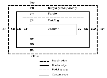
Borders & Margins Tab You can use this tab to set borders, margins, or padding for the image.
- Background Tab You can use this tab to add background settings to an image.
- Click OK.
- Click
 to save your work.