
NetHelp Theme Designer Settings (Responsive)
The Responsive theme adapts to the current window size/screen resolution. If the window size is too small, the side panel is closed automatically so that only the topic is displayed and visual elements such as breadcrumbs, buttons, and related topics change their appearance and size. This theme also includes a Favorites tab which allows end users to choose favorite topics (the favorite is stored on the user side). This theme works on Android 4.0 or later and iOS; on the desktop, IE9 or later.
The Theme Designer settings can all be edited in the Settings area on the right side of the Theme Designer. To find the field you’d like to edit, select it in the area on the left. The Settings area will display the field you need to edit.

For global settings (General, Context Sensitive, Toolbars, and Accessibility), use the drop-down to display those fields.
 Common Settings
There are several settings that are common throughout the Theme Designer for the Responsive theme:
- Swatches These are used to set the color scheme of most elements. You can change the appearance of a swatch or create new ones with the jQueryMobile Theme Roller. By default, most elements have an empty value for the Swatch setting, which means that the swatch will use the settings of its parent. For example, if the TOC has an empty swatch, it means that TOC will use the swatch of the side panel. By default, only the side panel and the topic have swatch values, which allow you to change the appearance for many swatches with two settings. There are five swatches in the default theme: a, b, c, d, e.
- Mini If chosen (the default), the compact view of the element will be used. The compact view uses less vertical height.
- Corners If chosen, the element will have rounded corners.
General
The general settings are global settings for this theme.
- Right-to-Left If selected, the theme text direction will be set for right-to-left languages. If you choose the Hebrew configuration file (settings.he-il.xml) for this theme, this check box will be selected automatically.
- Update title Switches the header title displayed on the browser tab from the topic title to the title of the project. If you would like the browser tab to remain static, rather than changing as the user navigates the output, select this check box.
- Default swatch The swatch chosen here will control the color scheme for all the elements in the theme, unless you change each individually. You can also change the topic and/or side panel swatches to change those areas separately.
- Favicon Specifies which icon will appear in the browser when your users mark your NetHelp as a favorite.
Context-Sensitive
The context-sensitive settings are global settings for this theme.
Strings
- Title The title used in the browser window title when a list of keywords, groups, or search results is shown on the page. This string can contain macros #{key} and #{value} that are replaced with the context-key ("keyword," "group," "id," or "search") and context-value. Default: "Topics for #{key}: #{value}"
- Not found message This message is shown when the result is empty (when the context-key is "keyword,""group," or "id"). Default: "No topics found"
- Not supported message This message is shown when the specified context-key is not supported. Default: "The key "#{key}" is not supported"
Accessibility
The accessibility settings are global settings for this theme.
Link menu header This text is read by the accessibility device if a keyword or group link has more than one topic to display. Default: "#{count} topics found"
Contents
- Closed book This text is read by the accessibility device when you mouse over a closed book that has no associated topic and, therefore, does not display a topic when clicked. Default: "Closed book without topic"
- Open book This text is read by the accessibility device when you mouse over an open book that has no associated topic and, therefore, does not display a topic when clicked. Default: "Open book without topic"
- Closed book with topic This text is read by the accessibility device when you mouse over a closed book that has an associated topic, which is displayed when the book is clicked. Default: "Closed book with topic"
- Open book with topic This text is read by the accessibility device when you mouse over an open book that has an associated topic, which is displayed when the book is clicked. Default: "Open book with topic"
- Topic This text is read by the accessibility device when you mouse over a topic. Default: "Topic"
Collapsible sections
- Collapsed section This text is read by the accessibility device for the collapsible section icons. Default: "Click to expand"
- Expanded section This text is read by the accessibility device for the expanded section icons. Default: "Click to collapse"
Keyboard and Screen Reader Uses
- Skip to main content This text becomes available to users when they open a topic and press TAB. After users encounter this option, they can press ENTER to bypass the navigation.
Buttons
The button settings control the label, icon, behavior, and text displayed on the buttons of the NetHelp toolbar.
If you would like to remove, rearrange, change the alignment, or add a custom button to the NetHelp toolbar, use the Toolbar
-
Label The name that will be used for the label and tooltip text of the button.
-
prev Default: "Previous"
-
next Default: "Next"
-
home Default: "Home"
-
print Default: "Print"
-
email Default: "Email"
The email address used for this button is support@mycompany.com by default. This should be changed in the Help Targets dialog.
-
twitter Default: "Twitter"
-
facebook Default: "Facebook"
-
favorites Default: "Favorites"
-
sidePanel Default: "Side panel"
This button opens and closes the side panel.
-
actions Default: "Actions"
This button is displayed only when a toolbar is collapsed. Clicking this button will display a menu containing all the buttons from the collapsed toolbar. When a toolbar is not collapsed, this button is hidden. If there is no Actions button on a toolbar, it can't be collapsed.
-
poweredBy Default: "Created with Doc-To-Help"
The button also includes a default click action that opens the Doc-To-Help website. This click action can be edited.
-
- Icon The icon displayed on the button. You can choose an alternate icon, upload your own
- Icon position Choose the position of the icon on the button.
- Show Label If selected, the label text will be displayed on the button.
- Collapsible Each button has a setting named "Collapsible." When it is checked, it means that the button can be hidden when there is not enough width to display all buttons on a toolbar and the toolbar must be collapsed. When it is not selected, the button will always be visible.
- Click (for poweredBy and Custom buttons only) The JavaScript code of the onclick event handler. This can be edited.
Toolbars (toolbars.left and toolbars.right)
The toolbar settings control which buttons are included in your NetHelp toolbar and how they are displayed. You can remove and rearrange the buttons, as well as add custom buttons. The alignment of the buttons can also be changed.
If you would like to change the NetHelp toolbar button labels, icons, and other options, edit the Buttons fields.
-
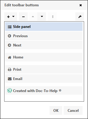
Content This field is used to add, remove, and rearrange the buttons in the NetHelp toolbar. Click the button to open the Edit toolbar buttons dialog. Buttons include Previous, Next, Print, Email, Twitter, Facebook, Favorites, Collapsed, and Side Panel.

- To Edit a Button Select it, then click on the Wrench button to open that button’s properties for editing.
- To Delete a Button Select it, then click the – button. If you remove a default button (Previous, Next, Home, Print, Email, Powered By, etc.), you can easily add it back by clicking the + button You cannot remove buttons that were defined in other Settings files.
- To Add a Custom Button Click the + button.
- To Rearrange the Buttons Use the up and down arrows.
- To Start a New Button Group Click the Start Group of Buttons button.
 Page Header
- Visible If selected, the header area will be displayed.
- Height Adjusts the height of the header, in pixels.
- Show Text If selected, the project title will displayed in the header.
-
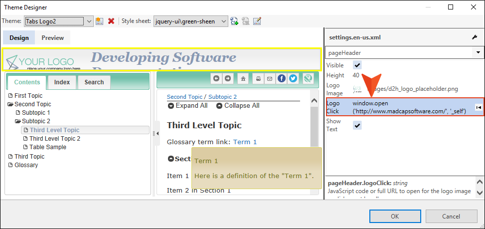
Logo Click You can add a URL or JavaScript link to a logo image in a custom theme. This makes the logo interactive, opening another location or performing some kind of action when a user clicks it.
 Topic
Topic
- Swatch The swatch chosen here will controls the color scheme for all the elements of the Topic area, unless you change each individually.
- Text width Used to manually set the width of the text (in pixels) in the topic window. By default, it is set to "0", which means the text will adjust to fill the window.
-
Table mode The display of tables in a responsive Target is important. This setting determines how ALL tables will be formatted in the target. This setting has four possible values: None, ColumnToggle, Reflow, and Auto. Regardless of your selection here, a scroll bar will appear as needed when there is not enough width.
-
None means the table display will not be modified.
-
ColumnToggle means there will be a Columns button above each table that will show a list with columns and allow users to select the ones they want to display.
-
Reflow means that tables will display in a special 2 column view when the window width isn't wide enough. In this two column view columns become rows so a single row from the initial table will be displayed as a record with multiple rows.
-
Auto means that on large screens tables will be displayed as-is (without any modifications), but on smaller screens all widths will be reset to autosize determined by the content.
-
Strings
- Not found text The message displayed when a topic cannot be loaded. Default: "Topic not found"
- Not found title This window title displayed when a topic cannot be loaded. Default: "Topic not found"
Related topics
You can set Swatch, Mini, and Corner settings for related topics.
- Not found title This window title displayed when a topic cannot be loaded. Default: "Topic not found"
- Icons Choose the icon that will appear before each subtopic link. There are options for topic, collapsed, and expanded.
Breadcrumbs
Breadcrumbs are the trail of topics at the top of the topic area.
-
Visible If selected, breadcrumbs will be displayed.
You can set Swatch, Mini, and Corner settings for breadcrumbs.
- Include current topic If selected, the current topic will be displayed in the breadcrumbs.
- Label The text label that will be shown before the breadcrumbs. Default: no label
- Separator The character or text displayed between breadcrumb items. Default: "/"
- Icons Choose the icon that will appear before each breadcrumb. There are options for topic, collapsed, and expanded.
Collapsible section
You can set Swatch, Mini, and Corner settings for collapsible sections.
- Icon position Choose the position of the icon on the button.
-
Icons Choose the icon that will appear before each section. There are options for collapsed and expanded.
The button labels and icons for the Expand All and Collapse All buttons in the topic.
-
Default label for the Expand All button: "Expand All"
-
Default label for the Collapse All button: "Collapse All"
For all four buttons, you can choose alternate icons, upload your own
-
Spinner
- Message text The text that displays in the spinner animation while the topic is loading. Default: "Loading …"
Popup section
You can set Swatch and Corner settings for the Popup sections.
TOC
- Label The text displayed on the table of contents. Default: "Contents"
- Swatch The swatch chosen here controls the color scheme for all the elements of the Contents (TOC) area, unless you change each individually.
Icons
The icons displayed for a Topic, Closed book, or the Tab icon. You can choose alternate icons, upload your own
backButton
- Label The tooltip for the Back button.
- Swatch/Corners You can set Swatch and Corner settings for the Popup sections.
- Icon The icon displayed on the button. You can choose an alternate icon, upload your own
Index
- Label The text displayed on the index. Default: "Index"
- Swatch You can set the Swatch for the index.
- Visible If selected, the index is displayed.
- Hide empty If selected, the index will automatically be hidden if there are no index keywords in your project.
Icons
- Item icon The icon displayed next to each item in the index (by default, no icon is displayed).
- Tab icon The icon displayed on the index tab.
Strings
- Filter tooltip The tooltip displayed for the index text box. Default: "Filter keywords"
- Not found message The message shown when no keywords are found. Default: "No keywords found"
- Found message The message shown when one or more keywords are found. It can contain a {count} macro that is replaced with the number of keywords found. Default: "#{count} keywords found"
- More text The text for the link that displays if the keywords don’t fit on the screen and aren’t scrolled. Default: "More…"
Search
- Label The text displayed on the Search tab. Default: "Search"
- Swatch You can set the Swatch for the Search pane.
- Visible If selected, the Search tab is displayed.
Icons
- Item icon The icon displayed next to each item in the Search (by default, no icon is displayed).
- Tab icon The icon displayed on the Search tab.
You can choose an alternate icon, upload your own
Strings
- Filter tooltip The tooltip for the Search text box. Default: "Search topics"
- Filter text Default: "Search…"
- Loading message This message is shown when the data is loading. Default: "Loading Search Engine…"
- Error message This message is shown if the data fails to load. Default: "Error: Search engine failed to load"
- Disabled message This message is shown when search is disabled. Default: "Search is disabled"
- Not found message This message is shown when no keywords are found. Default: "No topics found"
- Found message This message is shown when one or more topics are found. It can contain a {count} macro that is replaced with the number of topics found. Default: "# {count} topic(s) found."
- Correcting message This message is shown when the search engine suggests a search string correction to the user. It can contain a #{query} macro that is replaced with a link to the corrected search string. Default: "Did you mean #{query}?"
- Query modified message This message is shown when the original search criteria was changed because no results were returned.
Operators
- Operators The text name of the search operators "AND" , "NOT", and "OR."
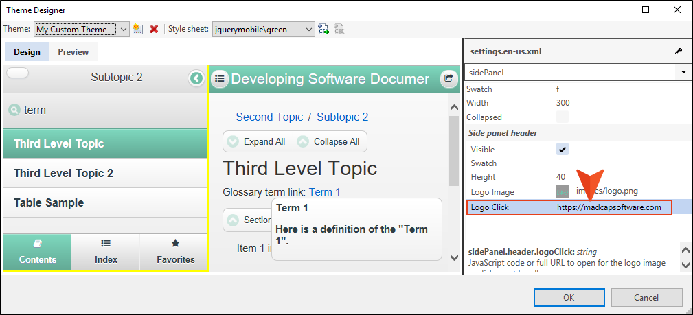
Side Panel
- Swatch The swatch chosen here controls the color scheme for all the elements of the side panel area, unless you change each individually.
- Width The default width of the side panel (in pixels).
- Collapsed If selected, the entire side panel will be collapsed by default.
Side panel header
- Visible If selected the side panel header is visible. (This is the default.)
- Swatch You can set the Swatch for the side panel header pane.
- Height Adjusts the height of the side panel header, in pixels.
- Logo Image You can choose a logo or other image that will display in the side panel header.
-
Logo Click You can add a URL or JavaScript link to a logo image in a custom theme. This makes the logo interactive, opening another location or performing some kind of action when a user clicks it.
 Favorites
- Label The text displayed on the Favorites tab. Default: "Favorites"
- Swatch You can set the Swatch for the Favorites pane.
- Visible If selected, the Favorites tab is displayed.
Icons
- Delete icon The icon displayed on the Delete button.
- Tab icon The icon displayed on the Favorites tab.
You can choose an alternate icon, upload your own
Strings
- Filter text This message is shown when Favorites filter text box is empty. Default: "Filter favorites…"
- Delete The tooltip text for the Delete button.
NavBar
- Visible If selected, the Navigation bar is displayed. (This is the set of tabs at the bottom of the side panel: Contents, Index, and Favorites.)
- Swatch You can set the Swatch for the Navigation bar.
- Icon position Choose the position of the icon on the button: left, right, top, or bottom.