 Outputs Supported


You can edit a related topics link that you have inserted into a topic.
[Menu Proxy — Headings — Online — Depth3 ]
How to Change the Topics Associated With a Related Topics Control
The first way to edit a related topics control is to change the topics associated with it.
Example You have a related topics link that has five topics associated with it. You might then create a new topic, which you decide should be included in the link as well. The steps below show you how to edit the related topics link to add that new topic to the link.
- Open the content file.
- In the XML Editor, right-click the related topics link.
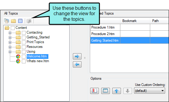
- In the context menu, select Edit Related Topics Control. The Insert Related Topics Control dialog opens. The topics currently associated with the link are listed on the right side of the dialog. All of the content files and folders in your project can be viewed on the left side of the dialog.
-
On the left side of the dialog, either double-click a topic that you want to add to the related topics control, or select the topic and click
 . After doing this, the topic is added to the Selected Topics area on the right side of the dialog.
You can use the "multi-view" to locate topics.


Shows all of the files

Shows or hides the folders that the files are stored in.

Shows or hides the files. If you click this button when the Show Folders button
 is selected, the area splits into two. The folder is shown on the left side, and the files and subfolders within it are shown on the right.
If the Show Files button
 is the only one selected, you can click this button to move up one folder level.
Lets you filter the kinds of files shown below. Depending on the task you are performing, this field may already be populated with the most appropriate file type(s).
- If you want to remove a topic from the link, click on that topic on the right side of the dialog. Then click
 .
. - Click OK. The Insert Related Topics Control dialog closes, and the link is now changed.
- Click
") to save your work.
to save your work.
How to Change the Options for a Related Topics Control
You can change the options for a related topics control, modifying elements such as the control label or the way the links are presented (e.g., popup menu or list).
- Open the content file.
- In the XML Editor, right-click the related topics link.
- In the context menu, select Edit Related Topics Control. The Insert Related Topics Control dialog opens. The topics currently associated with the link are listed on the right side of the dialog. All of the content files and folders in your project can be viewed on the left side of the dialog.
-
You can customize the related topics link in any of the following ways.
Add Bookmark
If you want a link to point to a particular bookmark within a topic, do the following.
- In the Selected Topics area on the right of the dialog, click on the relevant topic.
- At the bottom of the dialog click
 .
. -
In the Select Bookmark dialog, click on a heading or bookmark within the topic. If you select a heading, a bookmark will be created at that spot in the topic.
Note If you want to remove a bookmark from the link, you can select the bookmark in this dialog and click
 . This removes the bookmark from the link only; it does not remove the bookmark from the destination topic.
 - Click OK.
Style Class
If you want to select the style class
- At the bottom of the dialog click
 .
. - In the dialog, click on the style class you want to use. The main style is "MadCap:relatedTopics," but if you create a class under that style in your stylesheet, it will be available for selection as well.
- Click OK.
If you want to edit the actual style in the stylesheet, see the set of steps below.
Label
If you want to change the text shown on the control, do the following.
- At the bottom of the dialog click .
- In the dialog, enter text in the Label field.
- Click OK.
Popup Menu or List
If you want to specify that the links should be displayed in a popup menu (default) or as a simple list, do the following.
- At the bottom of the dialog click .
- In the dialog, click the down arrow in the Display topics in field and select Popup Menu or List.
-
Click OK.
Note For projects that are merged, the list option is supported for standard merging (e.g., linking to an FLPRJ file in the table of contents). However, it is not supported for automerging in WebHelp Plus output.
Target Frame
If you want to choose the type of frame used when the link is clicked, do the following.
- At the bottom of the dialog click .
-
In the Related Topics Link Options dialog, click the down arrow in the Target Frame field and select any of the following.
- Page Default The destination file opens in the same window as the output window.
- Parent Frame The destination file opens in the parent frame of the current topic while hiding that topic.
- New Window The destination file opens in a new browser window.
- Same Frame The destination file opens in the same window frame as the current topic.
- Top Frame The destination file opens in the same output window, removing all other framesets. You might use this option, for example, if the destination topic has its own frameset.
- Popup Window The destination file opens in a popup box on top of the current topic.
- Click OK.
Custom Order
If you want to specify that the links should be displayed in a custom order (rather than alphabetically), do the following.
- In the Selected Topics area on the right of the dialog, click on a topic that you want to move up or down.
- At the bottom of the dialog click
 or
or  .
. - Click in the Use Custom Ordering field and select Yes.
- Click OK.
- Click to save your work.
How to Edit the Style of a Related Topics Control
You can edit the style of a related topics link. When you do this, the style changes for all related topics links in any topics in your project. Also, keep in mind the various rules that pertain to related topic links.
- From the Content Explorer, open the stylesheet that you want to modify.
-
Complete one of the following sets of steps, depending on whether you want to use the Simplified view or Advanced view in the Stylesheet Editor.
-
Simplified The Simplified view displays styles in a grid view and is often best for brand new users.
This view provides an easy way to apply properties to styles, with format options available from a toolbar and dialogs (similar to the way one would use an interface such as Microsoft Word). In some cases, only the most common property options are available in the Simplified view (e.g., font, letter/word spacing, paragraph alignment/indentation, autonumbering format, borders, background). One advantage of the Simplified view is that you can apply a property to multiple styles at the same time. You can also click a check box to hide the properties in the editor, allowing you to see only the styles.
-
Advanced The Advanced view displays styles in a tree structure, and despite the name, is user friendly for authors of all levels.
For the properties, you can toggle between a grouped display and an alphabetical display. The Advanced view of the Stylesheet Editor lets you edit more settings than are available in the Simplified view. In addition, the Advanced view lets you see and apply settings to multiple mediums and media queries at the same time.
-
- In the local toolbar, make sure the first button displays
 (which means that the Simplified view is currently shown in the editor). If the button displays
  instead, then click it.
 - In the upper-left corner of the editor, click in the Show Styles field and select Show Link Styles or Show Dynamic Effects Styles. Different styles are displayed with each filter.
- From the grid in the bottom portion of the editor, find and select one of the following styles, depending on what you want to accomplish. You can use a general style (which starts with "helpControl") if you want to modify all types of Help control links (concept, keyword, and related topic links). Alternatively, you can use a specific style (which starts with
- MadCap|helpControlList Edit this style to change the look of the entire list (<ul> element) when links are displayed in a list, rather than in a popup.
- MadCap|helpControlListItem Edit this style to change the look of individual items in the list (<li> elements) when links are displayed in a list, rather than in a popup.
- MadCap|helpControlListItemLink Edit this style to change the look of links in the list (<a> elements) when links are displayed in a list, rather than in a popup.
- MadCap|helpControlMenu Edit this style to change the look of links (i.e., menu items) when links are displayed in a popup, rather than in a list. This particular style controls the entire list.
- MadCap|helpControlMenuItem Edit this style to change the look of links (i.e., menu items) when links are displayed in a popup, rather than in a list. This particular style controls the individual list items.
- MadCap|relatedTopics Edit this style to change the look of the heading for related topic links. The following three related topic link styles inherit properties from this style.
- MadCap|relatedTopicsControlList Edit this style to change the look of the entire list (<ul> element) when related topics are displayed in a list, rather than in a popup.
- MadCap|relatedTopicsControlListItem Edit this style to change the look of individual items in the list (<li> elements) when related topics are displayed in a list, rather than in a popup.
- MadCap|relatedTopicsControlListItemLink Edit this style to change the look of links in the list (<a> elements) when related topics are displayed in a list, rather than in a popup.
Note You can also change a pseudo class of a link style (e.g., MadCap|relatedTopics.focus or MadCap|relatedTopics.hover) if you want to modify the look of the related topic link when it is in a certain state (e.g., when it has focus or when the cursor is hovering over it).
- In the local toolbar of the editor, click
 . The Properties dialog opens.
-
Use the tabs and fields in the Properties dialog to change values for any of the style's properties.
For more information see Styles and Stylesheets, as well as Editing Styles in a Regular Stylesheet.
- In the Properties dialog, click OK.
- In the local toolbar, make sure the first button displays . If the button displays instead, then click it.
- In the upper-left corner of the editor, click in the Show Styles field and select Show Link Styles or Show Dynamic Effects Styles. Different styles are displayed with each filter.
- On the left side of the editor, find and select one of the following styles, depending on what you want to accomplish. You can use a general style (which starts with "helpControl") if you want to modify all types of Help control links (concept, keyword, and related topic links). Alternatively, you can use a specific style (which starts with
- MadCap|helpControlList Edit this style to change the look of the entire list (<ul> element) when links are displayed in a list, rather than in a popup.
- MadCap|helpControlListItem Edit this style to change the look of individual items in the list (<li> elements) when links are displayed in a list, rather than in a popup.
- MadCap|helpControlListItemLink Edit this style to change the look of links in the list (<a> elements) when links are displayed in a list, rather than in a popup.
- MadCap|helpControlMenu Edit this style to change the look of links (i.e., menu items) when links are displayed in a popup, rather than in a list. This particular style controls the entire list.
- MadCap|helpControlMenuItem Edit this style to change the look of links (i.e., menu items) when links are displayed in a popup, rather than in a list. This particular style controls the individual list items.
- MadCap|relatedTopics Edit this style to change the look of the heading for related topic links. The following three related topic link styles inherit properties from this style.
- MadCap|relatedTopicsControlList Edit this style to change the look of the entire list (<ul> element) when related topics are displayed in a list, rather than in a popup.
- MadCap|relatedTopicsControlListItem Edit this style to change the look of individual items in the list (<li> elements) when related topics are displayed in a list, rather than in a popup.
- MadCap|relatedTopicsControlListItemLink Edit this style to change the look of links in the list (<a> elements) when related topics are displayed in a list, rather than in a popup.
Note You can also change a pseudo class of a link style (e.g., MadCap|relatedTopics.focus or MadCap|relatedTopics.hover) if you want to modify the look of the related topic link when it is in a certain state (e.g., when it has focus or when the cursor is hovering over it).
- From the Show drop-down list on the upper-right side of the editor, select
 . The most relevant properties for that style are shown on the right side of the editor.
 - (Optional) You can use the toggle button in the local toolbar to show properties below in a group view
 or an alphabetical view
  .
. -
Locate the property you want to change.
-
I The area to the right of the property is used for selecting and entering values. If you know how to enter the information correctly, you can click in the value field and type it directly. Otherwise, click the ellipsis button
 to the right of the property. Depending on the type of property, the appropriate controls and options display, allowing you to choose or enter values (e.g., select from a drop-down list, click a button, complete fields in a dialog or popup). If you completed values in a popup, click OK at the bottom of the box.
 For more information see Styles and Stylesheets, as well as Editing Styles in a Regular Stylesheet.
- Click to save your work.
If Using Simplified View

If Using Advanced View
Rules
Keep in mind the following rules when working with these types of styles.
Font Color on Link Styles Only
You can set many different properties on Help controls. However, font color can be set only on styles that deal specifically with links (e.g., a, helpControlListItemLink
Example You want to use red on
Inheritance From Main List and Link Styles
Because these Help control styles are based on the main styles for unnumbered lists (ul), list items (li), and hyperlinks (a), they inherit properties from those standard styles.
Example You set a purple font on the "a" style. If you do not make any changes to your Help control styles, all of the links will use a purple font. But suppose you want
Note If setting a property on the "a" style does not seem to have an effect on the Help control links, check the heading style. For example, if you set purple on the "a" style but
Inheritance From General Help Control Styles
Because the general "helpControl" styles (helpControlList, helpControlListItem, helpControlListItemLink) are used to determine the look of all three types of Help control links, the more specific styles (e.g., conceptLinkControl, keywordlinkControl, relatedTopicsConrol) inherit properties from them.
Example You set a 12-pt font on the MadCap|helpControlListItem style. If you do not make changes to any of the more specific styles (MadCap|conceptLinkControlListItem, MadCap|keywordLinkControlListItem, MadCap|relatedTopicsControlListItem), all of them will use a 12-pt font. But suppose you want
No Inheritance Between Specific Styles
As shown, there is inheritance from main styles (e.g., a, li) and from the general "helpControl" styles. That's because the main styles are at a higher level than all of the Help control link styles, and the general "helpControl" styles are at a higher level than the more specific styles. But all of the specific Help control styles are at the same level; therefore, none of them inherit properties from any of the others.
Example You set a 10-pt font on the MadCap|keywordLinkControlList style (which controls entire lists for keyword links). Neither the MadCap|keywordLinkControlListItem style nor the MadCap|keywordLinkControlListItemLink style will inherit that font size. Instead, the MadCap|keywordLinkControlListItem style (which controls list items for keyword links) will either inherit from li or MadCap|helpControlListItem. And MadCap|keywordLinkControlListItemLink (which controls the actual links for keywords) will either inherit from "a" or MadCap|helpControlListItemLink. Or you can set different colors on those styles specifically.
What’s Noteworthy?
Note To edit alternate text for this feature in a specific language, you can modify the language skin. In the Language Skin Editor, select the desired language skin target, then adjust the values for the related AltText property. See Applying Alt Text.
