 Outputs Supported

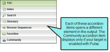
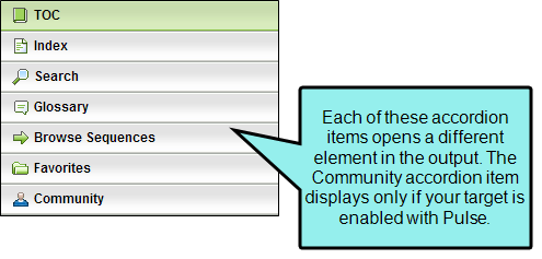
You can add various accordion items in your output, allowing users to open different elements of your output, such as the table of contents, index, glossary, community (for Pulse), and more. You can change the appearance of these accordion items by modifying style settings in the skin that you use for the output.
How to Specify Style Settings for Accordion Items
- Open a Standard skin.
- Select the Styles tab.
-
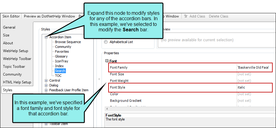
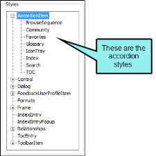
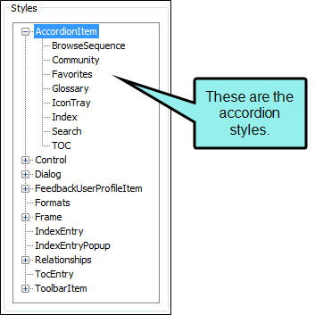
In the Styles section, expand the Accordion Item node.
-
Select the item that you want to edit. If you want the setting(s) to be applied to all of the items, select the Accordion Item node itself.
The items under this node represent the different accordions that can be added to your output.
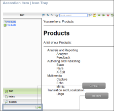
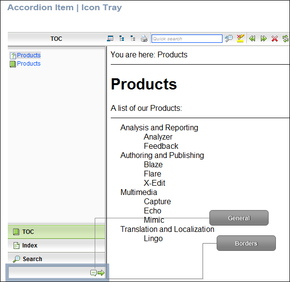
The IconTray item represents the rectangle at the bottom of these items. If the area is resized so that only a certain number of accordions can be shown, the other items are represented by small icons and contained within the icon tray. In the following example, we've added a thick red border around the icon tray.
- Select the Property Groups or Alphabetical List option to display the properties for the style item.
-
In the Properties section, set the values for the properties that you want modify.
Background Gradient
To change the background color of the accordion area:
Expand the Font property group on the right and change the value in the Background Gradient field to apply a color progression effect. The background changes from one color to another. Click the down arrow to open a small window. In this window, click the down arrow next to the Start field and select a color to use at the beginning of the gradient. Then click the down arrow next to the End field and select the color to use at the end of the gradient. Finally, click the down arrow next to the Style field and select a direction for the gradient effect or choose "solid." Click OK to accept the settings. When you click off the properties field, a small icon is displayed in the field, showing how the effect will look. If you are change the color for a style item that also has a gradient, the gradient properties have precedence over the solid color.
Background Gradient Hover
To change the background color of the accordion area when the end user hovers the mouse over it:
Expand the Font property group on the right and change the value in the Background Gradient Hover field to apply a color progression effect. The background changes from one color to another. Click the down arrow to open a small window. In this window, click the down arrow next to the Start field and select a color to use at the beginning of the gradient. Then click the down arrow next to the End field and select the color to use at the end of the gradient. Finally, click the down arrow next to the Style field and select a direction for the gradient effect or choose "solid." Click OK to accept the settings. When you click off the properties field, a small icon is displayed in the field, showing how the effect will look. If you are change the color for a style item that also has a gradient, the gradient properties have precedence over the solid color.
Background Image
To add a background image to the accordion area:
Expand the Font property group on the right and select an image in the Background Image field. Click the down arrow in this field and then select Browse for Image to find and select an image file.
Background Image Hover
To add a background image to the accordion area when the end user hovers the mouse over it:
Expand the Font property group on the right and select an image in the Background Image Hover field. Click the down arrow in this field and then select Browse for Image to find and select an image file.
Borders
To add or change borders for the item:
Expand the Borders property group on the right and change the value in any of the fields. Click the down arrow to open a small window. In this window, you can enter the width of the border in the lower-left field. You can select the unit of measurement (e.g., pixels, points, centimeters) using the lower-left drop-down arrow.
Font Color
To change the color of the font:
Expand the Font property group on the right and change the value in the Color field. Click the down arrow to open a color palette window. You can click a color shown, or you can click More colors and select a different color or create a custom color. If you are change the color for a style item that also has a gradient, the gradient properties have precedence over the solid color.
Font Family
To select a specific font family (e.g., Arial, Tahoma, Verdana):
Expand the Font property group on the right and change the value in the Font Family field. From the drop-down, select the font family or font set that you want to use.
Font Size
To change the size of the font:
Expand the Font property group on the right and change the value in the Font Size field. Click the down arrow to open a small window. In this window, you can enter the size of the font in the lower-left field (either type a number or use the up and down arrows). You can select the unit of measurement (e.g., pixels, points, centimeters) using the lower-right drop-down arrow.
Font Style
To change the style of the font (e.g., make it italic):
Expand the Font property group on the right and change the value in the Font Style field. Click the down arrow and select either italic or normal.
Font Weight
To change the weight of the font (e.g., make it bold):
Expand the Font property group on the right and change the value in the Font Weight field. Click the down arrow and select either bold or normal.
Icon
To select a different icon image:
Expand the General property group on the right side of the editor and select an image from the Icon field. Click the down arrow in this field and then select Browse for Image to find and select an image file.
Item Height
To change the height of the item:
Expand the Font property group on the right and change the value in the ItemHeight field. Click the down arrow to open a small window. In this window, you can enter the item height in the lower-left field (either type a number or use the up and down arrows). You can select the unit of measurement (e.g., pixels, points, centimeters) using the lower-right drop-down arrow. You can return to the default setting by using the upper-right drop-down arrow.
Label
To change the text that appears on the item:
Expand the General property group on the right side of the editor and enter new text in the Label field.
- Click
") to save your work.
to save your work.
Example — Accordion Bars (Font, Background Color)
You want to change the font used for the text in the Search accordion bar to Baskerville Old Face. In addition, you want to set the background color for the accordion bar to green.
In that case, you would do the following:
- Expand the Accordion Item node.
- Select Search.
- On the right side, make sure Property Groups is selected.
- Expand the Font group.
- Click in the cell to the right of Font Family.
- From the drop-down, find and select Baskerville Old Face.
- Click in the cell to the right of Background Gradient.
- In the small popup, click on the down arrow next to Start.
- Select a green color.
- Since we only want a solid background color, click OK.
- Click to save your work.
When you are finished in the Skin Editor, it will look something like this: