You can use styles to change the appearance of a glossary. You can modify the look of individual elements within the glossary, as well as the entire container holding the glossary.
[Menu Proxy — Headings — Online — Depth3 ]
How to Change the Look of a Glossary (Individual Elements)
- From the Content Explorer, open the stylesheet that you want to modify.
-
Complete one of the following sets of steps, depending on whether you want to use the Simplified view or Advanced view in the Stylesheet Editor.
-
Simplified The Simplified view displays styles in a grid view and is often best for brand new users.
This view provides an easy way to apply properties to styles, with format options available from a toolbar and dialogs (similar to the way one would use an interface such as Microsoft Word). In some cases, only the most common property options are available in the Simplified view (e.g., font, letter/word spacing, paragraph alignment/indentation, autonumbering format, borders, background). One advantage of the Simplified view is that you can apply a property to multiple styles at the same time. You can also click a check box to hide the properties in the editor, allowing you to see only the styles.
-
Advanced The Advanced view displays styles in a tree structure, and despite the name, is user friendly for authors of all levels.
For the properties, you can toggle between a grouped display and an alphabetical display. The Advanced view of the Stylesheet Editor lets you edit more settings than are available in the Simplified view. In addition, the Advanced view lets you see and apply settings to multiple mediums and media queries at the same time.
Note If you want to change the actual characters for the alphabetical headings above each section in the glossary, you must use the Advanced view.
-
- In the local toolbar, make sure the first button displays
 (which means that the Simplified view is currently shown in the editor). If the button displays
  instead, then click it.
 - In the upper-left of the editor, make sure the drop-down field is set to
 .
. - From the grid in the bottom portion of the Stylesheet Editor, select a style.
- To Customize the Definition Select div.GlossaryPageDefinition.
- To Customize the Container Select div.GlossaryPageEntry. This style class affects the "container" that holds each glossary term/definition group.
- To Customize the Heading Select div.GlossaryPageHeading. This style class affects the text for each alphabetical heading that is displayed above each section of the glossary.
- To Customize the Term (for Online Output) Select a.GlossaryPageTerm. You can also use one of the pseudo classes under it to change the look of the term, depending on its hyperlink behavior (focus, hover, link, visited).
- To Customize the Term (for Print-Based Output) Select div.GlossaryPageTerm.
- In the local toolbar of the editor, click
 . The Properties dialog opens.
 -
Use the Properties dialog to change values for the style's properties.
Note For more information about the components and properties in the editor, as well as the tasks that you can perform in it, see Styles and Stylesheets, Editing Styles in a Regular Stylesheet, and Stylesheet Editor.
- In the Properties dialog, click OK.
- In the local toolbar, make sure the first button displays
 . If the button displays
  instead, then click it.
 - In the upper-left of the editor, make sure the drop-down field is set to
 .
. - On the left side of the editor, select the style that you want to edit.
- To Customize the Definition Expand div. Then select GlossaryPageDefinition under it.
- To Customize the Container Expand div. Then select GlossaryPageEntry under it. This style class affects the "container" that holds each glossary term/definition group.
- To Customize the Heading Expand div. Then select GlossaryPageHeading under it. This style class affects the text for each alphabetical heading that is displayed above each section of the glossary.
- To Customize the Term (for Online Output) Expand a. Select GlossaryPageTerm. You can also use one of the pseudo classes under it to change the look of the term, depending on its hyperlink behavior (focus, hover, link, visited).
- To Customize the Term (for Print-Based Output) Expand div. Then select GlossaryPageTerm.
- From the Show drop-down list on the upper-right side of the editor, select
 .
. - (Optional) You can use the toggle button in the local toolbar to show properties below in a group view
 or an alphabetical view
  .
. - Locate the property you want to change.
-
The area to the right of the property is used for selecting and entering values. If you know how to enter the information correctly, you can click in the value field and type it directly. Otherwise, click the ellipsis button
 to the right of the property. Depending on the type of property, the appropriate controls and options display, allowing you to choose or enter values (e.g., select from a drop-down list, click a button, complete fields in a dialog or popup). If you completed values in a popup, click OK at the bottom of the box.
 -
(Optional) If you want to change the actual characters (e.g., A, B, C, D) that are used for the glossary headings, do the following.
- Under the div tag on the left side of the editor, make sure GlossaryPageHeading is selected.
- If you are using the group view, expand the Unclassified property group.
- Click in the cell to the right of mc-heading-format and type the new format. Make sure you place the character within { and } brackets.
Example The default format is {A}. This means that the headings will simply look like this: A, B, C, D, and so on. If you change it to {a}, the headings will be lowercase: a, b, c, d, and so on. If you change it to -{A}-, the headings will look like this: -A-, -B-, -C-, -D-, and so on.
Note For more information about the components and properties in the editor, as well as the tasks that you can perform in it, see Styles and Stylesheets, Editing Styles in a Regular Stylesheet, and Stylesheet Editor.
- Click
 to save your work.
If Using Simplified View
If Using Advanced View
More About the Glossary DIV Styles
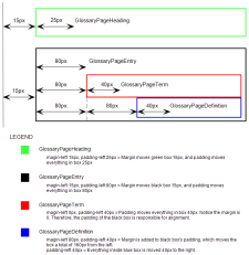
If you use the glossary div styles to change the look of a generated glossary, the following information and diagram may help to clarify the purpose of each style. Because these styles use <div> tags, you can think of them as nested boxes. This is important to understand when you try to align the different glossary elements through the use of margin and padding settings.
- Margins Control space outside of the box.
- Padding Controls space inside the box.
As a result of the boxes being nested, the margin and padding settings compound the distances in the output, as the diagram shows.
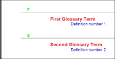
In the output, this type of collection of style settings might look like this.
How to Edit the Look of a Glossary (Entire Container)
- From the Content Explorer, open the stylesheet that you want to modify.
-
In the local toolbar, make sure the first button displays
 . If the button displays
  instead, then click it.
Note Some of the necessary style properties can also be changed in the Simplified view in the Stylesheet Editor.
- In the upper-left of the editor, make sure the drop-down field is set to
 .
. - In the Styles section of the editor, scroll down and select the MadCap|GlossaryProxy style or a class that you have created under it (e.g., MadCap|GlossaryProxy.myclass).
- From the Show drop-down list on the upper-right side of the editor, select
 .
. - (Optional) You can use the toggle button in the local toolbar to show properties below in a group view
 or an alphabetical view
  .
. - Locate the property you want to change.
- The area to the right of the property is used for selecting and entering values. If you know how to enter the information correctly, you can click in the value field and type it directly. Otherwise, click the ellipsis button
 to the right of the property. Depending on the type of property, the appropriate controls and options display, allowing you to choose or enter values (e.g., select from a drop-down list, click a button, complete fields in a dialog or popup). If you completed values in a popup, click OK at the bottom of the box.
For example, if you want to change the width of the entire glossary, you would first expand the Box property group. Then to the right of the width property, you would click
 and set the value in the popup.
Note For more information about the components and properties in the editor, as well as the tasks that you can perform in it, see Styles and Stylesheets, Editing Styles in a Regular Stylesheet, and Stylesheet Editor.
- Click
 to save your work.
What’s Noteworthy?
Note For Adobe PDF output, you can insert Heading variables into page layouts. These variables let you automatically display glossary headings at the top of pages. See Inserting Heading Variables Into Frames.
Note For steps on changing the look of glossary term links, see Editing the Style of Glossary Term Links.
Note If you want to change the look of glossaries in online output, you can do so by modifying styles within your skin. See Standard Skin Styles and HTML5 Skin Styles.
Note You can change the heading text for an auto-generated glossary in the language skin.


