Editing Text Popups
 Outputs Supported


You can edit text popups that you have inserted into a topic in at least two different ways: (1) edit the popup hotspot and text, and (2) edit the style of the text popup.
[Menu Proxy — Headings — Online — Depth3 ]
How to Edit the Popup Hotspot and Text
The first way to edit text popups is to change the popup hotspot and/or the text that users see when the popup opens.
Example You test the topic containing the text popup and you notice that a word is misspelled in the popup text. You can use the following steps to correct the spelling in the popup.
- Open the content file.
-
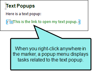
In XML Editor, right-click anywhere in the text popup marker.

- In the menu, select Edit Popup. The Insert Text Popup dialog opens.
- Change the text for the hotspot or the popup itself.
- Click OK. The changes are made to the text popup.
- Click
") to save your work.
to save your work.
How to Edit the Style of a Text Popup
You can edit the style (e.g., font, color) of a text popup hotspot or the popup body. When you do this, the style changes for all text popups in any topics in your project.
Example You test the topic containing the text popup and you notice that a word is misspelled in the popup text. You can use the following steps to correct the spelling in the popup.
- From the Content Explorer, open the stylesheet that you want to modify.
- Complete one of the following sets of steps, depending on whether you want to use the Simplified view or Advanced view in the Stylesheet Editor.
Simplified The Simplified view displays styles in a grid view and is often best for brand new users.
This view provides an easy way to apply properties to styles, with format options available from a toolbar and dialogs (similar to the way one would use an interface such as Microsoft Word). In some cases, only the most common property options are available in the Simplified view (e.g., font, letter/word spacing, paragraph alignment/indentation, autonumbering format, borders, background). One advantage of the Simplified view is that you can apply a property to multiple styles at the same time. You can also click a check box to hide the properties in the editor, allowing you to see only the styles.
Advanced The Advanced view displays styles in a tree structure, and despite the name, is user friendly for authors of all levels.
For the properties, you can toggle between a grouped display and an alphabetical display. The Advanced view of the Stylesheet Editor lets you edit more settings than are available in the Simplified view. In addition, the Advanced view lets you see and apply settings to multiple mediums and media queries at the same time.
- In the local toolbar, make sure the first button displays
 (which means that the Simplified view is currently shown in the editor). If the button displays
  instead, then click it.
 - In the upper-left corner of the editor, click in the drop-down field and select
 .
. - From the grid in the bottom portion of the editor, find and select the style called MadCap|popupHead (for the hotspot) or MadCap|popupBody (for the body of the popup).
- In the local toolbar of the editor, click
 . The Properties dialog opens.
 -
Use the tabs and fields in the Properties dialog to change values for any of the style's properties.
For more information see Styles and Stylesheets, as well as Editing Styles in a Regular Stylesheet.
- In the Properties dialog, click OK.
- In the local toolbar, make sure the first button displays . If the button displays instead, then click it.
- In the upper-left corner of the editor, click in the drop-down field and select .
- On the left side of the editor, find and select the style called MadCap|popupHead (for the hotspot) or MadCap|popupBody (for the body of the popup).
- From the Show drop-down list on the upper-right side of the editor, select
 . The most relevant properties for that style are shown on the right side of the editor.
 - (Optional) You can use the toggle button in the local toolbar to show properties below in a group view
 or an alphabetical view
  .
. -
Locate the property you want to change.
-
The area to the right of the property is used for selecting and entering values. If you know how to enter the information correctly, you can click in the value field and type it directly. Otherwise, click the ellipsis button
 to the right of the property. Depending on the type of property, the appropriate controls and options display, allowing you to choose or enter values (e.g., select from a drop-down list, click a button, complete fields in a dialog or popup). If you completed values in a popup, click OK at the bottom of the box.
For more information see Styles and Stylesheets, as well as Editing Styles in a Regular Stylesheet.
- Click to save your work.
If Using Simplified View
If Using Advanced View
What’s Noteworthy?
Note If you want to change the look of the container holding a text popup link, you can change the MadCap|popup style in the Stylesheet Editor. . For example, you can modify this style to place a border around the link. The MadCap|popupBody style lets you modify the popup text portion of an popup text effect (i.e., the area that is displayed or hidden when users click the hotspot link). The MadCap|popupHead style lets you modify the hotspot portion of a popup text effect. See Editing Styles in a Regular Stylesheet.
