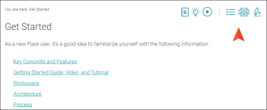
A topic toolbar displays buttons in a custom toolbar within the topic content, based on the insertion of a Topic Toolbar proxy. In addition to a Topic Toolbar proxy, you can use a skin component (for HTML5) or a Standard skin (for WebHelp and HTML Help outputs). Choosing the buttons for the toolbar can be done in the proxy, but it can also be done in the skin or skin component (proxy selections have precedence).
- In the Project Organizer, right-click the Skins folder, select Add Skin, and choose a skin or skin component, depending on your output type. Click Add when finished.
- HTML5 Format Choose HTML5 Component - Topic Toolbar.
- Other Formats Choose one of the WebHelp Standard skins (e.g., WebHelp - Default).
-
You can edit the Topic Toolbar skin component (for HTML5) or the Standard skin (for others). At this point, you can select the buttons you want to include in the toolbar, as well as make other design changes for the toolbar.
You can also add custom buttons to the toolbar.
- (Optional) You can also edit the Madcap|topicToolbarProxy style (or a class of it that you have created) to further control the look of the toolbar. However, many authors find that just using a skin component or skin is sufficient.
- Insert a Topic Toolbar proxy into a template page (or topic), selecting a skin component (for HTML5 only), style class, and/or buttons (as necessary) in the process. If you already selected buttons in the skin or skin component, you do not need to do so here.


