 Outputs Supported


You can add borders around lists or items within them. Borders can be added on any side (left, right, top, bottom), or all around.
How to Use a Style to Add a Border to a List
- From the Content Explorer, open the stylesheet that you want to modify.
-
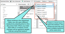
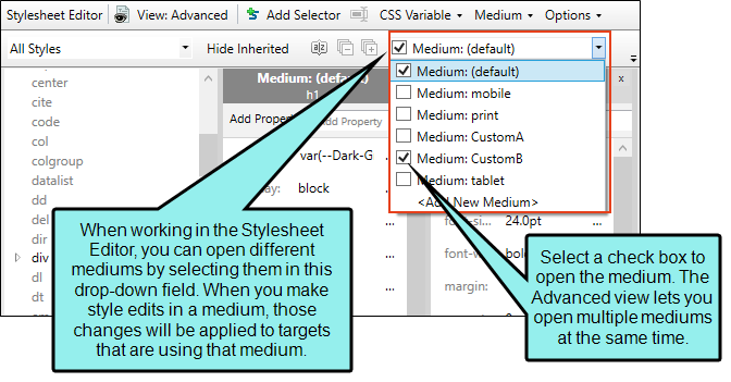
From the Medium drop-down in the Stylesheet Editor, make sure the proper medium is selected before you begin. In the Advanced view, you can open multiple mediums at once; you just need to look at the title at the top of the medium pane and make sure you are working in the correct one. If you are not using stylesheet mediums for your different outputs or if you want all mediums to have the same settings, just leave the medium set to default and continue.
Mediums can be used if you want to use one group of settings for online output types and another group of settings for print-based output types. For example, you might use the default medium for your online outputs and the print medium for your print outputs.
Please note that Flare remembers the last medium that you used when working in the stylesheet, so it may or may not be the one that you want to use the next time around.
- In the local toolbar, make sure the first button displays
 . If the button displays
  instead, then click it.
 - In the upper-left corner of the editor, click in the drop-down field and select
 .
. - Select a list style. For example, you can select ol for ordered (numbered) lists, ul for unordered (e.g., bullet) lists, or li for individual list items. You can select the parent style (e.g., li), or you can select a class that you may have created for that tag (e.g., li.Bold, li.Italic).
- From the Show drop-down list on the upper-right side of the editor, select
 .
. - (Optional) You can use the toggle button in the local toolbar to show properties below in a group view
 or an alphabetical view
  .
. - If you are using the grouped view, expand the Border group.
-
Locate and select the border property you want to change. Each side (bottom, left, right, top) has separate properties that you can set for the color, style, and width (e.g., border-bottom-style). You can set these properties individually, or you can set the primary property for each side (e.g., border-bottom), which lets you specify the color, style, and width in one place. If you plan to have the same settings for all sides, you can use the main border property to set the color, style, and width the same. The border-radius properties let you create curved edges on the border by providing horizontal and vertical values.
When you click
 next to a border property, a popup appears. Use the fields in the popup to define additional properties such as color, width, style, and thickness, then click OK.
 - Click
") to save your work.
to save your work.
What’s Next?
After editing a style, you can apply it to content in a topic or snippet.


