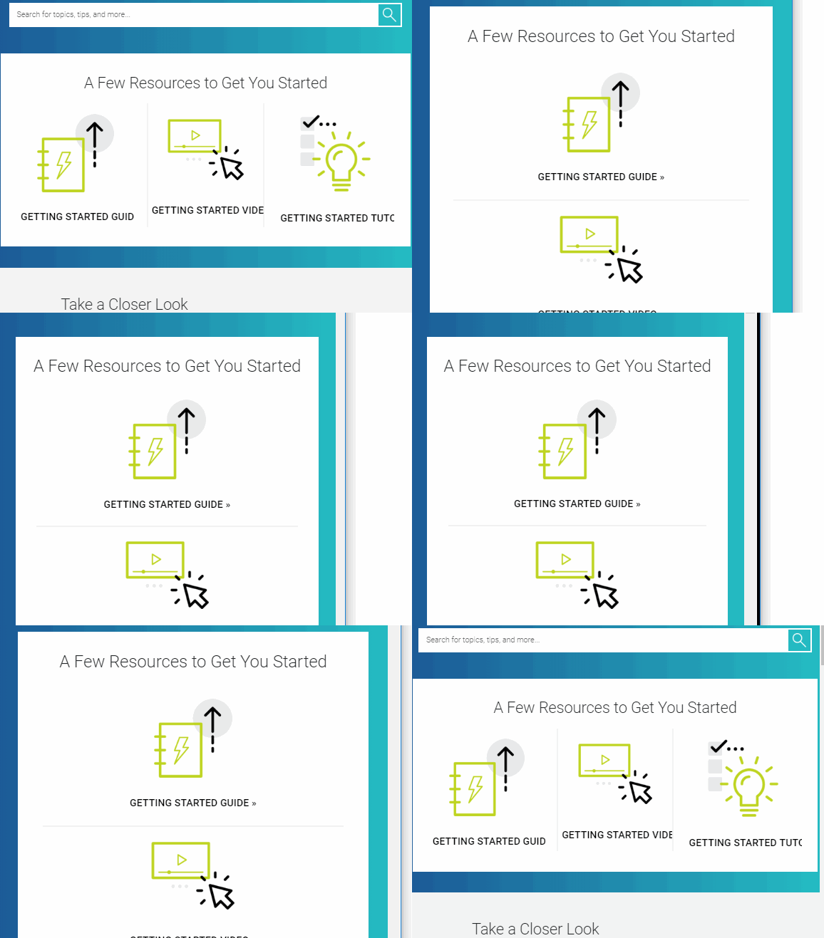
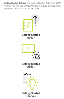
Styles and media queries can be used to make your content responsive in HTML5 output. This lets you present information—both its substance and structure—differently depending on the size of the screen or device. Flare provides a Responsive Layout window pane that helps you create this kind of content more easily. You also have the option of using third-party solutions (e.g., Zurb Foundation grid system) by adding the appropriate styles in your stylesheets and topics.
Note Flexbox is another popular web layout model. Unfortunately, Flare does not have an interface to support Flexbox. However, you can add styles to a stylesheet and then edit the topic markup directly using the Text Editor.
If the animation below is cut off, you can see the complete animation by clicking the link under it to open the full topic.


