If you use a Menu skin component and proxy to include a topic menu in your HTML5 Top Navigation output, you can set that menu to be fixed in place. You can set a fixed menu for web, tablet, or mobile screens (or all of them). This feature can also be used in Side Navigation output, but it makes more sense in Top Navigation output.
How to Set a Fixed Menu
- Open a Menu skin component.
- Select the Setup tab.
- In the Fixed Menu field, select one of the options:
- None The menu will not be fixed in the output.
- Web The menu will be fixed on screens that are larger than tablet and mobile.
- Tablet & Mobile The menu will be fixed on tablet and mobile screens.
- Mobile The menu will be fixed on mobile screens.
- All The menu will be fixed on all screens—web, tablet, and mobile.
- Click
 to save your work.
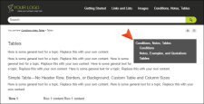
Example You include a topic menu on the right side of your topics, but you do not choose to fix that menu. Initially, it might look something like this:
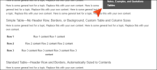
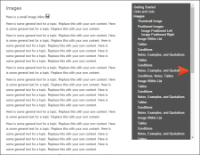
If you scroll down in the topic, notice that the menu moves up with the rest of the topic content:
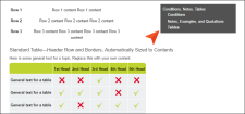
On the other hand, if you set the menu to be fixed, it will not move when you scroll down in the topic:
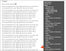
Tip Sometimes you might have a topic open in the output where the side menu is quite long, extending beyond the bottom of the window. The issue with having a fixed menu is that end users may not be able to see the links at the bottom of the menu because they are cut off, and the menu will not scroll because it is fixed in place.
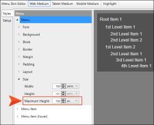
To solve this problem, you can open your Menu skin component and edit the maximum height for the menu.
If the maximum height is less than the height of the screen being used to view it, a scroll bar will be added within the menu, allowing end users to see all of the links.


