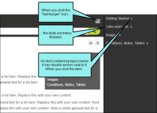
You can choose the look of the slide-out menu for Side or Top Navigation output (i.e., the menu that opens when you click the “hamburger” icon in tablet or mobile view). Either a drilldown or a tree format can be selected.
[Menu Proxy — Headings — Online — Depth3 ]
How to Set the Style for Slide-Out Menus
- Open an HTML5 Side or Top Navigation skin.
- Select the Setup tab.
-
From the Slide-Out Menu Style field, select one of the following:
-
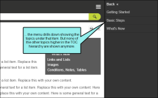
Drilldown With this format, any item containing sub-items has a double-arrow next to it. When you click on such an item, the entire menu changes, showing only that item and its sub-items.
-
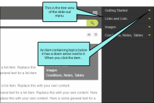
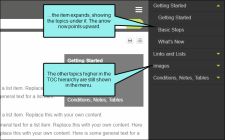
Tree With this format, any item containing sub-items has a down arrow next to it. When you click on that item, the sub-items are shown, but the rest of the menu remains in view as well.
-
- Click
 to save your work.
How to Edit the Look of the Tree View Arrows
In the Skin Editor, you can change the color and size for the arrows used for the tree format.
- Open an HTML5 Side or Top Navigation skin.
- Select the Styles tab.
-
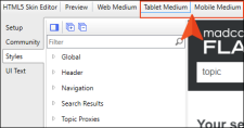
At the top of the Skin Editor, select either Tablet Medium or Mobile Medium.
If you want the same style to be used for both tablet and mobile outputs, make your edits in the Tablet medium. Your changes will then be inherited by the Mobile medium.
If you want different styles for the two outputs. make your changes in one medium, then switch to the other medium and make different selections.
-
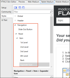
On the left side of the editor, expand Navigation > Panel > Item, and then select Expander Icon.
-
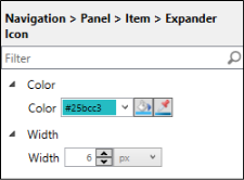
In the properties section, expand the available properties to edit.
- To change the color of the arrows, expand Color. Then use the fields to choose a color.
- To change the size of the arrows, expand Width. Then use the fields to set the width. The height will be adjusted automatically.
- Click
 to save your work.

