What if there is a conflict between your selected medium and a media query, or a conflict between media queries themselves? Media queries will always have precedence over your selected medium. As far as multiple media queries are concerned, the end result depends on the order of the media queries in your stylesheet (when viewing it in the Internal Text Editor). The general rule is that priority is given to whichever media query is listed last (i.e., the one that was added most recently) in the stylesheet. Then the next one above has the next highest priority, and so on. You can always open your stylesheet in the Internal Text Editor and change the order of the media queries.
Example You create a custom medium, naming it "Blue." You associate this medium with your HTML5 target. And when you open your stylesheet, you select this medium and tell Flare that the h1 style should be blue.
Next, you edit the factory tablet media query and you specify that the h1 style should be dark red.
After this, you edit the factory mobile media query and tell Flare to make the h1 style green.
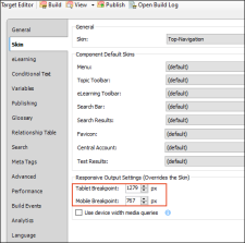
If you open your HTML5 target and look at the Skin tab, you will see that the tablet maximum width is set to 1279 pixels, and the mobile maximum width is set to 767 pixels.
You decide that you want a different look when the screen is between 1279 and 767 pixels. Therefore, you create a new media query, setting it to a maximum width of 1000 pixels, like this:
In the stylesheet, you set the h1 style for this media query to purple.
If you open the Content Explorer, right-click on your stylesheet, and select Open with > Internal Text Editor, the stylesheet will open in that editor. When you scroll to the bottom, you will see the custom medium and media queries are in this order (with @media showing where each section of styles begins):
- @media tablet
- @media mobile
- @media print (not being used in our example)
- @media Blue
- @media only screen and (max-width: 1000px)
Now you generate the HTML5 target and view the output. When the browser is maximized, you will notice that the h1 headings are blue, because that's what you set on the Advanced tab of the "Blue" medium.
Then you reduce the width of the browser. Once it gets to 1279 pixels, the h1 headings turn from blue to dark red, because that's what you set in the tablet media query.
You reduce the width of the browser even more. When you get to 1000 pixels, the h1 headings turn from red to purple, because that's what you set in your custom media query.
You continue to reduce the width of the browser. You're expecting the h1 headings to display in green (the color in the mobile media query), but they never do. What happened?
Remember that you added your custom media query last, so it appears at the bottom of the stylesheet. The tablet color (dark red) showed up because its width is higher than the custom media query width. As soon as it hit 1279 pixels, your browser saw that there were instructions to change the color to red. Even though the custom media query appears at the bottom of the stylesheet (therefore with the highest priority), its lower width setting meant that it wasn't in conflict with the tablet setting at that point. It was only at the point when the browser got to 1000 pixels that there was a conflict, so at that moment, the browser chose the media query that is lower in the stylesheet and displayed the text in purple.
The problem with the mobile media query is that by the time the browser was reduced to 767 pixels, it was already using a color for a media query with a higher priority. So the mobile color for h1 never got an opportunity to display.
To fix this, you can cut the mobile media query in the Internal Text Editor and paste it last in the stylesheet, so that the order is like this:
- @media tablet
- @media print (not being used in our example)
- @media Blue
- @media only screen and (max-width: 1000px)
- @media mobile
Now when you generate and view the output, it will work as you expect when you reduce the browser width: from blue to dark red to purple to green.


