 RESPONSIVE OUTPUT TUTORIAL
Styles and media queries can be used to make your content responsive in HTML5 output. This lets you present information—both its substance and structure—differently depending on the size of the screen or device. Flare provides a Responsive Layout window pane that helps you create this kind of content more easily. You also have the option of using third-party solutions (e.g., Zurb Foundation grid system) by adding the appropriate styles in your stylesheets and topics.
For this tutorial, let's focus on Flare's responsive layout system.
[Menu Proxy — Headings — Online — Depth3 ]
How to Create a Table With Content
First, let’s create some content in a table to illustrate why a responsive layout is valuable, and why using a table might not meet your needs.
-
From the Content Explorer, open the Introduction topic.
-
After the first h2 tag (History), create an empty paragraph.
-
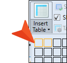
From the Table ribbon, click Insert Table (down-arrow).
-
Hover over the grid to choose one row and two columns.
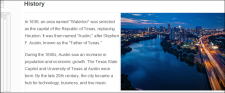
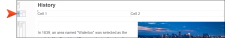
The table should look like this.

-
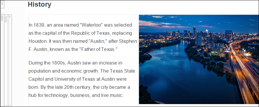
Copy the image, and paste it into the second column. And then copy the two paragraphs of text, and paste them into the first column.
-
To clean up the topic, delete the original image and text.
-
Click
") to save your work.
to save your work. -
Build the HTML5 output, and open it in a browser.
-
From the main menu, select the Introduction topic.
-
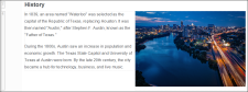
Click and drag the browser window to reduce it. In this example, the image gets smaller as the screen size is reduced. Ideally, the image size should stay the same, and stack underneath the text when the screen size is reduced.

-
Close the HTML5 output.


How to Create a Responsive Layout
Let's create a responsive layout using the Responsive Layout window pane. This window pane lets you create a "one-row grid" to hold content. The benefit of putting your content into such a grid is that it allows it to shift and be responsive to screens of different sizes.
-
Go back to the Introduction topic. Place the cursor at the end of the History heading.
-
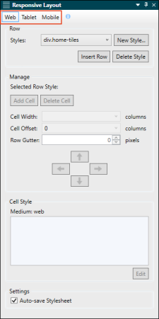
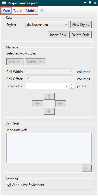
From the Home ribbon, select Responsive Layout. The Responsive Layout window pane opens. Notice the Web, Tablet, and Mobile media query buttons at the top.
-
Make sure Web is selected.
Note It is recommended that you start with Web to edit a layout for large screens. After you finish those settings, you can move on to Tablet, and then finally Mobile.
-
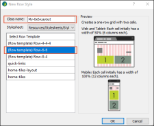
In the Row area, click New Style. The New Row Style dialog opens.
Flare considers the entire width of the screen displaying your output, and it divides this into 12 imaginary columns. The maximum width is 100% of the space, so 12 columns equals 100%. Half the width of the available screen space is 50%, or 6 imaginary columns. One-third of the width is 33.333%, or 4 columns. It is no more complicated than that.
-
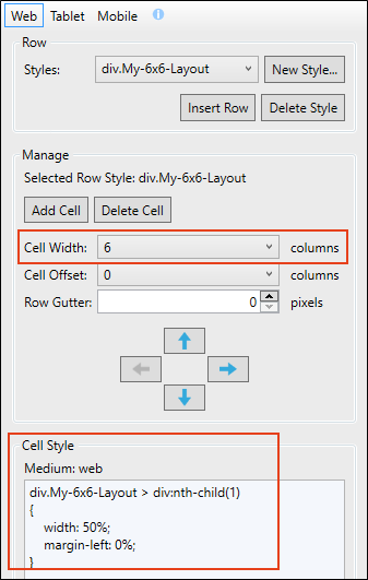
In the Class Name field, type My-6x6-Layout.
-
In the Select Row Template area, select (Row template) Row-6 6. Click OK.
-
From the Responsive Layout window pane, click Insert Row. In the XML Editor, the new row (a div style) gets inserted after the History heading. Click in Cell 1. In the Responsive Layout window pane notice that the Cell Width is 6 columns. This equates to 50%, or half the maximum width for a row.
When you create a responsive layout in Flare, you are asked to create a new "row" style, or use an existing one. It's called a row style because it controls everything that is going on inside that one-row grid. However, in CSS it is actually a div style. In the Cell Style area at the bottom of the Responsive Layout window pane, notice the div style, div.My-6x6-Layout.

-
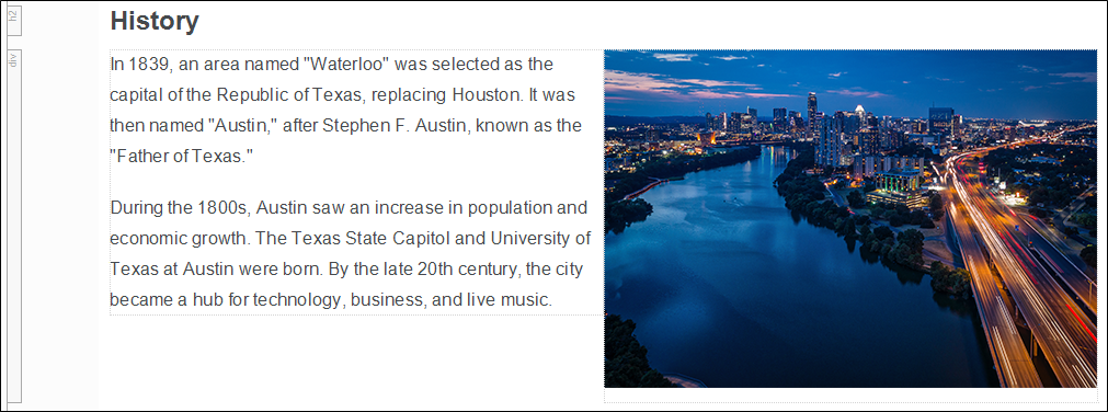
From your previous table, copy the image, and paste it into Cell 2, and then copy the corresponding text paragraphs into Cell 1. (Replace the default cell text in the layout grid.)
-
To clean up the topic, delete the table.
-
Click
to save your work. -
Place the cursor in one of the new cells. (If your XML Editor is narrow, the two cells might stack one of top of the other. That is okay.)
-
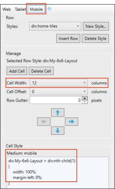
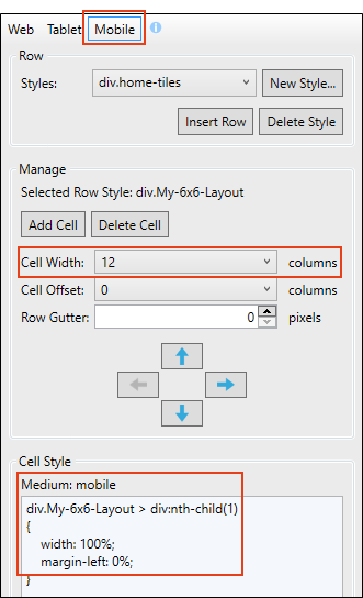
From the Responsive Layout window pane, click the Mobile media query button. Notice the Cell Width is 12 columns (rather than 6), and the Cell Style displays the width as 100% (rather than 50%). Because of the Mobile breakpoint and column size, the text and image should stack when the output is generated. (If you click on the Tablet media query button, notice that it has the same setup as the Web media query.)
-
Build the HTML5 output, and open it in a browser.
-
From the main menu, select the Introduction topic.
-
Click and drag the browser window to reduce it. Compared to the previous table, the new style in the responsive layout adjusts better as the screen gets narrower. The image retains its size and the content stacks at the appropriate breakpoint.

-
Close the HTML5 output.


How to Edit the Responsive Layout Style
Let’s look at the new row style for the Web media query in the stylesheet.
-
Click the Styles.css tab. (The Stylesheet Editor automatically opened when the new row style got added.)
-
In the left pane tree structure, expand the div element. Under it you'll see the class My-6x6-Layout.
-
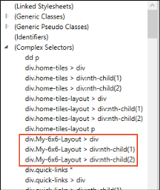
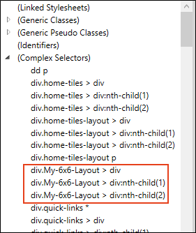
Scroll to the top of the left pane structure tree, and expand (Complex Selectors).
When you created the responsive layout, multiple complex selectors were added to the stylesheet. These selectors consist of div styles, using the nth-child pseudo class for each cell. In our case, the container holding both the cells is named div.My-6x6-Layout > div, Cell 1 is named div.My-6x6-Layout > div:nth-child(1), and Cell 2 is named div.My-6x6-Layout > div:nth-child(2).
-
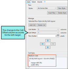
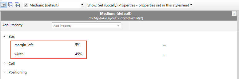
Let’s make a formatting adjustment to the second cell (Cell 2). Select div.My-6x6-Layout > div:nth-child(2).
-
In the local toolbar, select from the Show drop-down, select Show: Set (Locally) Properties - properties set in this stylesheet.
-
Expand the Box group (if in the Grouped view).
-
Change the margin-left property to 5%, and the width property to 45%. Click off the field.

-
Click
to save your work. -
Go back to the Introduction topic.
-
From the Responsive Layout window pane, click the Web media query button.
Notice that Cell 2 is now formatted with a 5% left margin. If you click in Cell 2, you can see the Cell Style update in the Responsive Layout window pane for the Web media query.
(If your XML Editor is narrow, the two cells might stack one of top of the other. That is okay.)
-
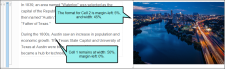
Build the HTML5 output, and open it in a browser to have a final look. For the Web screen size, notice the left margin for Cell 2.
-
Close the HTML5 output.
-
From the Window ribbon, select Close All Documents.

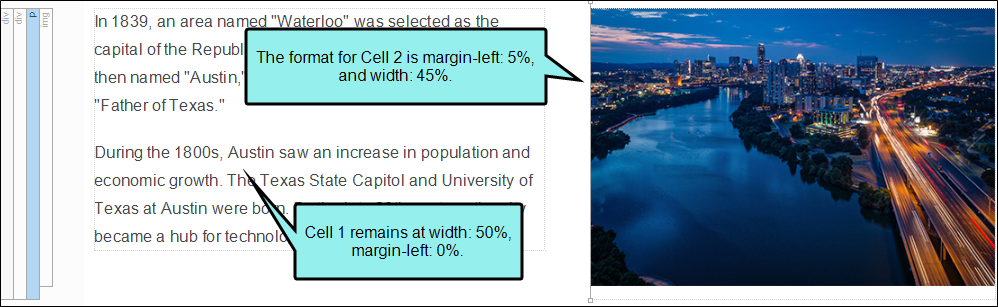
Tip For optimal responsive layout appearance, set the sum of all cell widths and margins in a row to equal 100 percent.
Ta-Da!
Congratulations! You've reached the end of this tutorial. Be sure to check out others. See Tutorials.

