 STYLES TUTORIAL—USING MEDIA QUERIES
A media query is an alternative group of settings in a stylesheet. These settings are automatically used under certain conditions, such as when a screen of a certain size is displaying the output. Media queries are able to do this because they are configured with specific criteria (e.g., maximum width of the screen, orientation, resolution). When the criteria are met, the style settings in the media query are used to display the output. You do not tell a Flare target to use a media query; it just happens automatically.
You can place any valid CSS style settings in a media query, just as you can in a medium. For example, if you want paragraph text to suddenly turn blue when a topic is viewed on an iPhone, you can edit the mobile media query, telling it to use a blue font for all paragraph styles.
[Menu Proxy — Headings — Online — Depth3 ]
How to Select Media Queries in the Stylesheet Editor
One of the most common ways to use a media query is to identify a width setting for a device with a different screen size. Let’s take a look at the media queries that come with Flare.
-
From the Content Explorer, expand Resources > Stylesheets, and double-click the Styles.css file.
-
From the local toolbar of the Stylesheet Editor, make sure the first button is labeled View: Advanced.
Note You can select a media query in the editor’s Simplified view. In that case, whichever media query you choose becomes the editable one.
-
In the left pane tree structure, select p.
-
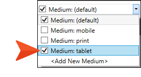
From the local toolbar, click the Medium drop-down.
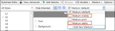
A couple of media queries (tablet and mobile) are already provided in Flare. You can create additional media queries from the Stylesheet Editor if you want, but most authors will be able to do everything they need with just the tablet and mobile media queries. The tablet media query is designed to be used on medium-sized screens, such as iPads. The mobile media query is designed to be used on smaller screens, such as smart phones. (The print item in the drop-down is actually a medium, not a media query. The default is a medium but can also be considered a media query in its relationship with the tablet and mobile items.)
-
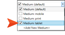
Click the check box next to the Medium: tablet item. The media query opens in a new window pane next to the default medium in the editor.
-
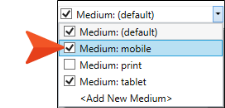
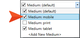
Select the drop-down again, and click the check box next to the Medium: mobile item. It opens in the editor.
-
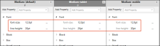
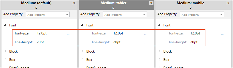
Expand different property groups in the media query window panes. Notice how the styles are initially inherited from the default medium.

How to Edit Tablet and Mobile Breakpoints
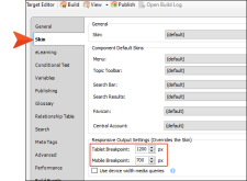
The tablet and mobile media queries are tied to the responsive output settings on the Skin tab of the Target Editor for HTML5 targets. The breakpoints provided in the target determine the point at which your media queries will become active in displaying the different style settings.
-
From the Project Organizer, expand Targets, and double-click All-About-Austin-HTML5.
-
In the Target Editor, select the Skin tab.
-
The default tablet breakpoint is 1279px, and the default mobile breakpoint is 767px. Let’s round those numbers down respectively, type 1200 pixels (tablet), and type 700 pixels (mobile).
-
Click
") to save your work.
to save your work.
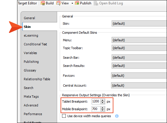
Note Notice the option for Use device width media queries. This means that the responsive nature of the skin depends on the device being used to view the output (browser, tablet, or mobile phone), rather than on merely the width of the screen.
Note HTML5 Side and Top Navigation skins are always enabled for responsive output. If you prefer using Tripane HTML5 output, you can set breakpoints in the skin.


