Approximate Time: 20 minutes
Welcome to the Responsive Output Tutorial.
- Tutorial Goal Learning about responsive framework and content concepts to increase online output usability.
- Key Concepts Getting familiar with how responsive skins and media queries affect output, creating responsive content and conditions based on screen size, and interacting with the Responsive Layout window pane for optimizing responsive design.
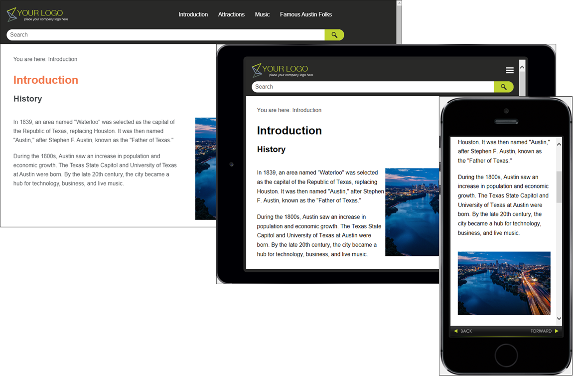
In another tutorial, we touched on how responsive output is displayed based on CSS style settings, as well as tablet and mobile breakpoints. It is recommended to work through the Using Media Queries tutorial before starting this one.
[Menu Proxy — Headings — Online — Depth3 ]
Using This Tutorial Online or Printing It
You can work your way through this tutorial either online or you can print it.
If you want to follow this tutorial online, you might want to resize your browser window, or use multiple monitors, so that you can see both the online topics and your Flare project at the same time.
If you want to download and print a tutorial PDF, click the link to the right of this topic.