 STYLES TUTORIAL—USING MEDIA QUERIES
As mentioned before, most authors will be able to do everything they need with just the tablet and mobile media queries. However, there are situations where content might look better if you create a custom media query. For example, a custom query might come in handy if you want content to display a certain way in between the tablet and mobile breakpoints, or if you want content to be narrower than the mobile width.
[Menu Proxy — Headings — Online — Depth3 ]
How to Create a New Media Query
-
Open the Styles.css file.
-
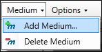
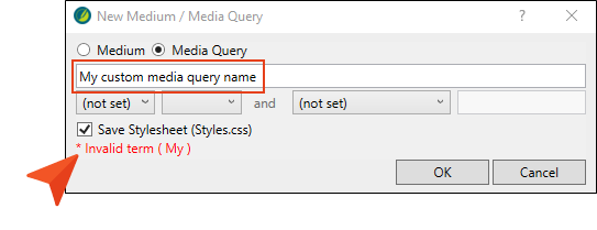
In the local toolbar of the Stylesheet Editor, click the Medium drop-down, and select Add Medium. The New Medium / Media Query dialog opens.
-
Select Media Query. Extra fields are shown in the dialog.
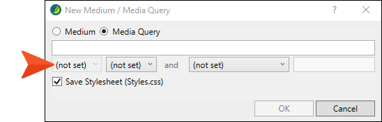
Note Media queries are written as logical expressions that check for specified media conditions. You can enter your media query directly in the text field (as long as you use valid media query syntax). Alternatively, you can use the fields below it to choose criteria for the media query; the text field is populated accordingly. For more information about creating custom media queries and the options available in the New Medium / Media Query dialog, see:
Copyhttp://www.w3.org/TR/css3-mediaqueries/ -
Set the fields in the dialog as follows, and then click OK. (The first drop-down is disabled, so just start at the second drop-down, and go back to the other when it is enabled.)
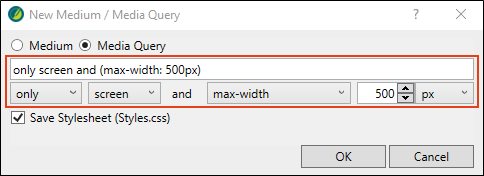
By setting the maximum width, when you reduce the width of the browser to 500px, it takes on a different look with the specific media query style setting for that device size.
-
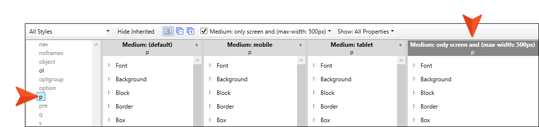
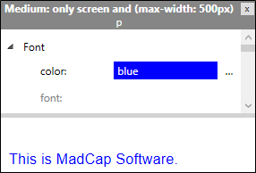
The custom media query, named Medium: only screen and (max-width:500px), displays automatically next to the other mediums in the editor. In the left pane tree structure, select the p style.
-
In the local toolbar, from the Show drop-down, choose Show: All Properties.
-
In the custom media query window pane, expand the Font group.
-
Next to the Color property, type blue, and press ENTER. The blue font color is not intended to make our project pretty, we just want the change to stand out after the build is generated.
Note If you are working the styles tutorials in a sequential order, the paragraph element font color was set to gray. Just update the value to blue.
-
Click off the Color property.
-
Click
") to save your work.
to save your work.
Note If you want to rename your media query, you can only rename it by making modifications to its settings in the dialog. It must retain valid syntax. Flare Desktop will let you know if the syntax is invalid.
How to View Media Query Precedence
The order that media queries display in the Text Editor affects how they are used.
What if there is a conflict between your selected medium and a media query, or a conflict between media queries themselves? Media queries will always have precedence over your selected medium. As far as multiple media queries are concerned, the end result depends on the order of the media queries in your stylesheet (when viewing it in the Internal Text Editor). The general rule is that priority is given to whichever media query is listed last (i.e., the one that was added most recently) in the stylesheet. Then the next one above has the next highest priority, and so on. You can always open your stylesheet in the Internal Text Editor and change the order of the media queries.
-
From the Content Explorer, expand Resources > Stylesheets, and right-click the Styles.css file.
-
From the context menu, select Open with, and then select Internal Text Editor.
-
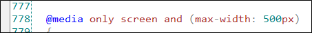
In the Text Editor, scroll to the bottom of the file (roughly line 778). The most recently added media query, @media only screen and (max-width:500px), has the highest precedence (it displays lowest in the stylesheet).
Note
-
Select the Project ribbon. Then from the Build Primary drop-down, select Build All-About-Austin-HTML5. The Builds window pane opens at the bottom of the Flare Desktop interface, and the target begins to generate. When the build finishes successfully, the Build Progress cell turns dark green.
-
Double-click the row to open the HTML5 output, and view it in a regular browser with the window maximized.
-
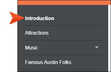
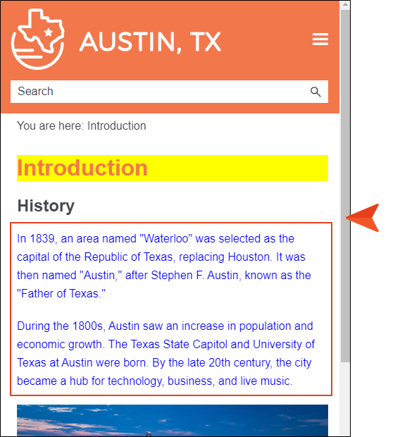
From the table of contents, select the Introduction topic.
-
Click and drag the browser window to reduce it. Once the width of the browser window reaches 500 pixels, the display changes to show the custom media query (with blue paragraph font).
-
Close the HTML5 output.
-
From the Window ribbon, select Close All Documents.
Ta-Da!
Congratulations! You've reached the end of this tutorial.
To go through other style tutorials, click here.
To check out additional tutorials, click here.


