 Outputs Supported

Important WebHelp and WebHelp Plus are deprecated in Flare Desktop, which means that they are slated to be removed in a future version.
In addition to the regular web toolbars that can be included in all most online outputs, you have another option for including toolbars. This option lets you insert toolbars anywhere in any topics.
For more about web toolbars versus topic toolbars, see Toolbars.
[Menu Proxy — Headings — Online — Depth3 ]
Basics of Using Topic Toolbars
The generation of topic toolbars is based on two elements—(1) the topic toolbar proxy and (2) settings in the Skin Editor.
Topic Toolbar Proxy
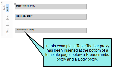
The Topic Toolbar proxy is used to tell Flare Desktop where you want the topic toolbar to be displayed in the output. If you want the toolbar to be shown at the top of only a few topics, you can insert the proxy at the top of each of those topics. If you want the toolbar to be shown at the bottom of all topics in your output, you can insert the proxy into a template page to be used for that target. You can even insert the proxy in the middle of text in a topic if you want certain toolbar buttons to be displayed there. When inserting a topic toolbar, you can select a skin if you are generating HTML5 output. You can also select an optional style class if you want to use it to control the look of the toolbar. Finally, you can choose which buttons to include in the toolbar. However, buttons can also be selected in your skin. If you are generating HTML5 output, keep in mind that the selection of the skin in the Topic Toolbar Proxy dialog overrides both the style class and button settings in the lower portion of the dialog.
Skin Editor Settings
For standard skins, there is a tab in the Skin Editor called "Topic Toolbar." The fields in that tab mirror those in the WebHelp Toolbar tab (for standard skins). As an alternative to specifying buttons in the Topic Toolbar proxy, you can specify them here in the skin. However, with standard skins, the settings in the proxy take precedence over those in the skin.
You can control the look of the items in the topic toolbar, and the background of the topic toolbar, by opening the Styles tab of the Skin Editor and modifying the appropriate styles. By default, the background is transparent so it will show whatever is behind it in the body of the topic. When you change any of these styles, they affect settings for items in both regular web toolbars and in topic toolbars. See Standard Skin Styles.
You can also use the Madcap|topicToolbarProxy style to change the look of the container holding the generated toolbar.
Note Although you can insert Topic Toolbar proxies in most of the online outputs, choosing the buttons for the toolbar can be done in the skin for only some outputs. For Microsoft HTML Help output, you can select buttons in the Topic Toolbar proxy only.
The Previous and Next buttons in HTML5 output using Side or Top Navigation skins (or no skin) differ from those in other WebHelp and other output types (including HTML5 outputs using a Tripane skin). In WebHelp and other output types, the Previous and Next buttons navigate between topics in a browse sequence (if one is available); otherwise they navigate between topics in the table of contents.
Example — WebHelp (Browse Sequence)
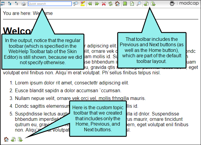
Let's say you want to add Next and Previous buttons, as well as the Home button, at the bottom of each topic in your WebHelp output. The buttons will use a browse sequence that you’ve added to your output.
Therefore, you open your skin and select the Topic Toolbar tab. The default settings already include the Next Topic, Current Topic Index, and Previous Topic items.
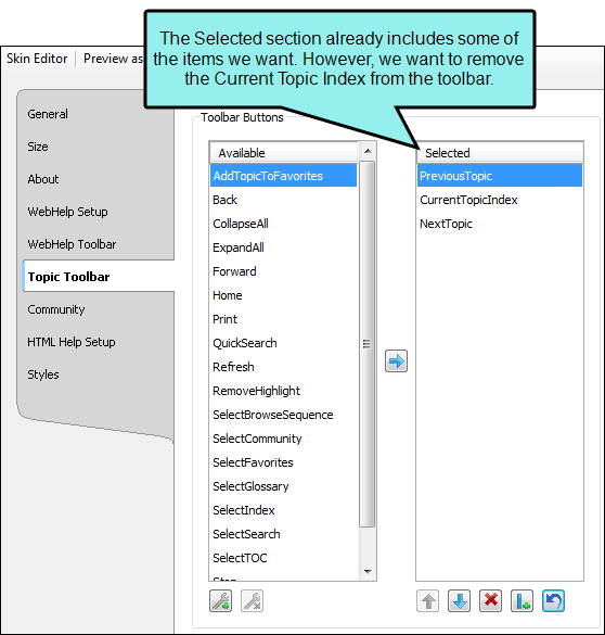
In the Selected section, you select CurrentTopicIndex and click  at the bottom of the tab. This moves that item back to the Available section on the left.
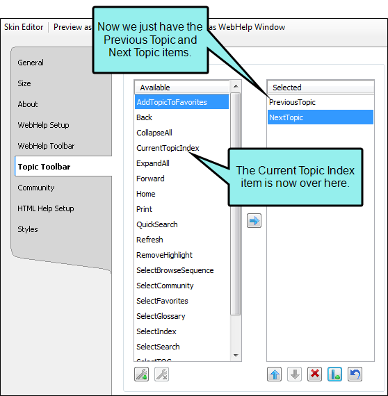
Next, in the Available section, you select the Home item and click  to move it to the Selected section.
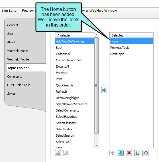
Now that the settings in the Skin Editor are completed, you can save your changes and insert the Topic Toolbar proxy (alternatively, you could have inserted the proxy before editing the skin). If you had wanted the custom toolbar to display in only a few topics, you would probably insert the proxy directly into those topics. However, because you want the toolbar to display at the bottom of every topic, the best way to accomplish this is to insert the proxy into a template page.
After making sure both the skin and the template page are associated with the WebHelp target, you can generate the output.
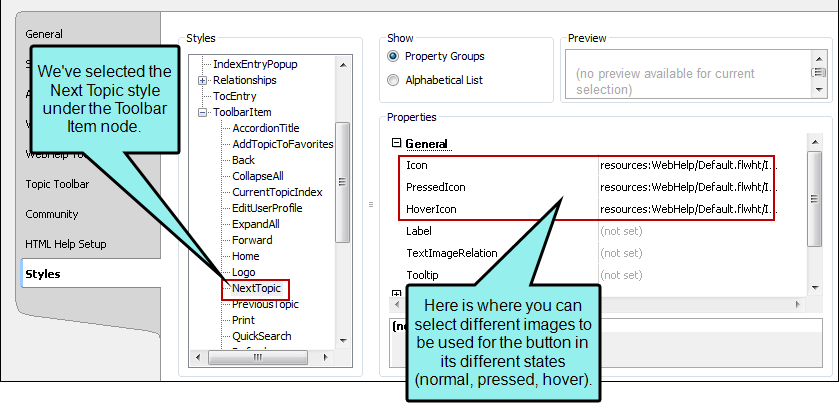
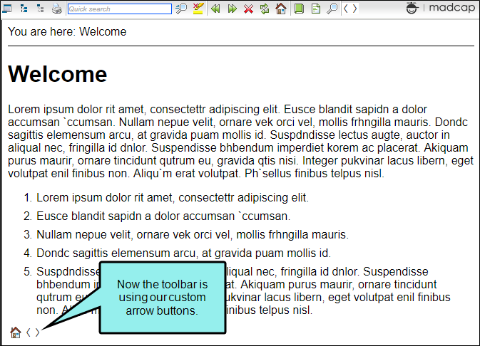
Suppose you have created your own arrow images and want to use them instead of the images provided by Flare Desktop. You can simply select your image files in the Styles tab of the Skin Editor.
Afterwards, the output might look something like this:
How to Specify Topic Toolbar Settings in a Standard Skin
Following are steps for specifying toolbar settings in a Standard skin. You can select the buttons either in these steps or when you insert the topic toolbar proxy.
- Open a Standard skin.
- Select the Topic Toolbar tab.
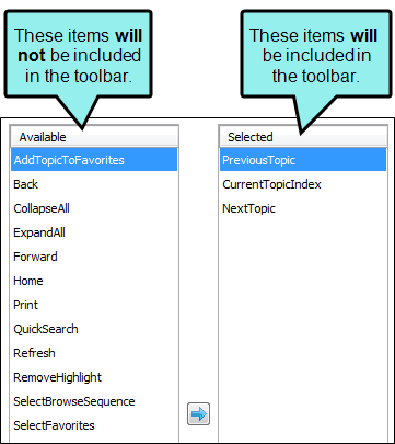
- Select options to include specific features (buttons) in the toolbar. Items that will be included in the toolbar are displayed in the Selected section on the right. Items that will not be included in the toolbar are displayed in the Available section on the left. You can use the right arrow button to move items from the Available section to the Selected section.
Following are descriptions of the various items.
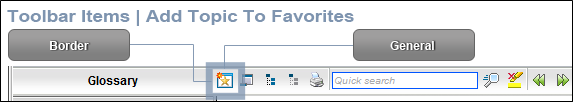
Add Topic to Favorites
Lets users add the active topic to the Favorites pane so that they can quickly access the topic in the future.
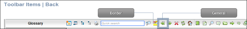
Back
Lets users open the topic that was viewed previously.
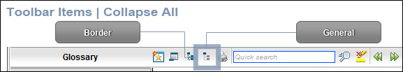
Collapse All
Lets users collapse all elements such as togglers, drop-down effects, and expanding text effects in a topic (if they are expanded).
Current Topic Index
Lets users see the display for the current topic in the sequence. This is typically used in conjunction with the "Next Topic" and "Previous Topic" buttons when the topic in question exists in a browse sequence. Flare Desktop finds the current topic in a browse sequence and display its position in relation to the rest of the topics in that sequence. (The root node is used to determine the count; in other words, if there are "child" topics in the sequence structure under the current topic, they will be included in the count.)

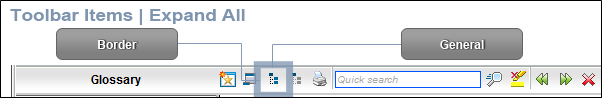
Expand All
Lets users expand all elements such as togglers, drop-down effects, and expanding text effects in a topic (if they are not yet expanded).
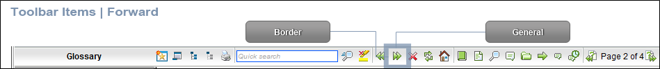
Forward
Lets users open the next topic in a previously viewed sequence.
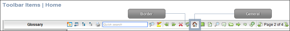
Home
Lets users open a designated home page (such as your company's website)
Next Topic
Lets users open the next topic in the output. If you are using a browse sequence, Flare Desktop attempts to find the current topic in a browse sequence and navigate to the next topic from there. If you are using HTML5 Side Navigation, Top Navigation, or skinless output, or if you are not using a browse sequence, Flare Desktop looks at the position of the current topic in your table of contents (TOC) and opens the next topic after it.

Previous Topic
Lets users open the previous topic in the output. If you are using a browse sequence, Flare Desktop attempts to find the current topic in a browse sequence and navigate to the previous topic from there. If you are using HTML5 Side Navigation, Top Navigation, or skinless output, or if you are not using a browse sequence, Flare Desktop looks at the position of the current topic in your table of contents (TOC) and opens the previous topic before it.

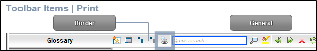
Print
Lets users open the Print dialog so that they can send the open topic to the printer.
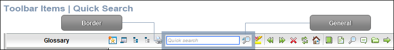
Quick Search
Lets users initiate a search in the active topic for the word or phrase that has been typed in the field next to the button.
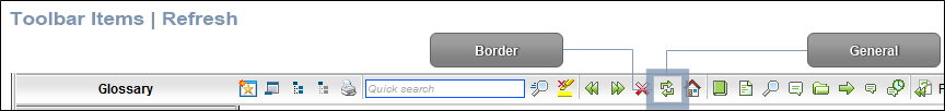
Refresh
Lets users update the content of the topic being viewed.
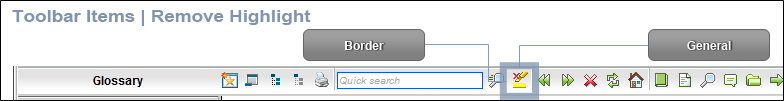
Remove Highlight
After a user performs a quick search in a topic, the search text found in the topic is highlighted. This button lets users turn the highlights off.
Select Browse Sequence
Lets users open the Browse Sequence feature.

Select Community
Lets users access their Pulse community features, if the are using MadCap Pulse

Select Favorites
Lets users open the Favorites feature.

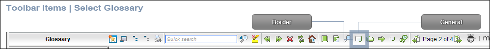
Select Glossary
Lets users open the Glossary feature.
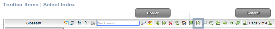
Select Index
Lets users open the Index feature.
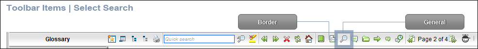
Select Search
Lets users open the Search feature.
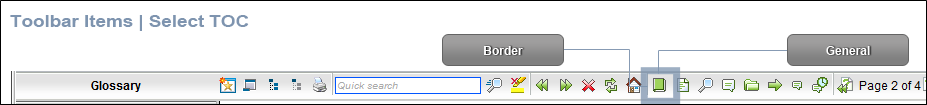
Select TOC
Lets users open the TOC feature.
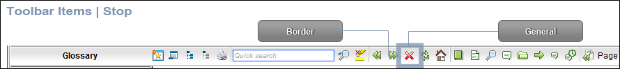
Stop
Lets users prevent a page from downloading file information.
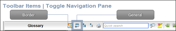
Toggle Navigation Pane
Lets users toggle between hiding and showing the navigation pane in the output window.
-
(Optional) You can use the buttons at the bottom of the tab to perform additional tasks.
Option
Description

Opens the New Toolbar Button dialog, which lets you add a custom button to the toolbar. After creating the custom button, select it and click
to move it to the Selected section.Unless you specify otherwise, in the output the new button will display the text for the name you gave it. However, you can change this by editing the control type for the new button. To do this, you can select the Styles tab in the Skin Editor, expand the Toolbar Item node, select one of the styles listed above, expand the Type property group, and from the Control Type field select Button. To choose an image for the button, expand the General property group on the Styles tab and select image files in the Icon fields.
If you want to provide a command for the custom button (e.g., so that clicking the button opens a website), you can select the Styles tab in the Skin Editor, expand the Toolbar Item node, select one of the styles listed above, expand the Type property group, and enter a command in the OnClick field. For example, the following command opens the MadCap Software website when a user clicks the button:
Copywindow.open("http://www.madcapsoftware.com");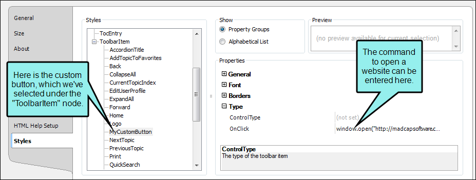
Alternatively, you can use the JavaScript area on the Topic Toolbar tab to enter a command for the button. See the next step.

Removes the selected custom button from the Available section.

Moves the selected item up in the order in the Selected section. In the output, buttons are displayed left to right according to the order in which they appear on this tab, with the item at the top being the first button shown on the left in the output.

Moves the selected item down in the order in the Selected section. 
Removes the selected item(s) from the Selected section. 
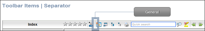
Adds a separator to the Selected section. A separator is the divider between the toolbar buttons and the navigation pane.

Resets the toolbar to the default settings.
-
(Optional) If you want to include custom JavaScript in the toolbar, click Edit in the area to the right. This opens the Toolbar JavaScript dialog, which you can use to enter or load custom JavaScript for the toolbar.
For example, the following command opens the MadCap Software website when a user clicks the button:
Copyfunction MyFunction()
{
window.open("http://www.madcapsoftware.com");
} - Click
") to save your work.
to save your work.
Topic Toolbar Buttons Supported
Although topic toolbars can be added in all online outputs, only certain buttons are supported in some outputs. The following table provides an overview.
|
|
HTML Help |
HTML5 |
WebHelp |
WebHelp Plus |
|---|---|---|---|---|
|
Add Topic to Favorites |
|
|
|
|
|
Back |
|
|
|
|
|
Collapse All |
|
|
|
|
|
Current Topic Index |
|
|
|
|
|
Expand All |
|
|
|
|
|
Forward |
|
|
|
|
|
Home |
|
|
|
|
|
Next Topic |
|
|
|
|
|
Previous Topic |
|
|
|
|
|
|
|
|
|
|
|
Quick Search |
|
|
|
|
|
Refresh |
|
|
|
|
|
Remove Search Highlight |
|
|
|
|
|
Select Browse Sequence |
|
|
|
|
|
Select Community |
|
|
|
|
|
Select Favorite |
|
|
|
|
|
Select Glossary |
|
|
|
|
|
Select Index |
|
|
|
|
|
Select Language |
|
|
|
|
|
Select Search |
|
|
|
|
|
Select Skin |
|
|
|
|
|
Select TOC |
|
|
|
|
|
Separator |
|
|
|
|
|
Stop |
|
|
|
|
|
Hide Navigation |
|
|
|
|
|
1Collapse All and Expand All are the same button for HTML5. 2This button is supported only for HTML5 output that is using a Tripane skin. It is not supported for HTML5 output using a Top Navigation skin, or no skin. 3If you are using a Tripane skin, this button lets you navigate browse sequences. If you are using a Top Navigation skin or no skin (or if you are using a Tripane skin without a browse sequence), this button lets you browse table of contents entries. |
||||
What’s Next?
Make sure that you associate the skin with the target. See Associating Skins With Targets.
You can also use a skin styles to change the look of toolbars. See Standard Skin Styles.
