 ELEARNING TUTORIAL—ADVANCED
Now that we have our content, let's add an eLearning toolbar so that learners can easily navigate from one topic to the next, and see their progress while doing so. In fact, if you are viewing this tutorial online, you can see an eLearning toolbar at the bottom of most topics; we've omitted the progress bar in our case, but we've included Next and Previous buttons.
There are two parts to adding this toolbar—a proxy and a skin component. The proxy is a placeholder that we will place where we want the toolbar to be generated and displayed in the output. The skin component lets us determine what elements will be included in the toolbar and how the toolbar will look.
[Menu Proxy — Headings — Online — Depth3 ]
How to Insert an eLearning Toolbar Into a Template Page
Our online output from this project will consist of a Home page, followed by a series of topics containing information, knowledge checks, and a quiz. We want our new toolbar to display at the bottom of all of those topics, except the Home page. The easiest way to add the same content or look to a lot of topics is to edit the template page associated with those topics. Our project is already set up with two template pages—one associated specifically with the Home page, and the other associated with our target (which we will get to soon). So by inserting the eLearning toolbar into the second template page, all of our topics, except the Home page, will include it in the output.
-
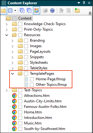
In the Content Explorer, expand Resources > Template Pages. Notice the two template pages.
-
Double-click Other-Topics.flmsp to open it.
-
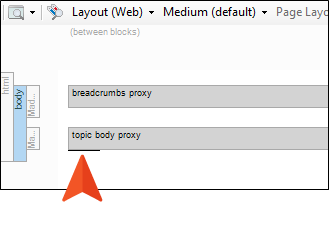
So far, this template page has two gray bars, which are proxies. We want to add a new proxy at the bottom. On your keyboard, press the down key until you see the cursor flashing horizontally after the second gray bar.
-
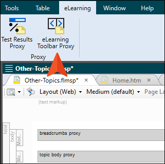
From the eLearning ribbon, select eLearning Toolbar Proxy.
-
In the eLearning Toolbar Proxy dialog, you could select a skin component, if you have one. But we don't have one yet, so we'll just leave this setting at (default). Click OK.
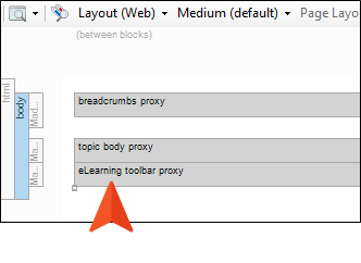
A new gray bar representing the eLearning Toolbar proxy is added to the template page.
-
Click
 to save your work.
How to Add and Edit an eLearning Skin Component
-
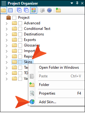
In the Project Organizer, right-click the Skins folder, and from the context menu select Add Skin.
-
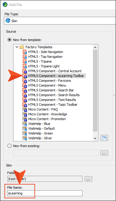
In the Add File dialog, select HTML5 Component - eLearning Toolbar. In the File Name field, enter eLearning (although in your actual project, you can name it anything you want). Then, click Add.
-
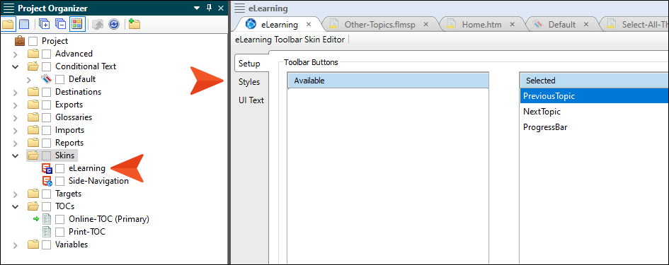
Expand the Skins folder to see the new file, and notice that the eLearning Toolbar Skin Editor opens to the right. In the following image, the Setup tab is selected, but it's possible a different tab might initially be active when you first open the editor.
-
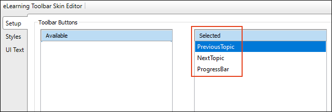
On the left side of the editor, make sure the Setup tab is selected. Notice that three elements (PreviousTopic, NextTopic, and ProgressBar) have already been added to the right side, and will therefore be displayed in the output in just that order. We could remove any of these, or change the order, but it's set just how we want, so let's leave it.
Note In the output, the "Next" button will automatically change to say "Complete" when it is the final page of all quiz topics under a test node in the TOC.
Note The progress bar will include all topics that are in the TOC. So if you have a TOC with 2,500 topics and decide to insert a short course in the middle of it with an eLearning toolbar that includes a progress bar, you might see something like "Page 943 of 2,500," which would look strange. Notice that in our own Help system output, we have not included the progress bar in our eLearning toolbar, because our output has a small number of tutorials with knowledge checks compared to the rest or our Help system.
-
On the left side of the editor, select the Styles tab.
-
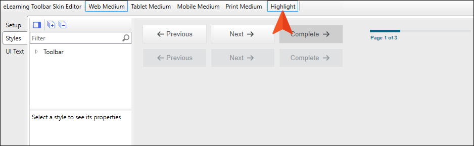
This gives us a preview of how the elements will look in the output. We'll leave most of the look and feel as is, but let's change the color in the progress bar to match our orange branding. To start, click the Highlight button in the local toolbar. This is a handy feature that is going to help us quickly locate the style that we need to edit.
-
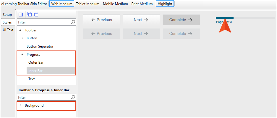
Now that the Highlight button is enabled, click the blue progress bar in the preview. Doing this automatically expands the Progress style group, selects the Inner Bar element, and displays the style properties on the left.
-
Expand the Background property.
-
Next to the Color field, click
 for more colors. The Color Picker opens.
 -
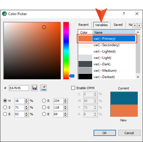
Select the Variables tab, and then select the primary branding color, var(--Primary). Click OK.
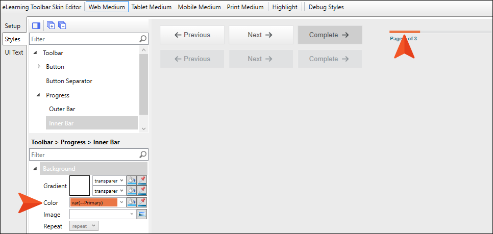
Notice the progress bar is now orange. (The branding color in the skin is a CSS variable that is pointing to the branding stylesheet.)
-
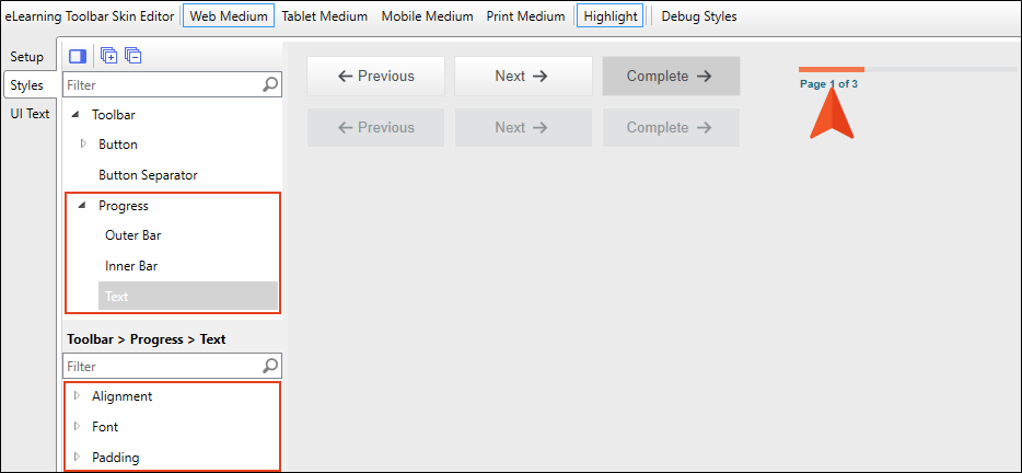
Let's change the font under that bar as well. Currently, it is a shade of blue. We could make it orange like our progress bar, but that might be hard to read. So let's make it black. In the preview, click Page 1 of 3. This expands the Progress style group, selects the Text element, and displays the properties on the left.
-
Expand the Font property.
-
Next to the Color field, click
for more colors. The Color Picker opens. -
Select the Variables tab, and then select the branding color, var(--Darkest). Click OK. The color changes in the preview to black.
-
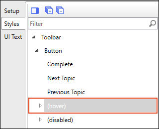
On the left side of the editor, scroll up if necessary and expand the Toolbar > Button style group, and select (hover).
-
Expand the Background properties. The fields show the blue hex number.
-
Next to the Gradient field, click
for more colors. The Color Picker opens. -
Select the Variables tab, and then select the primary branding color, var(--Primary). Click OK.
Note When you generate the output, you'll notice that the navigation buttons have a border around them when you hover over them. The skin component is using the same blue color for the border that you just changed for the button hover background. We're not going to change that color in this tutorial, but if you want to change it for your own project, just expand the Border section (shown next to Background in the image above) and change it in there for each of the fields shown (Left, Right, Top, Bottom).
-
Click
to save your work.


