A style is a formatting designation that you can use to quickly change the appearance of your content (such as characters, paragraphs, or tables) in multiple places at once. They allow you to separate your content from its presentation. Styles are stored in cascading stylesheet (CSS) files.
You can edit stylesheets that you create. However, you cannot open the stylesheets that are associated with contribution templates or topics sent to you by Flare authors.
Note Working in the Stylesheet Editor or Style Inspector is supported only for HTM and MCDOC file types in Contributor.
Following are the basic steps for editing styles in a regular stylesheet and in a table stylesheet.
[Menu Proxy — Headings — Online — Depth3 ]
How to Edit Styles in a Regular Stylesheet
- Open the stylesheet you want to modify or create a new one.
-
Complete one of the following sets of steps, depending on whether you want to use the Simplified view or Advanced view in the Stylesheet Editor.
-
Simplified The Simplified view displays styles in a grid view and is often best for brand new users.
This view provides an easy way to apply properties to styles, with format options available from a toolbar and dialogs (similar to the way one would use an interface such as Microsoft Word). In some cases, only the most common property options are available in the Simplified view (e.g., font, letter/word spacing, paragraph alignment/indentation, autonumbering format, borders, background). One advantage of the Simplified view is that you can apply a property to multiple styles at the same time. You can also click a check box to hide the properties in the editor, allowing you to see only the styles.
-
Advanced The Advanced view displays styles in a tree structure, and despite the name, is user friendly for authors of all levels.
For the properties, you can toggle between a grouped display and an alphabetical display. The Advanced view of the Stylesheet Editor lets you edit more settings than are available in the Simplified view. In addition, the Advanced view lets you see and apply settings to multiple mediums and media queries at the same time.
If Using Simplified View
- In the local toolbar, make sure the first button displays
 (which means that the Simplified view is currently shown in the editor). If the button displays
  instead, then click it.
 - (Optional) You can click in the Show Styles field
 in the upper-left corner of the Stylesheet Editor to limit which styles are shown in the editor. For example, if you select Show All Styles, then all styles will be displayed. If you select Show Paragraph Styles, only paragraph styles will be displayed. If you select Show Table Styles, only table styles will be displayed.
 - From the grid in the bottom portion of the Stylesheet Editor, select a style.
- In the local toolbar of the editor, click
 . The Properties dialog opens.
 - Use the Properties dialog to change values for the style's properties.
- In the Properties dialog, click OK.
If Using Advanced View
- In the local toolbar, make sure the first button displays
 . If the button displays
  instead, then click it.
 - (Optional) You can click in the Show Styles drop-down list
 in the upper-left corner of the Stylesheet Editor to limit which styles are shown in the editor. For example, if you select Show All Styles, then all styles will be displayed. If you select Show Paragraph Styles, then only paragraph styles will be displayed. If you select Show Table Styles, then only table styles will be displayed.
 - On the left side of the editor, select the style that you want to edit.
- From the Show Properties drop-down list
 on the upper-right side of the editor, select any of the options shown to determine which properties are displayed below. This is simply a way to find the appropriate property as quickly as possible.
- Set (Locally) Properties Displays properties that have been set explicitly in the stylesheet.
- Set Properties Displays properties that have been set explicitly in the stylesheet. It will also show properties that have been set in an imported stylesheet or inherited properties that have been set in a factory stylesheet.
- Assorted Relevant Properties Displays the property groups that are used most often for the selected style type.
- All Properties Displays all the different groups holding the properties for the selected style. This is simply a way to organize the properties intro groups so that they are easy for you to find. If you want to see the values for a given property group, expand it.
- (Optional) You can use the toggle button in the local toolbar to show properties below in a group view
 or an alphabetical view
  .
. -
Locate the property you want to change.
- The area to the right of the property is used for selecting and entering values. If you know how to enter the information correctly, you can click in the value field and type it directly. Otherwise, click the ellipsis button
 to the right of the property. Depending on the type of property, the appropriate controls and options display, allowing you to choose or enter values (e.g., select from a drop-down list, click a button, complete fields in a dialog or popup). If you completed values in a popup, click OK at the bottom of the box.
As you make changes to a property's values, you can see how the changes look in the Preview section at the bottom of the editor.
-
- Click
 to save your work.
How to Edit Styles in a Table Stylesheet
- Open the table stylesheet that you want to edit.
- In the Table Style Editor, set the options for the table style on the tabs available. Open the full topic for details of each option.
General Tab
This tab lets you set border, padding, margin, page layout breaks, and background properties for the entire table style.
- Table Margins Click in any of the individual fields (Left, Right, Top, Bottom) to specify the settings for the table margins (the amount of space around the table). In the left side of the field, enter a number for the amount of padding. In the right side of the field, select a unit of measurement (e.g., point, pixel, centimeter) for the number you entered. If you click the down arrow to the right of all the fields, the settings will be applied to all of the table margin fields. When you click that down arrow, a small popup displays. Use the lower-left area of the popup to enter a number for the amount of margin. Use the lower-right area to select a unit of measurement.
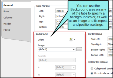
Background Use this area to specify the settings that you want for the table background.
In the Color field, click the down arrow and select a color from the popup. For advanced color options, select MoreColors and use the fields in the Color Picker dialog. Next to the Image field, click
 . Select an image file to insert and click OK.
If you want the background image to repeat, select one of the options from the Repeat field. You can also set the image position horizontally and vertically by using the X and Y fields.
- Cell Padding Click in any of the individual fields (Left, Right, Top, Bottom) to specify the settings for the cell padding (the amount of space between the edge of the table cell and the content in the cell). In the left side of the field, enter a number for the amount of padding. In the right side of the field, select a unit of measurement (e.g., point, pixel, centimeter) for the number you entered. If you click the down arrow to the right of all the fields, the settings will be applied to all of the cell padding fields. When you click that down arrow, a small popup displays. Use the lower-left area of the popup to enter a number for the amount of padding. Use the lower-right area to select a unit of measurement.
- Outer Borders Click in any of the individual fields (Left, Right, Top, Bottom) to specify the settings for the table border in the stylesheet. If you click the down arrow to the right of all the fields, the settings will be applied to all of the border fields. When you click that down arrow or in one of the individual fields, a small popup displays. Use the lower-left area of the popup to enter a number for the thickness of the border. Use the lower-middle area to select a unit of measurement (e.g., point, pixel, centimeter) for the number you entered.Use the upper-right area to select a color for the border. And use the lower-right area to select a line type (e.g., solid, double, dashed) for the border. When you are finished, click OK in the small popup.
- Border Radius These fields let you create rounded corners on the table. Click in any of the individual fields (Top-Left, Top-Right, Bottom-Right, Bottom-Left) to specify the settings for a particular corner of the table. If you click the down arrow to the right of all the fields, the settings will be applied to all of the fields. When you click that down arrow or in one of the individual fields, a small popup displays. This popup has two halves. You can complete only the left side of the popup if you like. This will create a curve that is equal horizontally and vertically. If you want a border to have more of a curve either horizontally or vertically, you can complete the fields in the right half of the popup as well, so that you have two values (e.g., 10px 15px) instead of one. For more information on using two sets of border radius properties, see css3.info/preview/rounded-border/. Use the lower-left area of the popup to enter a number for the amount of curve. The greater the number, the more curve that is applied. Use the area to the right of the number field to select a unit of measurement (e.g., point, pixel, centimeter). If you want to provide a second value for the rounded border, complete the same fields on the right half of the popup. When you are finished, click OK in the small popup.
- Cell Border Collapse Select whether you want to collapse the cell borders in the stylesheet. If you collapse the cell borders, the row and cell borders of a table are joined in a single border. If you do not collapse the cell borders, the row and cell borders of a table are detached. If you use the border radius properties to create rounded borders, this must be set to "Do not collapse cell borders."
- Cell Border Spacing Use this area to increase or decrease the amount of spacing for a cell border.
- Hide bottom ruling when table crosses a page break See Hiding the Bottom Border on Tables when Crossing Page Breaks.
- Overflow This determines what happens if content overflows the table.
- Visible The overflow is not clipped. It renders outside the table. This is default.
- Hidden The overflow is clipped, and the rest of the content will be invisible. If you are using border-radius properties on the table, you must select this option for the rounded corners to be seen properly.
- Scroll The overflow is clipped, but a scroll-bar is added to see the rest of the content.
- Auto If overflow is clipped, a scroll-bar should be added to see the rest of the content.
- Inherit The value of the overflow property is inherited from the parent element.
- Print Options Click this button to open the Breaks dialog and set page, column, and breaks for tables.
Rows, Columns, Header, and Footer Tabs
These tabs let you set properties for the various elements of the table. For any of these elements, you can add multiple repeatable patterns with different colors and text properties. Following are descriptions for the fields that appear on each tab.
Row/Column/Header/Footer Styles
Displays the patterns for the row, column, header, or footer in the stylesheet. Each line represents a different pattern and how many times it is repeated in a table before the next pattern occurs.
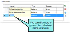
Name Displays the name of each pattern. Depending on which tab you are working on, the default names of the patterns may be Body1, Body2, Body3, etc.… Column1, Column2, Column3, etc.… Header1, Header2, Header3, etc.… Footer1, Footer2, Footer3, etc. You can click in the cell, press F2, and enter a custom name for each pattern if you like.
Type Select a type for the item. You can switch the type for an item using the drop down menu.
Header This is available only in the Columns tab. It can be used to indicate that the entire column acts as a header, carrying more weight in a sense than the rest of the columns, which carry equal weight.
- Pattern This lets you create automatic patterns in a table (e.g., alternating background colors).
- Custom This type will not be added to a table automatically. Instead, you would need to apply that item manually to the particular areas of the table where you want to use it.
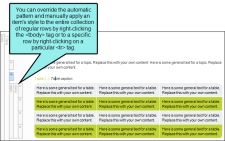
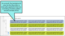
Example You have a table stylesheet with three pattern items on the Rows tab (Gray, Green, Blue), with alternating background colors.
However, only the first two items are using the Pattern type. The third item is using the Custom type. Therefore, when you insert a table and use this stylesheet, the rows alternate between gray and green only.
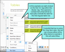
This particular pattern was created on the Rows tab, which means that it displays only in your body rows, not in any header or footer rows. By right-clicking on the tbody structure bar or any of the tr structure bars within it, you can select Row Style from the context menu. From there, you can select any of the available items in the pattern to override what you already have in the table.
The only difference between the first two items (Gray and Green) and the third item (Blue) is that Blue can be applied only from this context menu manually. Gray and Breen are applied automatically, but can be applied manually from the context menu too.
Repeat Click the up or down numbers to increase or decrease the number of times the pattern occurs in a table before the next pattern is displayed.
 Adds a new pattern. The new pattern is initially set to repeat just once, but you can change that in the "Repeat" cell.
 Removes the selected pattern from the list.
 Moves the selected pattern up in the list.
 Moves the selected pattern down in the list.
Height
Select a pattern from the section above. Then click this field to open a small popup, which lets you set properties for the height of the row or width of the column. In the lower-left field enter a number. In the lower-right field, select a unit of measurement (e.g., points, pixels, centimeters) for the number you entered. Then click OK to accept the settings, or click Cancel to close the window without accepting them.
Font
Select a pattern from the section above. Then click this field to open a small popup, which lets you set font properties.
- Weight Select an option to change the weight of the font (e.g., bold). The numbers from 100 to 900 represent different levels of darkness. The number 400 is the same as a "normal" weight, and the number 700 is the same as the standard "bold" option. "Bolder" means the next weight that is assigned to a font that is darker than the inherited one. "Lighter" means the next weight that is assigned to a font that is lighter than the inherited one.
Style Select an option to change the style of the font (e.g., italic).
According to the World Wide Web Consortium (w3.org):
The font style specifies whether the text is to be rendered using a normal, italic, or oblique face. Italic is a more cursive companion face to the normal face, but not so cursive as to make it a script face. Oblique is a slanted form of the normal face, and is more commonly used as a companion face to sans-serif. This definition avoids having to label slightly slanted normal faces as oblique, or normal Greek faces as italic.
- Color Click this field and select a color for the text. For advanced color options, select More colors and use the fields in the Color Picker dialog.
- Size In the top field, select Length. Then in the lower-left field enter a number for the size of the text, and in the lower-right select a unit of measurement (e.g., points, pixels, centimeters) for the number.
- Family Click in this field and select a font family (e.g., Arial) for the text.
Ruler
Select a pattern from the section above. Then click this field to open a small popup, which lets you set properties for a rule (i.e., horizontal line) between the rows or columns in the pattern. In the lower-left field enter a number for the size of the rule. In the lower-middle field, select a unit of measurement (e.g., points, pixels, centimeters) for the number you entered. In the upper-right field, select a color for the rule. In the lower-right field, select a type of line (e.g., solid, double, dashed) for the rule. Then click OK to accept the settings, or click Cancel to close the window without accepting them.
Separator
Select a pattern from the section above. Then click this field to open a small popup, which lets you set properties for a separator (i.e., a horizontal line) between the final row or column in the pattern and the first row or column in the next pattern. In the lower-left field enter a number for the size of the separator. In the lower-middle field, select a unit of measurement (e.g., points, pixels, centimeters) for the number you entered. In the upper-right field, select a color for the separator. In the lower-right field, select a type of line (e.g., solid, double, dashed) for the separator. Then click OK to accept the settings, or click Cancel to close the window without accepting them.
Alignment
Select an option for aligning text in the row or column horizontally.
- Left The text aligns at the left edge of each cell.
- Center The text aligns in the center of each cell.
- Right The text aligns at the right edge of each cell.
- Justify The text aligns both at the left and right edges of each cell.
vertical Alignment
Select an option for aligning text in the row or column vertically.
- Top The text aligns at the top of each cell.
- Middle The text aligns in the middle of each cell.
- Bottom The text aligns at the bottom of each cell.
Print Options (Rows Only)
Click the Print Options button to open the Breaks dialog and set page and column breaks for table row elements.
Background
Use this area to specify the settings that you want for the background. In the Color field, click the down arrow and select a color from the popup. For advanced color options, select More Colors and use the fields in the Color Picker dialog. Next to the Image field, click
 . Select an image file to insert and click OK. If you want the background image to repeat, select one of the options from the Repeat field. You can also set the image position horizontally and vertically by using the X and Y fields.
Cell Padding
Click in any of the individual fields (Left, Right, Top, Bottom) to specify the settings for the cell padding (the amount of space between the edge of the table cell and the content in the cell). In the left side of the field, enter a number for the amount of padding. In the right side of the field, select a unit of measurement (e.g., point, pixel, centimeter) for the number you entered. If you click the down arrow to the right of all the fields, the settings will be applied to all of the cell padding fields. When you click that down arrow, a small popup displays. Use the lower-left area of the popup to enter a number for the amount of padding. Use the lower-right area to select a unit of measurement.
Cell Content Style
When you insert a table, it is set up by default to use standard table tags in the individual cells (e.g., <th> for table headers, <td> for regular table text). However, if you press ENTER at the end of a line, a <p> tag is added within the standard tag. Therefore, in order to keep all of the content in your table cells looking consistent, there are a couple of things you can do. First, if you are editing table styles in a regular stylesheet, you can create advanced selectors (e.g., "td p"). Second, you may want to create a special style class of the p style to be used for table content (e.g., p.tabletext) and apply that style to all of your cells when you first create a table. You can manually apply specific styles to tables by selecting the table cells, clicking Table > Cell Content Style, and choosing the style to be used for those cells.
However, rather than repeating all these steps each time you create a table, the easiest way to accomplish this is to set a default cell content style. You can do this in a couple of ways: globally or using a table stylesheet.
The fields in this section let you set default styles in the table stylesheet for whatever tab you're on (Rows, Columns, Header, Footer). In the Tag field, select the parent style (usually p). Then in the Class field, select any class that is available for that parent style (e.g., TableRowText).
You can have different defaults for each table stylesheet.
When you insert a new table using a particular table stylesheet, the various parts of the table (e.g., header, row, footer) will automatically start out with the appropriate styles so that you don't have to set any of them manually.
This feature automatically applies the selected style class only in new tables (and in new cells within existing tables) that are associated with the table stylesheet. It does not affect existing tables.
If you also have a style set in the Table ribbon using the global method, your settings in a table stylesheet override that style.
For more information about selecting table cell content styles and using the global default method, see Selecting Styles for Table Cell Contents.
Note As an alternative to the Cell Content Style feature, you could use advanced selectors to automatically control the look of content in tables.
Pattern Example
Let's say you want the rows in the table to alternate between having no background color and a green background color. In addition, you want a header row to have a blue background. To do this, you would complete the following steps:
- Select the Row tab.
- In the Row Styles section, click
 . There should now be two patterns (Body1 and Body2).
 - To make the patterns more identifiable, click in the Name cell (where "Body1" is shown) and press F2. Then replace the existing text and type NoColor.
- Click in the Name cell (where "Body2" is shown) and press F2. Then replace the existing text and type Green.
- The Type cell should already be set to "Pattern" for each, and the Repeat cell should already be set to "1" for each. Keep those fields set as they are.
- Select the Green pattern row.
- In the Background/Color field, select a green color.
- Select the Header tab.
- Click in the Name cell and press F2. Then replace the existing text and type Blue.
- In the Background/Color field, select a blue color.
The Preview section lets you see how the table elements look as you make changes.
- Click
 to save your work.


