Customizing HTML Help, Help Viewer, Help 2.0, and JavaHelp Themes
The following themes are included with HTML Help, Help Viewer, Help 2.0, and JavaHelp targets. These themes are the starting point for creating your customized themes.
|
Target |
Themes Available |
Description |
|---|---|---|
|
HTML Help |
Default |
|
|
Top Navigation |
|
|
|
Bottom Navigation |
|
|
|
Nonscrolling |
|
|
|
JavaHelp |
Default |
|
- In the Theme section of the Target ribbon, click Add New. The Add New Theme dialog opens.
- Name the new theme, and choose the Source theme.
-
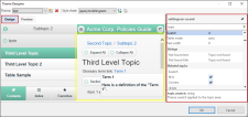
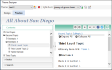
Click OK. The Theme Designer opens. An example of the current theme is displayed, complete with navigation buttons and other elements.
- Click the Design tab in the upper left side of the Theme Designer. The right pane is where you can edit your theme.

-
Make your changes.
 Navigation Bar Properties
The Navigation Bar folder includes sections that allow you to define the background, layout, next, and previous commands.
 Background Fields
Please note these fields will not be enabled unless the Navigation Bar is enabled in the selected theme.
- Same as Topic Text Sets the theme properties so they are inherited from the project settings.
- Background color Defines the color in the navigation bar area. Click the button to the right to access color palettes.
- Selected button color Defines the color of a button once it has been clicked.
-
Background picture Defines the background image in the navigation bar area. Click the browse button to access the image directory.
Note Images should be stored in the following folder: \\My-Doc-To-Help Projects\DocToHelp\Themes\theme type\theme name\Images\Backgrounds.
- Background repeat Defines where the image will appear in the background.
 Layout Fields
- Position Defines the location of the navigation area.
- Include topic title Determines if the topic title is included in the navigation area.
- Alignment Defines the position of the navigation elements.
- Hover color Defines the hover color for the navigation links. Click the button to the right to access color palettes.
- Nonscrolling Determines if the navigational area is nonscrolling.
 Commands Fields
The Previous and Next controls are available for HTML Help, Microsoft Help Viewer 1.x, JavaHelp and Help 2.0 targets.
All of these controls have the following properties:
- Style Defines the Previous or Next navigation as text, image, or text and image.
- Text Defines text for the Previous or Next link.
- Inherit from project Determines if the Previous or Next link text is inherited from the project.
- Default style Determines if the Previous or Next link style is inherited from the project.
- Enabled style Defines the enabled text style for the link.
- Disabled style Defines the disabled text style for the link.
- Hover style Defines the hover text style for the link.
-
Enabled picture Defines the enabled image for the button.
Note Images should be stored in the following folder: \\My-Doc-To-Help Projects\DocToHelp\Themes\theme type\theme name\Images\Buttons and Icons.
- Disabled picture Defines the disabled image for the button.
 Topic Text Properties
The Topic Text folder lets you modify the formatting of the topic pane of your target.
 Layout Fields
- Add margins to the HTML source Adds a small padding, or margins, to the theme by default. If you have defined margins in your HTML source document and do not want Doc-To-Help to change them, clear this box. This check box applies to HTML source documents only.
 Background Fields
- Inherit from project Sets the theme properties so they are inherited from the project settings.
- Background color Defines the color in the contents area. Click the button to the right to access color palettes.
-
Background picture Defines the background image in the contents area. Click the browse button to access the image directory.
Note Images should be stored in the following folder: \\My-Doc-To-Help Projects\DocToHelp\Themes\theme type\theme name\Images\Backgrounds
- Background repeat Defines where the image will appear in the background.
 Breadcrumbs Controls
Breadcrumbs are added by default to HTML Help, Microsoft Help Viewer 1.x, Help 2.0, and JavaHelp, but can be disabled in this dialog.
They will appear above the topic title in HTML Help, Help 2.0, and JavaHelp targets.
- Show Breadcrumbs If checked, breadcrumbs will be displayed above the topic title.
- Show separator line under breadcrumbs If checked, a line will appear under the breadcrumbs displayed above the topic title.
- Include current topic in breadcrumbs If checked, the topic displayed will appear as the last topic in the breadcrumbs. Otherwise, the breadcrumb path will stop at the topic’s parent. Please note that top-level topics will not have breadcrumbs.
- Label Text entered here will be displayed before the breadcrumb links (e.g., "You are here:"). If the "Inherit from Project" check box is selected, the text specified in the Help Targets dialog (Breadcrumbs Label field) will be used.
- Link Separator Determines the text that will separate breadcrumbs links. Most commonly used separators are: ">", "::", or "|".
- Text Six style controls are available to specify the font and color used for breadcrumbs links. Select the Use default styles check box to choose the defaults for all.
- ContentsOnly Style Controls font/color of TOC items with no topic(s) (e.g., a top-level heading). These items do not have links.
- Selected Style Enabled if "Include current topic in breadcrumbs" is selected. Controls font/color of last topic displayed in breadcrumbs path.
- Normal Style Controls font/color of breadcrumb links.
- Hover Style Controls font/color of the breadcrumb link when mouse hovers over it.
- Label Style Controls font/color of breadcrumbs label.
- Link separator style Controls font/color of link separator text.
 Popup Window Properties
The Popup Window folder lets you modify the formatting of the popup windows of your target.
 Background Fields
- Background color Defines the color in the popup. Click the button to the right to access color palettes.
-
Background picture Defines the background image in the popup. Click the browse button to access the image directory.
Note Images should be stored in the following folder: \\My-Doc-To-Help Projects\DocToHelp\Themes\theme type\theme name\Images\Backgrounds
- Background repeat Defines where the image will appear in the background.
 Secondary Window Properties
The Secondary Window folder lets you modify the formatting of the secondary windows of your target.
 Background Fields
- Background color Defines the color in the secondary windows. Click the button to the right to access color palettes.
-
Background picture Defines the background image in the secondary windows. Click the browse button to access the image directory.
Note Images should be stored in the following folder: \\My-Doc-To-Help Projects\DocToHelp\Themes\theme type\theme name\Images\Backgrounds
- Background repeat Defines where the image will appear in the background.
- Click OK.
Note Customized themes are stored by default on your computer in C:\Users\[username]\Documents\My Doc-To-Help Projects\Doc-To-Help\Themes. You can change this location using the Doc-To-Help Options dialog (Files button). To open the Options dialog, select File > Doc-To-Help > Options.
Note For information on customizing other online targets, see the following:
-
NetHelp Targets See Customizing NetHelp Themes.
-
Eclipse Help and EPUB Targets See Customizing Eclipse Help and EPUB Themes.

