The Branding Editor can be opened after a project is created and the styles can be edited anytime within a project. (If you created a project using the Start New Project Wizard, it is basically the same thing as the branding screen.) Use the Branding Editor to manage common branding elements (e.g., logo, hero image, font, color palette) to match the output with your company's brand.
[Menu Proxy — Headings — Online — Depth3 ]
How to Open This Editor
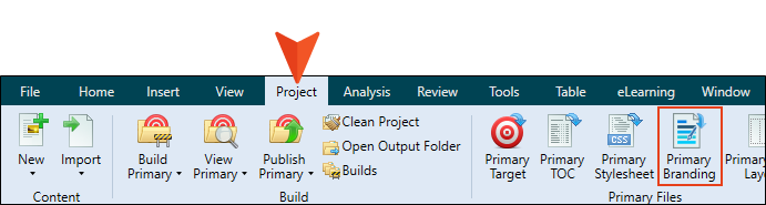
Do one of the following, depending on the part of the user interface you are using:
-
Ribbon Select Project > Primary Branding.
-
Content Explorer
-
Open the Content Explorer
-
Expand the Resources folder, and then Branding.
-
Double-click Branding.css.
-
Fields and Descriptions
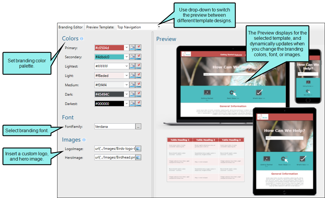
Colors
- Primary The main brand color. For example, the primary color might impact H1 headings for some templates.
-
Secondary Another brand color.
-
Lightest The lightest color (e.g., white, off-white) for ancillary purposes.
- Light A light color for ancillary purposes.
-
Medium A medium color for ancillary purposes.
-
Dark A dark color for ancillary purposes.
-
Darkest The darkest color (e.g., black, dark gray) for ancillary purposes.
Note The branding colors are designed to progress from lighter to darker shades. The colors are used for the preview and throughout the rest of the project, so use caution when changing a color from one extreme to another. For example, if you change a lighter element to a darker color, this could display dark content on top of other dark content. For the best results, adhere to the gradient progression.
Tip You can change the colors from a light theme to a dark mode by selecting the reverse type of color that the color field suggests. For example, for the Lightest field you would select the darkest color and the Darkest field would be the lightest. It is a good idea to test the colors in the output to make sure they look they way you intend.
Use any of the following to enter or select a color.
|
|
You can type a hexadecimal number (e.g., #000000) directly in this field. Alternatively, you can click the down arrow and choose a color or make the background transparent. |
|
|
This opens the Color Picker dialog, which lets you choose a color in many ways. Note that you can select a CSS variable. |
|
|
Adds a bar above the cursor. As you move the cursor over any area of your screen, the color changes in the bar to reflect the color that is directly behind the tip of the cursor. When you click, that color is loaded into the Color Picker dialog. |


Font
-
FontFamily You can select or type a specific font family (e.g., Arial, Tahoma, Verdana). You can also type a series of fonts (i.e., a font set) into the field.
Note When using a factory template, a font family is automatically set for the body style. All lower elements in the hierarchy use it. To use a different font for an element within body, you can change it in the regular stylesheet. For example, you might want to update the h2 and h3 styles to a different font (other than the inherited body style).
Images
-
LogoImage The main logo of your company or product. This lets you select an image for the background. Click
 and use the dialog to select an image file. The default logo is replaced with the selected logo image file. A raster image (e.g., PNG) is suitable for online output.
 -
LogoImagePrint The main logo of your company or product, intended for print-based output. This lets you select an image for the background. Click
and use the dialog to select an image file. Templates that include a PDF allow you to select a vector image (e.g., EPS, SVG), which is made up of geometric elements and provides more clarity for printed output. If you use a raster image it might appear pixelated in the output. -
BigLogo The main logo of your company or product. This is used only in the Brochure template to display a large version of the logo in one of panels. By default it is set to use a PNG file, but you can select a different file format, including a vector image.
-
HeroImage The main hero image shown on the home or cover page of the output. This lets you select an image for the background. Click
and use the dialog to select an image file. The default banner image at the top of online output, or the large image on a PDF title page, is replaced with the selected hero image file.
Note Branding items are based on CSS variables, and you cannot select a CSS variable when inserting an image directly into an area. Therefore, branding images can only be set as the background for an element.
What’s Noteworthy?
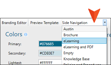
Note The editor includes a Preview Template drop-down. Its only purpose allows you to choose a different template to see in the Preview area how your branding would look using that template. If you view another template, your project remains the same (it does not automatically change to the selected template). You can change a template, but there is additional work involved.