 Outputs Supported


You can edit the look of relationship links by adjusting the appropriate styles in your stylesheet. This might involve changing the look of any of the following: the container holding the links, the heading(s) above the links, the link items themselves. The Simplified view of the Stylesheet Editor lets you edit only some of the necessary styles; for the rest of the styles, you need to use the Advanced view.


[Menu Proxy — Headings — Online — Depth3 ]
How to Edit the Container
- From the Content Explorer, open the stylesheet that you want to modify.
-
In the local toolbar, make sure the first button displays
 . If the button displays
  instead, then click it.
Note Some of the necessary style properties can also be changed in the Simplified view in the Stylesheet Editor.
- In the upper-left corner of the editor, click in the drop-down field and select
 .
. - On the left side of the editor, select the MadCap|relationshipsProxy style.
- From the Show drop-down list on the upper-right side of the editor, select
 . The most relevant properties for that style are shown on the right side of the editor.
 - (Optional) You can use the toggle button in the local toolbar to show properties below in a group view
 or an alphabetical view
  .
. - Following are some of the more common tasks that you may want to perform:
Border Properties
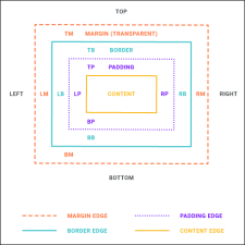
By default, a 1-pixel black border is already set, which separates the relationship links from the topic content above.
- If you are using the grouped view, expand the Border group.
Locate and select the border property you want to change. Each side (bottom, left, right, top) has separate properties that you can set for the color, style, and width (e.g., border-bottom-style). You can set these properties individually, or you can set the primary property for each side (e.g., border-bottom), which lets you specify the color, style, and width in one place. If you plan to have the same settings for all sides, you can use the main border property to set the color, style, and width the same. The border-radius properties let you create curved edges on the border by providing horizontal and vertical values.
When you click
 next to a border property, a popup appears. Use the fields in the popup to define additional properties such as color, width, style, and thickness, then click OK.
Margin Properties
By default, a 10-pixel top margin is already set. The margin is the space around the outside of the container.
- If you are using the group view, expand the Box group.
Locate and select the margin property that you want to change. Each side (bottom, left, right, top) has separate properties that you can set (e.g., margin-bottom, margin-left). However, if you plan to have the same settings for all four sides, you can simply use the main margin property to set the values all the way around. When you click in the cell to the right of one of the properties (e.g., margin, margin-bottom), a small popup displays.
- Next to a margin property, click .
- Use the left side of the popup to enter a number for the amount of margin.
- Use the right side of the popup to select a unit of measurement (e.g., point, pixel, centimeter) for the number you entered.
- Click OK.
- Next to a margin property, click
Padding Properties
By default, 20 pixels of padding are set on the left side of the container, and 10 pixels of padding are set on the top side. The padding is the space between the content inside the container and its outer edges.
- If you are using the group view, expand the Box group.
Locate and select the padding property that you want to change. Each side (bottom, left, right, top) has separate properties that you can set (e.g., padding-top, padding-left). However, if you plan to have the same settings for all four sides, you can simply use the main padding property to set the values all the way around. When you click in the cell to the right of one of the properties (e.g., padding, padding-bottom), a small popup displays.
- Next to a padding property, click .
- Use the left side of the popup to enter a number for the amount of padding.
- Use the right side of the popup to select a unit of measurement (e.g., point, pixel, centimeter) for the number you entered.
- Click OK.
- Next to a padding property, click
Note For more information about the components and properties in the editor, as well as the tasks that you can perform in it, see Styles and Stylesheets, Editing Styles in a Regular Stylesheet, and Stylesheet Editor.
- Click
") to save your work.
to save your work.
How to Edit a Heading
- From the Content Explorer, open the stylesheet that you want to modify.
-
Complete one of the following sets of steps, depending on whether you want to use the Simplified view or Advanced view in the Stylesheet Editor.
-
Simplified The Simplified view displays styles in a grid view and is often best for brand new users.
This view provides an easy way to apply properties to styles, with format options available from a toolbar and dialogs (similar to the way one would use an interface such as Microsoft Word). In some cases, only the most common property options are available in the Simplified view (e.g., font, letter/word spacing, paragraph alignment/indentation, autonumbering format, borders, background). One advantage of the Simplified view is that you can apply a property to multiple styles at the same time. You can also click a check box to hide the properties in the editor, allowing you to see only the styles.
-
Advanced The Advanced view displays styles in a tree structure, and despite the name, is user friendly for authors of all levels.
For the properties, you can toggle between a grouped display and an alphabetical display. The Advanced view of the Stylesheet Editor lets you edit more settings than are available in the Simplified view. In addition, the Advanced view lets you see and apply settings to multiple mediums and media queries at the same time.
Warning Mediums can be used if you want to use one group of settings for online output types and another group of settings for print-based output types. For example, you might use the default medium for your online outputs and the print medium for your print outputs. From the Medium drop-down in the Stylesheet Editor, make sure the proper medium is selected before you begin. In the Advanced view, you can open multiple mediums at once; you just need to look at the title at the top of the medium pane and make sure you are working in the correct one. If you are not using stylesheet mediums for your different outputs or if you want all mediums to have the same settings, just leave the medium set to default and continue. Please note that Flare remembers the last medium that you used when working in the stylesheet, so it may or may not be the one that you want to use the next time around. See Mediums and Media Queries.
If Using Simplified View
- In the local toolbar, make sure the first button displays (which means that the Simplified view is currently shown in the editor). If the button displays instead, then click it.
- In the upper-left corner of the Stylesheet Editor, click in the drop-down field and select
 .
. - In the Styles section of the editor, find the MadCap|relationshipsHeading style and select the appropriate style class after it.
- MadCap|relationshipsHeading.concept This class lets you change the look of the heading that is displayed above any concept links (i.e., any topics found in the "concept" column of the relationships table).
- MadCap|relationshipsHeading.reference This class lets you change the look of the heading that is displayed above any reference links (i.e., any topics found in the "reference" column of the relationships table).
- MadCap|relationshipsHeading.task This class lets you change the look of the heading that is displayed above task links (i.e., topics found in the "task" column of the relationships table).
Note If you want to apply a setting that is used for all three of the classes, you can select the parent MadCap|relationshipsHeading style. Whatever you set for that style will trickle down to the three classes, unless a different value is already specified on that class.
Note The three style classes mentioned above are designed to work in sync with the column headings in the Relationship Table Editor. You can change the column heading (i.e., link type) for any of these in the editor via the column properties dialog. You can also create a custom column. But if you do this, make sure that you create a corresponding style class in the stylesheet to control that column
- Following are some of the more common tasks that you may want to perform:
Font Color
The default color is black.
In the local toolbar of the Stylesheet Editor, click
 and select a color.
Font Size
The default size is 14 points.
In the local toolbar of the Stylesheet Editor, click the down arrow in the Font Size
 field and select a size measured in points.
Note If you want to change the actual text for each heading (the label), you need to use the Advanced view.
Note You can also specify other style settings that can normally be done for fonts or paragraphs.
Note For more information about the components and properties in the editor, as well as the tasks that you can perform in it, see Styles and Stylesheets, Editing Styles in a Regular Stylesheet, and Stylesheet Editor.
If Using Advanced View
- In the local toolbar, make sure the first button displays . If the button displays instead, then click it.
- In the upper-left corner of the Stylesheet Editor, click in the drop-down field and select .
- On the left side of the editor, expand the MadCap|relationshipsHeading style. Then select the appropriate style class under it:
- concept This class lets you change the look of the heading that is displayed above any concept links (i.e., any topics found in the "concept" column of the relationships table).
- reference This class lets you change the look of the heading that is displayed above any reference links (i.e., any topics found in the "reference" column of the relationships table).
- task This class lets you change the look of the heading that is displayed above any task links (i.e., any topics found in the "task" column of the relationships table).
Note If you want to apply a setting that is used for all three of the classes, you can select the parent MadCap|relationshipsHeading style. Whatever you set for that style will trickle down to the three classes, unless a different value is already specified on that class.
Note The three style classes mentioned above are designed to work in sync with the column headings in the Relationship Table Editor. You can change the column heading (i.e., link type) for any of these in the editor via the column properties dialog. You can also create a custom column. But if you do this, make sure that you create a corresponding style class in the stylesheet to control that column
- From the Show drop-down list on the upper-right side of the editor, select . The most relevant properties for that style are shown on the right side of the editor.
- (Optional) You can use the toggle button in the local toolbar to show properties below in a group view or an alphabetical view .
- Following are some of the more common tasks that you may want to perform:
Heading Text (Label)
For the "concept" links, the default text is "Related Information." For the "reference" links, the default text is "Reference Materials." For the "task" links, the default text is "Related Tasks."
To the right of mc-label, replace the default text.
Font Color
The default color is black.
- If you are using the grouped view, expand the Font group.
- To the right of color, click , and select a color. For advanced color options, click
 and use the fields in the Color Picker dialog, or click
  to select a color already used elsewhere on your screen. You can use the Color Picker to select a CSS variable.
Font Size
The default size is 14 points.
- If you are using the grouped view, expand the Font group.
- To the right of font-size, click , and complete the fields in the popup. Enter a number in the field and use the down arrow in the lower-right corner to select a unit of measurement.
- Click OK.
Note You can also specify other style settings that can normally be done for fonts or paragraphs.
Note For more information about the components and properties in the editor, as well as the tasks that you can perform in it, see Styles and Stylesheets, Editing Styles in a Regular Stylesheet, and Stylesheet Editor.
-
- Click to save your work.
How to Edit Link Items
- From the Content Explorer, open the stylesheet that you want to modify.
-
Complete one of the following sets of steps, depending on whether you want to use the Simplified view or Advanced view in the Stylesheet Editor.
-
Simplified The Simplified view displays styles in a grid view and is often best for brand new users.
This view provides an easy way to apply properties to styles, with format options available from a toolbar and dialogs (similar to the way one would use an interface such as Microsoft Word). In some cases, only the most common property options are available in the Simplified view (e.g., font, letter/word spacing, paragraph alignment/indentation, autonumbering format, borders, background). One advantage of the Simplified view is that you can apply a property to multiple styles at the same time. You can also click a check box to hide the properties in the editor, allowing you to see only the styles.
-
Advanced The Advanced view displays styles in a tree structure, and despite the name, is user friendly for authors of all levels.
For the properties, you can toggle between a grouped display and an alphabetical display. The Advanced view of the Stylesheet Editor lets you edit more settings than are available in the Simplified view. In addition, the Advanced view lets you see and apply settings to multiple mediums and media queries at the same time.
Warning Mediums can be used if you want to use one group of settings for online output types and another group of settings for print-based output types. For example, you might use the default medium for your online outputs and the print medium for your print outputs. From the Medium drop-down in the Stylesheet Editor, make sure the proper medium is selected before you begin. In the Advanced view, you can open multiple mediums at once; you just need to look at the title at the top of the medium pane and make sure you are working in the correct one. If you are not using stylesheet mediums for your different outputs or if you want all mediums to have the same settings, just leave the medium set to default and continue. Please note that Flare remembers the last medium that you used when working in the stylesheet, so it may or may not be the one that you want to use the next time around. See Mediums and Media Queries.
If Using Simplified View
- In the local toolbar, make sure the first button displays (which means that the Simplified view is currently shown in the editor). If the button displays instead, then click it.
- In the upper-left corner of the editor, click in the drop-down field and select
 .
. - In the Styles section of the editor, select the MadCap|relationshipsItem style.
- Following are some of the more common tasks that you may want to perform.
Font Color
The default color is black. The following instructions show you how to change the font color for print-based output. For online output, the color is based on the settings on the "a" style, which controls the look of all text hyperlinks in your output. To change this, see Editing Text Hyperlinks.
In the local toolbar of the Stylesheet Editor, click
and select a color.Font Size
The default size is 14 points.
In the local toolbar of the Stylesheet Editor, click the down arrow in the Font Size
field and select a size measured in points.Page Numbers for Print Output
Note If you want to change the leader settings (e.g., dots between topic names and page numbers) for print-based output, you need to use the Advanced view.
Note You can also specify other style settings that can normally be done for fonts.
Note For more information about the components and properties in the editor, as well as the tasks that you can perform in it, see Styles and Stylesheets, Editing Styles in a Regular Stylesheet, and Stylesheet Editor.
If Using Advanced View
- In the local toolbar, make sure the first button displays . If the button displays instead, then click it.
- In the upper-left corner of the editor, click in the drop-down field and select .
- In the Styles section of the editor, select the MadCap|relationshipsItem style.
- From the Show drop-down list on the upper-right side of the editor, select . The most relevant properties for that style are shown on the right side of the editor.
- (Optional) You can use the toggle button in the local toolbar to show properties below in a group view or an alphabetical view .
- Following are some of the more common tasks that you may want to perform.
Leader Alignment (Print-Based Output)
This determines how the page numbers are aligned at the end of the leader. The default setting is right alignment.
To the right of mc-leader-align, click
, and select an alignment setting (center, left, right).Leader Format (Print-Based Output)
This is the material that is shown between a topic name and the page number where it can be found. The default setting is a series of dots.
To the right of mc-leader-format, type what you want to be shown as the leader (e.g., dash, underline). Whatever you type will be repeated until the end of the leader.
Leader Indent (Print-Based Output)
This is the amount of space from the end of the list entry to the start of the leader.
- To the right of mc-leader-indent, click .
- Use the lower-left area of the popup to enter a number.
- Use the lower-right area to select a unit of measurement.
- Click OK.
Leader Offset (Print-Based Output)
This is the amount of space from the end of the leader to the page number following it.
- To the right of mc-leader-offset, click .
- Use the lower-left area of the popup to enter a number.
- Use the lower-right area to select a unit of measurement.
- Click OK.
Margin
This the amount of space around each item. The default setting is a left margin of 24 points.
- If you are using the group view, expand the Box group.
Locate and select the margin property that you want to change. Each side (bottom, left, right, top) has separate properties that you can set (e.g., margin-bottom, margin-left). However, if you plan to have the same settings for all four sides, you can simply use the main margin property to set the values all the way around. When you click in the cell to the right of one of the properties (e.g., margin, margin-bottom), a small popup displays.
- To the right of a margin property, click .
- Use the left side of the popup to enter a number for the amount of margin.
- Use the right side of the popup to select a unit of measurement (e.g., point, pixel, centimeter) for the number you entered.
- Click OK.
- To the right of a margin property, click
Font Color
The default color is black. The following instructions show you how to change the font color for print-based output. For online output, the color is based on the settings on the "a" style, which controls the look of all text hyperlinks in your output. To change this, see Editing Text Hyperlinks.
- If you are using the grouped view, expand the Font group.
- To the right of color, click , and select a color. For advanced color options, click and use the fields in the Color Picker dialog, or click to select a color already used elsewhere on your screen. You can use the Color Picker to select a CSS variable.
Font Size
The default size is 14 points.
- If you are using the grouped view, expand the Font group.
- To the right of font-size, click , and complete the fields in the popup. Enter a number in the field and use the down arrow in the lower-right corner to select a unit of measurement.
- Click OK.
Note You can also specify other style settings that can normally be done for fonts or paragraphs.
Note For more information about the components and properties in the editor, as well as the tasks that you can perform in it, see Styles and Stylesheets, Editing Styles in a Regular Stylesheet, and Stylesheet Editor.
- To the right of mc-leader-indent, click
-
- Click to save your work.
How to Edit Page Numbers for Print Output
- From the Content Explorer, open the stylesheet that you want to modify.
-
Complete one of the following sets of steps, depending on whether you want to use the Simplified view or Advanced view in the Stylesheet Editor.
-
Simplified The Simplified view displays styles in a grid view and is often best for brand new users.
This view provides an easy way to apply properties to styles, with format options available from a toolbar and dialogs (similar to the way one would use an interface such as Microsoft Word). In some cases, only the most common property options are available in the Simplified view (e.g., font, letter/word spacing, paragraph alignment/indentation, autonumbering format, borders, background). One advantage of the Simplified view is that you can apply a property to multiple styles at the same time. You can also click a check box to hide the properties in the editor, allowing you to see only the styles.
-
Advanced The Advanced view displays styles in a tree structure, and despite the name, is user friendly for authors of all levels.
For the properties, you can toggle between a grouped display and an alphabetical display. The Advanced view of the Stylesheet Editor lets you edit more settings than are available in the Simplified view. In addition, the Advanced view lets you see and apply settings to multiple mediums and media queries at the same time.
Warning Mediums can be used if you want to use one group of settings for online output types and another group of settings for print-based output types. For example, you might use the default medium for your online outputs and the print medium for your print outputs. From the Medium drop-down in the Stylesheet Editor, make sure the proper medium is selected before you begin. In the Advanced view, you can open multiple mediums at once; you just need to look at the title at the top of the medium pane and make sure you are working in the correct one. If you are not using stylesheet mediums for your different outputs or if you want all mediums to have the same settings, just leave the medium set to default and continue. Please note that Flare remembers the last medium that you used when working in the stylesheet, so it may or may not be the one that you want to use the next time around. See Mediums and Media Queries.
If Using Simplified View
- In the local toolbar, make sure the first button displays (which means that the Simplified view is currently shown in the editor). If the button displays instead, then click it.
- In the upper-left corner of the editor, click in the drop-down field and select
 .
. - In the Styles section of the editor, double-click the MadCap|xref.RelLinkPageNumber style class.
- Use the fields in the dialog to make changes (e.g., font color).
If Using Advanced View
- In the local toolbar, make sure the first button displays . If the button displays instead, then click it.
- In the upper-left corner of the editor, click in the drop-down field and select .
- In the Styles section of the editor, expand MadCap|xref and select the RelLinkPageNumber style class.
- From the Show drop-down list on the upper-right side of the editor, select . The most relevant properties for that style are shown on the right side of the editor.
- (Optional) You can use the toggle button in the local toolbar to show properties below in a group view or an alphabetical view .
- Use the properties area to the right to make changes (e.g., font color).
-
- Click to save your work.


