 Outputs Supported


Note Responsive content is supported in Clean XHTML output only if you do not select the target option to convert styles to inline. Responsive skins are not supported in Clean XHTML.
You can create responsive layouts in Flare using the Responsive Layout window pane. This window pane works alongside media queries and your stylesheet.
How to Create a Responsive Layout
- Open the content file.
- Select Home > Responsive Layout. The Responsive Layout window pane opens.
-
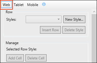
At the top of the Responsive Layout window pane, select the appropriate medium/media query: Web, Tablet, or Mobile.
Alternatively, you can select the appropriate layout view in the top local toolbar of the XML Editor.
It is recommended that you start with Web to create a layout for large screens. After you finish those settings, you can move on to the Tablet and then finally Mobile.
- In the content file, place your cursor where you want to create the layout. (The row will be added below the location of your cursor.)
-
In the Responsive Layout window pane, do one of the following.
To Select an Existing Style
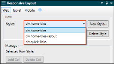
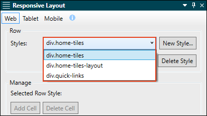
If you want to use the same row style for a responsive layout that you've created previously, click in the Styles drop-down and select it.
To Create a New Style
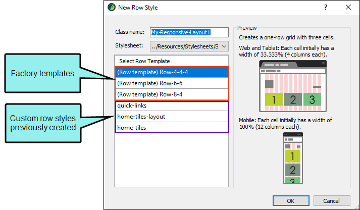
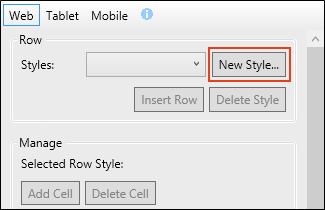
- Click New Style. The New Row Style dialog opens.
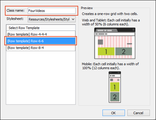
- In the Class name field, enter a name for the new row style (or you can keep the default name).
- (Optional) In the Stylesheet drop-down, you can select a stylesheet where the new style will be added.
-
On the left side of the dialog, select a template. This will list three factory templates provided by Flare. Also, any of your previously created row styles will also be listed in this dialog as available templates.
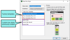
As you click on each factory template, a preview to the right describes how each one is configured. If you click on one of your previously created row styles, you will see some default text. This text was added as a comment for that new style. You can open your stylesheet and replace this text with whatever you want to describe your layout. This can be especially useful if you work with a team of authors who will be creating responsive layouts.
Selecting a template simply makes a copy of the style settings in that template and places them in your new style. You can then make changes to those styles when you choose different settings in the Responsive Layout window pane. So when you choose a template, pick one that is closest to the design that you plan on creating.
Following are the three factory templates:
- Row-4-4-4 This template starts you out with three cells, each taking up the space of four columns (33.333%) for Web and Tablet layouts, and 12 columns (100%) for Mobile layouts.
- Row-6-6 This template starts you out with two cells, each taking up the space of six columns (50%) for Web and Tablet layouts, and 12 columns (100%) for Mobile layouts.
- Row-8-4 This template starts you out with two cells. For Web and Tablet layouts, the first cell takes up the space of eight columns (66.667%) and the second cell takes up the space of four columns (33.333%). For Mobile layouts, both cells take up the space of 12 columns (100%).
- Click OK. The Row Styles field in the Responsive Layout window pane is now populated with the new style. Also, your stylesheet will open behind the topic (if it isn't already open).
Note If you no longer want to use an existing row style anywhere in your project, you can select it from the Styles drop-down and click Delete Style. This removes the appropriate styles from your stylesheet.
-
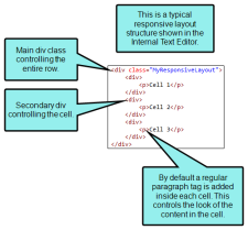
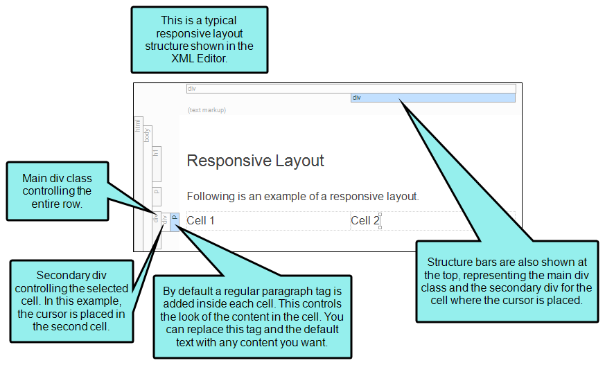
Click Insert Row. In the XML Editor, the row is inserted below your cursor location. A <div> tag—using the style name that you created or selected in the previous step—acts as the container for the row. Within that <div> tag there will be additional plain <div> tags, one for each cell.
- In the XML Editor, click in the cells, remove the default text, and add your own content. If you want, you can save this task until after you configure your row using the options in the next step.
-
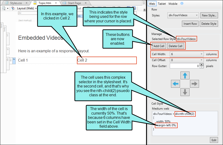
Click in a cell in the XML Editor. The row style for that layout is indicated at the top of the Manage section in the Responsive Layout window pane. So any changes you make will be applied to that style in your stylesheet.
Use any of the following options in the Responsive Layout window pane to enhance the cell and your layout.
Warning Keep in mind that your changes in this window pane will be auto-saved to your stylesheet by default. This means that anyone making changes to a particular row style using the Responsive Layout window pane will be affecting any other responsive layouts that are using that same style wherever they have been inserted throughout the project. You can remove the check mark from the Auto-save Stylesheet option at the bottom of the window pane; however, if you do that, you will need to save your changes to both your content file and your stylesheet as you work.
Add Cell
Adds a new cell to the right edge of the row. By default, a new cell will start out with a width of one column (8.333%).
Delete Cell
Deletes the selected cell from the layout. A message asks if you want to remove the corresponding style from the stylesheet as well.
Cell Width
Select a number of columns to set the width of the current cell (in percentage). For example, six columns equals 50%. As you select each number the new percentage changes in the Cell Style preview area below.
Cell Offset
Select a number of columns to provide the offset (left margin) for the current cell (in percentage). For example, four columns equals a left margin of 33.333%. When you select a number, the left margin percentage changes in the Cell Style preview area below.
Row Gutter
Enter the number of pixels for a gutter in the entire row. This adds left and right padding for each of the cells. For example, if you enter 20 pixels for a gutter, each cell will have 10 pixels of left padding and 10 pixels of right padding.

Moves the entire row up. This simply moves the layout above whatever block element is next to it (at the same level) in the XML Editor. Alternatively, you can click and drag the outermost div structure bar.

Moves the active cell to the left in the row.

Moves the active cell to the right in the row.

Moves the entire row down. This simply moves the layout below whatever block element is next to it (at the same level) in the XML Editor. Alternatively, you can click and drag the outermost div structure bar.
Edit
Opens the stylesheet so that the style (i.e., complex selector) for the current cell is selected. You can then make any additional style changes (e.g., add a border, add a background color, set the right margin).
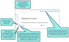
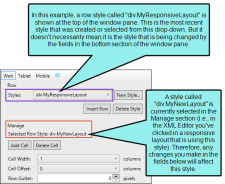
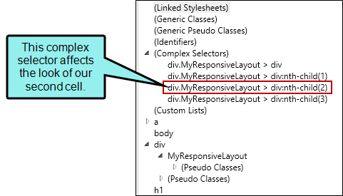
Example In the following example, we have a row style called "MyResponsiveLayout." In the XML Editor, we clicked in the second cell, and in the Responsive Layout window pane, we clicked Edit. The stylesheet therefore opened with this complex selector highlighted.
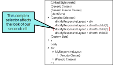
So any changes we make in the stylesheet at this point will alter our second cell only.
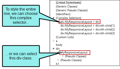
You can also make style changes for the entire row.
Example To make style changes that affect the entire row, we can either select the main complex selector having to do with our responsive layout, or we can select the appropriate class shown under the div style.

Auto-save
If this is selected any changes made to the selected style in this window pane will be applied in the stylesheet. If you disable this option, you must save changes in both the XML Editor and Stylesheet Editor as you work.
- When you are finished configuring the row for your current layout, select a different media query (e.g., Tablet, Mobile) at the top of the Responsive Layout window pane. (Alternatively, you can change the layout in the local toolbar of the XML Editor.)
- Repeat steps 8 and 9 until you are finished designing the row for all of your mediums/media queries.
- Click
") to save your work.
to save your work.


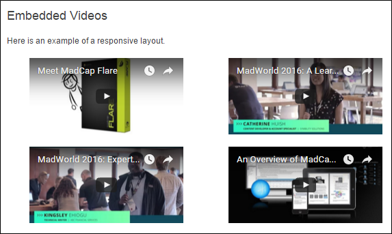
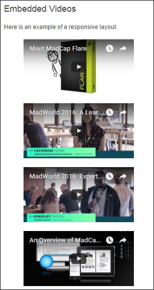
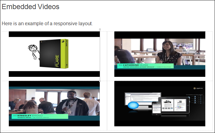
Example You want to embed four YouTube videos in a topic. When viewed on a large screen, you want the videos to display like this, two videos above the other two:
You want this same configuration to be used when the topic is viewed on a smaller tablet device.
But when viewed on a smart phone, you want each video to be displayed by itself, like this:
To make this happen, you first open the topic where you want to insert the videos, and you also open the Responsive Layout window pane.
Make sure the Web medium is selected in the Responsive Layout window pane.
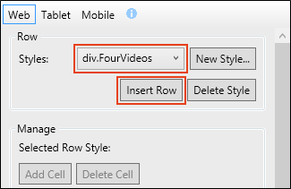
Then place the cursor where you want to insert the layout. We're going to assume you haven't created any row styles yet in your project, so in the Responsive Layout window pane, click New Style.
In the New Row Style dialog, give the new style a name. Let's say you call it FourVideos. Your stylesheet is already selected in the dialog, but you need to choose a template. Click Row-6-6, which will start you out with two cells in the row, each taking up half the total space.
After you click OK, the row style is added to your stylesheet and is selected in the Responsive Layout window pane. Also, your stylesheet will open behind the topic.
Now click Insert Row.
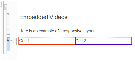
In your topic, you will see two cells, indicated by the dummy text "Cell 1" and "Cell 2."
Click in either of the cells. The Responsive Layout window pane will change, showing the buttons that you can select, as well as the current style settings for that cell.
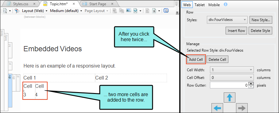
You've got two cells, but you need two more. So click Add Cell. This inserts a third cell in your topic. Click Add Cell again. This adds a fourth cell.
So you've got four cells for the four videos, but you need to adjust their widths. Click in the third cell and in the Responsive Layout window pane, change the Cell Width to 6. Do the same for the fourth cell. Now each of the four cells has a width of 50%.
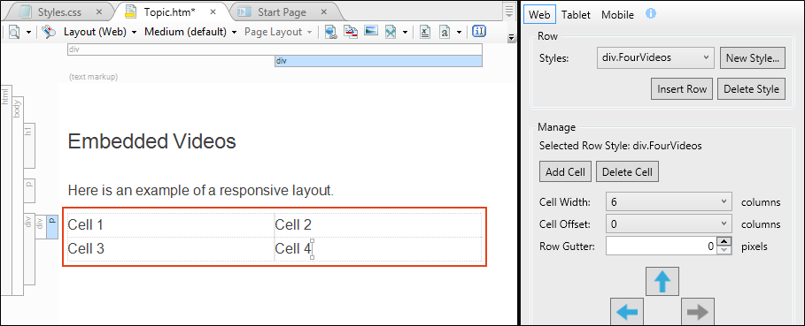
Next, click in each cell and replace the default text with your embedded YouTube videos
You can also apply other styles to your content as needed. For example, you might want to center your content.
At the top of the Responsive Layout window pane, click Tablet. The layout view and medium in the XML Editor change automatically.
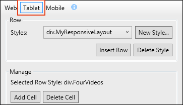
Set all four cells to the same width (6 columns, 50%).
At the top of the Responsive Layout window pane, click Mobile. The layout view and medium in the XML Editor change automatically.
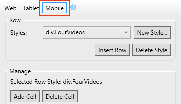
Click in each cell and in the Responsive Layout window pane, make sure the Cell Width is set to 12. This results in a width of 100% for each cell.
When you generate your HTML5 output, you should see the configuration shown at the beginning of this example for each of the three layouts (Web, Tablet, Mobile).
Note Depending on the approach you use, it may be technically possible to create responsive content in other formats besides HTML5. However, you will notice that best results are achieved with HTML5 targets, and in particular, Side and Top Navigation outputs. Many of the other formats are able to produce responsive content only in very basic ways.
Also, even though the Responsive Layout window pane is designed with only online output in mind, the content you add to the layouts will show up in other outputs, including print-based outputs (unless you condition that content out). You can open your stylesheet, choose the print medium, and edit the resulting div and complex selectors that were created from a responsive layout. You just might find that you are able to reuse those layouts in your print-based outputs, depending on the simplicity of the responsive layout and the style settings that you provide for the print output.


