 Outputs Supported
This window pane opens when you select the Home ribbon and choose Responsive Layout. You can use this window pane to create single-row grids that allow your content to be responsive. This means that the structure of the content shifts, depending on the size of the screen displaying it. See Creating Responsive Layouts.
Also see Responsive Web Design and Responsive Layouts.
Warning Keep in mind that your changes in this window pane will be auto-saved to your stylesheet by default. This means that anyone making changes to a particular row style using the Responsive Layout window pane will be affecting any other responsive layouts that are using that same style wherever they have been inserted throughout the project. You can remove the check mark from the Auto-save Stylesheet option at the bottom of the window pane; however, if you do that, you will need to save your changes to both your content file and your stylesheet as you work.
Buttons and Sections
|
Web |
Select this if you want your settings in the window pane to be used for large screens. This option synchronizes with the Web Layout mode and default medium settings in the XML Editor. See Mediums and Media Queries. |
|
Tablet |
Select this if you want your settings in the window pane to be used for medium screens. This option synchronizes with the Web Layout (Tablet) mode and tablet media query settings in the XML Editor. See Mediums and Media Queries. The Tablet option is based on your Tablet Breakpoint setting on the Skin tab of the Target Editor. See Responsive Skins. |
|
Mobile |
Select this if you want your settings in the window pane to be used for small screens. This option synchronizes with the Web Layout (Mobile) mode and mobile media query settings in the XML Editor. See Mediums and Media Queries. The Mobile option is based on your Mobile Breakpoint setting on the Skin tab of the Target Editor. See Responsive Skins. |
|
Styles |
If you have created row styles previously, you can select one from this field. You can then insert a row into a content file based on the style, or you can delete the style from your stylesheet. |
|
New Style |
Opens the New Row Style dialog, which lets you create a new style, basing it on either a factory template or a style you have previously created. See New Row Style Dialog. |
|
Insert Row |
Inserts a new row into the open content file (e.g., topic, snippet). The row is based on the style that is selected in the Styles field. After the row is inserted, you can add content to the cells and you can use the buttons and fields in the bottom portion of the Responsive Layout window pane to configure the grid. |
|
Delete Style |
Deletes the style that is selected in the Styles field. This removes the div style completely from your stylesheet, including any complex selectors that were created for each cell in the row. |
|
Add Cell |
Adds a new cell to the right edge of the row. By default, a new cell will start out with a width of one column (8.333%). |
|
Delete Cell |
Deletes the selected cell from the layout. A message asks if you want to remove the corresponding style from the stylesheet as well. |
|
Cell Width |
Select a number of columns to set the width of the current cell (in percentage). For example, six columns equals 50%. As you select each number the new percentage changes in the Cell Style preview area below. |
|
Cell Offset |
Select a number of columns to provide the offset (left margin) for the current cell (in percentage). For example, four columns equals a left margin of 33.333%. When you select a number, the left margin percentage changes in the Cell Style preview area below. |
|
Row Gutter |
Enter the number of pixels for a gutter in the entire row. This adds left and right padding for each of the cells. For example, if you enter 20 pixels for a gutter, each cell will have 10 pixels of left padding and 10 pixels of right padding. |
|
|
Moves the entire row up. This simply moves the layout above whatever block element is next to it (at the same level) in the XML Editor. Alternatively, you can click and drag the outermost div structure bar. |
|
|
Moves the active cell to the left in the row. |
|
|
Moves the active cell to the right in the row. |
|
|
Moves the entire row down. This simply moves the layout below whatever block element is next to it (at the same level) in the XML Editor. Alternatively, you can click and drag the outermost div structure bar. |
|
Edit |
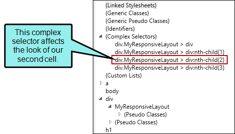
Opens the stylesheet so that the style (i.e., complex selector) for the current cell is selected. You can then make any additional style changes (e.g., add a border, add a background color, set the right margin). Example In the following example, we have a row style called "MyResponsiveLayout." In the XML Editor, we clicked in the second cell, and in the Responsive Layout window pane, we clicked Edit. The stylesheet therefore opened with this complex selector highlighted.
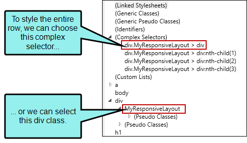
So any changes we make in the stylesheet at this point will alter our second cell only. You can also make style changes for the entire row. Example To make style changes that affect the entire row, we can either select the main complex selector having to do with our responsive layout, or we can select the appropriate class shown under the div style.
|
|
Auto-save Stylesheet |
If this is selected any changes made to the selected style in this window pane will be applied in the stylesheet. If you disable this option, you must save changes in both the XML Editor and Stylesheet Editor as you work. |