 Outputs Supported
HTML5 Side and Top Navigation skins are always enabled for responsive output, but you can adjust some settings on the Skin tab in the Target Editor. For Tripane output, you can enable responsive output in the Skin Editor, and you can adjust the same settings as Side and Top Navigation output in the Target Editor. When a skin is responsive, the navigation elements (e.g., menu/table of contents items) are automatically adjusted depending on the size of the screen.
If the animation below is cut off, you can see the complete animation by clicking the link under it to open the full topic.
[Menu Proxy — Headings — Online — Depth3 ]
Examples
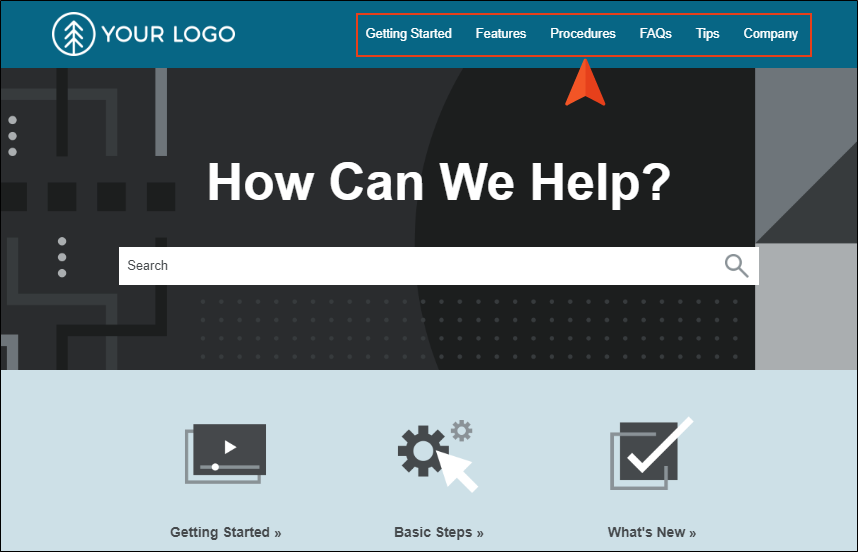
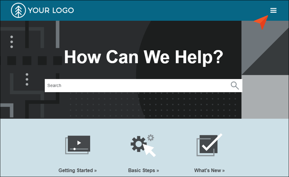
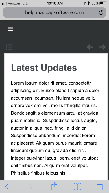
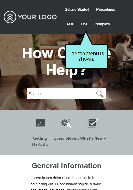
Example You create HTML5 Top Navigation output. When viewed on a large screen, menus appear at the top. These are populated from your TOC file.
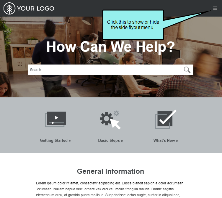
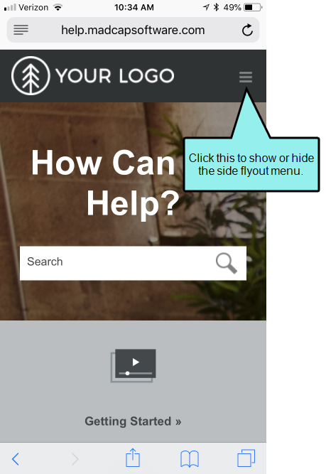
But when you open the same output on a tablet device, you notice the top menus are no longer there. Because of the smaller screen they are placed in a flyout menu in the upper-right corner.
Example You want to create HTML5 Tripane output from your project and provide it to people using both large desktops and small mobile devices. Without using responsive output, you would need to create two targets and two skins, and perhaps separate settings elsewhere (e.g., stylesheet mediums). If you do not create a separate target and skin for the mobile output, but instead direct people to open the full output on their smart phones, it can be difficult (if not impossible) to navigate through that output on a smart phone.
So instead, you enable responsive output in the HTML5 Tripane skin. When finished, you direct end users to open the same HTML5 output, regardless of their browser or device. On a smart phone, the skin is adjusted automatically.
In the end, you accomplished essentially the same thing that you did with two targets and two skins, but you did it with only one target and skin.
Responsive Skins and Mediums
To support responsive output, HTML5 skins come equipped with three mediums/media queries—Web, Tablet, and Mobile. Web kind of serves as both a medium and media query in Flare (controlling how skins and content look on a large screen), whereas tablet and mobile are technically both media queries, not mediums. You can use these media queries to specify different looks when necessary for the various devices people might be using to view your output.
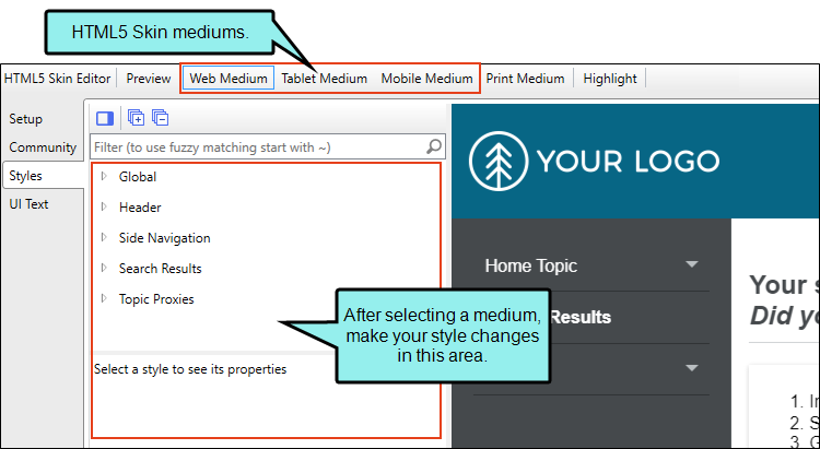
- Web When you first open an HTML5 skin, Web Medium is selected. With that medium chosen, any changes you make to the styles are applied to that medium. This means that when users are viewing your output on a regular browser, that's the look they will see.
- Tablet If you want to change the look that users see when viewing your output on a tablet, select Tablet Medium and make your style changes.
- Mobile If you want to change the look that users see when viewing your output on a mobile device, select Mobile Medium and make your style changes.
Similar to cascading stylesheets (CSS), there is a system of inheritance at work with skin mediums. The Web medium is the default. Most settings in that medium are inherited by the Tablet medium. In turn, settings in the Tablet medium are inherited by the Mobile medium. Therefore, if you want all of the mediums to share the same look (e.g., your company logo), you can set it once in the Web medium and it will automatically be used in all three. If you make any changes in the Tablet medium, those settings will override whatever had been inherited from the Web medium. Likewise, you can make changes in the Mobile medium, which will override any settings inherited from the Tablet medium.
Note An exception to this inheritance is with navigation icon images. Because these icon images are often different sizes in the Web medium than in the other mediums, most navigation icon images do not pass down from the Web medium to the Tablet medium. However, the Tablet medium does inherit the icon image used for the "Mark as New" feature from the Web medium. Also, icon images are passed down from the Tablet medium to the Mobile medium.
Note Within each medium, the icons under the TOC Entry style inherit from the icon settings in the Navigation Panel > TOC. Therefore, if no icons are set in the TOC Entry style classes in the Web medium, Flare will use the Navigation Panel > TOC icons in that medium. The same holds true for the Tablet medium; if no icons are set in the TOC Entry classes in the Tablet medium, they will be inherited from the Navigation Panel > TOC icons in the Tablet medium. And the same is the case with the Mobile medium.
Note In the HTML5 Skin Editor, the user interface displays a Print medium button next to the Web, Tablet, and Mobile mediums. The main purpose of the Print medium is for controlling how the skin looks when printed from an online source. The Print medium in the skin is its own entity, separate from the other mediums, and it does not share the same purpose as mediums in the stylesheet or in responsive output.
How to Enable Responsive Tripane Skins
For Tripane output, you can use the following steps to enable responsive output:
- Open an HTML5 Tripane skin and select the Setup tab.
- In the Responsive Output Settings section, select Enable responsive output.
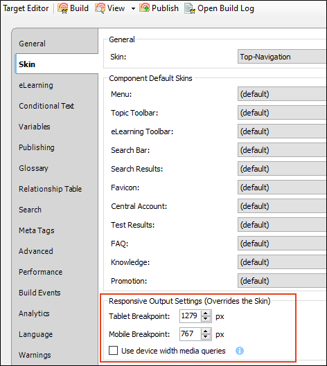
- (Optional) Responsive output works by automatically changing the display once the viewer reaches a certain width. You can change the maximum width at which the display changes from one medium to the next. Use the following to specify responsive settings for a skin.
- Tablet Max-Width Enter the number of pixels for the maximum width of a Tablet view.
- Mobile Max-Width Enter the number of pixels for the maximum width of a Mobile view.
Example You keep the default settings of 1279 pixels for the Tablet maximum width and 767 pixels for the Mobile maximum width.
If you generate output and view it in a regular browser with the window maximized, you will see the skin style settings for the Web medium.
You then click and drag the browser window to reduce it. Once the width of the browser window reaches 1279 pixels of width, the display changes to show the skin style settings associated with the Tablet medium.
You continue to reduce the size of the browser window. Once the width reaches 767 pixels, the display changes to show the settings for the Mobile medium.
Therefore, the Web medium is named as it is because the largest size is usually meant for a regular web browser. The next size down is often used for tablets, such as iPads, so that medium is called "Tablet." And the smallest size is controlled by the Mobile medium, because a display that small is usually seen in mobile phones.
- Click
") to save your work.
to save your work.
Device Width Media Queries
In addition to the fields in the Skin Editor, there are additional responsive output settings in the Target Editor that are available for Side and Top Navigation
This means that the responsive nature of the skin depends on the device being used to view the output (browser, tablet, or mobile phone), rather than on merely the width of the screen.
Similar to the fields in the Skin Editor, you can set values to tell Flare at which sizes to change the display.
- Tablet Breakpoint Enter the number of pixels for the maximum width of a Tablet view.
- Mobile Breakpoint Enter the number of pixels for the maximum width of a Mobile (or phone) view.
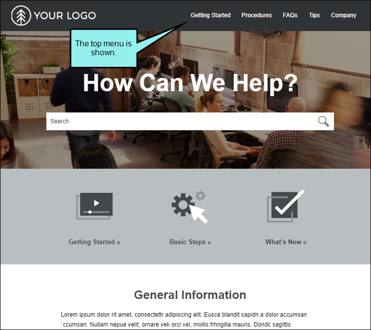
Example You disable Use device width media queries. When you view the output maximized in a browser, you will see the top menu.
When you drag the browser window, making it smaller so that its resolution is lower than the number you provided in the Tablet Breakpoint field, the display changes. Now you won't see the top menu anymore. Instead, you will see the side flyout menu. That's because the responsiveness is based on the width of the output in the browser, rather than on the width of the output in the device itself.
Now suppose you enable Use device width media queries. When you view the output maximized in a browser, it will look just like it did before, with the top menu visible. But now when you make the browser window smaller, the display stays the same, even if you reduce it all the way down to the mobile width settings.
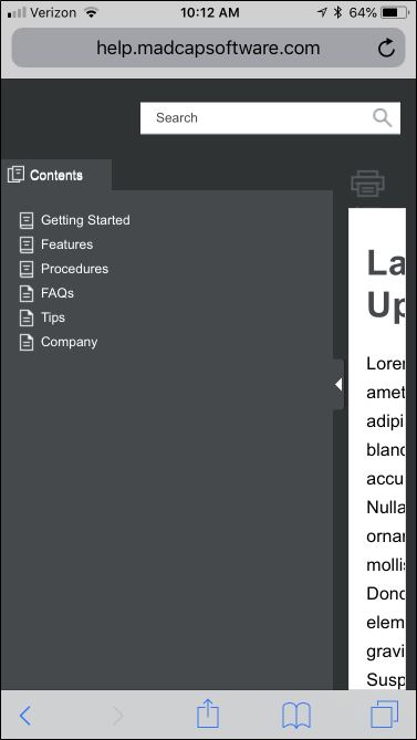
But if you view that same output on an actual tablet or mobile phone, it will display with the side flyout menu.
Tip Even if you want to base your responsive skin on the device width, you might find it most useful to leave the "Use device width media queries" option disabled while you are still editing content. This lets you test your responsive output more easily by dragging the browser to different sizes. Then when you're ready to generate and publish your final output, enable the check box.
Tip If you want to disable the top menu when viewed on a browser, and use only the side flyout menu that is usually reserved for tablets and mobile devices, you can set the tablet width value to a very high number.
Note If you have a Tripane skin in your project and you enter responsive output settings in both the Skin Editor and Target Editor, the settings in the target take precedence. However, this is not true if you have not yet made a change to the tablet or mobile breakpoint fields in the Target Editor, but you have made changes to them in the Skin Editor. In that case, the numbers from the changed Skin Editor will be used.


