HTML5 Skin Styles
 Outputs Supported
There are many ways to style your HTML5 skin, whether it be a Side Navigation, Top Navigation, or Tripane skin, or one of the skin components. From the Project Organizer, open the skin, select the Styles tab in the Skin Editor, and make your changes on the right.
If you enable the skin to produce responsive output—meaning that the look of the output can automatically adjust depending on the size of the end user's device—there are additional features for making the output look the way you it want to.
[Menu Proxy — Headings — Online — Depth3 ]
Mediums
To support responsive output, HTML5 skins come equipped with three mediums/media queries—Web, Tablet, and Mobile. Web kind of serves as both a medium and media query in Flare (controlling how skins and content look on a large screen), whereas tablet and mobile are technically both media queries, not mediums. You can use these media queries to specify different looks when necessary for the various devices people might be using to view your output.
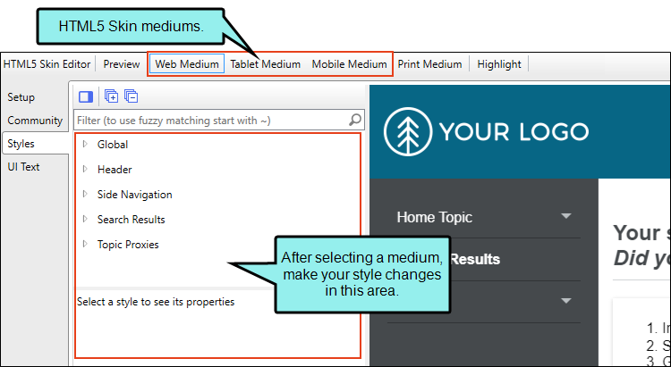
- Web When you first open an HTML5 skin, Web Medium is selected. With that medium chosen, any changes you make to the styles are applied to that medium. This means that when users are viewing your output on a regular browser, that's the look they will see.
- Tablet If you want to change the look that users see when viewing your output on a tablet, select Tablet Medium and make your style changes.
- Mobile If you want to change the look that users see when viewing your output on a mobile device, select Mobile Medium and make your style changes.
Similar to cascading stylesheets (CSS), there is a system of inheritance at work with skin mediums. The Web medium is the default. Most settings in that medium are inherited by the Tablet medium. In turn, settings in the Tablet medium are inherited by the Mobile medium. Therefore, if you want all of the mediums to share the same look (e.g., your company logo), you can set it once in the Web medium and it will automatically be used in all three. If you make any changes in the Tablet medium, those settings will override whatever had been inherited from the Web medium. Likewise, you can make changes in the Mobile medium, which will override any settings inherited from the Tablet medium.
Note An exception to this inheritance is with navigation icon images. Because these icon images are often different sizes in the Web medium than in the other mediums, most navigation icon images do not pass down from the Web medium to the Tablet medium. However, the Tablet medium does inherit the icon image used for the "Mark as New" feature from the Web medium. Also, icon images are passed down from the Tablet medium to the Mobile medium.
Note Within each medium, the icons under the TOC Entry style inherit from the icon settings in the Navigation Panel > TOC. Therefore, if no icons are set in the TOC Entry style classes in the Web medium, Flare will use the Navigation Panel > TOC icons in that medium. The same holds true for the Tablet medium; if no icons are set in the TOC Entry classes in the Tablet medium, they will be inherited from the Navigation Panel > TOC icons in the Tablet medium. And the same is the case with the Mobile medium.
Note In the HTML5 Skin Editor, the user interface displays a Print medium button next to the Web, Tablet, and Mobile mediums. The main purpose of the Print medium is for controlling how the skin looks when printed from an online source. The Print medium in the skin is its own entity, separate from the other mediums, and it does not share the same purpose as mediums in the stylesheet or in responsive output.
Enabling Responsive Output
Enabling responsive output for HTML5 Tripane skins can be accomplished by clicking a check box in the Setup tab. You do not need to enable responsive output for Side Navigation, Top Navigation, or skinless output, because it is always enabled in those cases. However, you can adjust settings in the Target Editor.
- Open an HTML5 Tripane skin and select the Setup tab.
- In the Responsive Output Settings section, select Enable responsive output.
- (Optional) Responsive output works by automatically changing the display once the viewer reaches a certain width. You can change the maximum width at which the display changes from one medium to the next. Use the following to specify responsive settings for a skin.
- Tablet Max-Width Enter the number of pixels for the maximum width of a Tablet view.
- Mobile Max-Width Enter the number of pixels for the maximum width of a Mobile view.
Example You keep the default settings of 1279 pixels for the Tablet maximum width and 767 pixels for the Mobile maximum width.
If you generate output and view it in a regular browser with the window maximized, you will see the skin style settings for the Web medium.
You then click and drag the browser window to reduce it. Once the width of the browser window reaches 1279 pixels of width, the display changes to show the skin style settings associated with the Tablet medium.
You continue to reduce the size of the browser window. Once the width reaches 767 pixels, the display changes to show the settings for the Mobile medium.
Therefore, the Web medium is named as it is because the largest size is usually meant for a regular web browser. The next size down is often used for tablets, such as iPads, so that medium is called "Tablet." And the smallest size is controlled by the Mobile medium, because a display that small is usually seen in mobile phones.
- Click
") to save your work.
to save your work.
Interactive Live Preview
The preview area in the Styles tab of the HTML5 Skin Editor is more than just a static image. You can click in the preview to move around and open different areas.
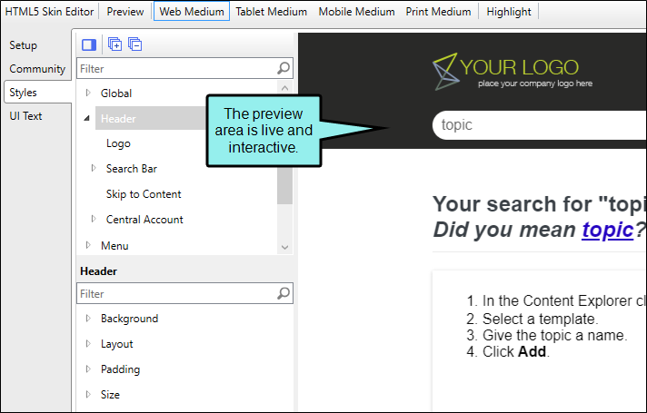
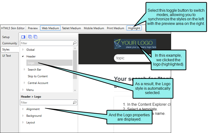
If you click Highlight in the local toolbar, the mode changes. As a result, different areas of the preview area become highlighted as you move the mouse over them. And when you click on an area, the corresponding style on the left is also selected. This makes it easier to know what styles you need to change in order to affect that part of the skin. The reverse is also true; as you click on styles, the corresponding area in the preview comes into focus if it is visible in the preview area.
After you make style changes, the preview changes accordingly.
You can also click the full preview option in the local toolbar of the Skin Editor
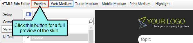
This full preview respects the responsive output setting in the skin. If you have responsive output enabled, the preview is also responsive. If the responsive output disabled, the preview is static.
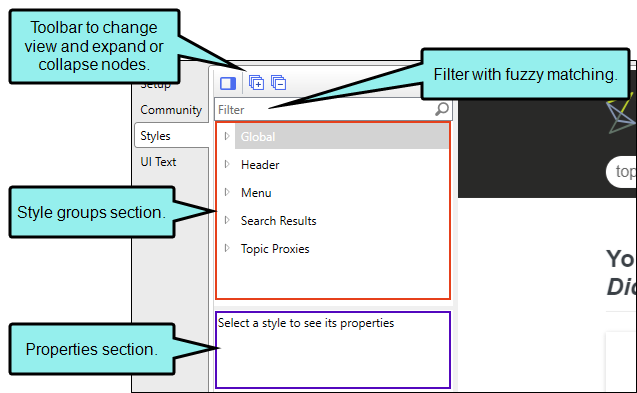
Style Groups and Properties Sections
When you open the Skin Editor to make changes to skin styles, the styles are organized for easy navigation and editing.
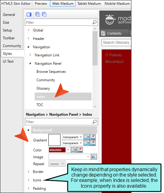
Style groups are in one section while their corresponding properties are in another. The style sections mimic a tree structure with root and child nodes, where a root node is the parent to a connecting child node. By default, the style groups are truncated to the root node, but can be expanded by selecting the expand/collapse icons next to them. The style groups and properties are dynamic (i.e., displayed, or hidden) based on what is applicable to the selected skin, setup options, and style. Use the style group section to pinpoint a style to edit.
Note You also click  to expand all the style groups at once, and then click
  to collapse the styles to the root level.
Once a style group is selected at a root or child level, its corresponding properties show in the properties section (if properties are applicable). Use the properties section to identify a specific style property to change.
There is also a filter to quickly find what you might be looking for to change in the skin.
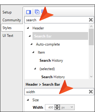
Example You want to change the search bar width, but you’re not sure where to look in the Skin Editor’s Style tab to do this.
In the Filter field, type search. The results take you to the matching style group. Note that the filter does fuzzy matching, so you could enter part of a word and see a possible match for what you are looking for.
Now that you see where the search bar skin options are, you can click the style to see its properties. In the properties section, another filter appears to pinpoint the property options. In this Filter field, type width. The results take you to the appropriate property for adjusting the width size.
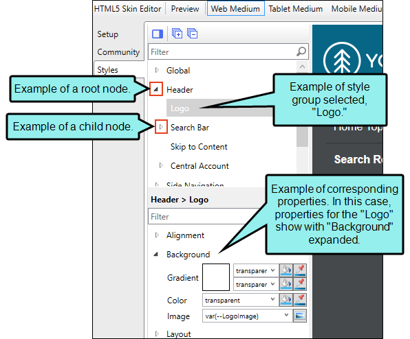
If you make changes to a root style, all the child styles below it will inherit those changes.
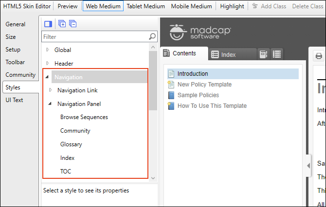
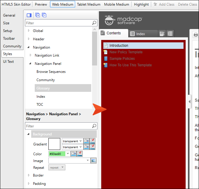
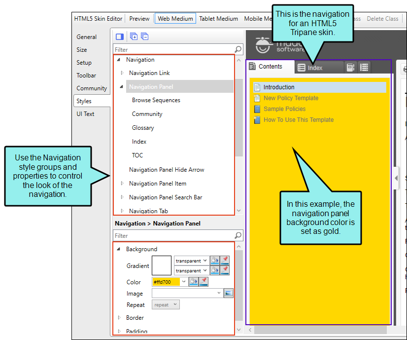
Example You have a Tripane skin and want to change the background color of the navigation panels from white to dark red in the Web medium. First, in the style groups section, you expand the Navigation node, and then you expand the Navigation Panel node. Under these root nodes are five more style groups that represent the kinds of panels you can include in your output—Browse Sequences, Community, Glossary, Index, TOC. (In the Tablet and Mobile mediums you would see Browse Sequences, Glossary, Index, Search Filters, and TOC.)
Because you want each of those five panels to have the same color, you select the Navigation Panel style group. The corresponding properties (i.e., Background, Padding, and Border) display in the properties section. Then, you expand the root Background node. There is a Gradient field, a Color field, and an image field. The image has the highest precedence, which means that if you enter settings in all the Background fields, the image will win. Gradient has the next highest precedence. If you want to use a color, you need to make sure the Gradient fields are set to transparent and that there is no image selected.
You use the Color field to choose a dark red color.
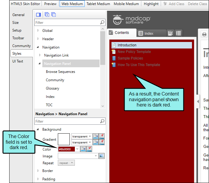
Regardless of the panel you select, it is dark red.
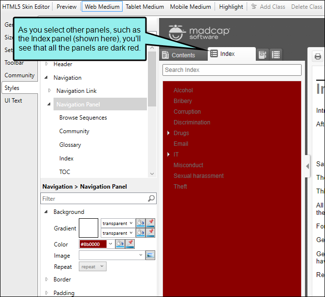
If you select style groups under a child node, the same properties show as you see above in the root node.
If you make changes to child properties, those settings override anything inherited from the root, and they pertain only to that child.
Example You have set the root Background property to show the navigation panel in dark red, as described in the previous example.
If you want the Glossary panel to show in green instead, you can select Glossary, and then expand the Background property that corresponds to it.
In the Color field, you select a green color. As a result, the Glossary panel is green.
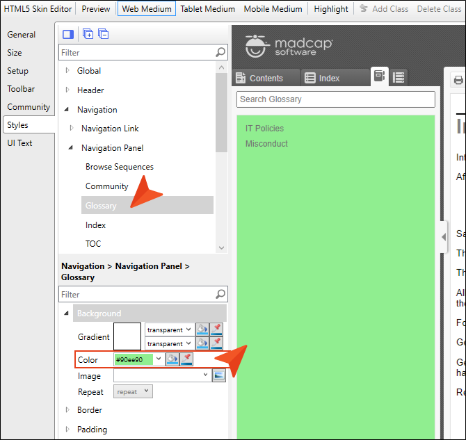
But all the other panels remain dark red.
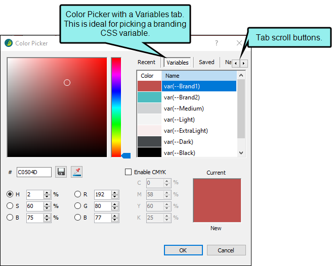
Note When changing a color in the Skin Editor, you can use CSS variables. For selecting a CSS variable you can open the Color Picker, and select a color from the Variables tab.
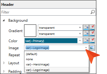
Note You can use CSS variables to select an image in the Skin Editor. Use the drop-down, or you can type the variable reference into the field directly. Note that the Skin Editor supports path-referenced images instead of hard-coded images.
When inserting images, be aware that you cannot select a CSS variable for an image inserted directly into a content file in Flare. Instead, you need to set a CSS variable as a background image, which you can do through a stylesheet or skin.
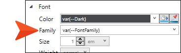
Note You cannot select a CSS variable for fonts in the Skin Editor interface. However, you can manually enter the font family variable into the field.
Horizontal or Vertical Viewing
You can view the style groups section and properties section in a horizontal way (i.e., columns stacked one on top of the other), or in a vertical fashion (i.e., side-by-side). You can change the position to your preference, and also set all the style groups to display as expanded or collapsed.
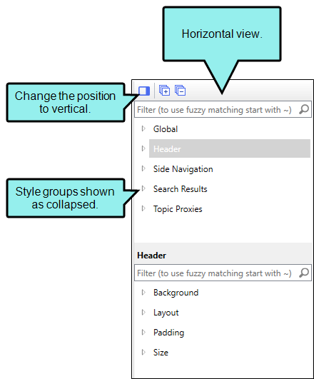
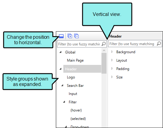
How to Switch Viewing Preference
-
In the Skin Editor Styles tab, from the local toolbar, select
 . (By default, the editor is set to the horizontal view.)
 -
(Optional) Select
Expand All. (By default, the skin options are collapsed.) -
At any time, you can switch back to the other view. From the local toolbar, select
 .
.
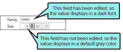
Default Values in Gray
When making changes to skin styles in HTML5 skins, you may notice that some fields display text or numbers in gray. This is the default value for that particular field. If you enter a different value, the font displays in a darker font.
Medium-Specific Styles
Responsive output lets you place settings on styles using any of the three mediums—Web, Tablet, and Mobile. However, not all styles and properties are necessarily pertinent to all mediums. That's why only see some styles and properties when you have a particular medium selected and not another.
Example You have a Top Navigation skin and want to change the slide out button that you see when the output is shown in a tablet or mobile phone size.
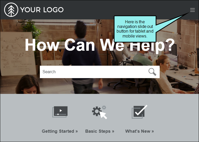
When you select either the Tablet or Mobile Medium, you can see and adjust the Navigation Slide Out Button.
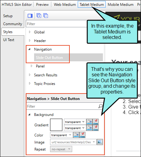
But when you select the Web medium, this style is not available because it isn't used in larger web browser views of the output.
Activities for HTML5 Skins and Components
You might perform the following style activities if you are working in an HTML5 skin or a skin component.
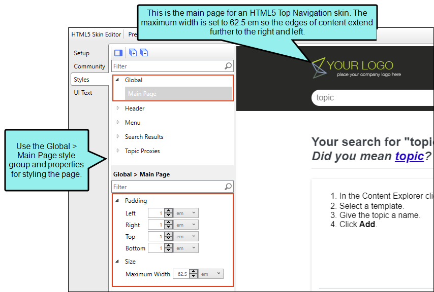
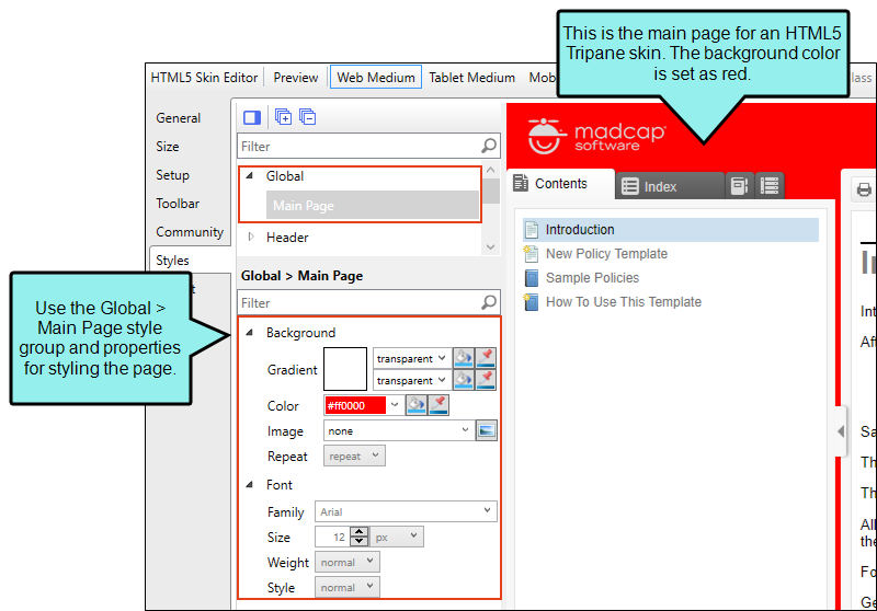
Global—All HTML5 Skins
The global section contains main page styles for Side Navigation, Top Navigation, and Tripane skins. See Main Page in HTML5 Skins.
Side and Top Side Navigation Skins
For Side and Top Navigation skins, you can control the padding and maximum width for the page.
Tripane Skins
For Tripane skins, you can control the font and background color for the page.
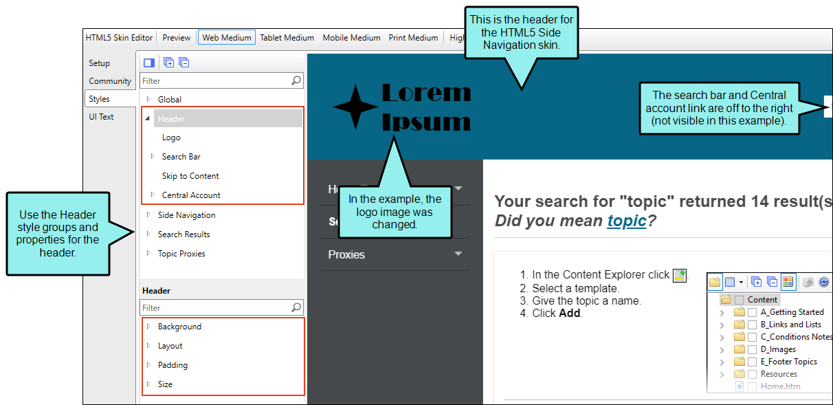
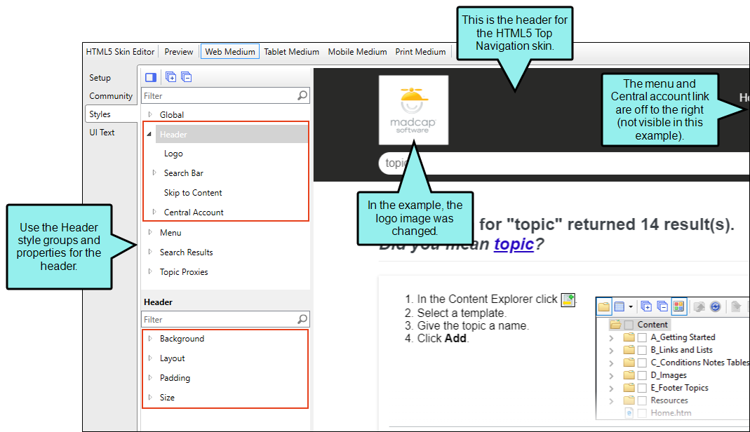
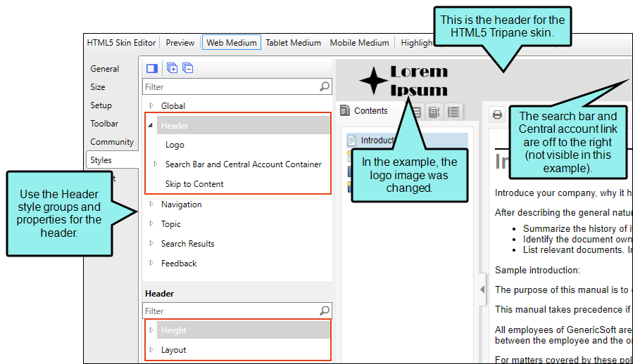
Header—All HTML5 Skins
The header is the area at the top of the screen for Side Navigation, Top Navigation, and Tripane skins. See Headers in HTML5 Skins.
Side Navigation Skins
For Side Navigation skins, the header displays a logo, search bar, and Central account link (if you are producing private output).
Top Navigation Skins
For Top Navigation skins, the header displays a logo, the search bar, top menu, and Central account link (if you are producing private output).
Tripane Skins
For Tripane skins, the header displays a logo, search bar, and Central account link (if you are producing private output).
Note If you want to style items for search results, you can use the Search section in the Skin Editor. Alternatively, you can use the Search Results skin component, which works with a Search Results proxy.
Note The Tripane skin you are using applies a theme to the header and search bar. Tripane Light uses a light gray header and search bar; Tripane uses a dark gray header and search bar.
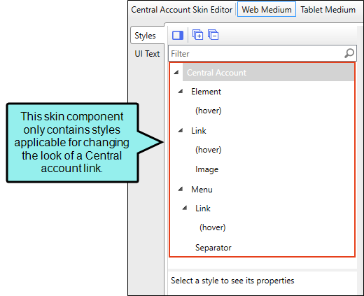
Central Account Link Skin Component
One of the tasks that the Header area in Side Navigation, Top Navigation, and Tripane skins lets you perform is modifying the look of the Central account link that is used for private outputs. Alternatively, you can use a Central Account Link proxy to add the link some place other than the header, and you can use a Central Account Link skin component to control the look for it.
The options in the skin component are the same as the Central account link options in the Side Navigation, Top Navigation, and Tripane skins.
Search Bar Skin Component
One of the tasks that the Header area in Side Navigation, Top Navigation, and Tripane skins lets you perform is modifying the look of the search bar at the top of pages. Alternatively, you can use a Search Bar proxy to add a custom search bar elsewhere, and you can use a Search Bar skin component to control the look for it.
The options in the skin component are the same as the search bar options in the Side Navigation, Top Navigation, and Tripane skins.
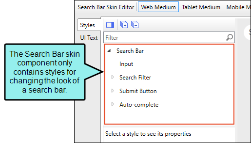
The Search Bar skin component is not supported if you are generating Tripane output. It is only available when you are producing Side Navigation, Top Navigation, or skinless output.
Menu—Side/Top Navigation Skins, Menu Skin Components
You can control the look of the menu that is included with a Side or Top Navigation skin, as well as additional menus that you add through the Menu proxy. See Menus in HTML5 Skins.
Side Navigation Skins
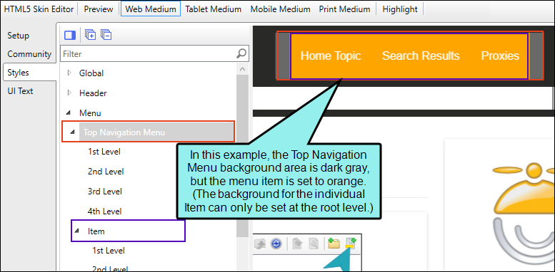
For Side Navigation skins, the Side Navigation style group and properties are used to control the look of the menu that is displayed on the left or right side of topics. You can specify settings for the entire menu, or for individual items at varying levels within the menu.
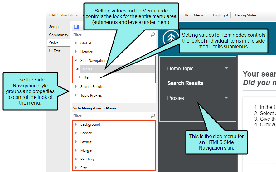
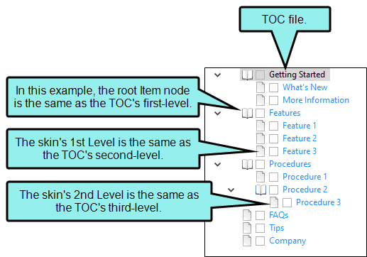
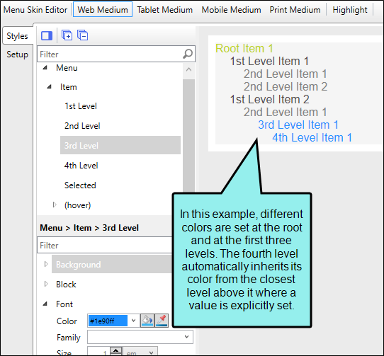
The main menu items, and their sub-levels correspond to the items in your TOC file. If you make changes to properties for the main menu nodes, such as Menu, Item, Item (hover), and Item (selected), they are applied to the root (top) level of the menu, which is the same as the first-level items in your TOC file.
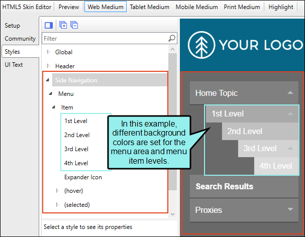
Any changes to the sub-levels of the Side Navigation menu item's (i.e., 1st Level, 2nd Level, 3rd Level, 4th Level) correspond to the items in the TOC file. Second-level items in the TOC correspond to the Item's 1st Level, third-level TOC items to the 2nd Level, and so on.
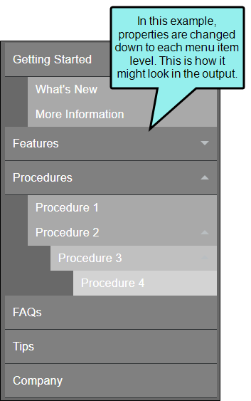
In the Side Navigation HTML5 Skin Editor, keep in mind that lower level items inherit property values that are placed on higher items (e.g., closer to the top), unless you specifically change them to be different.
Top Navigation Skins
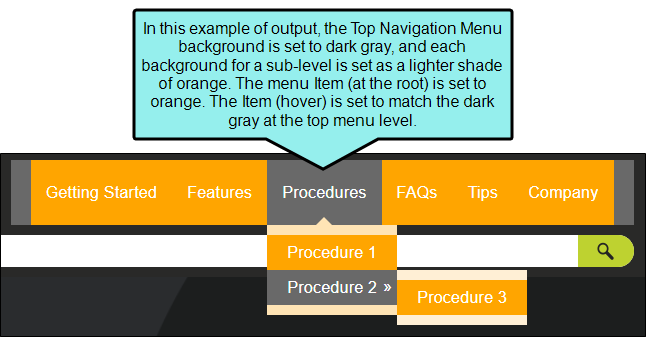
For Top Navigation skins, the Top Navigation style group and properties are used to control the look of the menu that is displayed at the top of topics. You can specify settings for the entire menu, or for individual items at varying levels within the menu.
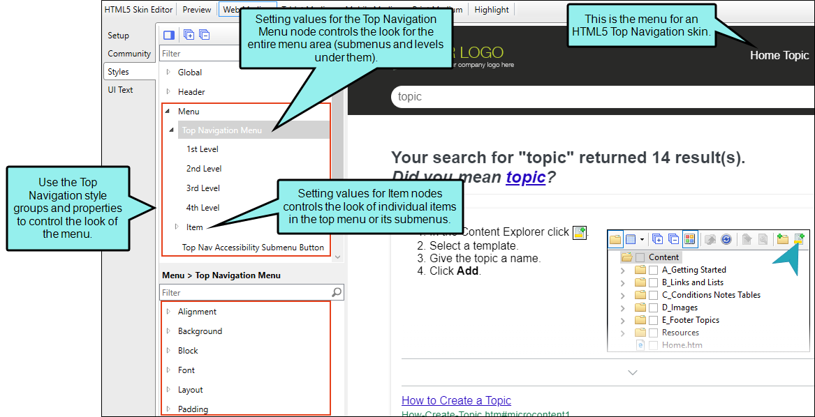
The main menu items, and their sub-levels correspond to the items in your TOC file. If you make changes to properties for the main menu nodes, such as Top Navigation Menu, Item, Item (hover), they are applied to the root (top) level of the menu, which is the same as the first-level items in your TOC file.
Any changes to the Top Navigation Menu item's sub-levels (i.e., 1st Level, 2nd Level, 3rd Level, 4th Level) correspond to the items in the TOC file. Second-level items in the TOC correspond to the Item's 1st Level, third-level TOC items to the 2nd Level, and so on.

In the Top Navigation HTML5 Skin Editor the lower level items inherit property values that are placed on higher items (e.g., closer to the top), unless you specifically change them to be different.
Menu Skin Components
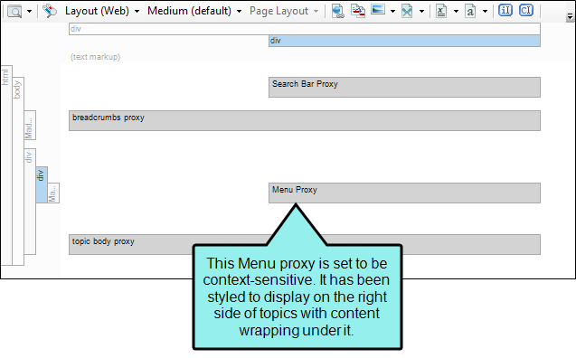
A Menu skin component can work in tandem with a Menu proxy that you insert into a topic or template page. This feature is most useful in Top Navigation and skinless outputs.
The styles for a Menu skin component are similar to those for the full Top Navigation skin, but there are some differences and options unique to each.
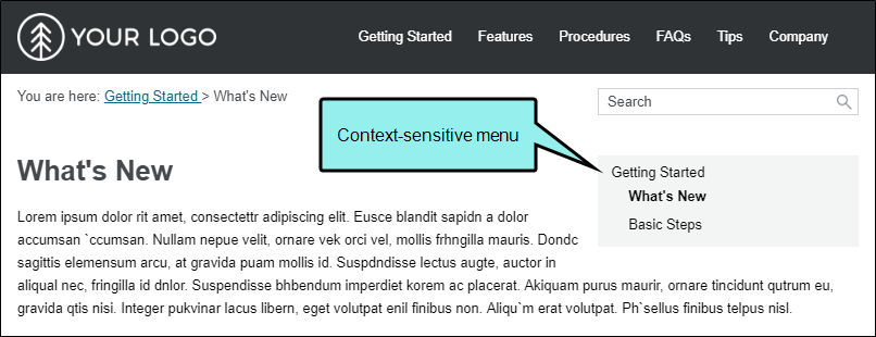
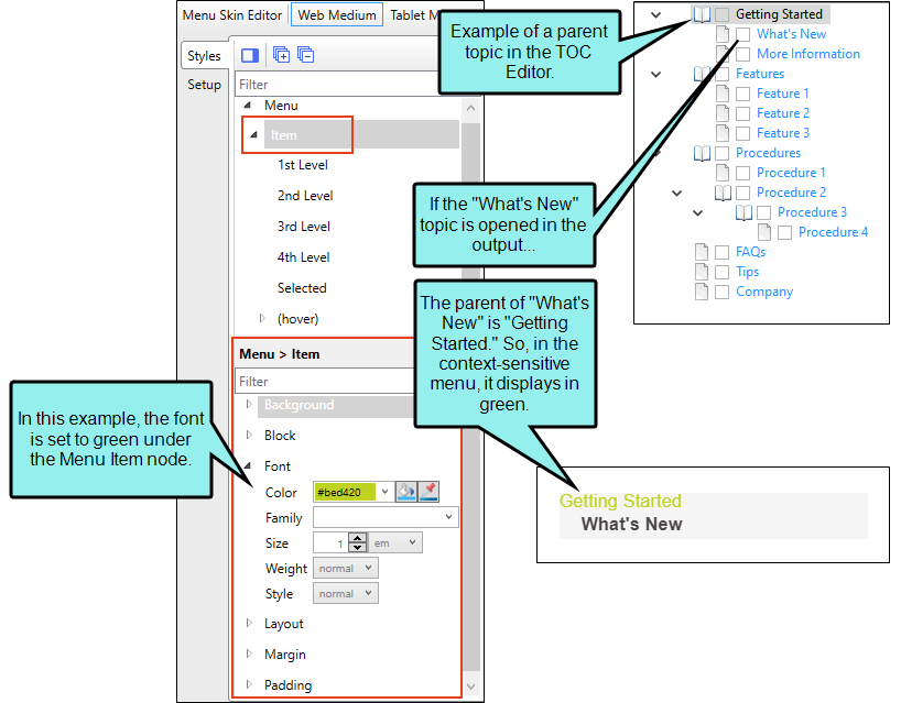
The primary thing to remember about a Menu component is that it can be context-sensitive, meaning it refers only to the topic that is open and, depending on your settings, the parent, sibling, and child items from the TOC. On the other hand, the menu styles in the full Top Navigation skin are always concerned with your TOC file structure as a whole.
That being said, the menu item style levels in a Menu component can mean something different than they do for the full Top Navigation skin.
When you set values for the Menu Item or Item (hover) nodes, you are controlling the look for the menu items that are at the top level of the menu. If you insert a context-sensitive Menu proxy that includes the parent, the root Menu Item style group refers to the parent topic.
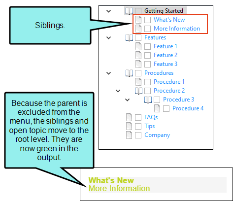
If you don't include the parent, but you do include the siblings, the root Menu Item style refers to those sibling topics in the TOC.
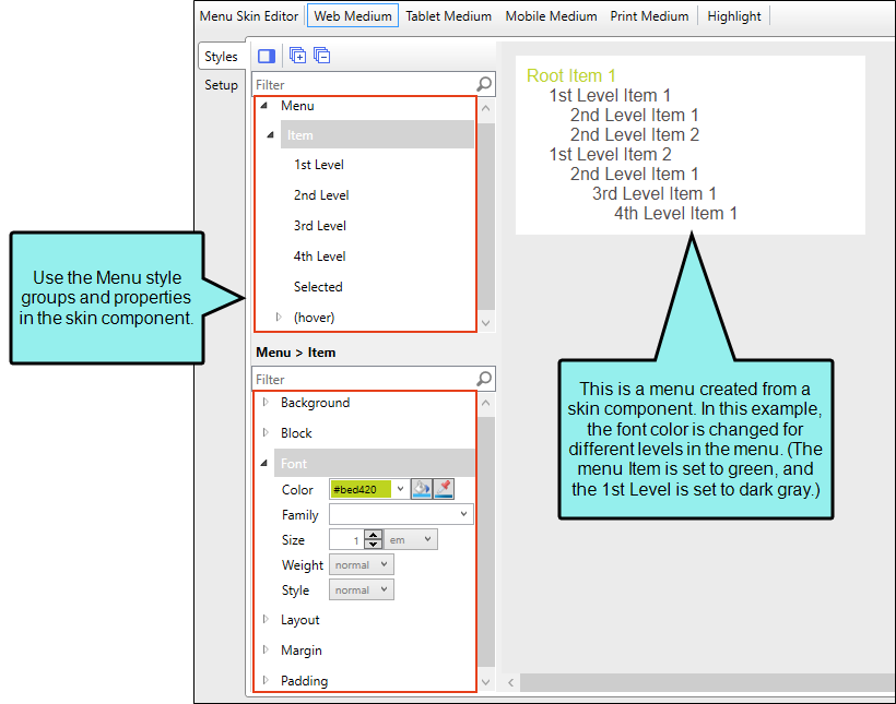
The 1st Level style refers to the first level under the root, followed by 2nd Level, 3rd Level, and 4th Level. The same kind of inheritance used for menu items in the full Top Navigation skin is used for a Menu component.
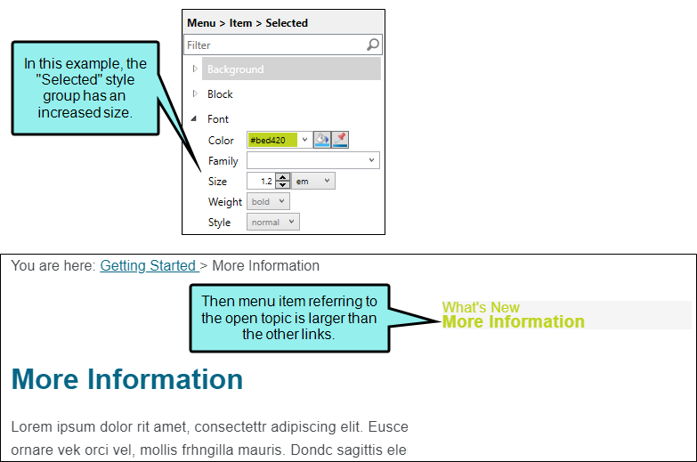
There is also a style called "Selected" for Menu components. This lets you apply a unique look to the menu item that refers to the topic that is currently open.
Navigation—All HTML5 Skins
For Side Navigation, Top Navigation, and Tripane skins, the Navigation style group and properties are used to control the look of navigation elements, which allow users to open different parts of your output. See Navigation in HTML5 Skins.
Side and Top Navigation Skins
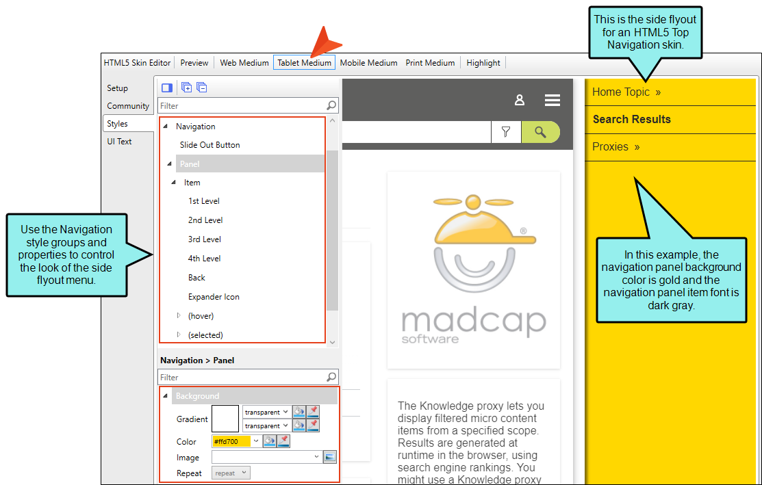
For Side and Top Navigation skins, the Navigation style group and properties are used to control the look of the side flyout navigation pane when displayed on a tablet or mobile device. It is not shown if you are working in the Web medium view in the Skin Editor, but only in the Tablet and Mobile mediums.
Tripane Skins
For Tripane skins, the Navigation style group and properties are available in all three mediums, although there are different options available for the Tablet and Mobile mediums.
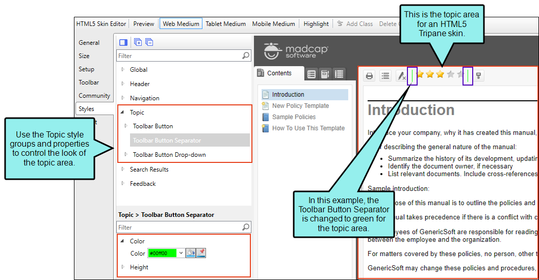
Topic—Tripane Skins
For Tripane skins, the Topic style groups and properties are used to control the look of the topic area of the output. This includes the container holding the topic content, and the toolbar just above the topic content. See Topics in HTML5 Skins.
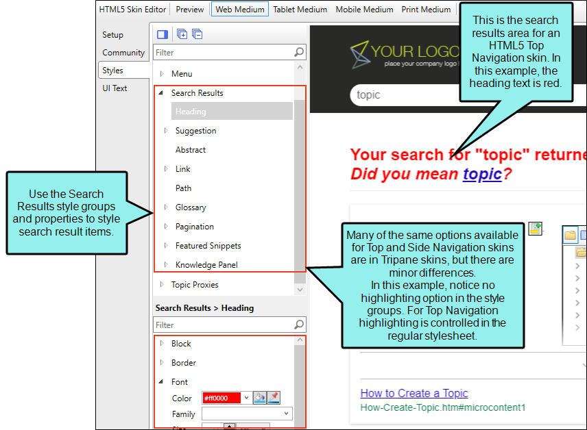
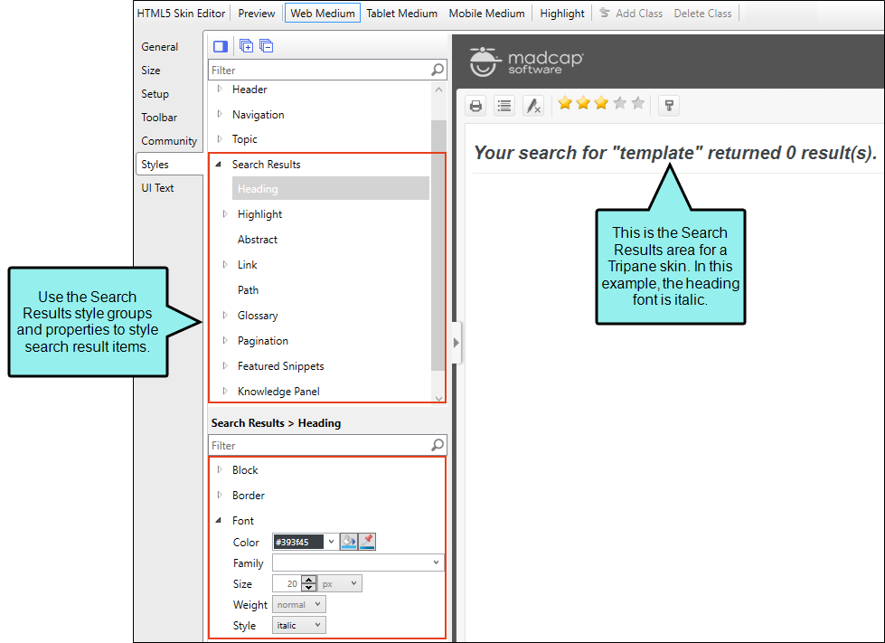
Search Results—All HTML5 Skins, Search Results Components
You can use a Side Navigation, Top Navigation, or Tripane skin to change the appearance of search result items. You can also do this with a smaller Search Results skin component. See Search Results in HTML5 Skins.
Side and Top Navigation Skins
For Side and Top Navigation skins, you can control the look of search result elements such as the heading, abstract (i.e., descriptive text of the file), links, glossary terms, pagination, featured snippets, and Knowledge Panel. Search highlighting is controlled in your regular stylesheet by modifying special classes under the span style.
Tripane Skins
For Tripane skins, you can control the look of search result elements such as the heading, search highlighting, abstract (i.e., descriptive text of the file), links, glossary terms, pagination, featured snippets, and Knowledge Panel.
Search Results Skin Components
Alternatively, you can use the Search Results skin component and its related proxy to design a custom container to display search results.
The options in the skin component are the same as those in the Side or Top Navigation skin. Chances are good that you will never need to use a Search Results skin component, but it is available in case you want the flexibility of having another page showing search results.
The Search Results skin component is not supported if you are generating Tripane output. It is only available when you are producing Side Navigation, Top Navigation, or skinless output.
Note If you want to style the search bar and its elements, you can use the Header section in the Skin Editor, or you can use a Search Bar skin component.
Featured snippets and knowledge panel
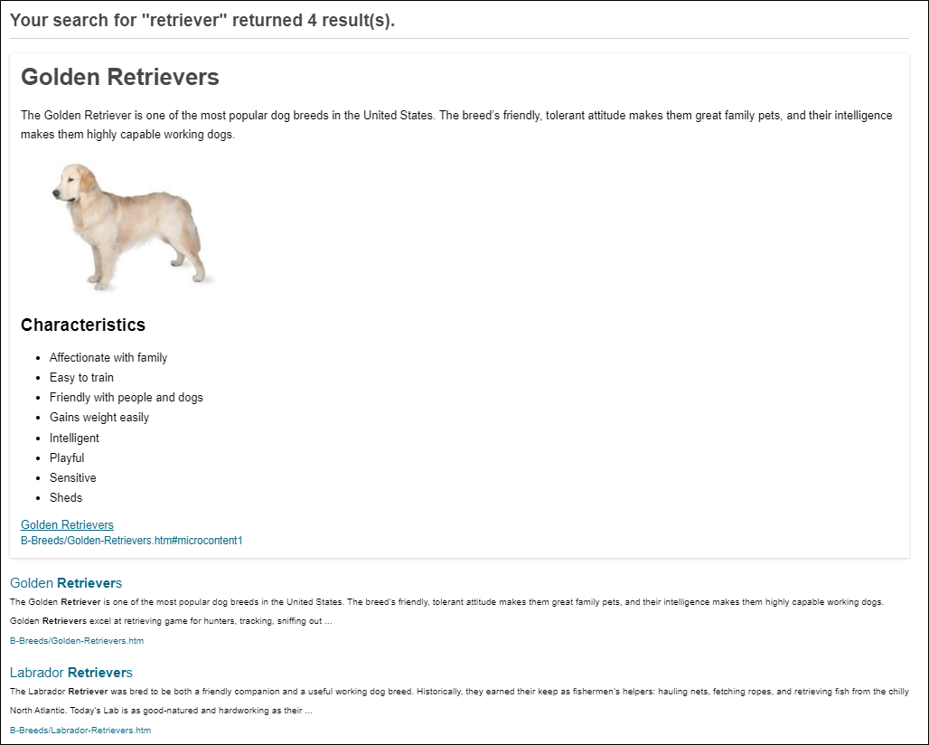
You can use a Side Navigation, Top Navigation, or Tripane skin to control micro content that might display in the HTML5 output. Under the Search Results style groups, you can select featured snippets and Knowledge Panel nodes.
-
Featured Snippets Featured snippets display in HTML5 output above the regular search results, according to phrases closely matching an end user's keyword(s). You can filter to more specifically determine which micro content might display as featured snippets. You can also change its view mode (Plain Text, Truncated, or Drop-Down) in your HTML5 skin.
-
Knowledge Panel Micro content can be displayed in HTML5 search results in an area called the "Knowledge Panel." By default, this panel displays on the right side of the search results page. However, you can edit the skin to display it on the left side or in the middle (above the featured snippets and regular search results). You can also change its view mode (Plain Text, Truncated, or Drop-Down) in your HTML5 skin.

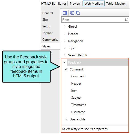
Feedback—Tripane Skins
For Tripane skins, these are style groups for elements that are displayed if you integrate your output with MadCap Feedback. See Feedback in HTML5 Skins.
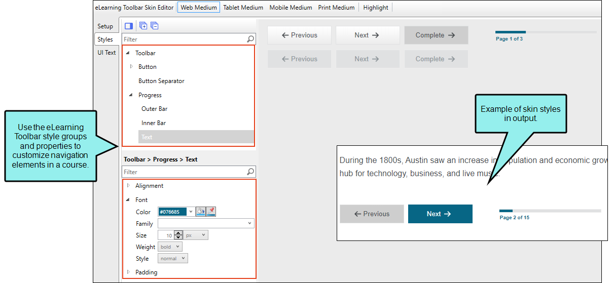
eLearning Toolbar Skin Components
The eLearning Toolbar skin component dictates the general appearance for the navigation elements in your course. You can edit the eLearning Toolbar skin component to select which buttons are included in the course and control how they look and feel in the output.
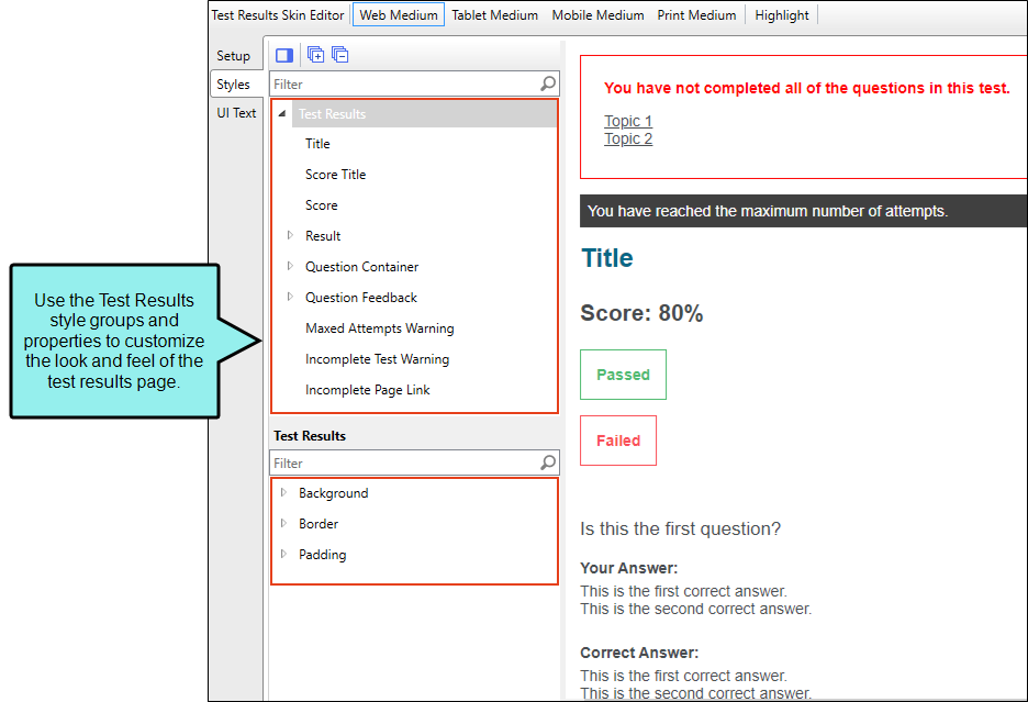
Test Results Skin Components
The autogenerated test results page includes many sections that are visible by default. You can use the Test Results Skin Editor to determine which sections display in the output, and also to customize the look and feel of the test results page.
Topic Toolbar Skin Components
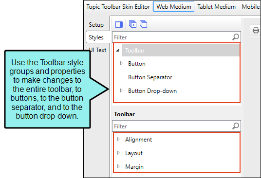
In Topic Toolbar skin components, you can use skin styles used to control the look of a toolbar you add via a proxy. See Topic Toolbars in HTML5 Skin Components
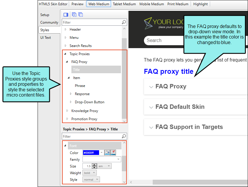
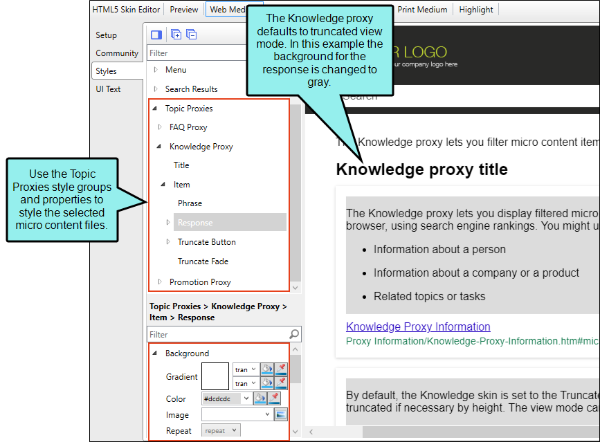
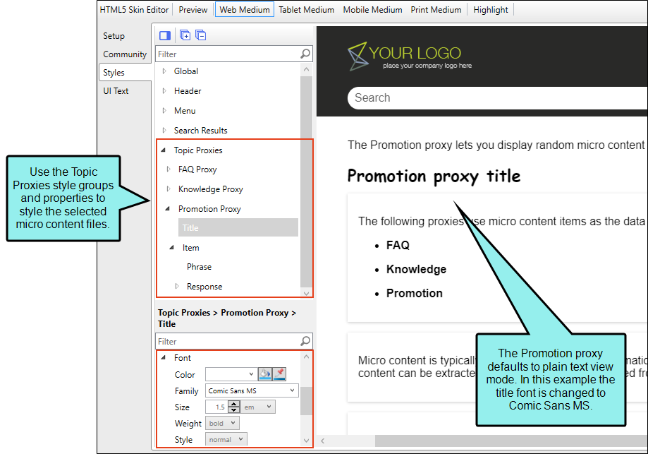
Topic Proxies—Side/Top Navigation Skins, Micro Content Skin Components
You can edit micro content elements in your HTML5 output using full skins with topic proxies (e.g., FAQ, Knowledge, Promotion). However, for maximum control and customization you can add a micro content skin component for each topic proxy.
FAQ Proxy
The FAQ proxy lets you generate a list of phrases and responses for the selected micro content file(s) in most outputs. Results are static, based on specific criteria selected when the target is built, not on the search engine output. This type of proxy is ideal for including traditional FAQs, but it can be used for other purposes as well.
knowledge proxy
The Knowledge proxy lets you display filtered micro content items in HTML5 output. Results are dynamic, generated at runtime in the browser, using search engine rankings. You might use a Knowledge proxy to display content such as information about a person, a company, technical specifications, related tasks, etc.
promotion proxy
The Promotion proxy lets you display random micro content items in HTML5 output. Results are dynamic, generated at runtime in the browser, using the search engine. You might use a Promotion proxy to display information about relevant products, events, new features, etc.
What’s Noteworthy?
Note If you want to change labels for some of these styles, or if you want to display the output user interface in a particular language, you can use the UI Text tab in the Skin Editor.

