 Outputs Supported
In Tripane skins, this section is used to control the look of the topic area of the output. This includes the container holding the topic content. It also includes the toolbar just above the topic content.
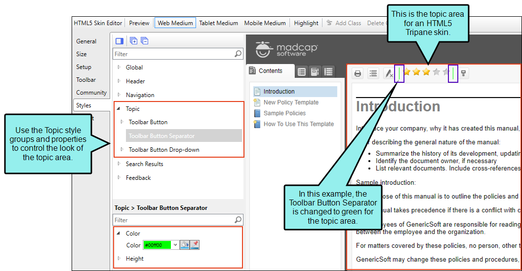
The interactive preview in the Skin Editor can be used to help you find the style you need to change. To use this, click Highlight in the local toolbar and click in the preview area to the right. The corresponding style is selected on the left side of the Skin Editor.
You can also use the following steps to find and edit the skin styles.
How to Specify Style Settings for the Topic Area in HTML5
- Open an HTML5 skin (Tripane).
- Select the Styles tab.
- (Optional) If you are using responsive output, make sure you select the appropriate medium—Web, Tablet, or Mobile—in the local toolbar before making changes to styles.
-
On the left side of the editor, expand and select any of the following Topic style groups:
Topic
This is the container holding topics in the output.
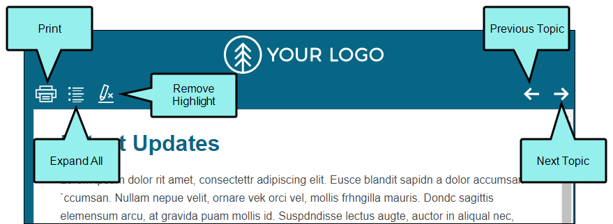
Topic > Toolbar Button
These are the buttons and other elements that are part of toolbars that you can add to output.
The Toolbar Button style has properties both at the root and on children nodes. If you want the setting(s) to be applied to all of the items (except the separator), select the Toolbar Button style itself. Otherwise, expand any of the child styles to apply settings to them individually.
Following are the child styles that control individual elements in the toolbar:
- Collapse All Lets users collapse all elements such as togglers, drop-down effects, and expanding text effects in a topic (if they are expanded). This toggles with the Expand All button.
- Current Topic Index Lets users see the display for the current topic in the sequence. This is typically used in conjunction with the "Next Topic" and "Previous Topic" buttons when the topic in question exists in a browse sequence. Flare finds the current topic in a browse sequence and display its position in relation to the rest of the topics in that sequence. (The root node is used to determine the count; in other words, if there are "child" topics in the sequence structure under the current topic, they will be included in the count.)
- Edit User Profile Lets users edit their Pulse or Feedback registration profile settings. This toggles with the Login button. The Edit User Profile button is shown if the user is already logged in.
- Expand All Lets users expand all elements such as togglers, drop-down effects, and expanding text effects in a topic (if they are not yet expanded). This toggles with the Collapse All button.
- Login Lets users log in to Pulse or Feedback, if you have integrated it with the output. This toggles with the Edit User Profile button. The Login button is shown if the user is not yet logged in.
- Next Topic Lets users open the next topic in the output. If you are using a browse sequence, Flare attempts to find the current topic in a browse sequence and navigate to the next topic from there. If you are using HTML5 Side Navigation, Top Navigation, or skinless output, or if you are not using a browse sequence, Flare looks at the position of the current topic in your table of contents (TOC) and opens the next topic after it.
- Previous Topic Lets users open the previous topic in the output. If you are using a browse sequence, Flare attempts to find the current topic in a browse sequence and navigate to the previous topic from there. If you are using HTML5 Side Navigation, Top Navigation, or skinless output, or if you are not using a browse sequence, Flare looks at the position of the current topic in your table of contents (TOC) and opens the previous topic before it.
- Print Lets users open the Print dialog so that they can send the open topic to the printer.
- Remove Highlight After a user performs a quick search in a topic, the search text found in the topic is highlighted. This button lets users turn the highlights off.
- Select Language Lets users switch between languages using a drop-down menu, if you have built multilingual output.
- Select Skin Lets users choose from multiple skins to change the display of the output.
- Topic Ratings (full) Displays ratings for a topic (if you have incorporated your output with MadCap Pulse or Feedback). For example, if a topic has been rated three out of five stars, "Topic Ratings (full)" lets you control how the three stars look.
- Topic Ratings (empty) This shows an empty rating (by default a non-colored star). For example, if a topic has been rated three out of five stars, "Topic Ratings (empty)" lets you control how the two stars look.
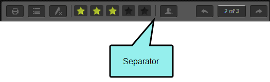
Topic > Toolbar Button Separator
This controls any separators that you may have added to the toolbar. A separator is the divider between the toolbar buttons and the navigation pane.

Topic > Toolbar Button Drop-down
This controls any drop-down menus that you may have added to the toolbar, such as the Select Language or Select Skin menus.
Note In order to see these items in the output, you must include a WebHelp toolbar or topic toolbar in your project.
Note You can add a custom toolbar button class by clicking Toolbar Button and in the local toolbar selecting Add Class.
-
Expand any of the nodes and complete the necessary fields. The properties and fields that you see are different for each node. Following is a general list in alphabetical order:
Background
You can change any of the following to affect the background:
-
Gradient This lets you change the background color using a progression effect. Select the beginning gradient color in the first field, and then select a second gradient color in the second field. You can use any of the following to enter or select a color.

You can type a hexadecimal number (e.g., #000000) directly in this field. Alternatively, you can click the down arrow and choose a color or make the background transparent.

This opens the Color Picker dialog, which lets you choose a color in many ways. Note that you can select a CSS variable.

Adds a bar above the cursor. As you move the cursor over any area of your screen, the color changes in the bar to reflect the color that is directly behind the tip of the cursor. When you click, that color is loaded into the Color Picker dialog.
- Color This lets you select a single color.
- Image This lets you select an image for the background. Click
 and use the dialog to select an image file.
 - Repeat Use this field to tell Flare whether the image should repeat or not.
Note The Image field has the highest precedence, which means that if you enter settings in all of the Background fields, the image will win. Gradient has the next highest precedence. If you want to use the Color field, you need to make sure the Gradient fields are set to transparent and that there is no image selected.
Border
You can change any of the following to affect the border on the element:
-
Border Edge Fields (Top, Right, Bottom, Left) You can add a border line around any of the edges of the element. You can use any of the following. The first three fields are used to control the type and size of the border line. The last three fields are alternative ways to choose a color for the border.

You can select a type of line for the border (e.g., solid, dashed, dotted).

Type a number in the field or use the arrows to increase or decrease it.

Click in this field and select a unit of measurement (e.g., pixels, points, centimeters).

You can type a hexadecimal number (e.g., #000000) directly in this field. Alternatively, you can click the down arrow and choose a color.
This opens the Color Picker dialog, which lets you choose a color in many ways. Note that you can select a CSS variable.
Adds a bar above the cursor. As you move the cursor over any area of your screen, the color changes in the bar to reflect the color that is directly behind the tip of the cursor. When you click, that color is loaded into the Color Picker dialog.
- Border Radius Fields (Top Left, Top Right, Bottom Right, Bottom Left) If you want the element to have rounded corners, you can enter values in any of these fields. In the first field type a number or use the arrows. Then click in the second field and select the unit of measurement (e.g., pixels, points, centimeters). The higher the number, the more of a curve the corner will have.
Box Shadow
You can change any of the following to affect the box shadow on the element:
- Horizontal Shadow Length This is the position of the horizontal shadow. Negative values are allowed. In the first field type a number or use the arrows. Then click in the second field and select the unit of measurement (e.g., pixels, points, centimeters).
- Vertical Shadow Length This is the position of the vertical shadow. Negative values are allowed. In the first field type a number or use the arrows. Then click in the second field and select the unit of measurement (e.g., pixels, points, centimeters).
- Shadow Blur Length This is the blur distance. In the first field type a number or use the arrows. Then click in the second field and select the unit of measurement (e.g., pixels, points, centimeters).
-
Shadow Color This lets you select a color for the shadow. You can use any of the following:
You can type a hexadecimal number (e.g., #000000) directly in this field. Alternatively, you can click the down arrow and choose a color or make the background transparent.
This opens the Color Picker dialog, which lets you choose a color in many ways. Note that you can select a CSS variable.
Adds a bar above the cursor. As you move the cursor over any area of your screen, the color changes in the bar to reflect the color that is directly behind the tip of the cursor. When you click, that color is loaded into the Color Picker dialog.
- Shadow Inset This changes the shadow from an outer shadow (outset) to an inner shadow. Click in the field and select an option. If you select false the shadow will be outset. If you select true the shadow will be inset.
Event
You can provide a command for the item when it is clicked by the user.
Example You want to provide a command for an item (e.g., so that clicking the button opens a website). The following command opens the MadCap Software website when a user clicks the button:
Copywindow.open("http://www.madcapsoftware.com");font
You can change any of the following to affect the font:
-
Color This lets you select a color for the font. You can use any of the following:
You can type a hexadecimal number (e.g., #000000) directly in this field. Alternatively, you can click the down arrow and choose a color.
This opens the Color Picker dialog, which lets you choose a color in many ways. Note that you can select a CSS variable.
Adds a bar above the cursor. As you move the cursor over any area of your screen, the color changes in the bar to reflect the color that is directly behind the tip of the cursor. When you click, that color is loaded into the Color Picker dialog.
- Family You can select or type a specific font family (e.g., Arial, Tahoma, Verdana).
- Size You can change the font size. In the first field type a number or use the arrows. Then click in the second field and select the unit of measurement (e.g., pixels, points).
- Weight You can click in this field and make the font normal or bold.
- Style You can click in this field and make the font normal or italic.
General
You can change the color for the element.
You can type a hexadecimal number (e.g., #000000) directly in this field. Alternatively, you can click the down arrow and choose a color.
This opens the Color Picker dialog, which lets you choose a color in many ways. Note that you can select a CSS variable.
Adds a bar above the cursor. As you move the cursor over any area of your screen, the color changes in the bar to reflect the color that is directly behind the tip of the cursor. When you click, that color is loaded into the Color Picker dialog.
Height
You enter a height for the element. In the first field type a number or use the arrows. Then click in the second field and select the unit of measurement (e.g., pixels, points, centimeters).
icon
You can click
and select a different image for the toolbar button.You can click the Display drop-down and choose one of the options:
- none The element will not be shown.
-
block The element will be shown and adds a line break after it. For some elements this option might be called flex, which reflects the flexbox technology associated with it.
You can change the height or width of the element. In the first field type a number or use the arrows. Then click in the second field and select the unit of measurement (e.g., pixels, points, centimeters).
Layout
You can click in the Display field and choose one of the options (some of these options might not be available for certain styles):
-
none The element will not be shown.
-
block The element will be shown and adds a line break after it. For some elements this option might be called flex, which reflects the flexbox technology associated with it.
-
inline The element will be shown but does not add a line break after it, allowing it to be positioned next to other elements.
-
inline-block The element will be shown but does not add a line break after it, allowing it to be positioned next to other elements. This is similar to inline; however, with this option, a width and height can be set on the element, and top/bottom margin and padding settings are respected.
Padding
You can change the padding for any of the sides on the element (Left, Right, Top, Bottom). In the first field type a number or use the arrows. Then click in the second field and select the unit of measurement (e.g., pixels, points, centimeters).
Position
You can change the position of the element, meaning its width and height:
- Width You enter a width for the element. In the first field type a number or use the arrows. Then click in the second field and select the unit of measurement (e.g., pixels, points, centimeters).
- Height You enter a height for the element. In the first field type a number or use the arrows. Then click in the second field and select the unit of measurement (e.g., pixels, points, centimeters).
Size
You can change the height or width of the element. In the first field type a number or use the arrows. Then click in the second field and select the unit of measurement (e.g., pixels, points, centimeters).
Text
You can click the Display drop-down and choose one of the options:
- none The element will not be shown.
-
block The element will be shown and adds a line break after it. For some elements this option might be called flex, which reflects the flexbox technology associated with it.
You can change any of the following to affect the font:
-
Color This lets you select a color for the font. You can use any of the following:
You can type a hexadecimal number (e.g., #000000) directly in this field. Alternatively, you can click the down arrow and choose a color.
This opens the Color Picker dialog, which lets you choose a color in many ways. Note that you can select a CSS variable.
Adds a bar above the cursor. As you move the cursor over any area of your screen, the color changes in the bar to reflect the color that is directly behind the tip of the cursor. When you click, that color is loaded into the Color Picker dialog.
- Family You can select or type a specific font family (e.g., Arial, Tahoma, Verdana).
- Size You can change the font size. In the first field type a number or use the arrows. Then click in the second field and select the unit of measurement (e.g., pixels, points).
- Weight You can click in this field and make the font normal or bold.
- Style You can click in this field and make the font normal or italic.
-
-
- Click
") to save your work.
to save your work.

Note You can also use the UI Text tab in the Skin Editor to change labels for some of these styles.
