 Outputs Supported
In addition to a main skin, you can also use several smaller skin components with HTML5 targets. Most of these components are used in combination with corresponding proxies
In most cases, a proxy is the element that actually generates the search element, menu, or toolbar when you build output. The related skin component is used to provide a look for it
[Menu Proxy — Headings — Online — Depth3 ]
Adding Skin Components
Skin components can be added to a project in the same way that you would add full skins. In the Project Organizer, right-click the Skins folder and from the context menu select Add Skin. Then choose the kind of skin component you want to add.
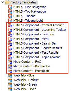
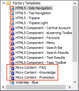
Micro Content Skin Components
You can add micro content elements to your HTML5 output using a regular full skin such as Side Navigation or Top Navigation, without worrying about additional skin components. Both the featured snippets and Knowledge Panel search results can be included from the Target Editor using default styles.
But if you want more control over the look and behavior of the micro content item, you can add a micro content skin component and proxy (e.g., FAQ, Knowledge, Promotion) for maximum customization. When you add a micro content proxy to a content file, you can select a specific skin for filtered micro content files.
The micro content skin types are Micro Content – FAQ, Micro Content – Knowledge, and Micro Content – Promotion. Each skin takes on slightly different default styles and options that cater to the intended use.
When you add one of the micro content skin types, it automatically opens in the Micro Content Skin Editor. This editor is a slimmed down version of the regular Skin Editor, but it focuses just on the selected skin component and proxy.
-
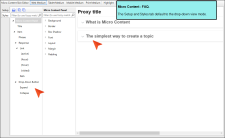
Micro Content - FAQ This skin defaults to drop-down view mode. It is used for FAQ proxies, but it can also be used for Knowledge and Promotion proxies.
-
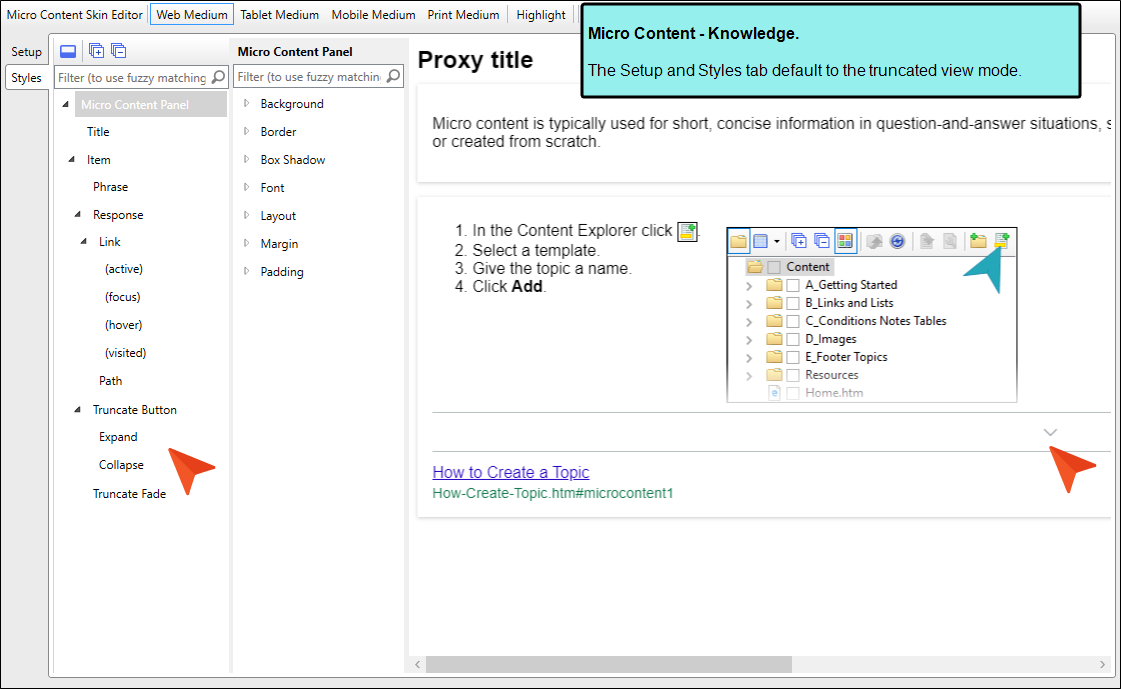
Micro Content - Knowledge This skin defaults to truncated view mode. It is used for Knowledge proxies, but it can also be used for FAQ and Promotion proxies.

-
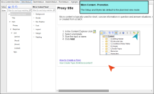
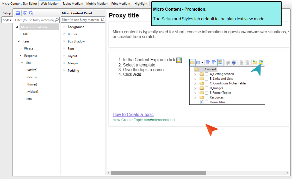
Micro Content - Promotion This skin defaults to plain text view mode. It is used for Promotion proxies, but it can also be used for FAQ and Knowledge proxies.

Note The Micro Content - FAQ skin component and FAQ proxy are unique in that they are applicable to non-HTML5 targets in addition to HTML5 targets (e.g., PDF, Word, Clean XHTML, Eclipse, EPUB, and HTML Help).
The other micro content skin components (i.e., Micro Content - Knowledge, and Micro Content - Promotion) can be used for styling only HTML5 outputs.
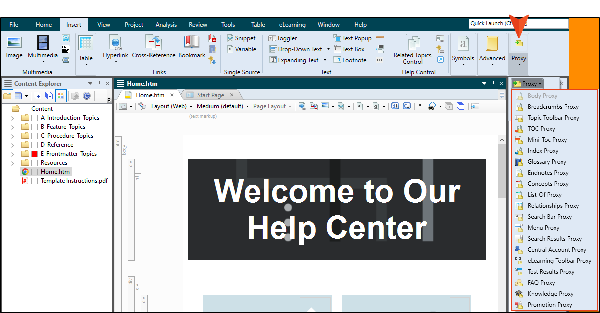
Inserting Proxies
You can add a proxy by clicking in the content file where you want it to be placed. Then from the Insert ribbon, select Proxy > Insert [Name of Proxy].
Working With Skin Components and Proxies
The following skin components and related proxies are commonly used for HTML5 outputs. Some are more useful in some outputs than in others.
Note The Favicons skin component is the only one that is not associated with a proxy. Simply by adding and editing this type of skin component, your HTML5 output will include favicons in the appropriate locations. We will not be covering favicons in the following sections.
Central Account
A Central Account proxy lets you create an account link drop-down, allowing users viewing private output to log out or edit their MadCap Central profile settings. By default, the account link is included automatically in the header of the regular skin.

After inserting a Central Account proxy, you can edit it. To do this, open the topic or template page where the proxy is inserted, right-click on it, and select Edit Central Account Proxy. You can also edit the look of the account link by editing the styles in the regular skin or the Central Account skin component that you used.
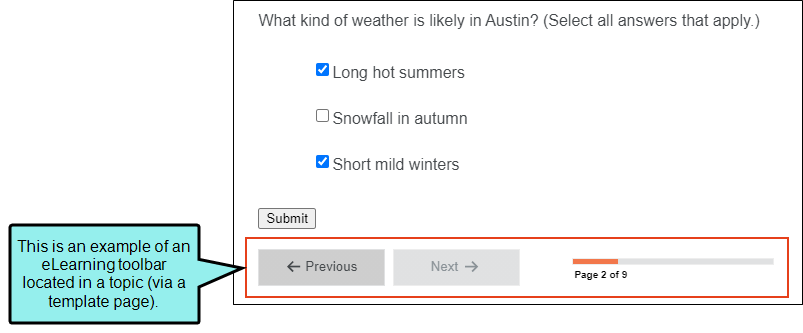
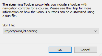
eLearning Toolbar
The eLearning Toolbar proxy lets you include intuitive navigation buttons and controls in your course. These might be a Next and Previous button, or a progress bar. When you build HTML5 output, the proxy content is replaced with the generated navigation tools.
When you insert this proxy, the eLearning Toolbar Proxy dialog opens. If you have customized the eLearning Toolbar skin component, you can select it from the Skin File drop-down.
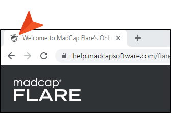
Favicons
Short for “favorite icons,” favicons are supported in Flare for HTML5 output. A favicon is the image that you sometimes see in a browser tab, address bar, bookmark, Windows tiles, etc. The Favicons skin component is the only one that is not associated with a proxy. Simply by adding and editing this type of skin component, your HTML5 output will include favicons in the appropriate locations.
Menu
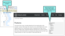
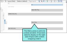
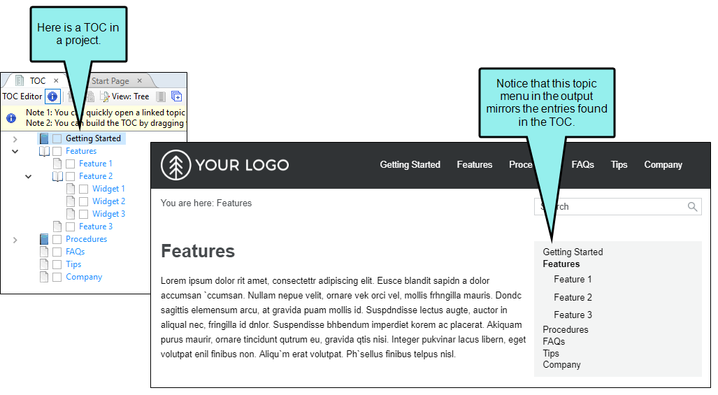
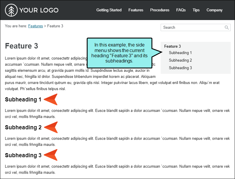
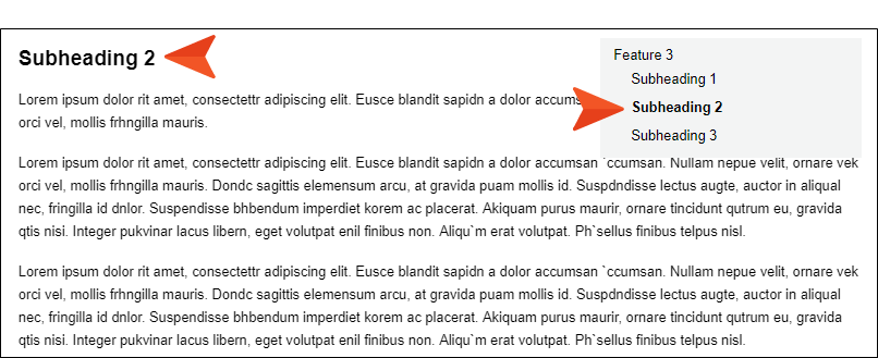
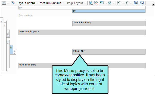
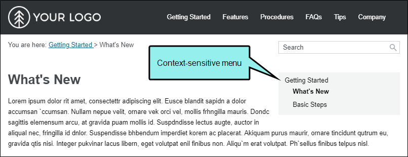
A Menu proxy lets you create a topic menu based on your TOC file, allowing users to navigate to other topics. This proxy can be especially useful if you are creating HTML5 Top Navigation or skinless output and you want a context-sensitive menu to display next to each topic. When you build the output, the proxy is replaced with the generated menu.
The Menu proxy and skin component allow users to access navigation unique to each topic, while the main navigation at the top of the page is typically limited to the first few levels of your TOC. This feature is not as common in Side Navigation or Tripane outputs, because those formats always include the full navigation on the side of topics.
When you insert a Menu proxy, the Menu Proxy dialog opens.
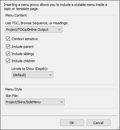
You can select the following options:
-
Use TOC, Browse Sequence, or Headings If you have more than one TOC file in your project, you can select the one that the Menu proxy should use. It is most common to base a menu on a TOC, but you can also select a browse sequence.
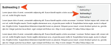
You also have the option of selecting “Headings,” which will display topic headings in the side menu instead. In other words, any headings or subheadings (e.g., h1, h2, h3, h4) that you’ve included in a topic will be shown in the side menu instead of other topics in the output.
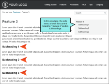
Also, when viewing a topic that is set up like this—and the menu is fixed in place (via the Setup tab of the Skin Editor)—each sub-heading section will be highlighted as you scroll down in the topic.
-
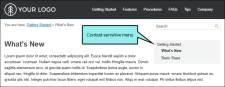
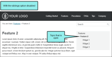
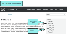
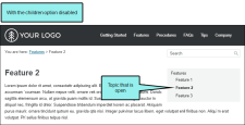
Context sensitive Select this check box if you want the menu to show only closely related entries in the TOC. In Flare's Top Navigation project templates, this kind of proxy was inserted into a template page to create a side menu for most of the topics in the output.
If you do not make the menu context-sensitive, it displays everything in the TOC (depending on the depth level you select).
-
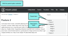
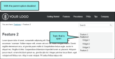
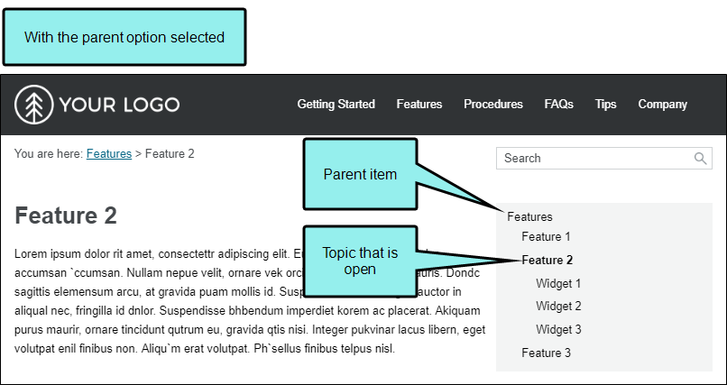
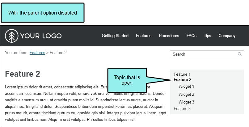
Include parent If you have selected the Context sensitive option, you can also select this check box to include the parent TOC item in the menu.
-
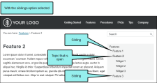
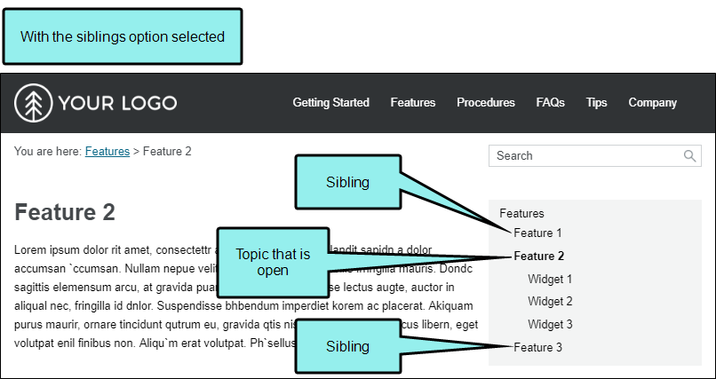
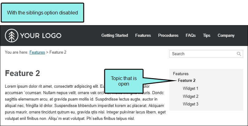
Include siblings If you have selected the Context sensitive option, you can also select this check box to include TOC items in the menu that are on the same level as the open topic.
-
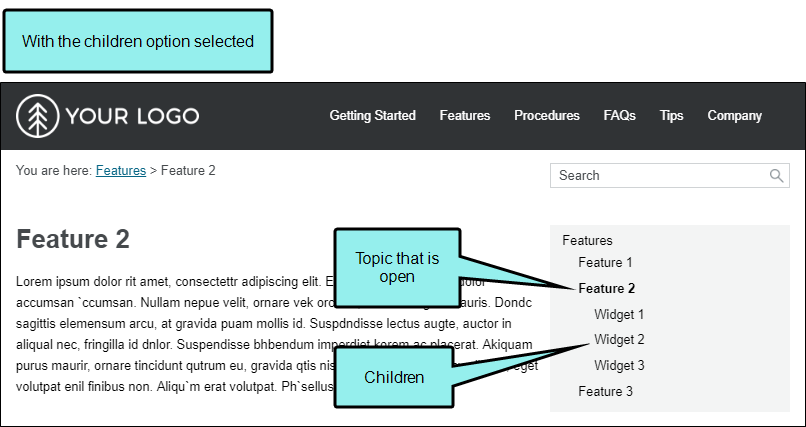
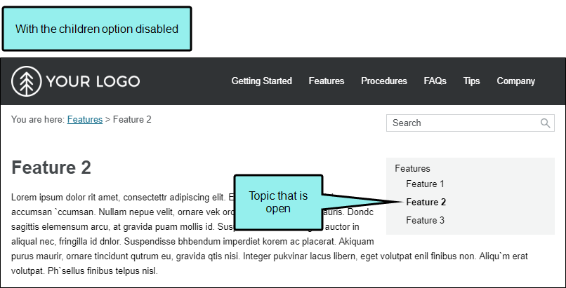
Include children If you have selected the Context sensitive option, you can also select this check box to include TOC items in the menu that are children of the topic that is open.
- Levels to Show (Depth) This lets you choose how many levels of items deep in the TOC to include in the menu. If the Context sensitive option is disabled, this refers to the depth level overall for the TOC. If both the Context sensitive and the Include children options are enabled, it refers to the number of levels under the topic that is open.
-
Skin File If you have added a Menu skin component to your project and want to use it to control the look of the menu, you can select it from this field.
If you do not select a Menu skin component in this field, Flare uses the first one it finds in your project (if one exists). Otherwise, Flare provides a default design.
Note If you use a Menu skin component and proxy to include a topic menu in your HTML5 Top Navigation output, you can set that menu to be fixed in place. You can set a fixed menu for web, tablet, or mobile screens (or all of them).
Note For HTML5 Tripane output, the Menu proxy and skin component will not work for merged projects or linking to external Help systems. Merging projects is not supported in Side or Top Navigation output at all.
Search Bar
A Search Bar proxy lets you create a field that can be used to perform searches in HTML5 output. When you build the output, the proxy is replaced with the generated search bar. If you insert a search bar using a proxy, you might also need to hide the search bar from some topics so that you do not have two search bars on a page.

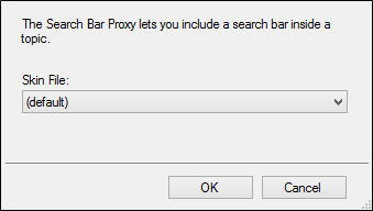
When you insert a Search Bar proxy, the Search Bar Proxy dialog opens.
You can select the following:
-
Skin File If you have added a search bar skin component to your project and want to use it to control the look of the search bar, you can select it from this field.
If you do not select a Search Bar skin component in this field, Flare uses the first one it finds in your project (if one exists). Otherwise, Flare provides a default design.
Note The Search Bar proxy and skin component are not supported in HTML5 Tripane output.
Search Results
A Search Results proxy works with the Search Bar proxy and lets you create a container that is used to display the results of end user searches in your output. When you build the output, the proxy is replaced with the generated search results.
When you insert this kind of proxy, the Search Results Proxy dialog opens.
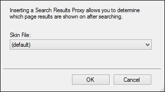
You can select the following:
- Skin File A skin component lets you control the look of generated search results. If you have added multiple skin components to your project, you can use this field to select the one to associate with this proxy. You can then edit that skin component to change its appearance.
Warning Do not insert a Search Results proxy into a template page. Insert it only into topics.
Note The Search Results proxy and skin component are not supported in HTML5 Tripane output.
Test Results
The Test Results proxy is necessary for ending course navigation and calculating the test results score when you link a custom pass or fail topic for the test results page. When you insert this proxy, the Test Results Proxy dialog opens. If you have customized the Test Results skin component, you can select it from the Skin File drop-down.
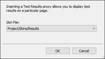
When a Test Results proxy is included in the custom results page, the pages display with your modified content in the output.

Topic Toolbar
You can use the Topic Toolbar proxy to generate a toolbar anywhere in your topics. This is an alternative (or an additional option) to the web toolbar that can be included in some online outputs.
When you insert a Topic Toolbar proxy, the Topic Toolbar Proxy dialog opens.
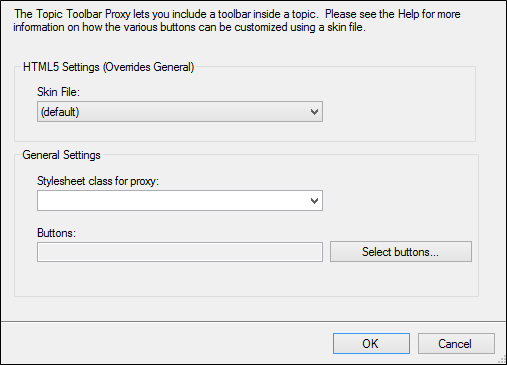
Topic toolbars can be inserted into outputs other than HTML5. However, the Topic Toolbar skin component is supported in HTML5 only. Therefore, the Topic Toolbar Proxy dialog is split into two sections. The HTML5 Settings area pertains only to HTML5 output. The General Settings area pertains to all of the outputs that support topic toolbars, including HTML5. Anything that is set in the HTML5 Settings area overrides what is set in the General Settings area, including the buttons that are selected for the toolbar.
You can select the following options:
-
Skin File If you have added an HTML5 Topic Toolbar skin component to your project and want to use it to control the look of the toolbar, you can select it from this field. From the Skin Editor, you can select the buttons to be included in the toolbar. Alternatively, you can select buttons from the Buttons field below.
If you do not select a Topic Toolbar component in this field, Flare uses the first one it finds in your project (if one exists). Otherwise, Flare provides a default design.
-
Stylesheet class for proxy You can select a class to affect the look of the entire toolbar. This is an alternative, or supplement, to editing the skin component in the Skin Editor. However, for HTML5 output, using a skin component is the most common method for designing the look of the toolbar.
You might create and use a proxy style class, for example, if you want to add a border around the toolbar. If you do not select a class from this field, the generated toolbar will use the style settings from the parent MadCap|topicToolbarProxy style. You have the option of creating a class for this proxy style in the Stylesheet Editor. To do this, select the MadCap|topicToolbarProxy style and in the local toolbar click Add Selector to create a class. The class will then be available from this field.
- Buttons You have the option of selecting buttons for a toolbar in the Skin Editor or by using this field. You can click Select buttons to open a dialog, then select the buttons to include in the toolbar. For HTML5 outputs, the Topic Toolbar proxy will use whatever settings are specified in a Topic Toolbar skin component (if you have added one to your project), overriding any buttons you may have selected directly in the proxy. If you have not associated a Topic Toolbar skin component with the proxy, Flare will just use the first one it finds in your project. However, for outputs using Standard and Mobile skins, the settings in the proxy take precedence over anything you may have set on the Toolbar tab in the Skin Editor.
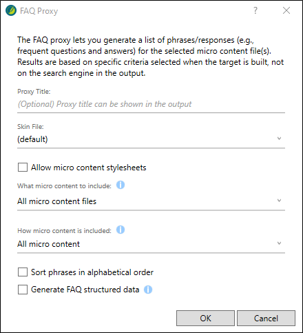
Micro Content - FAQ
The FAQ proxy lets you generate a list of phrases and responses for the selected micro content file(s) in most outputs. Results are static, based on specific criteria selected when the target is built, not on the search engine output. This type of proxy is ideal for including traditional FAQs, but it can be used for other purposes as well.
When you insert an FAQ proxy into a content file, the FAQ Proxy dialog opens. If you have added a Micro Content - FAQ skin component to your project and want to use it to control the look of micro content item, you can select it from the Skin File field.
Note The Micro Content - FAQ skin component and FAQ proxy are unique in that they are applicable to non-HTML5 targets in addition to HTML5 targets (e.g., PDF, Word, Clean XHTML, Eclipse, EPUB, and HTML Help).
The other micro content skin components (i.e., Micro Content - Knowledge, and Micro Content - Promotion) can be used for styling only HTML5 outputs.
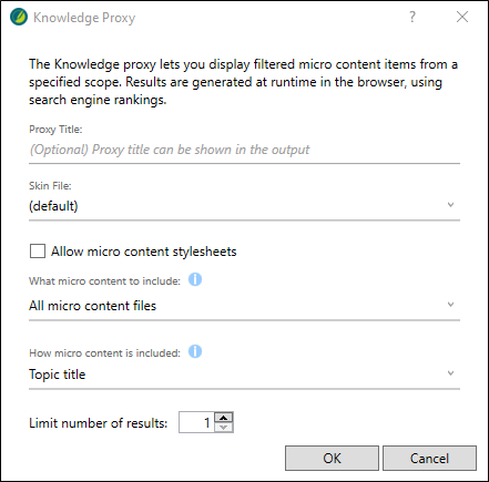
Micro Content - Knowledge
The Knowledge proxy lets you display filtered micro content items in HTML5 output. Results are dynamic, generated at runtime in the browser, using search engine rankings. You might use a Knowledge proxy to display content such as information about a person, a company, technical specifications, related tasks, etc.
When a Knowledge proxy is inserted, the Knowledge Proxy dialog opens. If you have added a Micro Content - Knowledge skin component to your project and want to use it to control the look of micro content item, you can select it from the Skin File field.
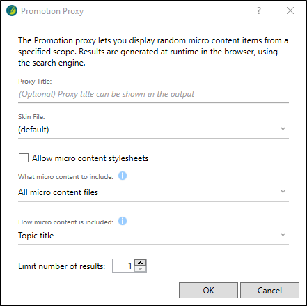
Micro Content - Promotion
The Promotion proxy lets you display random micro content items in HTML5 output. Results are dynamic, generated at runtime in the browser, using the search engine. You might use a Promotion proxy to display information about relevant products, events, new features, etc.
When a Promotion proxy is inserted, the Promotion Proxy dialog opens. If you have added a Micro Content - Promotion skin component to your project and want to use it to control the look of micro content item, you can select it from the Skin File field.
What’s Noteworthy?
Note HTML5 Side and Top Navigation outputs do not support the Current Topic Index button. Additionally, in HTML5 Side and Top Navigation outputs, the Next Topic and Previous topic buttons navigate between topics in the table of contents; in HTML5 Tripane output these buttons navigate between topics in a browse sequence (if one is available). Otherwise, HTML5 Side and Top Navigation outputs support the same buttons as HTML5 Tripane output.
Note You are not limited to one skin component of each type, although that is the most common situation. If you want, you can use multiple skin components of any type. If this is the case, you can associate a default skin component with a target. When you do this, the skin component you choose will always be used for any proxy of that same type that you insert for that target, unless you override it by associating a different skin component with a specific proxy that you've inserted.
