 Outputs Supported
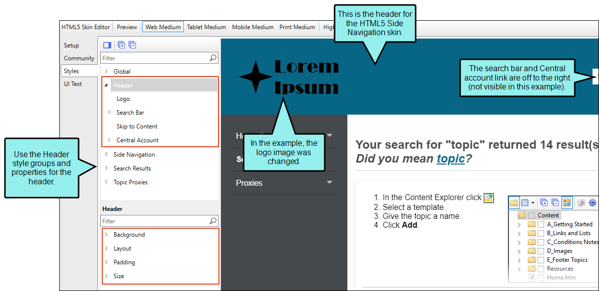
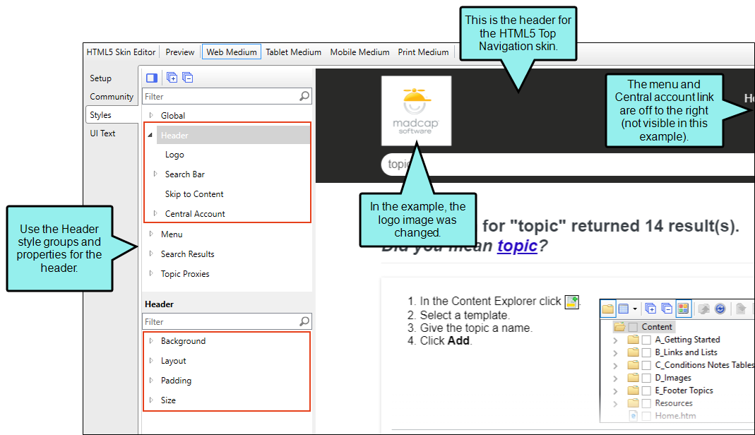
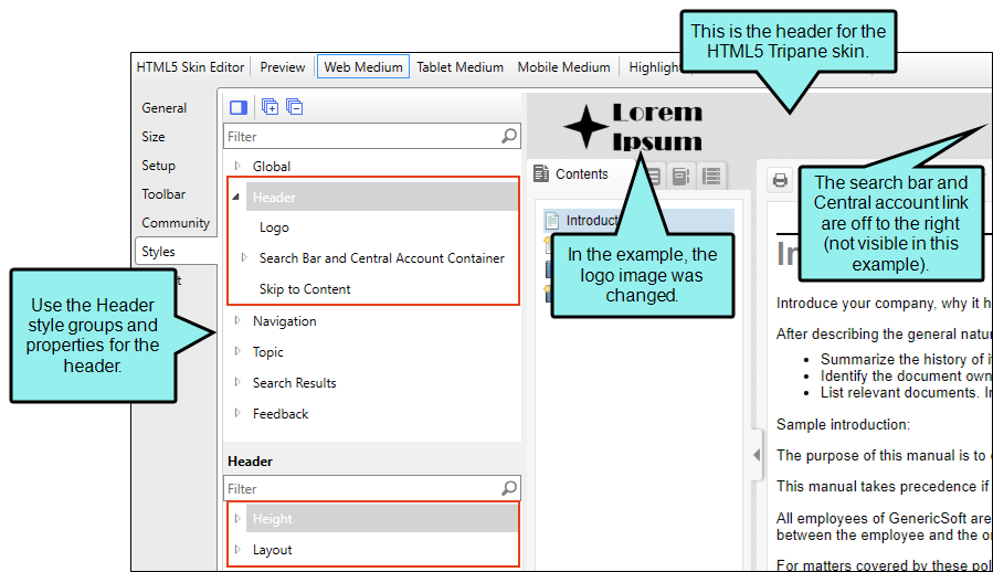
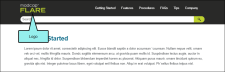
This is the area at the top of the screen for Side Navigation, Top Navigation, and Tripane skins.
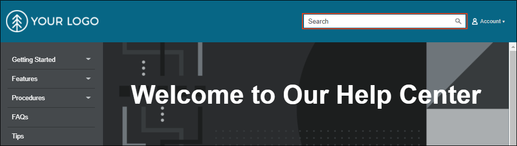
For Side Navigation skins, this area displays elements such as a logo, search bar, and Central account link (if you are producing private output).
For Top Navigation skins, this area displays elements such a logo, search bar, top menu, and Central account link (if you are producing private output).
For Tripane skins, this area displays elements such a logo, search bar, and Central account link (if you are producing private output).
The interactive preview in the Skin Editor can be used to help you find the style you need to change. To use this, click Highlight in the local toolbar and click in the preview area to the right. The corresponding style is selected on the left side of the Skin Editor.
You can also use the following steps to find and edit the skin styles.
[Menu Proxy — Headings — Online — Depth3 ]
How to Specify Style Settings for Headers in HTML5
- Open an HTML5 skin.
- Select the Styles tab.
- (Optional) If you are using responsive output, make sure you select the appropriate medium—Web, Tablet, or Mobile—in the local toolbar before making changes to styles.
-
On the left side of the editor, expand and select any of the following Header style groups (some styles might not be included, depending on the type of skin).
Header
This controls the entire header area.
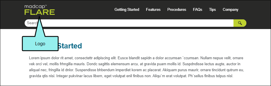
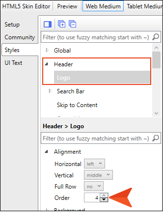
Header > Logo
This controls the logo in the header.
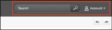
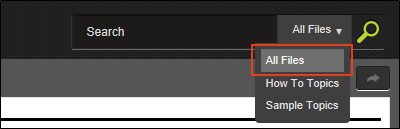
Header > Search Bar and Central Account Container
For Tripane skins only, this lets you hide or show the container holding the search bar and Central account link.
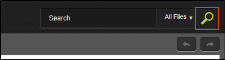
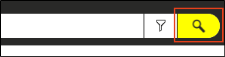
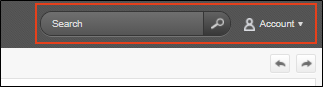
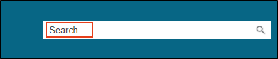
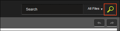
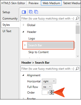
Header > Search Bar
This controls the search bar in the header.

Header > Search Bar > Input
This controls the text used when users perform searches.
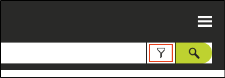
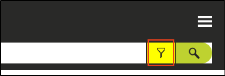
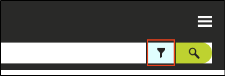
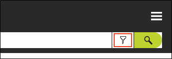
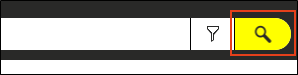
Header > Search Bar > Filter
This controls the look of the search filter area, if you have included one.
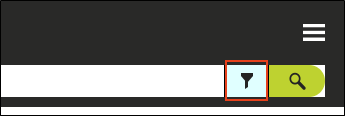
Header > Search Bar > Filter > (hover)
This lets you change how the search filter looks when users hover over it.
Header > Search Bar > Filter > (selected)
This lets you change how the search filter looks when it is selected.
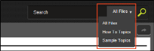
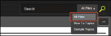
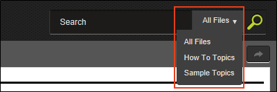
Header > Search Bar > Filter > Drop-down
This controls the drop-down portion of the search filter.
Header > Search Bar > Filter > Drop-down > (hover)
This lets you change how the search filter drop-down looks when users hover over it.
Header > Search Bar > Submit Button
This controls the look of the button used to initiate searches.
Header > Search Bar > Submit Button > (hover)
This lets you change how the search submit button looks when users hover over it. It is supported for Google search integration.
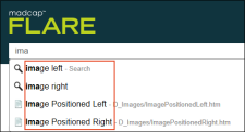
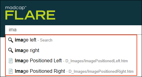
Header > Search Bar > Auto-complete
This applies the look and feel for the search bar when auto-complete suggestions are displayed. This is supported for Elasticsearch integration.
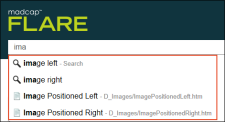
Header > Search Bar > Auto-complete > Item
This controls the font and other settings for auto-complete suggestions that are displayed in the drop-down. You can modify the settings separately for the Project Content or the Search History items. This is supported for Elasticsearch integration.
Header > Search Bar > Auto-complete > Item > (selected)
This applies look and feel changes for the selected auto-completed item. You can modify the settings separately for the Project Content or the Search History items. This is supported for Elasticsearch integration.
Header > Search Bar > Auto-complete > Item > Icon
This controls how the icon next to the auto-complete item displays. You can modify the settings separately for the Project Content or the Search History items. This is supported for Elasticsearch integration.
Header > Search Bar > Auto-complete > Item > Phrase
This lets you change how the auto-completed phrase displays. You can modify the settings separately for the Project Content or the Search History items. This is supported for Elasticsearch integration.
Header > Search Bar > Auto-complete > Item > Phrase > (match)
This allows you to modify how the matched auto-completed phrase displays. You can modify the settings separately for the Project Content or the Search History items. This is supported for Elasticsearch integration.
Header > Search Bar > Auto-complete > Item > Description
This controls how the file location of the auto-completed item looks in the drop-down list. You can modify the settings separately for the Project Content or the Search History items. This is supported for Elasticsearch integration.
Header > Search Bar > Auto-complete > Item > Separator
This applies styles for the hyphen separating the phrase from the description. You can modify the settings separately for the Project Content or the Search History items. This is supported for Elasticsearch integration.
Header > Search Bar > Auto-complete > Item > Remove Button
These settings allow you to change the background color of the Remove button, and allow you to modify the image of the Remove button as well. This is supported for Elasticsearch integration.
Header > Skip to Content
This lets you change the look of the text for the “Skip to main content” accessibility feature. This displays when users open the output and press TAB. After encountering this option, they can press ENTER to bypass the navigation.

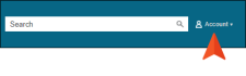
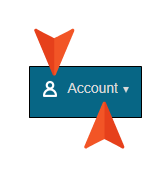
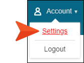
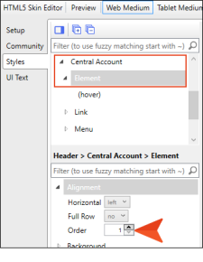
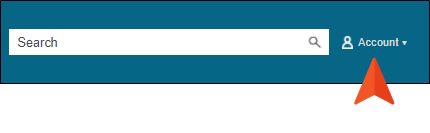
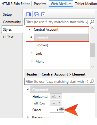
Header > Central Account > Element
This controls the look of the entire account link area.
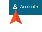
Header > Central Account > Element > (hover)
This controls the look of the entire account link area when a user hovers over it.
Header > Central Account > Link
This controls the look of the area showing the image, text, and down arrow that the user first sees in private output hosted on MadCap Central.
Header > Central Account > Link > (hover)
This controls the look of the area showing the image, text, and down arrow when a user hovers over it.
Header > Central Account > Link > Image
This controls the image shown to the left of the word "Account."
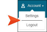
Header > Central Account > Menu
This controls the look of the entire menu area. If you click this area in the preview to display the drop-down options, the popup continues to display until you click again. This means you can continue to view the options while you make adjustments to the styles, allowing you to see changes immediately.
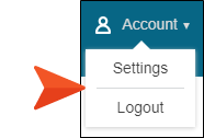
Header > Central Account > Menu > Link
This controls the look of the link for individual menu items.
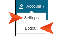
Header > Central Account > Menu > Link > (hover)
This controls the look of the link for individual menu items when a user hovers over them.
Header > Central Account > Menu > Separator
This controls the look of area that separates menu items.
-
Expand any of the nodes and complete the necessary fields. The properties and fields that you see are different for each node. Also, you might see nodes for a Tripane skin that you do not see for a Side or Top Navigation skin, and vice versa. Following is a general list in alphabetical order:
Absolute Position
For certain styles, this can allow you to be more precise with the position of an element. This might be necessary to prevent the element from disappearing from the screen. In addition to entering values with specific units of measurement (e.g., pixels), you can enter auto in a field. You might do this, for example, if you want the left or right property to have a particular value, but leave the other property to be adjusted automatically.
Alignment
Depending on the style and element you are working with, you may be able to select one or more of the following:
- Horizontal This option lets you choose whether to position the element to the left, middle, or right.
- Vertical This option lets you choose whether to position the element on the top, middle, or bottom.
- Full Row This option allows the element to take up all of the space horizontally in the header.
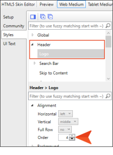
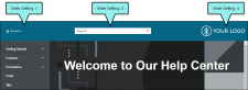
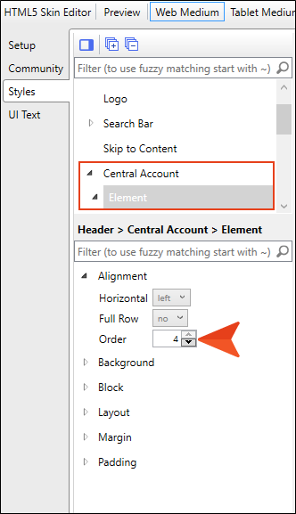
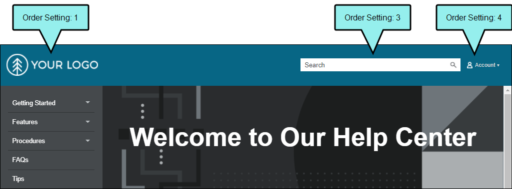
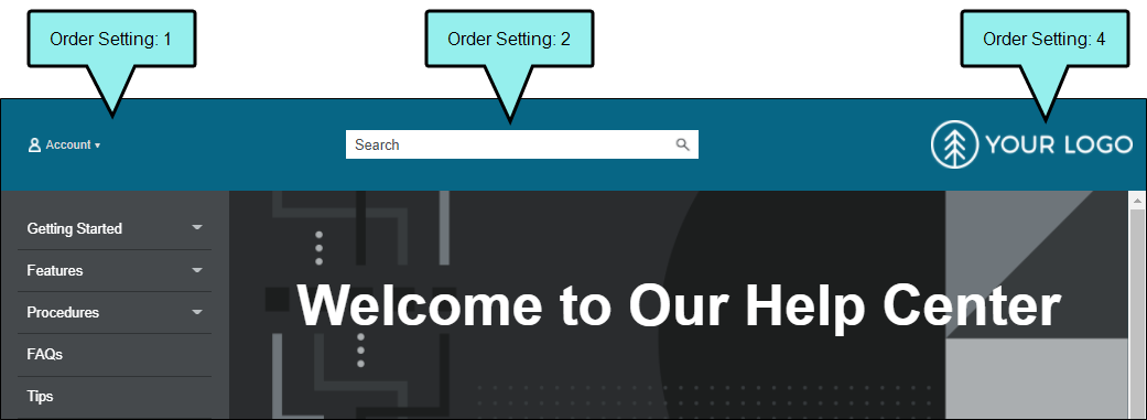
- Order This option determines which element comes first (1), second (2), third (3), or fourth (4) in the header. Side Navigation has three elements (logo, search bar, and Central account link), but Top Navigation has four (logo, search bar, menu, and Central account link).
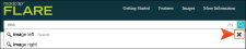
Example
If you have a Side Navigation skin, the Central Account Element is set to have an order value of 4. This means it appears to the right of both the logo and the search bar, which have lower values for that option (the logo is set at 1, and the search bar is set at 3).


You change the values for the Alignment > Order property as follows:
-
Logo: 4
-
Search Bar: 2
-
Central Account Element: 1

As a result, the header will look like this in the output:
Background
You can change any of the following to affect the background:
-
Gradient This lets you change the background color using a progression effect. Select the beginning gradient color in the first field, and then select a second gradient color in the second field. You can use any of the following to enter or select a color.

You can type a hexadecimal number (e.g., #000000) directly in this field. Alternatively, you can click the down arrow and choose a color or make the background transparent.

This opens the Color Picker dialog, which lets you choose a color in many ways. Note that you can select a CSS variable.

Adds a bar above the cursor. As you move the cursor over any area of your screen, the color changes in the bar to reflect the color that is directly behind the tip of the cursor. When you click, that color is loaded into the Color Picker dialog.
- Color This lets you select a single color.
- Image This lets you select an image for the background. Click
 and use the dialog to select an image file.
 - Repeat Use this field to tell Flare whether the image should repeat or not.
Note The Image field has the highest precedence, which means that if you enter settings in all of the Background fields, the image will win. Gradient has the next highest precedence. If you want to use the Color field, you need to make sure the Gradient fields are set to transparent and that there is no image selected.
Block
This is the container (or "block") holding content in an element. You can change any of the following to affect the block:
- Line Height This is how tall the container is that holds the content. In the first field type a number or use the arrows. Then click in the second field and select the unit of measurement (e.g., pixels, points, centimeters).
- Text Align This changes the alignment of the content. Click in the field and select an option (center, justify, left, right).
- Text Indent This is how far the text is moved inward. In the first field type a number or use the arrows. Then click in the second field and select the unit of measurement (e.g., pixels, points, centimeters).
- Word Wrap You can click in the Word Wrap field and choose whether to wrap text for the element (normal) or not (nowrap).
Border
You can change any of the following to affect the border on the element:
-
Border Edge Fields (Top, Right, Bottom, Left) You can add a border line around any of the edges of the element. You can use any of the following. The first three fields are used to control the type and size of the border line. The last three fields are alternative ways to choose a color for the border.

You can select a type of line for the border (e.g., solid, dashed, dotted).

Type a number in the field or use the arrows to increase or decrease it.

Click in this field and select a unit of measurement (e.g., pixels, points, centimeters).

You can type a hexadecimal number (e.g., #000000) directly in this field. Alternatively, you can click the down arrow and choose a color.
This opens the Color Picker dialog, which lets you choose a color in many ways. Note that you can select a CSS variable.
Adds a bar above the cursor. As you move the cursor over any area of your screen, the color changes in the bar to reflect the color that is directly behind the tip of the cursor. When you click, that color is loaded into the Color Picker dialog.
- Border Radius Fields (Top Left, Top Right, Bottom Right, Bottom Left) If you want the element to have rounded corners, you can enter values in any of these fields. In the first field type a number or use the arrows. Then click in the second field and select the unit of measurement (e.g., pixels, points, centimeters). The higher the number, the more of a curve the corner will have.
Box Shadow
You can change any of the following to affect the box shadow on the element:
- Horizontal Shadow Length This is the position of the horizontal shadow. Negative values are allowed. In the first field type a number or use the arrows. Then click in the second field and select the unit of measurement (e.g., pixels, points, centimeters).
- Vertical Shadow Length This is the position of the vertical shadow. Negative values are allowed. In the first field type a number or use the arrows. Then click in the second field and select the unit of measurement (e.g., pixels, points, centimeters).
- Shadow Blur Length This is the blur distance. In the first field type a number or use the arrows. Then click in the second field and select the unit of measurement (e.g., pixels, points, centimeters).
-
Shadow Color This lets you select a color for the shadow. You can use any of the following:
You can type a hexadecimal number (e.g., #000000) directly in this field. Alternatively, you can click the down arrow and choose a color or make the background transparent.
This opens the Color Picker dialog, which lets you choose a color in many ways. Note that you can select a CSS variable.
Adds a bar above the cursor. As you move the cursor over any area of your screen, the color changes in the bar to reflect the color that is directly behind the tip of the cursor. When you click, that color is loaded into the Color Picker dialog.
- Shadow Inset This changes the shadow from an outer shadow (outset) to an inner shadow. Click in the field and select an option. If you select false the shadow will be outset. If you select true the shadow will be inset.
Font
You can change any of the following to affect the font:
-
Color This lets you select a color for the font. You can use any of the following:
You can type a hexadecimal number (e.g., #000000) directly in this field. Alternatively, you can click the down arrow and choose a color.
This opens the Color Picker dialog, which lets you choose a color in many ways. Note that you can select a CSS variable.
Adds a bar above the cursor. As you move the cursor over any area of your screen, the color changes in the bar to reflect the color that is directly behind the tip of the cursor. When you click, that color is loaded into the Color Picker dialog.
- Family You can select or type a specific font family (e.g., Arial, Tahoma, Verdana).
- Size You can change the font size. In the first field type a number or use the arrows. Then click in the second field and select the unit of measurement (e.g., pixels, points).
- Weight You can click in this field and make the font normal or bold.
- Style You can click in this field and make the font normal or italic.
Height
You enter a height for the element. In the first field type a number or use the arrows. Then click in the second field and select the unit of measurement (e.g., pixels, points, centimeters).
Layout
You can click in the Display field and choose one of the options (some of these options might not be available for certain styles):
-
none The element will not be shown.
-
block The element will be shown and adds a line break after it. For some elements this option might be called flex, which reflects the flexbox technology associated with it.
-
inline The element will be shown but does not add a line break after it, allowing it to be positioned next to other elements.
-
inline-block The element will be shown but does not add a line break after it, allowing it to be positioned next to other elements. This is similar to inline; however, with this option, a width and height can be set on the element, and top/bottom margin and padding settings are respected.
Margin
You can change the margin for any of the sides on the element (Left, Right, Top, Bottom). In the first field type a number or use the arrows. Then click in the second field and select the unit of measurement (e.g., pixels, points, centimeters).
Padding
You can change the padding for any of the sides on the element (Left, Right, Top, Bottom). In the first field type a number or use the arrows. Then click in the second field and select the unit of measurement (e.g., pixels, points, centimeters).
Project Content
This is a setting for the Auto-complete nodes. Project content takes snippets of all topics that are found in the search criteria. Within this node, you can set other styles such as font and height.
Search History
This is a setting for the Auto-complete nodes. Search history is a combination of the individual user searches. Within this node, you can set other styles such as font and height.
Size
For some properties, you can change the height or width of the element. For other properties, you can change the maximum width of the element. In the first field type a number or use the arrows. Then click in the second field and select the unit of measurement (e.g., pixels, points, centimeters).
Text Decoration
You can click in the Decoration field and select a text decoration (e.g., underline, line-through, overline, underline).
Width
You enter a width for the element. In the first field type a number or use the arrows. Then click in the second field and select the unit of measurement (e.g., pixels, points, centimeters).
- Click
") to save your work.
to save your work.


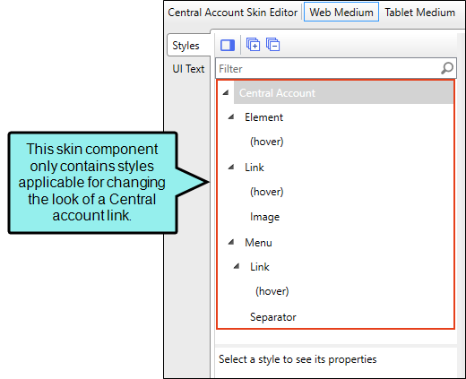
Central Account Link Skin Component
One of the tasks that the Header area in Side Navigation, Top Navigation, and Tripane skins lets you perform is modifying the look of the Central account link that is used for private outputs. Alternatively, you can use a Central Account Link proxy to add the link some place other than the header, and you can use a Central Account Link skin component to control the look for it.
The options in the skin component are the same as the Central account link options in the Side Navigation, Top Navigation, and Tripane skins.
Search Bar Skin Component
One of the tasks that the Header area in Side Navigation, Top Navigation, and Tripane skins lets you perform is modifying the look of the search bar at the top of pages. Alternatively, you can use a Search Bar proxy to add a custom search bar elsewhere, and you can use a Search Bar skin component to control the look for it.
The options in the skin component are the same as the search bar options in the Side Navigation, Top Navigation, and Tripane skins.
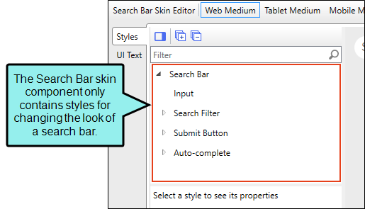
The Search Bar skin component is not supported if you are generating Tripane output. It is only available when you are producing Side Navigation, Top Navigation, or skinless output.
What’s Noteworthy?
Note For HTML5 logos, the following image types are supported: PNG, BMP, JPEG, TIF, TIFF, and GIF.
Note If you want to style items for search results, you can use the Search section in the Skin Editor. See Search Results in HTML5 Skins.
Note The Tripane skin you are using applies a theme to the header and search bar. Tripane Light uses a light gray header and search bar; Tripane uses a dark gray header and search bar.
