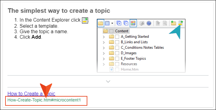
 Outputs Supported
A Side Navigation, Top Navigation, or Tripane skin can be used to change the appearance of search result items. You can also do this with a smaller Search Results skin component.
The interactive preview in the Skin Editor can be used to help you find the style you need to change. To use this, click Highlight in the local toolbar and click in the preview area to the right. The corresponding style is selected on the left side of the Skin Editor.
You can also use the following steps to find and edit the skin styles.
[Menu Proxy — Headings — Online — Depth3 ]
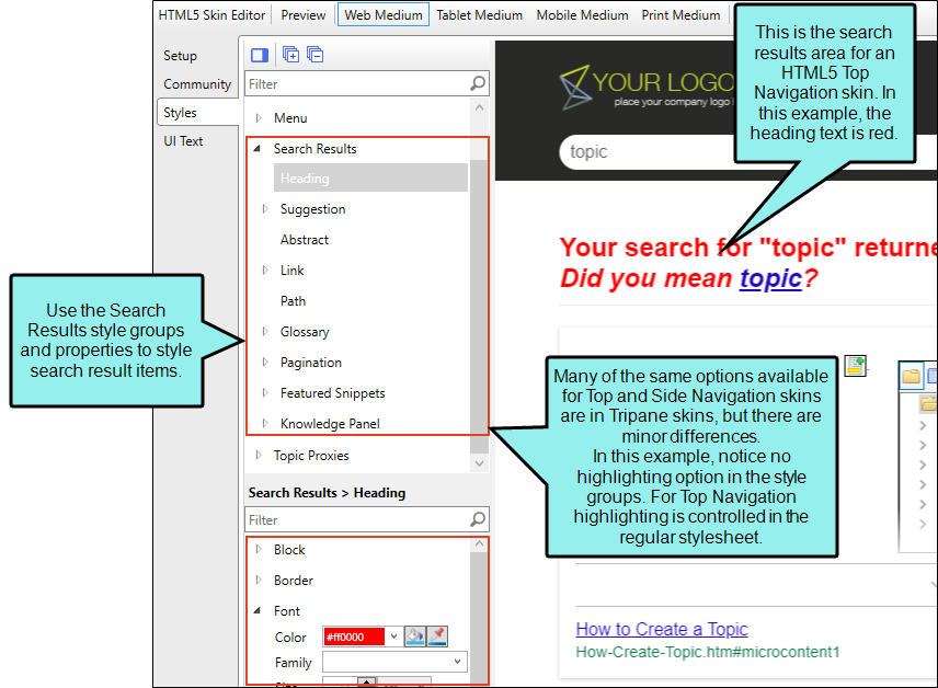
Side or Top Navigation Skins
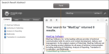
For Side and Top Navigation skins, you can control the look of search result elements such as the heading, abstract (i.e., descriptive text of the file), links, glossary terms, pagination, featured snippets, and Knowledge Panel. Search highlighting is controlled in your regular stylesheet by modifying special classes under the span style.
Tripane Skins
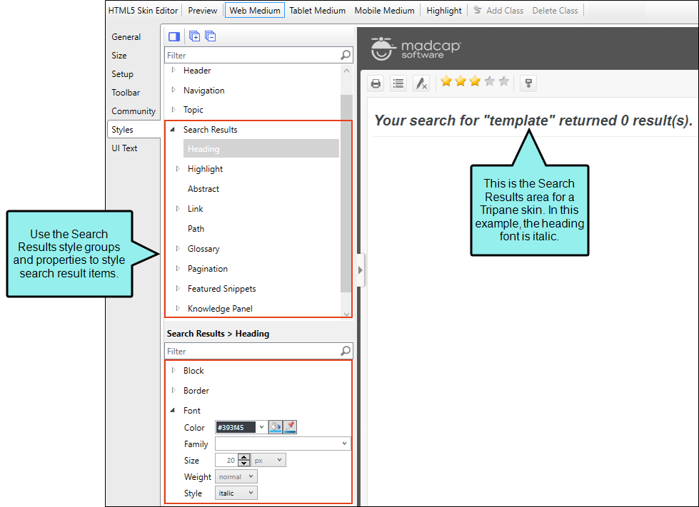
For Tripane skins, you can control the look of search result elements such as the heading, search highlighting, abstract (i.e., descriptive text of the file), links, glossary terms, pagination, featured snippets, and Knowledge Panel.
Search Results Skin Components
Alternatively, you can use the Search Results skin component and its related proxy to design a custom container to display search results.
The options in the skin component are the same as those in the Side or Top Navigation skin. Chances are good that you will never need to use a Search Results skin component, but it is available in case you want the flexibility of having another page showing search results.
The Search Results skin component is not supported if you are generating Tripane output. It is only available when you are producing Side Navigation, Top Navigation, or skinless output.
How to Specify Style Settings for Search Results in HTML5
- Open an HTML5 skin.
- Select the Styles tab.
- (Optional) If you are using responsive output, make sure you select the appropriate medium—Web, Tablet, or Mobile—in the local toolbar before making changes to styles.
-
On the left side of the editor, expand and select any of the following Search Results style groups:
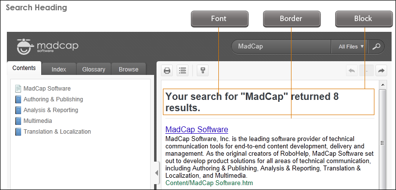
Search Results > Search Heading
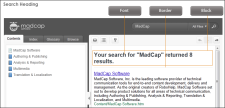
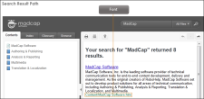
This is the heading at the beginning of the search results, indicating how many search results were found.
Search Results > Highlight
When users perform searches in your online output, the keywords that are found may be highlighted in the topics. The background for each term found in a topic can be highlighted in a different color. In Flare you can use styles to change not only the color background, but other settings as well (e.g., font style, text decoration).
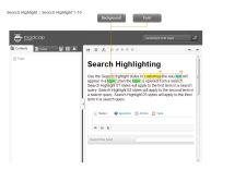
The Search Highlight style is used for Tripane skins. It has properties both at the root and on children nodes. If you want the setting(s) to be applied to all of the items, complete the fields under the Search Highlight style itself. Otherwise, expand any of the child styles (Search Highlight 01 to 10) to apply settings to them individually. Each search highlight style is numbered to coordinate with the order search terms are entered. For example, the style named "Search Highlight 01" will be used for matches to the first search term entered and "Search Highlight 10" would coordinate with the tenth entered term. You can customize up to 10 highlight colors.
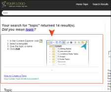
Search Results > Suggestion
This line will suggest a different search string if not enough results are generated from the initial search string. You can hide this option in the Layout properties for this element.
Search Results > Suggestion > Link
This will provide a link to the suggested search string.
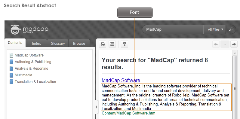
Search Results > Abstract
This is the opening paragraph text for a search result, giving you context.
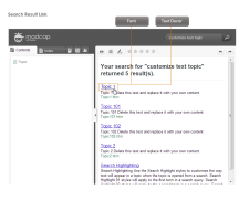
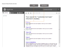
Search Results > Link
This is the link at the top of the search result.
Search Results > Link > (active)
This is the search result link when it is in an active state.

Search Results > Link > (focus)
This is the search result link when it has focus.
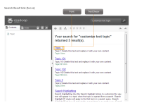
Search Results > Link > (hover)
This is the search result link when a user hovers over it.
Search Results > Link > (visited)
This is the search result link after it has been selected.

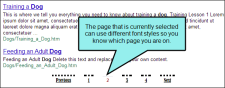
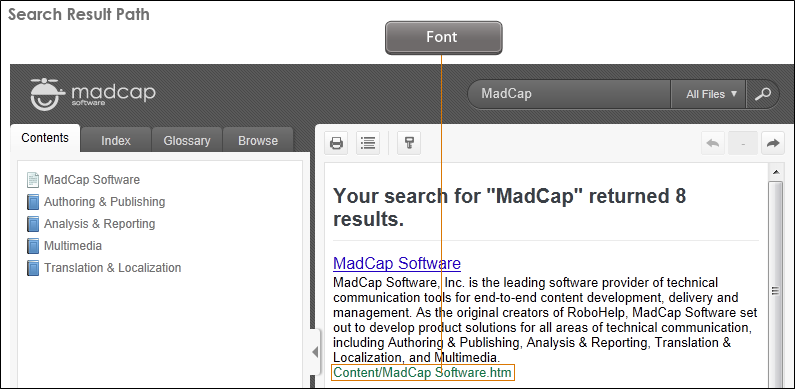
Search Results > Link > Path
This shows the path to the file containing the search result.
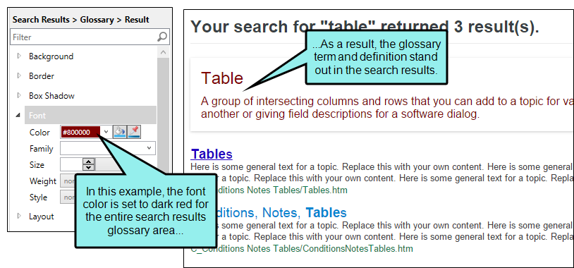
Search Results > Glossary > Result
This controls the look of the area holding glossary terms and definitions if they are included at the beginning of search results.

Search Results > Glossary > Term
This controls the look of glossary terms (not definitions) if they are included at the beginning of search results.
Search Results > Glossary > Term > Link
This controls the look of a glossary term (not definition) if it is included at the beginning of search results, and if it is linked to another topic. In other words, when you create a glossary term, you have a choice of simply typing the definition or linking it to a topic
Search Results > Glossary > Term > Link > (active)
This controls the look of a glossary term (not definition) if it is included at the beginning of search results, and if it is linked to another topic. This controls the look of the link when it is in an active state.
Search Results > Glossary > Term > Link > (focus)
This controls the look of a glossary term (not definition) if it is included at the beginning of search results, and if it is linked to another topic. This controls the look of the link when it has focus.
Search Results > Glossary > Term > Link > (hover)
This controls the look of a glossary term (not definition) if it is included at the beginning of search results, and if it is linked to another topic. This controls the look of the link when a user hovers over it.
Search Results > Glossary > Term > Link > (visited)
This controls the look of a glossary term (not definition) if it is included at the beginning of search results, and if it is linked to another topic. This controls the look of the link after it has been selected.
Search Results > Glossary > Term > Definition
This controls the look of glossary definitions (not terms) if they are included at the beginning of search results.
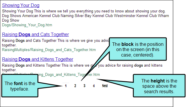
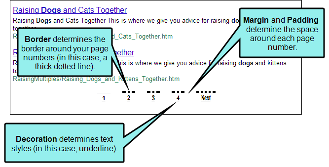
Search Results > Pagination
This controls the block, font, and height (i.e., distance from the last search result) of search pagination elements.

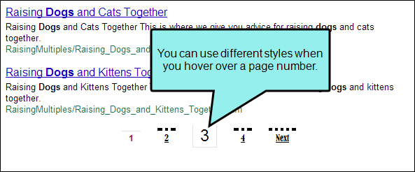
Search Results > Pagination > Item
This look of text in search pagination elements.

Search Results > Pagination > Item > (selected)
This controls the look of text of a search pagination element when it is selected.
Search Results > Pagination > Item > (hover)
This controls the look of text of a search pagination element when you hover over it.

Search Results > Featured Snippets
This is the main container holding the featured snippets result. In this style group you can set the Layout property to include the container or exclude it entirely from output.
Search Results > Featured Snippets > Item
This lets you control the look of each featured snippets container displaying the contents.
Search Results > Featured Snippets > Item > Phrase
If the Layout property is set to display the phrase, you can control the look of the phrase text and area for the output. By default, the phrase does not display.
Search Results > Featured Snippets > Item > Response
This lets you control the look and area for the featured snippet response.
Search Results > Featured Snippets > Item > Response > Link
This controls the look for the link with the featured snippet’s response. Items under this node (e.g., active, focus, hover, visited) control the look for when those user actions occur.
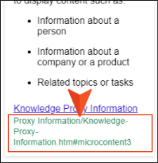
Search Results > Featured Snippets > Item > Response > Path
This shows the path to the file containing the search result, and controls how it looks in the output.

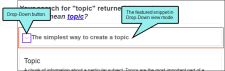
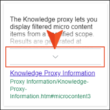
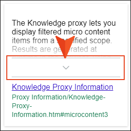
Search Results > Featured Snippets > Item > Truncate Button
In Skin Editor’s Setup tab, the micro content featured snippet view mode must be set at “Truncated” to see this option. You can control the look of the truncated button area. Items under this node (e.g., expand, collapse) control the look of the button for when those user actions occur.

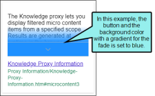
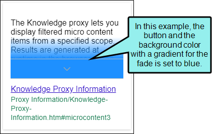
Search Results > Featured Snippets > Item > Truncate Fade
When the truncated view mode is enabled, you can set properties for the fade. (The fade properties can match the button properties, or they can be different.)
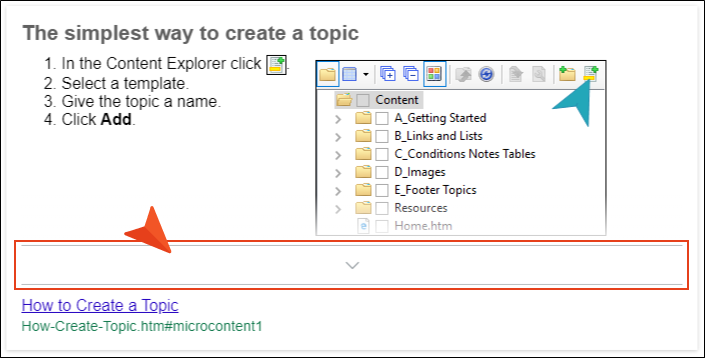
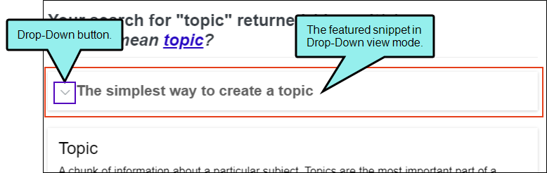
Search Results > Featured Snippets > Item > Drop-Down Button
In Skin Editor’s Setup tab, the micro content featured snippet view mode must be set at “Drop-Down” to see this option. You can control the look of the truncated button area. Items under this node (e.g., expand, collapse) control the look of the button for when those user actions occur.
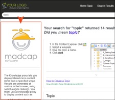
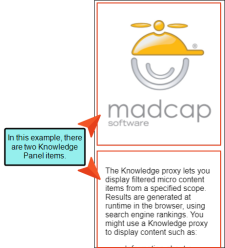
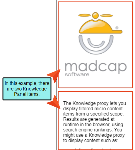
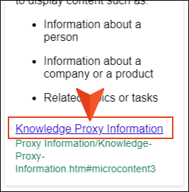
Search Results > Knowledge Panel
This is the main micro content container holding the Knowledge Panel in the HTML5 output’s search results. In this style group you can set the Layout property to include the container or exclude it entirely from output. You can customize the look of this container with many available styles, change the position of it, and more.
Search Results > Knowledge Panel > Item
This lets you control the look of each featured snippets container displaying the contents.
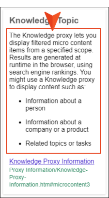
Search Results > Knowledge Panel > Item > Phrase
If the Layout property is set to display the phrase, you can control the look of the phrase text and area for the output. By default, the phrase does not display.

Search Results > Knowledge Panel > Item > Response
This lets you control the look and area for the Knowledge Panel response.
Search Results > Knowledge Panel > Item > Response > Link
This controls the look for the link with the Knowledge Panel’s response. Items under this node (e.g., active, focus, hover, visited) control the look for when those user actions occur.
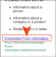
Search Results > Knowledge Panel > Item > Response > Path
This shows the path to the file containing the search result, and controls how it looks in the output.
Search Results > Knowledge Panel > Item > Truncate Button
In Skin Editor’s Setup tab, the micro content Knowledge Panel view mode must be set at “Truncated” to see this option. You can control the look of the truncated button area. Items under this node (e.g., expand, collapse) control the look of the button for when those user actions occur.
Search Results > Knowledge Panel > Item > Truncate Fade
When the truncated view mode is enabled, you can set properties for the fade. (The fade properties can match the button properties, or they can be different.)
Search Results > Knowledge Panel > Item > Drop-Down Button
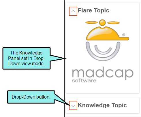
In Skin Editor’s Setup tab, the micro content Knowledge Panel view mode must be set at “Drop-Down” to see this option. You can control the look of the truncated button area. Items under this node (e.g., expand, collapse) control the look of the button for when those user actions occur.

-
Expand any of the nodes and complete the necessary fields. The properties and fields that you see are different for each node. Also, you might see nodes for a Tripane skin that you do not see for a Side or Top Navigation skin, and vice versa. Following is a general list in alphabetical order:
Background
You can change any of the following to affect the background:
-
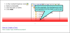
Gradient This lets you change the background color using a progression effect. Select the beginning gradient color in the first field, and then select a second gradient color in the second field. You can use any of the following to enter or select a color.

You can type a hexadecimal number (e.g., #000000) directly in this field. Alternatively, you can click the down arrow and choose a color or make the background transparent.

This opens the Color Picker dialog, which lets you choose a color in many ways. Note that you can select a CSS variable.

Adds a bar above the cursor. As you move the cursor over any area of your screen, the color changes in the bar to reflect the color that is directly behind the tip of the cursor. When you click, that color is loaded into the Color Picker dialog.
- Color This lets you select a single color.
- Image This lets you select an image for the background. Click
 and use the dialog to select an image file.
 - Repeat Use this field to tell Flare whether the image should repeat or not.
Note The Image field has the highest precedence, which means that if you enter settings in all of the Background fields, the image will win. Gradient has the next highest precedence. If you want to use the Color field, you need to make sure the Gradient fields are set to transparent and that there is no image selected.
Block
This is the container (or "block") holding content in an element. You can change any of the following to affect the block:
- Line Height This is how tall the container is that holds the content. In the first field type a number or use the arrows. Then click in the second field and select the unit of measurement (e.g., pixels, points, centimeters).
- Text Align This changes the alignment of the content. Click in the field and select an option (center, justify, left, right).
- Word Wrap You can click in the Word Wrap field and choose whether to wrap text for the element (normal) or not (nowrap).
Border
You can change any of the following to affect the border on the element:
-
Border Edge Fields (Top, Right, Bottom, Left) You can add a border line around any of the edges of the element. You can use any of the following. The first three fields are used to control the type and size of the border line. The last three fields are alternative ways to choose a color for the border.

You can select a type of line for the border (e.g., solid, dashed, dotted).

Type a number in the field or use the arrows to increase or decrease it.

Click in this field and select a unit of measurement (e.g., pixels, points, centimeters).

You can type a hexadecimal number (e.g., #000000) directly in this field. Alternatively, you can click the down arrow and choose a color.
This opens the Color Picker dialog, which lets you choose a color in many ways. Note that you can select a CSS variable.
Adds a bar above the cursor. As you move the cursor over any area of your screen, the color changes in the bar to reflect the color that is directly behind the tip of the cursor. When you click, that color is loaded into the Color Picker dialog.
- Border Radius Fields (Top Left, Top Right, Bottom Right, Bottom Left) If you want the element to have rounded corners, you can enter values in any of these fields. In the first field type a number or use the arrows. Then click in the second field and select the unit of measurement (e.g., pixels, points, centimeters). The higher the number, the more of a curve the corner will have.
Box Shadow
You can change any of the following to affect the box shadow on the element:
- Horizontal Shadow Length This is the position of the horizontal shadow. Negative values are allowed. In the first field type a number or use the arrows. Then click in the second field and select the unit of measurement (e.g., pixels, points, centimeters).
- Vertical Shadow Length This is the position of the vertical shadow. Negative values are allowed. In the first field type a number or use the arrows. Then click in the second field and select the unit of measurement (e.g., pixels, points, centimeters).
- Shadow Blur Length This is the blur distance. In the first field type a number or use the arrows. Then click in the second field and select the unit of measurement (e.g., pixels, points, centimeters).
-
Shadow Color This lets you select a color for the shadow. You can use any of the following:
You can type a hexadecimal number (e.g., #000000) directly in this field. Alternatively, you can click the down arrow and choose a color or make the background transparent.
This opens the Color Picker dialog, which lets you choose a color in many ways. Note that you can select a CSS variable.
Adds a bar above the cursor. As you move the cursor over any area of your screen, the color changes in the bar to reflect the color that is directly behind the tip of the cursor. When you click, that color is loaded into the Color Picker dialog.
- Shadow Inset This changes the shadow from an outer shadow (outset) to an inner shadow. Click in the field and select an option. If you select false the shadow will be outset. If you select true the shadow will be inset.
Font
You can change any of the following to affect the font:
-
Color This lets you select a color for the font. You can use any of the following:
You can type a hexadecimal number (e.g., #000000) directly in this field. Alternatively, you can click the down arrow and choose a color.
This opens the Color Picker dialog, which lets you choose a color in many ways. Note that you can select a CSS variable.
Adds a bar above the cursor. As you move the cursor over any area of your screen, the color changes in the bar to reflect the color that is directly behind the tip of the cursor. When you click, that color is loaded into the Color Picker dialog.
- Family You can select or type a specific font family (e.g., Arial, Tahoma, Verdana).
- Size You can change the font size. In the first field type a number or use the arrows. Then click in the second field and select the unit of measurement (e.g., pixels, points).
- Weight You can click in this field and make the font normal or bold.
- Style You can click in this field and make the font normal or italic.
Height
You enter a height for the element. In the first field type a number or use the arrows. Then click in the second field and select the unit of measurement (e.g., pixels, points, centimeters).
Layout
You can click in the Display field and choose one of the options (some of these options might not be available for certain styles):
-
none The element will not be shown.
-
block The element will be shown and adds a line break after it. For some elements this option might be called flex, which reflects the flexbox technology associated with it.
-
inline The element will be shown but does not add a line break after it, allowing it to be positioned next to other elements.
-
inline-block The element will be shown but does not add a line break after it, allowing it to be positioned next to other elements. This is similar to inline; however, with this option, a width and height can be set on the element, and top/bottom margin and padding settings are respected.
Margin
You can change the margin for any of the sides on the element (Left, Right, Top, Bottom). In the first field type a number or use the arrows. Then click in the second field and select the unit of measurement (e.g., pixels, points, centimeters).
Padding
You can change the padding for any of the sides on the element (Left, Right, Top, Bottom). In the first field type a number or use the arrows. Then click in the second field and select the unit of measurement (e.g., pixels, points, centimeters).
Position
You can change the position of Knowledge Panel elements. The micro content can be located to the left, or right of other search results (i.e., featured snippets or regular search items). Or they can also be placed in the middle, meaning that they align with other search results, but they display first, or above the other containers.
Side Panel
The side panel property displays only if the Knowledge Panel is set to a left or right position. You can customize the positioning of the element by adjusting the width and gap. For both attributes, in the first field type a number or use the arrows. Then click in the second field and select the unit of measurement (e.g., pixels, points, centimeters).
Size
You can change the height or width of the element. In the first field type a number or use the arrows. Then click in the second field and select the unit of measurement (e.g., pixels, points, centimeters).
Text Decoration
You can click in the Decoration field and select a text decoration (e.g., underline, line-through, overline, underline).
-
- Click
") to save your work.
to save your work.


What’s Noteworthy?
Note If you want to style the search bar and its elements, you can use the Header section in the Skin Editor.
