 Outputs Supported
You can edit micro content elements in your HTML5 output using full skins with topic proxies (e.g., FAQ, Knowledge, Promotion). However, for maximum control and customization you can add a micro content skin component for each topic proxy.
The interactive preview in the Skin Editor can be used to help you find the style you need to change. To use this, click Highlight in the local toolbar and click in the preview area to the right. The corresponding style is selected on the left side of the Skin Editor.
You can also use the following steps to find and edit the skin styles.
How to Specify Style Settings for Topic Proxies in HTML5
-
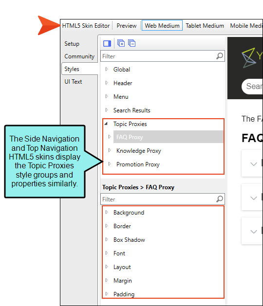
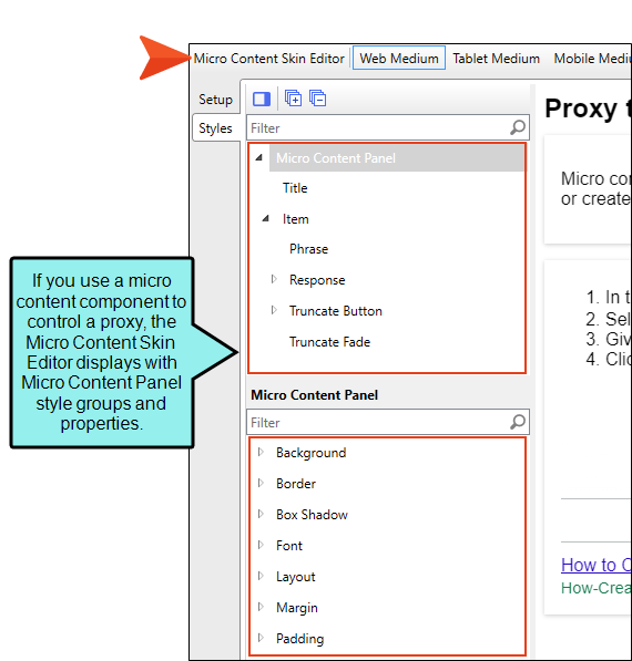
Open an HTML5 skin, or a micro content skin component (e.g., FAQ, Knowledge, Promotion).
If you use a Micro Content skin component, the skin opens in a Micro Content Skin Editor, which is a slimmed down version of the regular Skin Editor that has style groups and properties only for the proxy.
-
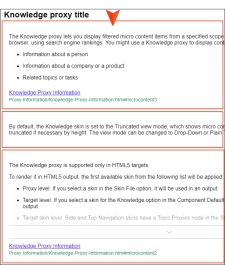
(Optional) Select the Setup tab, and choose between Truncated, Drop-Down, or Plain Text view modes for the proxy.
-
Select the Styles tab.
-
Make sure the Web Medium is selected.
-
On the left side of the editor, go to one of the following style groups, depending on the type of skin.
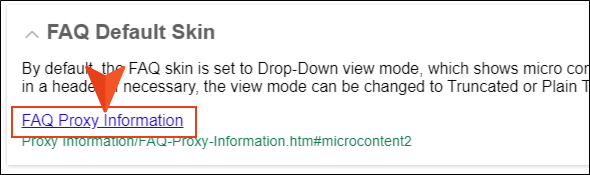
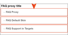
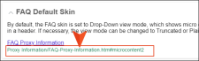
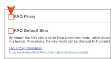
Topic Proxies > FAQ Proxy
This is the main FAQ proxy container holding micro content that displays in the HTML5 output’s search results. You can customize the look of this container with many available styles.
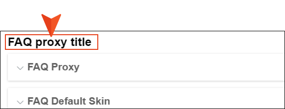
Topic Proxies > FAQ Proxy > Title
This lets you control the look and area for the proxy title.
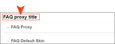
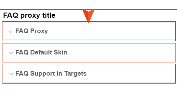
Topic Proxies > FAQ Proxy > Item
This lets you control the look of each FAQ proxy container displaying the contents.
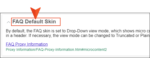
Topic Proxies > FAQ Proxy > Item > Phrase
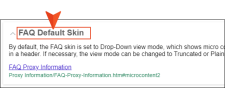
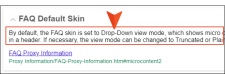
Since the Drop-Down view mode is the default for the FAQ proxy, this lets you control the look and area for the phrase text that displays for each drop-down item.
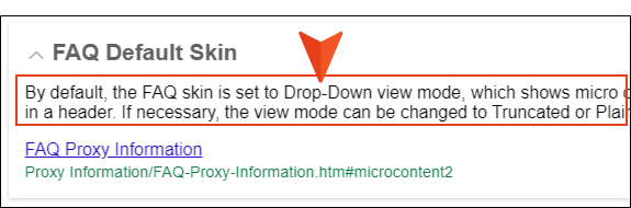
Topic Proxies > FAQ Proxy > Item > Response
This lets you control the look and area for the FAQ response.
Topic Proxies > FAQ Proxy > Item > Response > Link
This controls the look for the link with the FAQ response. Items under this node (e.g., active, focus, hover, visited) control the look for when those user actions occur.

Topic Proxies > FAQ Proxy > Item > Response > Path
This shows the path to the file containing the search result, and controls how it looks in the output.
Topic Proxies > FAQ Proxy > Item > Drop-Down Button
In Skin Editor’s Setup tab, the Proxy Options FAQ proxy view mode must be set at “Drop-Down” to see this option (and by default it is). You can control the look of the truncated button area. Items under this node (e.g., expand, collapse) control the look of the button for when those user actions occur.
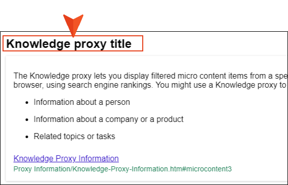
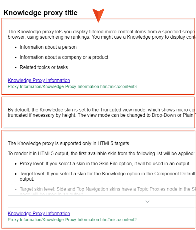
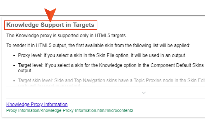
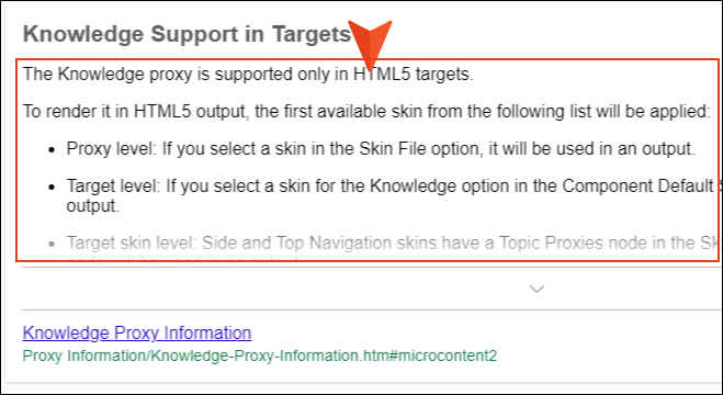
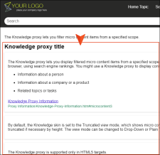
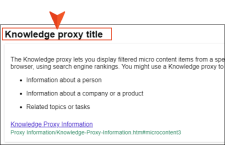
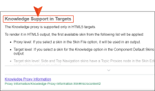
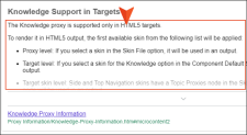
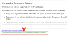
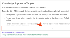
Topic Proxies > Knowledge Proxy
This is the main Knowledge proxy container holding micro content that displays in the HTML5 output’s search results. You can customize the look of this container with many available styles. By default, this container displays in output, but you can select to exclude it entirely from output.
Topic Proxies > Knowledge Proxy > Title
This lets you control the look and area for the proxy title.
Topic Proxies > Knowledge Proxy > Item
This lets you control the look of each Knowledge proxy container displaying the contents.
Topic Proxies > Knowledge Proxy > Item > Phrase
If the Layout property is set to display the phrase, you can control the look of the phrase text and area for the output. By default, the phrase does not display.
Topic Proxies > Knowledge Proxy > Item > Response
This lets you control the look and area for the Knowledge response.
Topic Proxies > Knowledge Proxy > Item > Response > Link
This controls the look for the link with the Knowledge response. Items under this node (e.g., active, focus, hover, visited) control the look for when those user actions occur.

Topic Proxies > Knowledge Proxy > Item > Response > Path
This shows the path to the file containing the search result, and controls how it looks in the output.
Topic Proxies > Knowledge Proxy > Item > Truncate Button
In Skin Editor’s Setup tab, the Proxy Options Knowledge proxy view mode must be set at “Truncated” to see this option (and by default it is). You can control the look of the truncated button area. Items under this node (e.g., expand, collapse) control the look of the button for when those user actions occur.
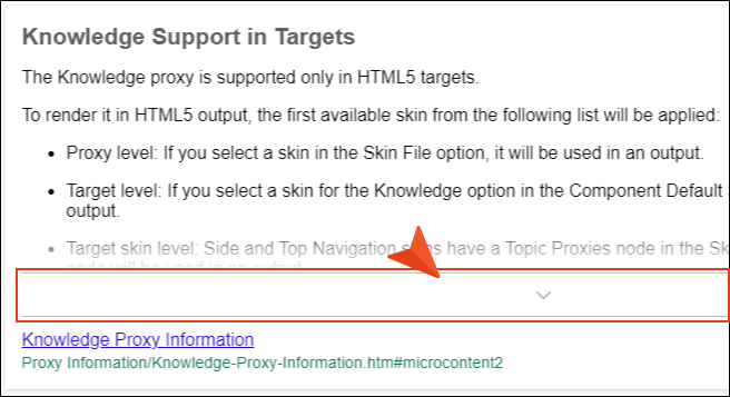
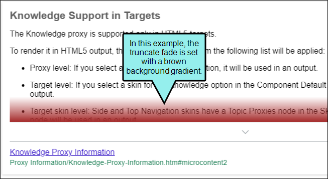
Topic Proxies > Knowledge Proxy > Item > Truncate Fade
When the truncated view mode is enabled, you can set properties for the fade.

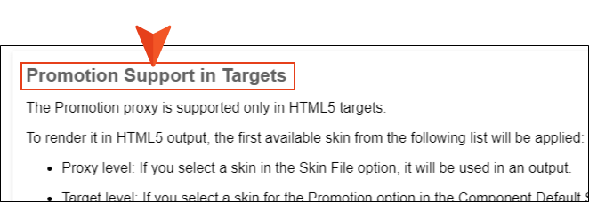
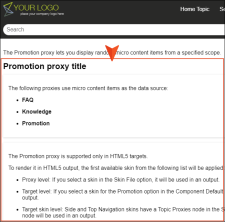
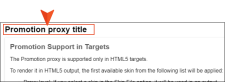
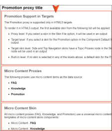
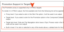
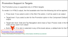
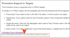
Topic Proxies > Promotion Proxy
This is the main Promotion proxy container holding micro content that displays in the HTML5 output’s search results. You can customize the look of this container with many available styles. By default, this container displays in output, but you can select to exclude it entirely from output.
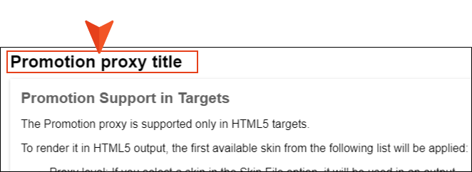
Topic Proxies > Promotion Proxy > Title
This lets you control the look and area for the proxy title.
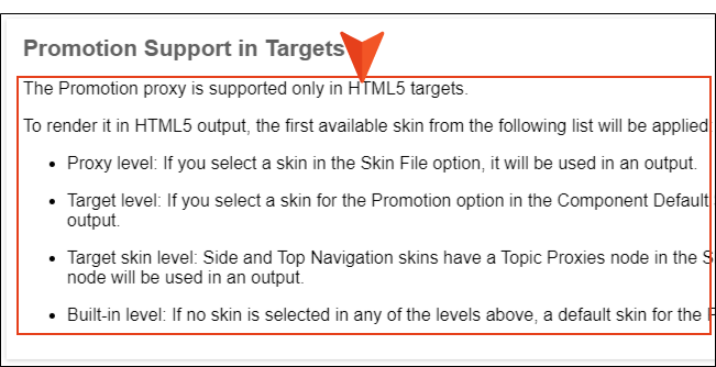
Topic Proxies > Promotion Proxy > Item
This lets you control the look of each Promotion proxy container displaying the contents.
Topic Proxies > Promotion Proxy > Item > Phrase
If the Layout property is set to display the phrase, you can control the look of the phrase text and area for the output. By default, the phrase does not display.

Topic Proxies > Promotion Proxy > Item > Response
This lets you control the look and area for the Promotion response.
Topic Proxies > Promotion Proxy > Item > Response > Link
If the Layout property is set to display the link, you can control the look of the text and area for the output. By default, the link does not display. Items under this node (e.g., active, focus, hover, visited) control the look for when those user actions occur.
Topic Proxies > Promotion Proxy > Item > Response > Path
If the Layout property is set to display the path, you can control the look of the text and area for the output. This shows the path to the file containing the search result.
Micro Content Panel
This only displays if you are using a Micro Content skin component rather than a full skin. This is the main proxy container holding FAQ, Knowledge, or Promotion micro content that displays in the HTML5 output’s search results.
All three micro content proxies use a universal micro content skin component, but each of the three proxy templates are designed with a default view for the corresponding proxy. You can insert micro content proxies into template pages, control positioning with responsive layouts, and customize the look of this container with many available styles.
-
Expand any of the nodes and complete the necessary fields. The properties and fields that you see are different for each node. Following is a general list in alphabetical order:
Background
You can change any of the following to affect the background:
-
Gradient This lets you change the background color using a progression effect. Select the beginning gradient color in the first field, and then select a second gradient color in the second field. You can use any of the following to enter or select a color.

You can type a hexadecimal number (e.g., #000000) directly in this field. Alternatively, you can click the down arrow and choose a color or make the background transparent.

This opens the Color Picker dialog, which lets you choose a color in many ways. Note that you can select a CSS variable.

Adds a bar above the cursor. As you move the cursor over any area of your screen, the color changes in the bar to reflect the color that is directly behind the tip of the cursor. When you click, that color is loaded into the Color Picker dialog.
- Color This lets you select a single color.
- Image This lets you select an image for the background. Click
 and use the dialog to select an image file.
 - Repeat Use this field to tell Flare whether the image should repeat or not.
Note The Image field has the highest precedence, which means that if you enter settings in all of the Background fields, the image will win. Gradient has the next highest precedence. If you want to use the Color field, you need to make sure the Gradient fields are set to transparent and that there is no image selected.
Block
This is the container (or "block") holding content in an element. You can change any of the following to affect the block:
- Line Height This is how tall the container is that holds the content. In the first field type a number or use the arrows. Then click in the second field and select the unit of measurement (e.g., pixels, points, centimeters).
- Text Align This changes the alignment of the content. Click in the field and select an option (center, justify, left, right).
- Word Wrap You can click in the Word Wrap field and choose whether to wrap text for the element (normal) or not (nowrap).
Border
You can change any of the following to affect the border on the element:
-
Border Edge Fields (Top, Right, Bottom, Left) You can add a border line around any of the edges of the element. You can use any of the following. The first three fields are used to control the type and size of the border line. The last three fields are alternative ways to choose a color for the border.

You can select a type of line for the border (e.g., solid, dashed, dotted).

Type a number in the field or use the arrows to increase or decrease it.

Click in this field and select a unit of measurement (e.g., pixels, points, centimeters).

You can type a hexadecimal number (e.g., #000000) directly in this field. Alternatively, you can click the down arrow and choose a color.
This opens the Color Picker dialog, which lets you choose a color in many ways. Note that you can select a CSS variable.
Adds a bar above the cursor. As you move the cursor over any area of your screen, the color changes in the bar to reflect the color that is directly behind the tip of the cursor. When you click, that color is loaded into the Color Picker dialog.
- Border Radius Fields (Top Left, Top Right, Bottom Right, Bottom Left) If you want the element to have rounded corners, you can enter values in any of these fields. In the first field type a number or use the arrows. Then click in the second field and select the unit of measurement (e.g., pixels, points, centimeters). The higher the number, the more of a curve the corner will have.
Box Shadow
You can change any of the following to affect the box shadow on the element:
- Horizontal Shadow Length This is the position of the horizontal shadow. Negative values are allowed. In the first field type a number or use the arrows. Then click in the second field and select the unit of measurement (e.g., pixels, points, centimeters).
- Vertical Shadow Length This is the position of the vertical shadow. Negative values are allowed. In the first field type a number or use the arrows. Then click in the second field and select the unit of measurement (e.g., pixels, points, centimeters).
- Shadow Blur Length This is the blur distance. In the first field type a number or use the arrows. Then click in the second field and select the unit of measurement (e.g., pixels, points, centimeters).
-
Shadow Color This lets you select a color for the shadow. You can use any of the following:
You can type a hexadecimal number (e.g., #000000) directly in this field. Alternatively, you can click the down arrow and choose a color or make the background transparent.
This opens the Color Picker dialog, which lets you choose a color in many ways. Note that you can select a CSS variable.
Adds a bar above the cursor. As you move the cursor over any area of your screen, the color changes in the bar to reflect the color that is directly behind the tip of the cursor. When you click, that color is loaded into the Color Picker dialog.
- Shadow Inset This changes the shadow from an outer shadow (outset) to an inner shadow. Click in the field and select an option. If you select false the shadow will be outset. If you select true the shadow will be inset.
Font
You can change any of the following to affect the font:
-
Color This lets you select a color for the font. You can use any of the following:
You can type a hexadecimal number (e.g., #000000) directly in this field. Alternatively, you can click the down arrow and choose a color.
This opens the Color Picker dialog, which lets you choose a color in many ways. Note that you can select a CSS variable.
Adds a bar above the cursor. As you move the cursor over any area of your screen, the color changes in the bar to reflect the color that is directly behind the tip of the cursor. When you click, that color is loaded into the Color Picker dialog.
- Family You can select or type a specific font family (e.g., Arial, Tahoma, Verdana).
- Size You can change the font size. In the first field type a number or use the arrows. Then click in the second field and select the unit of measurement (e.g., pixels, points).
- Weight You can click in this field and make the font normal or bold.
- Style You can click in this field and make the font normal or italic.
Height
You enter a height for the element. In the first field type a number or use the arrows. Then click in the second field and select the unit of measurement (e.g., pixels, points, centimeters).
Layout
You can click in the Display field and choose one of the options (some of these options might not be available for certain styles):
-
none The element will not be shown.
-
block The element will be shown and adds a line break after it. For some elements this option might be called flex, which reflects the flexbox technology associated with it.
-
inline The element will be shown but does not add a line break after it, allowing it to be positioned next to other elements.
-
inline-block The element will be shown but does not add a line break after it, allowing it to be positioned next to other elements. This is similar to inline; however, with this option, a width and height can be set on the element, and top/bottom margin and padding settings are respected.
Margin
You can change the margin for any of the sides on the element (Left, Right, Top, Bottom). In the first field type a number or use the arrows. Then click in the second field and select the unit of measurement (e.g., pixels, points, centimeters).
Padding
You can change the padding for any of the sides on the element (Left, Right, Top, Bottom). In the first field type a number or use the arrows. Then click in the second field and select the unit of measurement (e.g., pixels, points, centimeters).
Size
You can change the height or width of the element. In the first field type a number or use the arrows. Then click in the second field and select the unit of measurement (e.g., pixels, points, centimeters).
Text decoration
You can click in the Decoration field and select a text decoration (e.g., underline, line-through, overline, underline).
-