 Outputs Supported
This section is used to control the look of navigation elements in the skin, which allow users to open different parts of your output. In Side and Top Navigation skins, the navigation part of the skin is used only for Tablet and Mobile mediums, to determine the look of navigation in slide-out menus for small screens. In Tripane skins, the navigation part of the skin is used for all mediums—Web, Tablet, and Mobile.
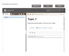
The interactive preview in the Skin Editor can be used to help you find the style you need to change. To use this, click Highlight in the local toolbar and click in the preview area to the right. The corresponding style is selected on the left side of the Skin Editor.
You can also use the following steps to find and edit the skin styles.
How to Specify Style Settings for Navigation Elements in HTML5
- Open an HTML5 skin.
- Select the Styles tab.
- (Optional) If you are using responsive output, make sure you select the appropriate medium—Web, Tablet, or Mobile—in the local toolbar before making changes to styles.
-
On the left side of the editor, expand and select any of the following Navigation style groups. (The Navigation section is not visible in Side or Top Navigation skins until you select the Tablet or Mobile medium.)
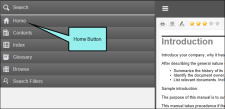
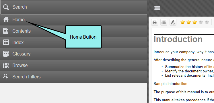
Navigation > Home Button
In Tripane skins, this controls the button that users see in the slide out in Tablet and Mobile views.
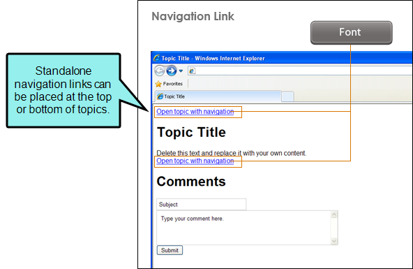
Navigation > Navigation Link
In Tripane skins, these are links that users may see at the top or bottom of topics if they open those topics as standalone files. In order to add these links to the output, you must enable them on the Setup tab of the Skin Editor.
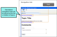
This style has properties both at the root and on children nodes.
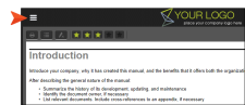
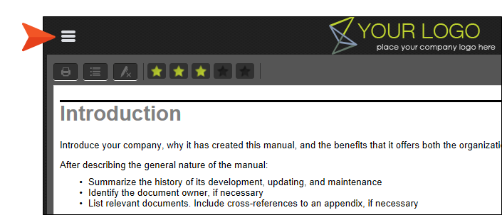
Navigation > Navigation Slide Out Button
This controls the button that people use in Tablet and Mobile views to access the slide out navigation.
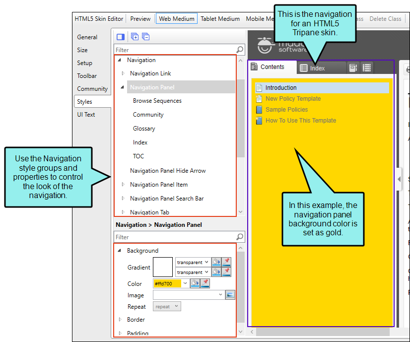
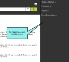
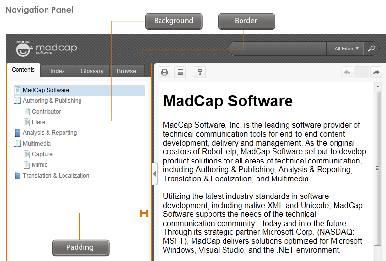
Navigation > Navigation Panel
In Tripane skins, this controls the panel area that contains the following elements: Browse Sequence, Community, Glossary, Index, Search Filters, and TOC.
This style has properties both at the root and on children nodes.
In Side, Top, and Tripane Skins, this controls the panel area that slides out in Tablet and Mobile mediums for small screens.
Note The TOC node under the Navigation Panel style lets you change icons in general for all books/topics in a TOC. If instead you want to change the book or topic icons only for specific entries in your TOC, use the TOC Entry style instead, creating classes for it.
Note The Community element is available only in the Web medium.
Note The Search Filters element is available only in the Tablet and Mobile mediums.
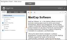
Navigation > Navigation Panel Hide Arrow
In Tripane skins, this controls the look of the arrow button that is shown on the divider between the navigation elements and content in Web view. Users can click this button to show or hide the navigation elements.
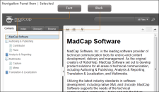
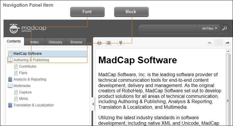
Navigation > Navigation Panel Item
This controls the look of text in navigation panel elements.

Navigation > Navigation Panel Item (hover)
This controls the look of text in navigation panel elements when a user hovers over it.
Navigation > Navigation Panel Item (selected)
This controls the look of text in navigation panel elements when it is selected.
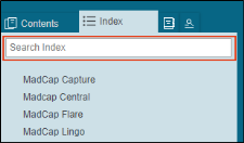
Navigation > Navigation Panel Search Bar
In Tripane skins, this controls the look of the search field that users see in some navigation elements (e.g., Index, Glossary).
Navigation > Navigation Tab
In Tripane skins, this controls the look of the tab area at the top of each navigation element. For example, you might want to change the height or width, or change the tab layout to specify if the tab should show an image then text, text then an image, text only, or an image only. If you want to change other characteristics, such as the color or the icon images themselves, you need to use either the Navigation Tab (active) or Navigation Tab (inactive) style.

This style has properties both at the root and on children nodes.
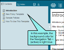
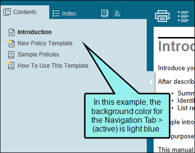
Navigation > Navigation Tab > (active)
In Tripane skins, this controls the look of the tab area at the top of each navigation element when the tab is selected.
This style has properties both at the root and on children nodes.
To change the color of the tab, including the strip around the edge of the panel, you can modify the background of the Navigation Tab (active) style.
Navigation > Navigation Tab > (inactive)
In Tripane skins, this controls the look of the tab area at the top of each navigation element when the tab is not selected.
This style has properties both at the root and on children nodes.
Navigation > TOC Entry
In Tripane skins, this is the "Marked as New" icon used for new items.
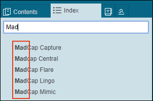
Navigation > Index Highlight
In Tripane skins, this is the highlighting that is seen when a user begins typing in the Index search field.
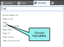
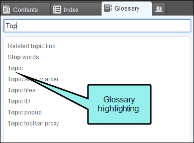
Navigation > Glossary Highlight
In Tripane skins, this is the highlighting that is seen when a user begins typing in the Glossary search field.
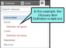
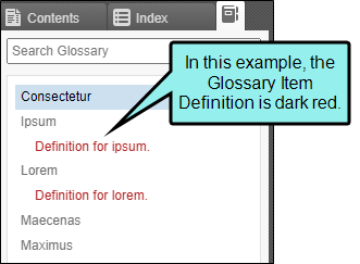
Navigation > Glossary Item Definition
In Tripane skins, this controls the look of the definition entry for glossary items.
-
Expand any of the nodes and complete the necessary fields. The properties and fields that you see are different for each node. Following is a general list in alphabetical order:
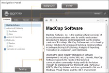
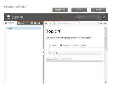
Background
You can change any of the following to affect the background:
-
Gradient This lets you change the background color using a progression effect. Select the beginning gradient color in the first field, and then select a second gradient color in the second field. You can use any of the following to enter or select a color.

You can type a hexadecimal number (e.g., #000000) directly in this field. Alternatively, you can click the down arrow and choose a color or make the background transparent.

This opens the Color Picker dialog, which lets you choose a color in many ways. Note that you can select a CSS variable.

Adds a bar above the cursor. As you move the cursor over any area of your screen, the color changes in the bar to reflect the color that is directly behind the tip of the cursor. When you click, that color is loaded into the Color Picker dialog.
- Color This lets you select a single color.
- Image This lets you select an image for the background. Click
 and use the dialog to select an image file.
 - Repeat Use this field to tell Flare whether the image should repeat or not.
Note The Image field has the highest precedence, which means that if you enter settings in all of the Background fields, the image will win. Gradient has the next highest precedence. If you want to use the Color field, you need to make sure the Gradient fields are set to transparent and that there is no image selected.
Block
This is the container (or "block") holding content in an element. You can change any of the following to affect the block:
- Line Height This is how tall the container is that holds the content. In the first field type a number or use the arrows. Then click in the second field and select the unit of measurement (e.g., pixels, points, centimeters).
- Text Align This changes the alignment of the content. Click in the field and select an option (center, justify, left, right).
- Word Wrap You can click in the Word Wrap field and choose whether to wrap text for the element (normal) or not (nowrap).
Border
You can change any of the following to affect the border on the element:
-
Border Edge Fields (Top, Right, Bottom, Left) You can add a border line around any of the edges of the element. You can use any of the following. The first three fields are used to control the type and size of the border line. The last three fields are alternative ways to choose a color for the border.

You can select a type of line for the border (e.g., solid, dashed, dotted).

Type a number in the field or use the arrows to increase or decrease it.

Click in this field and select a unit of measurement (e.g., pixels, points, centimeters).

You can type a hexadecimal number (e.g., #000000) directly in this field. Alternatively, you can click the down arrow and choose a color.
This opens the Color Picker dialog, which lets you choose a color in many ways. Note that you can select a CSS variable.
Adds a bar above the cursor. As you move the cursor over any area of your screen, the color changes in the bar to reflect the color that is directly behind the tip of the cursor. When you click, that color is loaded into the Color Picker dialog.
- Border Radius Fields (Top Left, Top Right, Bottom Right, Bottom Left) If you want the element to have rounded corners, you can enter values in any of these fields. In the first field type a number or use the arrows. Then click in the second field and select the unit of measurement (e.g., pixels, points, centimeters). The higher the number, the more of a curve the corner will have.
Bottom
You can change any of the following to affect the font for the navigation link when it appears at the bottom of a topic:
-
Color This lets you select a color for the font. You can use any of the following:
You can type a hexadecimal number (e.g., #000000) directly in this field. Alternatively, you can click the down arrow and choose a color.
This opens the Color Picker dialog, which lets you choose a color in many ways. Note that you can select a CSS variable.
Adds a bar above the cursor. As you move the cursor over any area of your screen, the color changes in the bar to reflect the color that is directly behind the tip of the cursor. When you click, that color is loaded into the Color Picker dialog.
- Family You can select or type a specific font family (e.g., Arial, Tahoma, Verdana).
- Size You can change the font size. In the first field type a number or use the arrows. Then click in the second field and select the unit of measurement (e.g., pixels, points).
- Weight You can click in this field and make the font normal or bold.
- Style You can click in this field and make the font normal or italic.
Font
You can change any of the following to affect the font:
-
Color This lets you select a color for the font. You can use any of the following:
You can type a hexadecimal number (e.g., #000000) directly in this field. Alternatively, you can click the down arrow and choose a color.
This opens the Color Picker dialog, which lets you choose a color in many ways. Note that you can select a CSS variable.
Adds a bar above the cursor. As you move the cursor over any area of your screen, the color changes in the bar to reflect the color that is directly behind the tip of the cursor. When you click, that color is loaded into the Color Picker dialog.
- Family You can select or type a specific font family (e.g., Arial, Tahoma, Verdana).
- Size You can change the font size. In the first field type a number or use the arrows. Then click in the second field and select the unit of measurement (e.g., pixels, points).
- Weight You can click in this field and make the font normal or bold.
- Style You can click in this field and make the font normal or italic.
General
You can change the color for the element.
You can type a hexadecimal number (e.g., #000000) directly in this field. Alternatively, you can click the down arrow and choose a color.
This opens the Color Picker dialog, which lets you choose a color in many ways. Note that you can select a CSS variable.
Adds a bar above the cursor. As you move the cursor over any area of your screen, the color changes in the bar to reflect the color that is directly behind the tip of the cursor. When you click, that color is loaded into the Color Picker dialog.
Glossary
You can expand the Layout node, click in the Display field, and choose whether to show the search bar in the Glossary pane. If you want to show it, select block. If you do not want to show it, select none.
Height
You enter a height for the element. In the first field type a number or use the arrows. Then click in the second field and select the unit of measurement (e.g., pixels, points, centimeters).
Icon
You can click
and select a different image to be used for the element.Icons
You can click
and select a different image for any of the following TOC entry icons:- Closed Book Icon You can select a different icon image for the book items in the TOC when they are closed.
- Open Book Icon You can select a different icon image for the book items in the TOC when they are open (or selected).
- Topic Icon You can select a different icon image for the topic items in the TOC.
- Mark As New Icon You can select a different icon image for the topic items in the TOC when they are marked as new.
Important If you are setting these under the Toc Entry style (instead of the Navigation Panel style), you must first create a class of the Toc Entry style and then choose the images for that class. Selecting images in the root fields under Toc Entry will do nothing. To create a class, select Toc Entry and in the local toolbar click Add Class. You will also need to open your TOC, right-click on an entry, select Properties, and on the General tab choose the Style Class that you created.
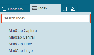
Index
You can expand the Layout node, click in the Display field, and choose whether to show the search bar in the Index pane. If so, select block. If not, select none.
Layout
You can click in the Display field and choose one of the options (some of these options might not be available for certain styles):
-
none The element will not be shown.
-
block The element will be shown and adds a line break after it. For some elements this option might be called flex, which reflects the flexbox technology associated with it.
-
inline The element will be shown but does not add a line break after it, allowing it to be positioned next to other elements.
-
inline-block The element will be shown but does not add a line break after it, allowing it to be positioned next to other elements. This is similar to inline; however, with this option, a width and height can be set on the element, and top/bottom margin and padding settings are respected.
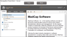
Padding
You can change the padding for any of the sides on the element (Left, Right, Top, Bottom). In the first field type a number or use the arrows. Then click in the second field and select the unit of measurement (e.g., pixels, points, centimeters).
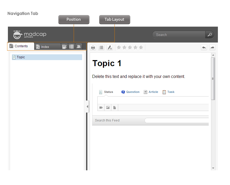
Position
You can change the position of the element, meaning its width and height:
- Width You enter a width for the element. In the first field type a number or use the arrows. Then click in the second field and select the unit of measurement (e.g., pixels, points, centimeters).
- Height You enter a height for the element. In the first field type a number or use the arrows. Then click in the second field and select the unit of measurement (e.g., pixels, points, centimeters).
Tab Layout
You can change what appears in the navigation tabs and their order. Click the Layout field and select one of the layout options (TextOnly, ImageOnly, TextThenImage, ImageThenText).
Note One of the benefits of having image icons on the navigation tabs is that it lets users drag the pane to reduce its width more than they could otherwise. The text disappears, and tooltips on the image icons let you know what a particular tab contains.
Text Shadow
You can change any of the following to affect the text shadow on the element:
- Shadow Visibility You can click in this field and choose to make the shadow either hidden or visible.
- Horizontal Shadow Length This is the position of the horizontal shadow. Negative values are allowed. In the first field type a number or use the arrows. Then click in the second field and select the unit of measurement (e.g., pixels, points, centimeters).
- Vertical Shadow Length This is the position of the vertical shadow. Negative values are allowed. In the first field type a number or use the arrows. Then click in the second field and select the unit of measurement (e.g., pixels, points, centimeters).
- Shadow Blur Length This is the blur distance. In the first field type a number or use the arrows. Then click in the second field and select the unit of measurement (e.g., pixels, points, centimeters).
-
Shadow Color This lets you select a color for the shadow. You can use any of the following:
You can type a hexadecimal number (e.g., #000000) directly in this field. Alternatively, you can click the down arrow and choose a color or make the background transparent.
This opens the Color Picker dialog, which lets you choose a color in many ways. Note that you can select a CSS variable.
Adds a bar above the cursor. As you move the cursor over any area of your screen, the color changes in the bar to reflect the color that is directly behind the tip of the cursor. When you click, that color is loaded into the Color Picker dialog.
Top
You can change any of the following to affect the font for the navigation link when it appears at the top of a topic:
-
Color This lets you select a color for the font. You can use any of the following:
You can type a hexadecimal number (e.g., #000000) directly in this field. Alternatively, you can click the down arrow and choose a color.
This opens the Color Picker dialog, which lets you choose a color in many ways. Note that you can select a CSS variable.
Adds a bar above the cursor. As you move the cursor over any area of your screen, the color changes in the bar to reflect the color that is directly behind the tip of the cursor. When you click, that color is loaded into the Color Picker dialog.
- Family You can select or type a specific font family (e.g., Arial, Tahoma, Verdana).
- Size You can change the font size. In the first field type a number or use the arrows. Then click in the second field and select the unit of measurement (e.g., pixels, points).
- Weight You can click in this field and make the font normal or bold.
- Style You can click in this field and make the font normal or italic.
-
- Click
") to save your work.
to save your work.


Note In order to see navigation items in the Tripane output, you must make sure they are added to the skin.
Note Use the UI Text tab in the editor to change labels and default values for these styles.
