 Outputs Supported


Note Responsive content is supported in Clean XHTML output only if you do not select the target option to convert styles to inline. Responsive skins are not supported in Clean XHTML.
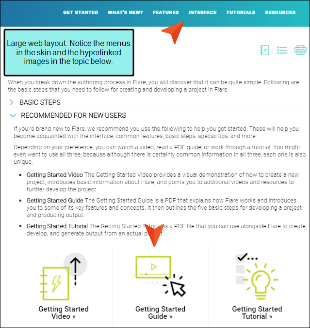
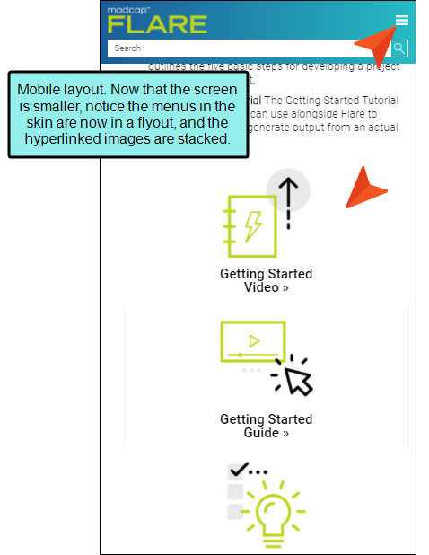
Responsive web design (RWD) is a way to construct your HTML5 output so that the display and content are adjusted automatically depending on the device. Therefore, on tablets and mobile devices such as smart phones, users will see a condensed look and perhaps different text that is more appropriate for those devices, compared with larger monitors. You can get the same effect if you shrink your browser to a smaller size.
|
|
|
|
|
|