 Outputs Supported
Important Feedback is deprecated in Flare, which means that it is slated to be removed in a future version.
If you integrate your output with MadCap Feedback, you can use styles in a skin to control different elements.
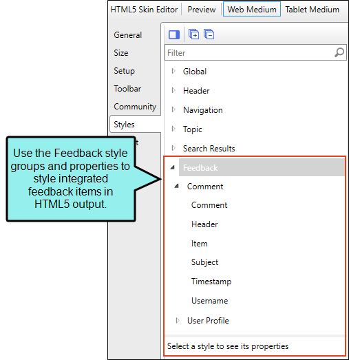
How to Specify Style Settings for Feedback in HTML5
- Open an HTML5 Tripane skin.
- If you are using responsive output, make sure you select Web Medium in the local toolbar. Feedback integration is not supported in the Tablet and Mobile views, although topic rating stars will display in the topic toolbar.
- Select the Styles tab.
-
On the left side of the editor, expand and select any of the Feedback style groups:
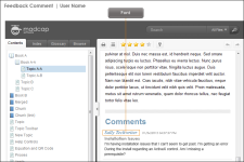
Feedback > Comment > Comment
This lets you control the look of topic comment text.
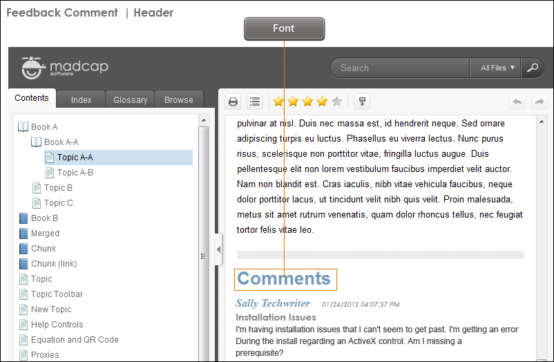
Feedback > Comment > Header
This lets you control the look of the header text that appears above comments in a topic.

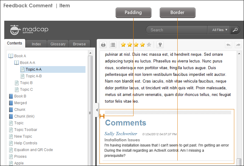
Feedback > Comment > Item
This lets you control the look of the container displaying the contents, including header and the comments.
Feedback > Comment > Subject
This lets you control the look of the subject text that appears just above a comment.
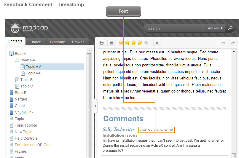
Feedback > Comment > Timestamp
This lets you control the look of the date and time that appears in a comment.
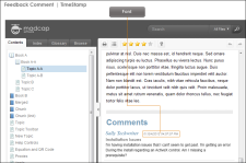
Feedback > Comment > Username
This lets you control the look of the user's name that appears in a comment.
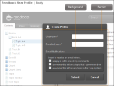
Feedback > User Profile > Body
This lets you control the look of the interface used for creating a profile.
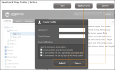
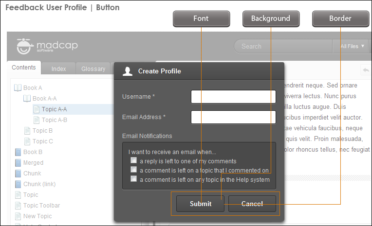
Feedback > User Profile > Button
This lets you control the look of the buttons in the interface that is used for creating a profile.
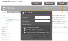
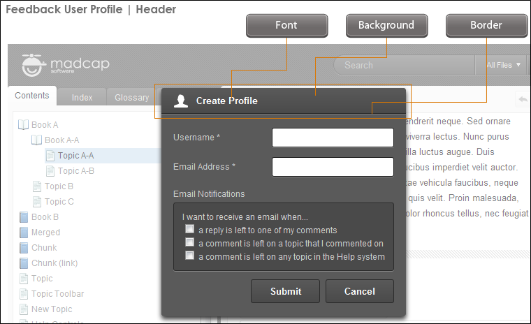
Feedback > User Profile > Header
This lets you control the look of the header text in the interface that is used for creating a profile.
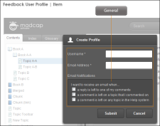
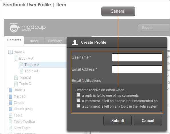
Feedback > User Profile > Item
The Feedback User Profile dialog always includes a "Username" and "E-mail Address" field. In addition to those fields, you can add many others by using the Community tab in the Skin Editor.
Once you've added the fields, you can edit User Profile items in the skin to specify which fields are required for users to complete.
The User Profile style group has properties both at the root and on children nodes. In addition to the many standard fields that can be included (e.g., Address1, City, Department, Occupation), you can add up to 10 custom fields (e.g., Custom1, Custom2, Custom3), which can be used for any kind of field not already available.
If you want the setting(s) to be applied to all of the items, complete the General > Required field under the User Profile > Item style group itself. Otherwise, select any of the children (Address1, Address2, Birthdate, etc.) to apply settings to them individually.
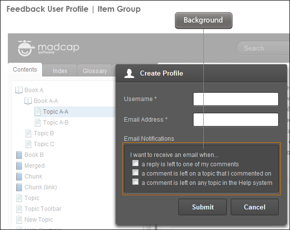
Feedback > User Profile > Item Group
This lets you control the look of the container holding fields in the interface when creating a profile.

Feedback > User Profile > Item Input
This lets you control the look of the text that users type in fields when creating a profile.

Feedback > User Profile > Item Label
This lets you control the look of the field label text in the interface that is used for creating a profile.
-
Expand any of the nodes and complete the necessary fields. The properties and fields that you see are different for each node. Following is a general list in alphabetical order:
Background
You can change any of the following to affect the background:
-
Gradient This lets you change the background color using a progression effect. Select the beginning gradient color in the first field, and then select a second gradient color in the second field. You can use any of the following to enter or select a color.

You can type a hexadecimal number (e.g., #000000) directly in this field. Alternatively, you can click the down arrow and choose a color or make the background transparent.

This opens the Color Picker dialog, which lets you choose a color in many ways. Note that you can select a CSS variable.

Adds a bar above the cursor. As you move the cursor over any area of your screen, the color changes in the bar to reflect the color that is directly behind the tip of the cursor. When you click, that color is loaded into the Color Picker dialog.
- Color This lets you select a single color.
- Image This lets you select an image for the background. Click
 and use the dialog to select an image file.
 - Repeat Use this field to tell Flare whether the image should repeat or not.
Note The Image field has the highest precedence, which means that if you enter settings in all of the Background fields, the image will win. Gradient has the next highest precedence. If you want to use the Color field, you need to make sure the Gradient fields are set to transparent and that there is no image selected.
Border
You can change any of the following to affect the border on the element:
-
Border Edge Fields (Top, Right, Bottom, Left) You can add a border line around any of the edges of the element. You can use any of the following. The first three fields are used to control the type and size of the border line. The last three fields are alternative ways to choose a color for the border.

You can select a type of line for the border (e.g., solid, dashed, dotted).

Type a number in the field or use the arrows to increase or decrease it.

Click in this field and select a unit of measurement (e.g., pixels, points, centimeters).

You can type a hexadecimal number (e.g., #000000) directly in this field. Alternatively, you can click the down arrow and choose a color.
This opens the Color Picker dialog, which lets you choose a color in many ways. Note that you can select a CSS variable.
Adds a bar above the cursor. As you move the cursor over any area of your screen, the color changes in the bar to reflect the color that is directly behind the tip of the cursor. When you click, that color is loaded into the Color Picker dialog.
- Border Radius Fields (Top Left, Top Right, Bottom Right, Bottom Left) If you want the element to have rounded corners, you can enter values in any of these fields. In the first field type a number or use the arrows. Then click in the second field and select the unit of measurement (e.g., pixels, points, centimeters). The higher the number, the more of a curve the corner will have.
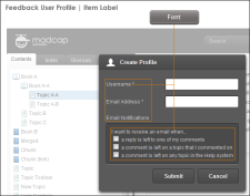
Font
You can change any of the following to affect the font:
-
Color This lets you select a color for the font. You can use any of the following:
You can type a hexadecimal number (e.g., #000000) directly in this field. Alternatively, you can click the down arrow and choose a color.
This opens the Color Picker dialog, which lets you choose a color in many ways. Note that you can select a CSS variable.
Adds a bar above the cursor. As you move the cursor over any area of your screen, the color changes in the bar to reflect the color that is directly behind the tip of the cursor. When you click, that color is loaded into the Color Picker dialog.
- Family You can select or type a specific font family (e.g., Arial, Tahoma, Verdana).
- Size You can change the font size. In the first field type a number or use the arrows. Then click in the second field and select the unit of measurement (e.g., pixels, points).
- Weight You can click in this field and make the font normal or bold.
- Style You can click in this field and make the font normal or italic.
General
You can click in the Required field and choose whether to make the element required (true) or not (false).
Padding
You can change the padding for any of the sides on the element (Left, Right, Top, Bottom). In the first field type a number or use the arrows. Then click in the second field and select the unit of measurement (e.g., pixels, points, centimeters).
-
- Click
") to save your work.
to save your work.


Note In order to see these items in the output, you must enable Feedback with your output.
Note Use the UI Text tab in the Skin Editor to change labels for some of these styles.
