 Outputs Supported
The eLearning Toolbar skin component dictates the general appearance for the navigation elements in your course. You can edit the eLearning Toolbar skin component to select which buttons are included in the course and control how they look and feel in the output.
[Menu Proxy — Headings — Online — Depth3 ]
How to Edit the eLearning Toolbar Skin Component
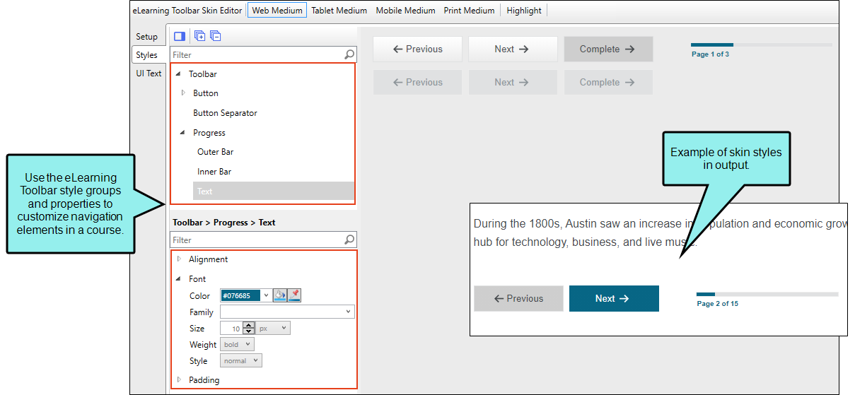
Edit the eLearning Toolbar skin component to customize what the toolbar should look like when a learner navigates through a course. In the eLearning Toolbar Skin Editor, there are three tabs where you can make changes to the toolbar.
-
From the Project Organizer, expand the Skins folder, and double-click the skin for eLearning. The eLearning Toolbar Skin Editor opens.
-
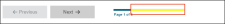
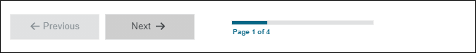
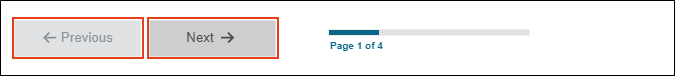
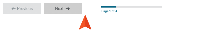
Select the Setup tab, and choose the toolbar buttons to include. By default the Previous Topic, Next Topic, and Progress Bar are selected to display in the output. You can use the bottom local toolbar to delete and arrange items, or add a separator element.
-
Select the Styles tab. Using this tab you can customize the look and feel of the toolbar, individual buttons, and the progress bar.
-
(Optional) If you are using responsive output, make sure you select the appropriate medium—Web, Tablet, or Mobile—in the local toolbar before making changes to styles.
-
In the editor, expand and select any of the Toolbar style groups.
Tip To quickly find a style to edit, from the local toolbar, click the Highlight button. This enables Highlight mode, where the right panel in the editor is a live preview. Click any part of the live preview and it locates the corresponding style in the left panel to edit. Once a style is updated, it displays as such in the live preview.
Toolbar
This controls the look and feel of the entire toolbar.
Toolbar > Button
This controls how the buttons look (e.g., Previous, Next, and Complete). You can customize each button individually.
Toolbar > Button > (hover)
This controls how a toolbar button looks when it is hovered over with a mouse. You can customize each button individually.

Toolbar > Button > (disabled)
This controls how a toolbar button looks when it is in a disabled state. You can customize each button individually.

Toolbar > Button Separator
This controls the look of separators if added to the toolbar. A separator is the divider between the toolbar buttons.
Note You won't see the separator updates in the eLearning Toolbar Skin Editor, but it does display in the output if it is added to your skin. To see a separator, you first need to add it from the Setup tab. Click
 .
.Progress
This controls the progress bar container (or wrapper).

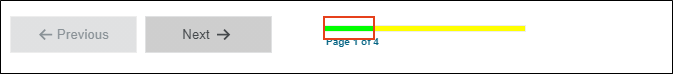
Progress > Outer Bar
This controls how the outer part of the progress bar looks.
Progress > Inner Bar
This controls how the progress bar background looks inside the outer part.
Progress > Text
This controls how the text looks associated with the progress bar.

-
Expand any of the nodes and complete the necessary fields. The properties and fields that you see are different for each node. Following is a general list in alphabetical order:
Alignment
You can click in the Horizontal field and choose whether to position to the right or left side of the display.
Background
You can change any of the following to affect the background:
-
Gradient This lets you change the background color using a progression effect. Select the beginning gradient color in the first field, and then select a second gradient color in the second field. You can use any of the following to enter or select a color.

You can type a hexadecimal number (e.g., #000000) directly in this field. Alternatively, you can click the down arrow and choose a color or make the background transparent.

This opens the Color Picker dialog, which lets you choose a color in many ways. Note that you can select a CSS variable.

Adds a bar above the cursor. As you move the cursor over any area of your screen, the color changes in the bar to reflect the color that is directly behind the tip of the cursor. When you click, that color is loaded into the Color Picker dialog.
- Color This lets you select a single color.
- Image This lets you select an image for the background. Click
 and use the dialog to select an image file.
 - Repeat Use this field to tell Flare whether the image should repeat or not.
Note The Image field has the highest precedence, which means that if you enter settings in all of the Background fields, the image will win. Gradient has the next highest precedence. If you want to use the Color field, you need to make sure the Gradient fields are set to transparent and that there is no image selected.
Border
You can change any of the following to affect the border on the element:
-
Border Edge Fields (Top, Right, Bottom, Left) You can add a border line around any of the edges of the element. You can use any of the following. The first three fields are used to control the type and size of the border line. The last three fields are alternative ways to choose a color for the border.

You can select a type of line for the border (e.g., solid, dashed, dotted).

Type a number in the field or use the arrows to increase or decrease it.

Click in this field and select a unit of measurement (e.g., pixels, points, centimeters).

You can type a hexadecimal number (e.g., #000000) directly in this field. Alternatively, you can click the down arrow and choose a color.
This opens the Color Picker dialog, which lets you choose a color in many ways. Note that you can select a CSS variable.
Adds a bar above the cursor. As you move the cursor over any area of your screen, the color changes in the bar to reflect the color that is directly behind the tip of the cursor. When you click, that color is loaded into the Color Picker dialog.
- Border Radius Fields (Top Left, Top Right, Bottom Right, Bottom Left) If you want the element to have rounded corners, you can enter values in any of these fields. In the first field type a number or use the arrows. Then click in the second field and select the unit of measurement (e.g., pixels, points, centimeters). The higher the number, the more of a curve the corner will have.
Box Shadow
You can change any of the following to affect the box shadow on the element:
- Horizontal Shadow Length This is the position of the horizontal shadow. Negative values are allowed. In the first field type a number or use the arrows. Then click in the second field and select the unit of measurement (e.g., pixels, points, centimeters).
- Vertical Shadow Length This is the position of the vertical shadow. Negative values are allowed. In the first field type a number or use the arrows. Then click in the second field and select the unit of measurement (e.g., pixels, points, centimeters).
- Shadow Blur Length This is the blur distance. In the first field type a number or use the arrows. Then click in the second field and select the unit of measurement (e.g., pixels, points, centimeters).
-
Shadow Color This lets you select a color for the shadow. You can use any of the following:
You can type a hexadecimal number (e.g., #000000) directly in this field. Alternatively, you can click the down arrow and choose a color or make the background transparent.
This opens the Color Picker dialog, which lets you choose a color in many ways. Note that you can select a CSS variable.
Adds a bar above the cursor. As you move the cursor over any area of your screen, the color changes in the bar to reflect the color that is directly behind the tip of the cursor. When you click, that color is loaded into the Color Picker dialog.
- Shadow Inset This changes the shadow from an outer shadow (outset) to an inner shadow. Click in the field and select an option. If you select false the shadow will be outset. If you select true the shadow will be inset.
event
Enter a JavaScript command that is triggered when a user clicks a button.
Font
You can change any of the following to affect the font:
-
Color This lets you select a color for the font. You can use any of the following:
You can type a hexadecimal number (e.g., #000000) directly in this field. Alternatively, you can click the down arrow and choose a color.
This opens the Color Picker dialog, which lets you choose a color in many ways. Note that you can select a CSS variable.
Adds a bar above the cursor. As you move the cursor over any area of your screen, the color changes in the bar to reflect the color that is directly behind the tip of the cursor. When you click, that color is loaded into the Color Picker dialog.
- Family You can select or type a specific font family (e.g., Arial, Tahoma, Verdana).
- Size You can change the font size. In the first field type a number or use the arrows. Then click in the second field and select the unit of measurement (e.g., pixels, points).
- Weight You can click in this field and make the font normal or bold.
- Style You can click in this field and make the font normal or italic.
Icon
You can click
and select a different image for the toolbar button.You can click the Display drop-down and choose one of the options:
-
none The element will not be shown.
-
block The element will be shown and adds a line break after it. For some elements this option might be called flex, which reflects the flexbox technology associated with it.
You can change the height or width of the element. In the first field type a number or use the arrows. Then click in the second field and select the unit of measurement (e.g., pixels, points, centimeters).
Layout
You can click the Display drop-down and choose one of the options:
-
none The element will not be shown.
-
block The element will be shown and adds a line break after it. For some elements this option might be called flex, which reflects the flexbox technology associated with it.
Click the Order drop-down to change the order of the text within the button in relation to the icon (e.g., left, right, top, bottom).
Margin
You can change the margin for any of the sides on the element (Left, Right, Top, Bottom). In the first field type a number or use the arrows. Then click in the second field and select the unit of measurement (e.g., pixels, points, centimeters).
Padding
You can change the padding for any of the sides on the element (Left, Right, Top, Bottom). In the first field type a number or use the arrows. Then click in the second field and select the unit of measurement (e.g., pixels, points, centimeters).
Size
You can change the height or width of the element. In the first field type a number or use the arrows. Then click in the second field and select the unit of measurement (e.g., pixels, points, centimeters).
Text
You can click the Display drop-down and choose one of the options:
-
none The element will not be shown.
-
block The element will be shown and adds a line break after it. For some elements this option might be called flex, which reflects the flexbox technology associated with it.
You can change any of the following to affect the font:
-
Color This lets you select a color for the font. You can use any of the following:
You can type a hexadecimal number (e.g., #000000) directly in this field. Alternatively, you can click the down arrow and choose a color.
This opens the Color Picker dialog, which lets you choose a color in many ways. Note that you can select a CSS variable.
Adds a bar above the cursor. As you move the cursor over any area of your screen, the color changes in the bar to reflect the color that is directly behind the tip of the cursor. When you click, that color is loaded into the Color Picker dialog.
- Family You can select or type a specific font family (e.g., Arial, Tahoma, Verdana).
- Size You can change the font size. In the first field type a number or use the arrows. Then click in the second field and select the unit of measurement (e.g., pixels, points).
- Weight You can click in this field and make the font normal or bold.
- Style You can click in this field and make the font normal or italic.
-
-
-
Select the UI Text tab. Use this tab to customize a list of text strings for the toolbar components. This includes text for the label, tooltip, alt text for buttons, and progress bar.
Note You can customize the text used for a different language in the output. From the Language drop-down, select the language, and then modify the text in each row.
-
Click
") to save your work.
to save your work.


How to Associate the eLearning Toolbar Skin Component With a Proxy or Target
Do one of the following, depending on the part of the user interface you are using:
-
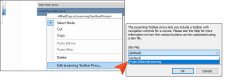
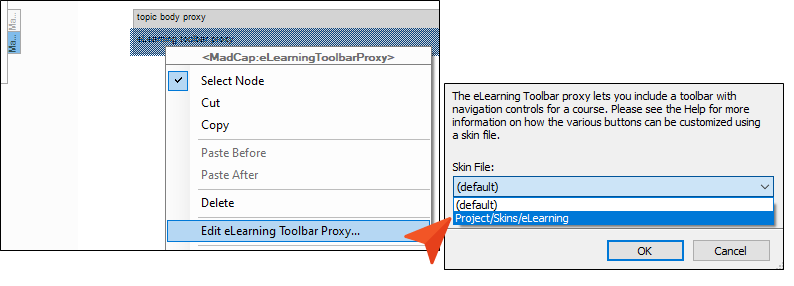
eLearning Toolbar Proxy Open the template page or topic that includes the eLearning Toolbar proxy. Right-click the proxy, and select Edit eLearning Toolbar Proxy. In the Skin File drop-down, select your eLearning Toolbar skin.
-
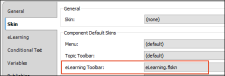
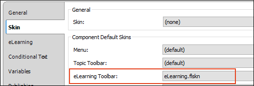
HTML5 Target Open the HTML5 target, and select the Skin tab. Locate the eLearning Toolbar drop-down, and select your eLearning Toolbar skin.
Note You are not limited to one skin component of each type, although that is the most common situation. If you want, you can use multiple skin components of any type. If this is the case, you can associate a default skin component with a target. When you do this, the skin component you choose will always be used for any proxy of that same type that you insert for that target, unless you override it by associating a different skin component with a specific proxy that you've inserted.

