 Outputs Supported
Using skin styles is one way to control the look of the menu that is included with a Side or Top Navigation skin, as well as additional menus that you add through the Menu proxy.
The interactive preview in the Skin Editor can be used to help you find the style you need to change. To use this, click Highlight in the local toolbar and click in the preview area to the right. The corresponding style is selected on the left side of the Skin Editor.
You can also use the following steps to find and edit the skin styles.
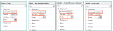
[Menu Proxy — Headings — Online — Depth3 ]
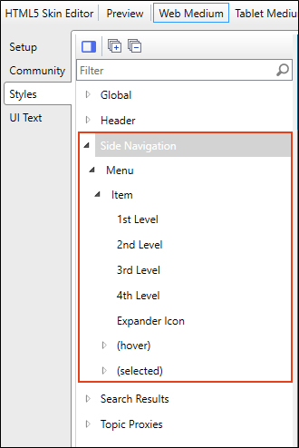
Side Navigation Skins
For Side Navigation skins, the Side Navigation style group and properties are used to control the look of the menu that is displayed on the left or right side of topics. You can specify settings for the entire menu, or for individual items at varying levels within the menu.
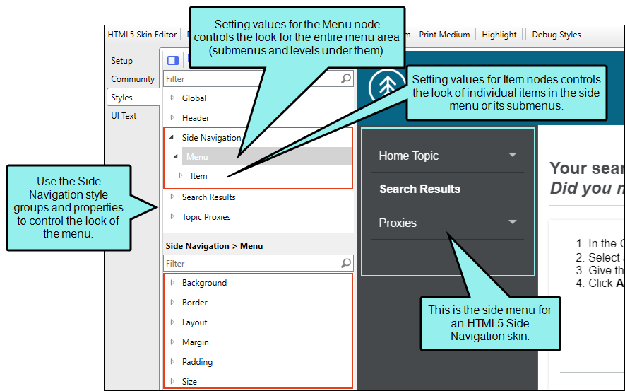
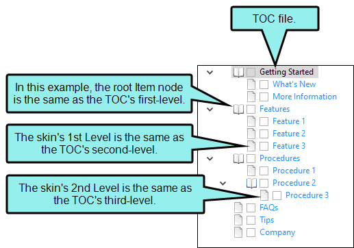
The main menu items, and their sub-levels correspond to the items in your TOC file. If you make changes to properties for the main menu nodes, such as Menu, Item, Item (hover), and Item (selected), they are applied to the root (top) level of the menu, which is the same as the first-level items in your TOC file.
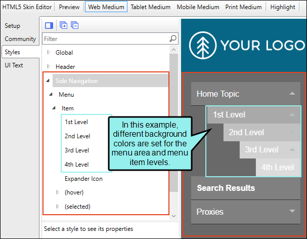
Any changes to the sub-levels of the Side Navigation menu item's (i.e., 1st Level, 2nd Level, 3rd Level, 4th Level) correspond to the items in the TOC file. Second-level items in the TOC correspond to the Item's 1st Level, third-level TOC items to the 2nd Level, and so on.
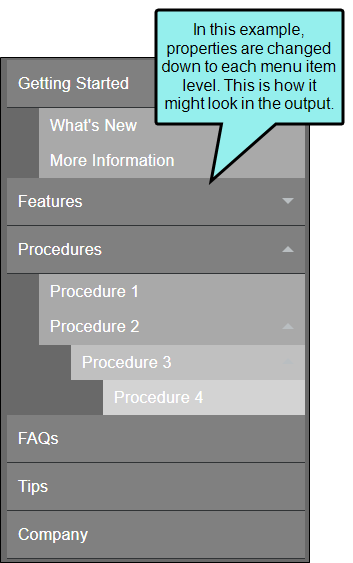
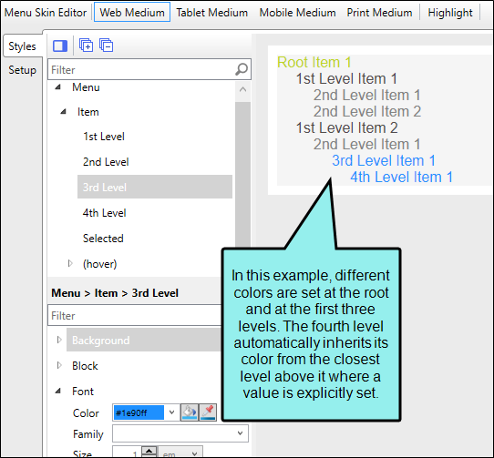
In the Side Navigation HTML5 Skin Editor, keep in mind that lower level items inherit property values that are placed on higher items (e.g., closer to the top), unless you specifically change them to be different.
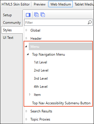
Top Navigation Skins
For Top Navigation skins, the Top Navigation style group and properties are used to control the look of the menu that is displayed at the top of topics. You can specify settings for the entire menu, or for individual items at varying levels within the menu.
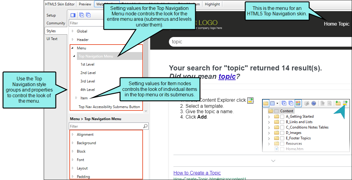
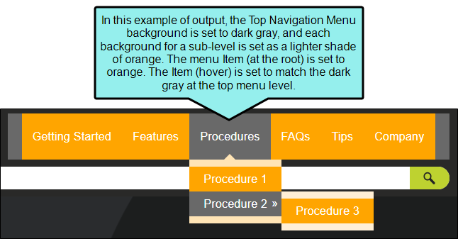
The main menu items, and their sub-levels correspond to the items in your TOC file. If you make changes to properties for the main menu nodes, such as Top Navigation Menu, Item, Item (hover), they are applied to the root (top) level of the menu, which is the same as the first-level items in your TOC file.
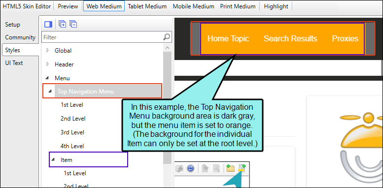
Any changes to the Top Navigation Menu item's sub-levels (i.e., 1st Level, 2nd Level, 3rd Level, 4th Level) correspond to the items in the TOC file. Second-level items in the TOC correspond to the Item's 1st Level, third-level TOC items to the 2nd Level, and so on.

In the Top Navigation HTML5 Skin Editor the lower level items inherit property values that are placed on higher items (e.g., closer to the top), unless you specifically change them to be different.
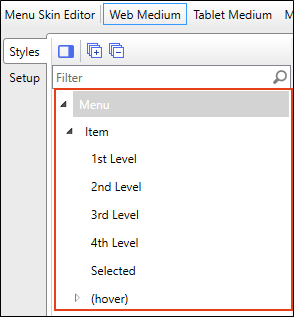
Menu Skin Components
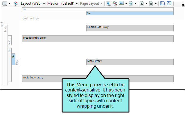
A Menu skin component can work in tandem with a Menu proxy that you insert into a topic or template page. This feature is most useful in Top Navigation and skinless outputs.
The styles for a Menu skin component are similar to those for the full Top Navigation skin, but there are some differences and options unique to each.
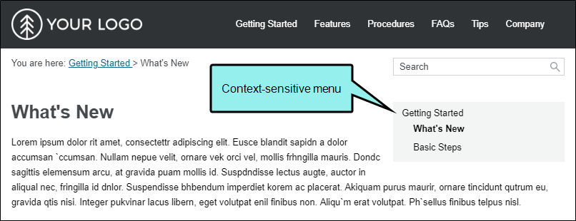
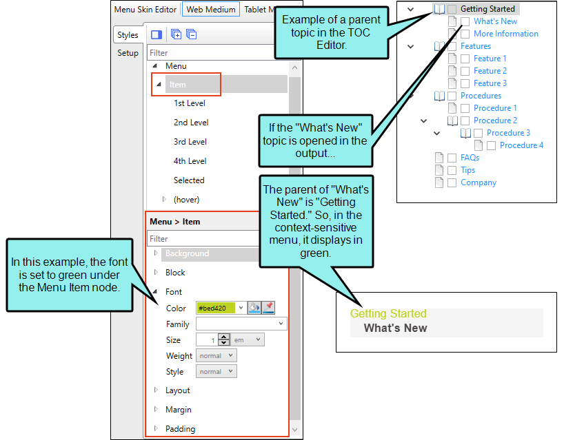
The primary thing to remember about a Menu component is that it can be context-sensitive, meaning it refers only to the topic that is open and, depending on your settings, the parent, sibling, and child items from the TOC. On the other hand, the menu styles in the full Top Navigation skin are always concerned with your TOC file structure as a whole.
That being said, the menu item style levels in a Menu component can mean something different than they do for the full Top Navigation skin.
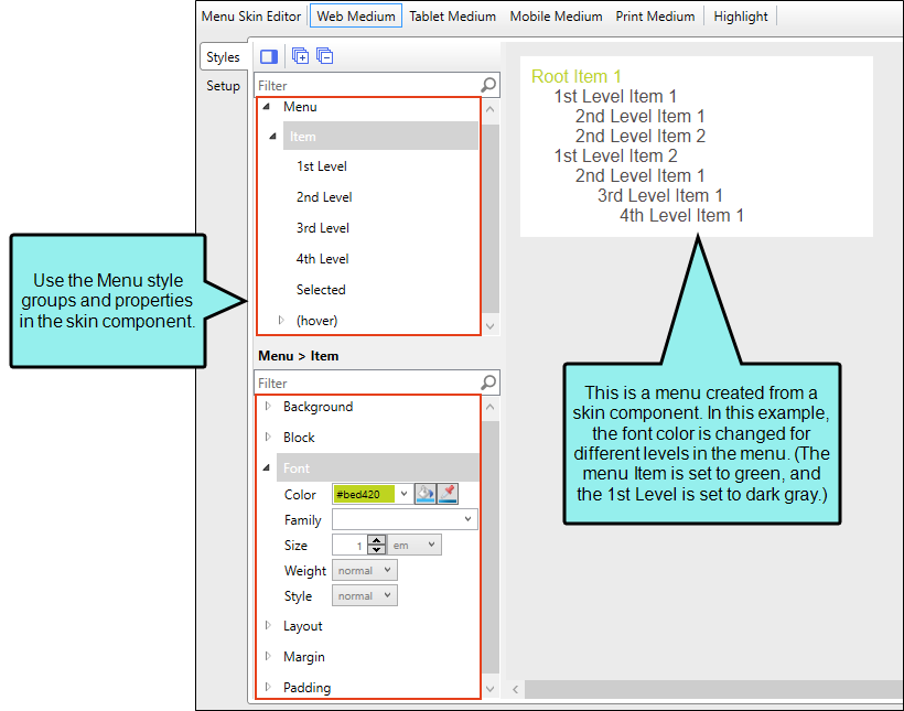
When you set values for the Menu Item or Item (hover) nodes, you are controlling the look for the menu items that are at the top level of the menu. If you insert a context-sensitive Menu proxy that includes the parent, the root Menu Item style group refers to the parent topic.
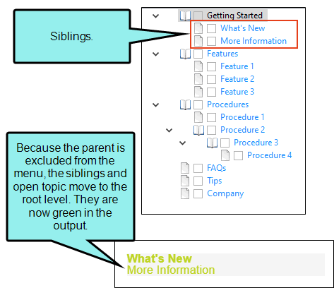
If you don't include the parent, but you do include the siblings, the root Menu Item style refers to those sibling topics in the TOC.
The 1st Level style refers to the first level under the root, followed by 2nd Level, 3rd Level, and 4th Level. The same kind of inheritance used for menu items in the full Top Navigation skin is used for a Menu component.
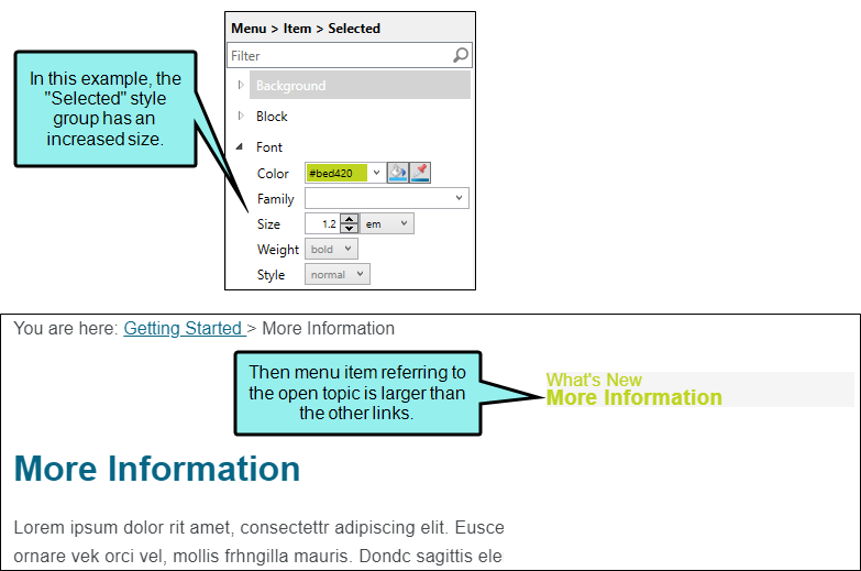
There is also a style called "Selected" for Menu components. This lets you apply a unique look to the menu item that refers to the topic that is currently open.
How to Specify Style Settings for Menus in HTML5
- Open an HTML5 Side or Top Navigation skin, or a Menu skin component.
-
If you opened a skin component, make sure you select the appropriate medium—Web, Tablet, or Mobile—in the local toolbar before making changes to styles.
If you opened a full Side or Top Navigation skin, you must have Web Medium selected, because menu elements are not shown in Tablet or Mobile views. For those mediums, you would set navigation elements instead. See Navigation in HTML5 Skins.
- Select the Styles tab.
-
On the left side of the editor, go to one of the following style groups, depending on the type of skin.
-
Side Navigation

-
Top Navigation

-
Menu Used for Menu skin components
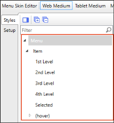
Then expand and select any of the following styles:
Side Navigation Styles
Side Navigation > Menu
This controls the look of the entire menu and submenu areas.
Side Navigation > Menu > Item
This controls the look of individual items within a menu.
Side Navigation > Menu > Item > (hover)
This controls the look of individual items within a menu when a user hovers over them.
Side Navigation > Menu > Item > (selected)
This controls the look of individual items within a menu when the item is selected.
Top Navigation Styles
Menu > Top Navigation Menu
This controls the look of the entire menu and submenu areas.
Menu > Top Navigation Menu > Item
This controls the look of individual items within a menu.
Menu > Top Navigation Menu > Item > (hover)
This controls the look of individual items within a menu when a user hovers over them.
Menu > Top Nav Accessibility Submenu Button
This controls the look of the drop-down function that appears next to a top menu item containing a submenu when a person uses the TAB key to get to that location.
Menu Skin Component Styles
Menu
This controls the look of the entire menu and submenu areas.
Menu > Item
This controls the look of individual items within a menu.
Menu > Item > (hover)
This controls the look of individual items within a menu when a user hovers over them.
-
-
Expand any of the nodes and complete the necessary fields. The properties and fields that you see are different for each node. Also, you might see nodes in the full skin that you do not see in a skin component, and vice versa. Following is a general list in alphabetical order:
Alignment
Depending on the style and element you are working with, you may be able to select one or more of the following:
- Horizontal This option lets you choose whether to position the element to the left, middle, or right.
- Vertical This option lets you choose whether to position the element on the top, middle, or bottom.
- Full Row This option allows the element to take up all of the space horizontally in the header.
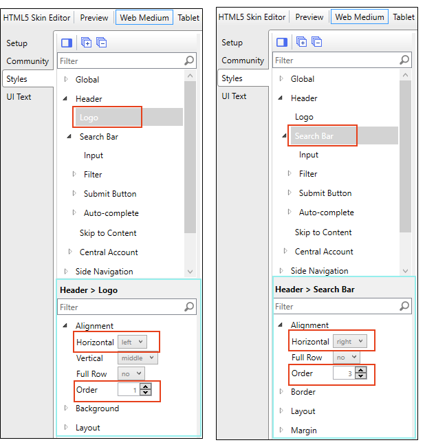
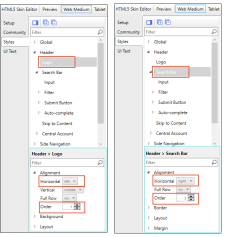
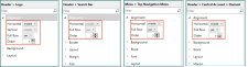
- Order This option determines which element comes first (1), second (2), third (3), or fourth (4) in the header. Side Navigation has three elements (logo, search bar, and Central account link), but Top Navigation has four (logo, search bar, menu, and Central account link).
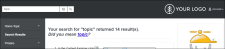
Example You add a new Side Navigation skin. Initially it looks like this:
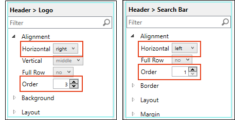
The logo comes first (Order=1) and is positioned left, whereas the search bar comes second (Order=3) and is positioned right.
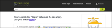
Maybe you want to reverse this, placing the search bar first (aligned left) and the logo second (aligned far right). (You just keep the Central account link where it is for now.)
In that case, you would change the settings like this:

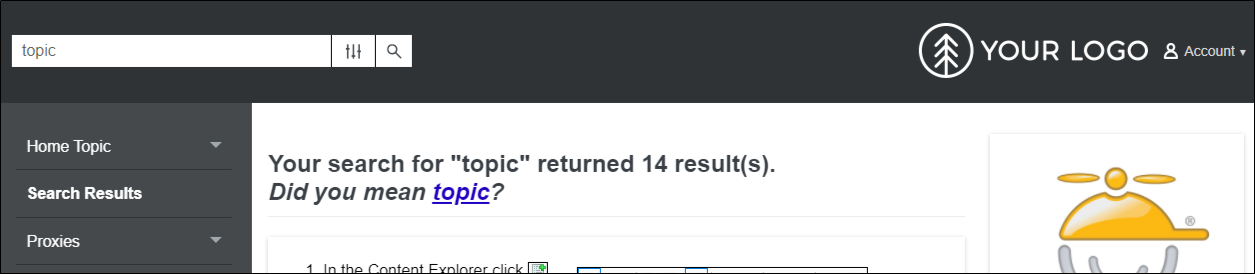
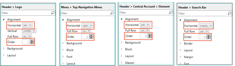
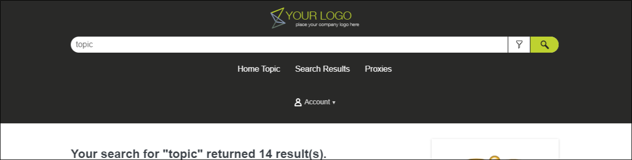
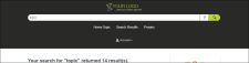
Now suppose you create a new Top Navigation skin. Initially it looks like this:
The logo comes first (Order=1) and is positioned left. The menu is second (Order=2) and is positioned right. The Central account link is third (Order=3). The search bar is fourth (Order=4) and is set to take up a full row.
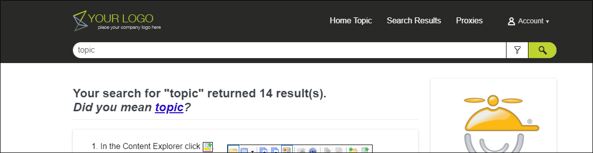
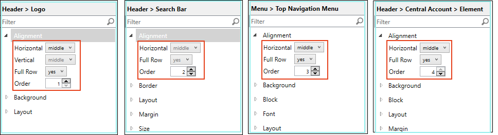
Now maybe you want each element to take up all the space on its row, centered, with the logo first, the search bar second, followed by the menu, and then the Central account link.
In that case, you would change the settings like this:
Background
You can change any of the following to affect the background:
-
Gradient This lets you change the background color using a progression effect. Select the beginning gradient color in the first field, and then select a second gradient color in the second field. You can use any of the following to enter or select a color.

You can type a hexadecimal number (e.g., #000000) directly in this field. Alternatively, you can click the down arrow and choose a color or make the background transparent.

This opens the Color Picker dialog, which lets you choose a color in many ways. Note that you can select a CSS variable.

Adds a bar above the cursor. As you move the cursor over any area of your screen, the color changes in the bar to reflect the color that is directly behind the tip of the cursor. When you click, that color is loaded into the Color Picker dialog.
- Color This lets you select a single color.
- Image This lets you select an image for the background. Click
 and use the dialog to select an image file.
 - Repeat Use this field to tell Flare whether the image should repeat or not.
Note The Image field has the highest precedence, which means that if you enter settings in all of the Background fields, the image will win. Gradient has the next highest precedence. If you want to use the Color field, you need to make sure the Gradient fields are set to transparent and that there is no image selected.
Block
This is the container (or "block") holding content in an element. You can change any of the following to affect the block:
- Line Height This is how tall the container is that holds the content. In the first field type a number or use the arrows. Then click in the second field and select the unit of measurement (e.g., pixels, points, centimeters).
- Text Align This changes the alignment of the content. Click in the field and select an option (center, justify, left, right).
- Text Indent This is how far the text is moved inward. In the first field type a number or use the arrows. Then click in the second field and select the unit of measurement (e.g., pixels, points, centimeters).
- Word Wrap You can click in the Word Wrap field and choose whether to wrap text for the element (normal) or not (nowrap).
Border
You can change any of the following to affect the border on the element:
-
Border Edge Fields (Top, Right, Bottom, Left) You can add a border line around any of the edges of the element. You can use any of the following. The first three fields are used to control the type and size of the border line. The last three fields are alternative ways to choose a color for the border.

You can select a type of line for the border (e.g., solid, dashed, dotted).

Type a number in the field or use the arrows to increase or decrease it.

Click in this field and select a unit of measurement (e.g., pixels, points, centimeters).

You can type a hexadecimal number (e.g., #000000) directly in this field. Alternatively, you can click the down arrow and choose a color.
This opens the Color Picker dialog, which lets you choose a color in many ways. Note that you can select a CSS variable.
Adds a bar above the cursor. As you move the cursor over any area of your screen, the color changes in the bar to reflect the color that is directly behind the tip of the cursor. When you click, that color is loaded into the Color Picker dialog.
- Border Radius Fields (Top Left, Top Right, Bottom Right, Bottom Left) If you want the element to have rounded corners, you can enter values in any of these fields. In the first field type a number or use the arrows. Then click in the second field and select the unit of measurement (e.g., pixels, points, centimeters). The higher the number, the more of a curve the corner will have.
Font
You can change any of the following to affect the font:
-
Color This lets you select a color for the font. You can use any of the following:
You can type a hexadecimal number (e.g., #000000) directly in this field. Alternatively, you can click the down arrow and choose a color.
This opens the Color Picker dialog, which lets you choose a color in many ways. Note that you can select a CSS variable.
Adds a bar above the cursor. As you move the cursor over any area of your screen, the color changes in the bar to reflect the color that is directly behind the tip of the cursor. When you click, that color is loaded into the Color Picker dialog.
- Family You can select or type a specific font family (e.g., Arial, Tahoma, Verdana).
- Size You can change the font size. In the first field type a number or use the arrows. Then click in the second field and select the unit of measurement (e.g., pixels, points).
- Weight You can click in this field and make the font normal or bold.
- Style You can click in this field and make the font normal or italic.
Layout
You can click in the Display field and choose one of the options (some of these options might not be available for certain styles):
-
none The element will not be shown.
-
block The element will be shown and adds a line break after it. For some elements this option might be called flex, which reflects the flexbox technology associated with it.
-
inline The element will be shown but does not add a line break after it, allowing it to be positioned next to other elements.
-
inline-block The element will be shown but does not add a line break after it, allowing it to be positioned next to other elements. This is similar to inline; however, with this option, a width and height can be set on the element, and top/bottom margin and padding settings are respected.
Padding
You can change the padding for any of the sides on the element (Left, Right, Top, Bottom). In the first field type a number or use the arrows. Then click in the second field and select the unit of measurement (e.g., pixels, points, centimeters).
Size
You can change the height or width of the element. In the first field type a number or use the arrows. Then click in the second field and select the unit of measurement (e.g., pixels, points, centimeters).
Width
You enter a width for the element. In the first field type a number or use the arrows. Then click in the second field and select the unit of measurement (e.g., pixels, points, centimeters).
- Click
") to save your work.
to save your work.