 Outputs Supported
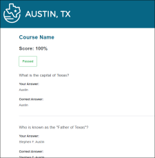
The autogenerated test results page includes many sections that are visible by default. You can use the Test Results Skin Editor to determine which sections display in the output, and also to customize the look and feel of the test results page.
[Menu Proxy — Headings — Online — Depth3 ]
How to Add the Test Results Skin Component
Adding a test results skin component to your project is not necessary in order for the eLearning course to work. But if you want to control the look and feel of the results, then the test results skin component allows for its customization.
-
Do one of the following, depending on the part of the user interface you are using:
-
Ribbon Select Project > New > Add Skin.
-
Right-Click From the Project Organizer, right-click the Skins folder, and select Add Skin.
-
-
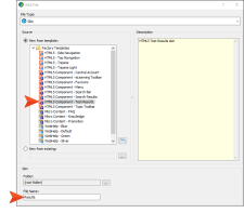
From the Add File dialog, expand Factory Templates, and select HTML5 Component – Test Results. Give it a file name (e.g., Results), and click Add. The Test Results Skin Editor opens.

How to Edit the Test Results Skin Component
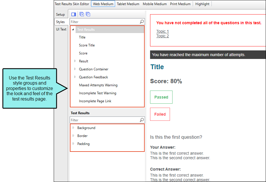
Edit the Test Results skin component to apply customizations to the page. In the Test Results Skin Editor, there are three tabs where you can make changes to different sections of the test results page.
-
Open the Test Results Skin Editor.
-
Select the Setup tab, and choose the test result options to include in the test results page.
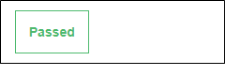
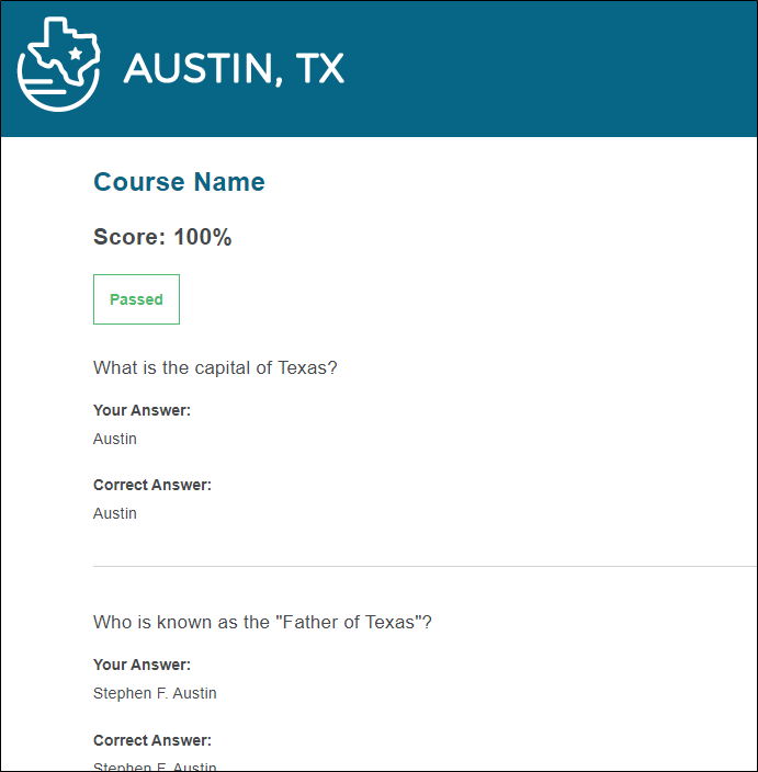
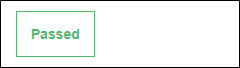
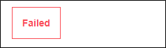
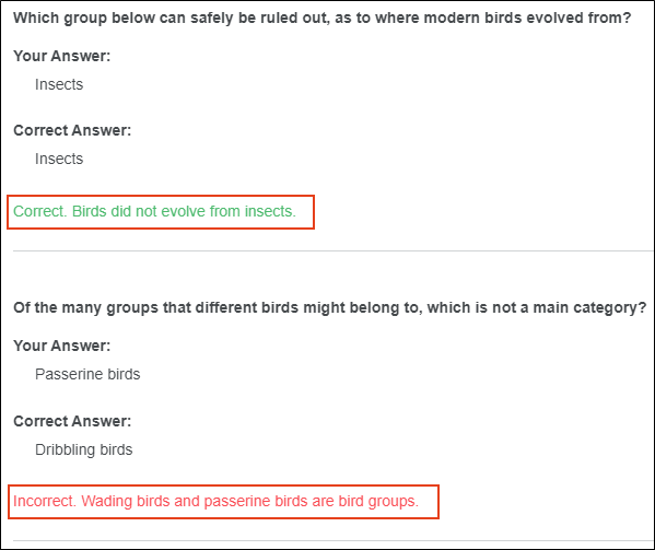
Show Passed / Failed
Select to display whether the learner passed or failed the course.
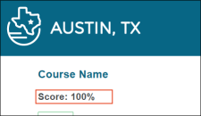
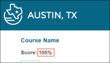
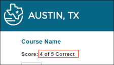
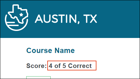
Show Score
Select to display the learner's score. If shown, select from the drop-down either Percentage Correct (e.g., 80%) or Total Correct (e.g., 7 of 10 Correct).
Show Questions
Select to display the test questions in the results page. If shown, select to display learner answers, correct answers, and feedback for questions.
-
Select the Styles tab. Using this tab you can customize the look and feel of the test results title, score, questions, answers, incomplete test warnings, and more.
-
(Optional) If you are using responsive output, make sure you select the appropriate medium—Web, Tablet, or Mobile—in the local toolbar before making changes to styles.
-
On the left side of the editor, expand and select any of the Test Results style groups.
Tip To quickly find a style to edit, from the local toolbar, click the Highlight button. This enables Highlight mode, where the right panel in the editor is a live preview. Click any part of the live preview and it locates the corresponding style in the left panel to edit. Once a style is updated, it displays as such in the live preview.
Test Results
This controls the look and feel of the entire test results page.
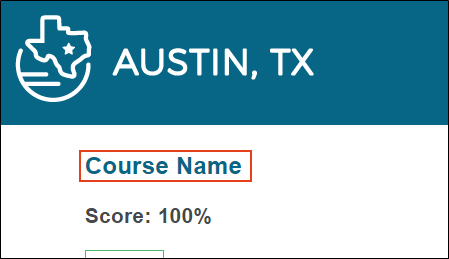
Test Results > Title
This controls how the test title container looks.
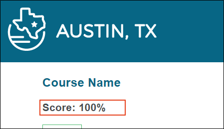
Test Results > Score Title
This controls how the score container looks.
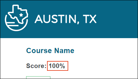
Test Results > Score
This controls how the score container looks, according to percent complete or total complete. (To change the score type, select it from the Setup tab, Show Score drop-down.)
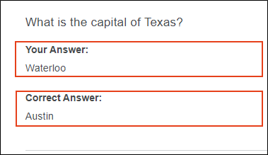
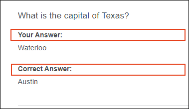
Test Results > Result
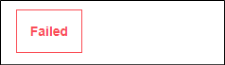
This controls how the test results container looks, including a successful or unsuccessful attempt. You can also customize how the Failed versus the Passed results show.
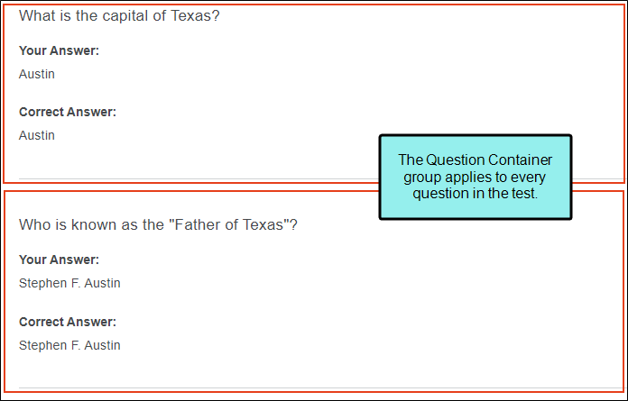
Test Results > Question Container
This controls how the entire question container looks.

Test Results > Question Container > (first)
You can change the way the first question container looks compared to the others.
Test Results > Question Container > (last)
You can change the way the last question container looks compared to the others.
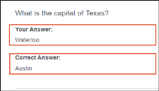
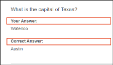
Test Results > Question Container > Question
This controls how the questions appear in the test results page.
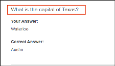
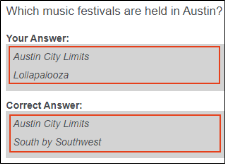
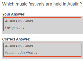
Test Results > Question Container > Answer Container
This controls how the answers look in the test results.
Test Results > Question Container > Answer Container > Title
This controls how the titles for the answers display. You can also create a different look for the correct answer versus the user answer.
Test Results > Question Container > Answer Container > Content
This controls how the answer container looks for the content. You can also create a different look for the correct answer versus the user answer.
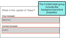
Test Results > Question Container > Answer Container > Content Item
This controls how the content for the answer looks. You can also create a different look for the correct answer versus the user answer.
Test Results > Question Feedback
This controls how feedback for a question displays in the test results page. You can adjust how the correct versus incorrect feedback looks.

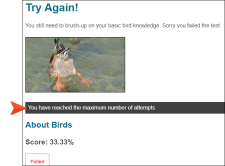
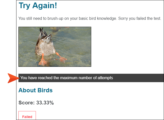
Test Results > Maxed Attempts Warning
This controls the look for the container that alerts the learner to reaching the maximum amount of test attempts.
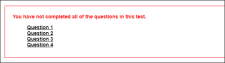
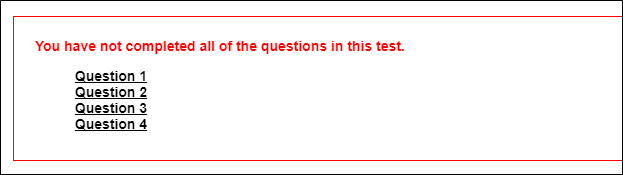
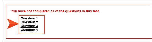
Test Results > Incomplete Test Warning
This controls the look for the container that alerts the learner of an incomplete test (if they navigate to the results page before the test is completed).
Test Results > Incomplete Page Link
This controls how the page links look when the Incomplete Test Warning displays.

-
Expand any of the nodes and complete the necessary fields. The properties and fields that you see are different for each node. Following is a general list in alphabetical order:
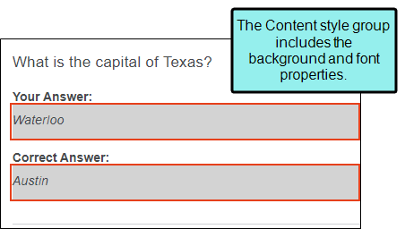
Background
You can change any of the following to affect the background:
-
Gradient This lets you change the background color using a progression effect. Select the beginning gradient color in the first field, and then select a second gradient color in the second field. You can use any of the following to enter or select a color.

You can type a hexadecimal number (e.g., #000000) directly in this field. Alternatively, you can click the down arrow and choose a color or make the background transparent.

This opens the Color Picker dialog, which lets you choose a color in many ways. Note that you can select a CSS variable.

Adds a bar above the cursor. As you move the cursor over any area of your screen, the color changes in the bar to reflect the color that is directly behind the tip of the cursor. When you click, that color is loaded into the Color Picker dialog.
- Color This lets you select a single color.
- Image This lets you select an image for the background. Click
 and use the dialog to select an image file.
 - Repeat Use this field to tell Flare whether the image should repeat or not.
Note The Image field has the highest precedence, which means that if you enter settings in all of the Background fields, the image will win. Gradient has the next highest precedence. If you want to use the Color field, you need to make sure the Gradient fields are set to transparent and that there is no image selected.
Border
You can change any of the following to affect the border on the element:
-
Border Edge Fields (Top, Right, Bottom, Left) You can add a border line around any of the edges of the element. You can use any of the following. The first three fields are used to control the type and size of the border line. The last three fields are alternative ways to choose a color for the border.

You can select a type of line for the border (e.g., solid, dashed, dotted).

Type a number in the field or use the arrows to increase or decrease it.

Click in this field and select a unit of measurement (e.g., pixels, points, centimeters).

You can type a hexadecimal number (e.g., #000000) directly in this field. Alternatively, you can click the down arrow and choose a color.
This opens the Color Picker dialog, which lets you choose a color in many ways. Note that you can select a CSS variable.
Adds a bar above the cursor. As you move the cursor over any area of your screen, the color changes in the bar to reflect the color that is directly behind the tip of the cursor. When you click, that color is loaded into the Color Picker dialog.
- Border Radius Fields (Top Left, Top Right, Bottom Right, Bottom Left) If you want the element to have rounded corners, you can enter values in any of these fields. In the first field type a number or use the arrows. Then click in the second field and select the unit of measurement (e.g., pixels, points, centimeters). The higher the number, the more of a curve the corner will have.
Font
You can change any of the following to affect the font:
-
Color This lets you select a color for the font. You can use any of the following:
You can type a hexadecimal number (e.g., #000000) directly in this field. Alternatively, you can click the down arrow and choose a color.
This opens the Color Picker dialog, which lets you choose a color in many ways. Note that you can select a CSS variable.
Adds a bar above the cursor. As you move the cursor over any area of your screen, the color changes in the bar to reflect the color that is directly behind the tip of the cursor. When you click, that color is loaded into the Color Picker dialog.
- Family You can select or type a specific font family (e.g., Arial, Tahoma, Verdana).
- Size You can change the font size. In the first field type a number or use the arrows. Then click in the second field and select the unit of measurement (e.g., pixels, points).
- Weight You can click in this field and make the font normal or bold.
- Style You can click in this field and make the font normal or italic.
LAYOUT
You can click in the Display field and choose one of the options (some of these options might not be available for certain styles):
-
none The element will not be shown.
-
block The element will be shown and adds a line break after it. For some elements this option might be called flex, which reflects the flexbox technology associated with it.
-
inline The element will be shown but does not add a line break after it, allowing it to be positioned next to other elements.
-
inline-block The element will be shown but does not add a line break after it, allowing it to be positioned next to other elements. This is similar to inline; however, with this option, a width and height can be set on the element, and top/bottom margin and padding settings are respected.
Margin
You can change the margin for any of the sides on the element (Left, Right, Top, Bottom). In the first field type a number or use the arrows. Then click in the second field and select the unit of measurement (e.g., pixels, points, centimeters).
Padding
You can change the padding for any of the sides on the element (Left, Right, Top, Bottom). In the first field type a number or use the arrows. Then click in the second field and select the unit of measurement (e.g., pixels, points, centimeters).
Style
You can click the List Style drop-down and choose one of the options (none, disc, circle, square, decimal, decimal-leading-zero, lower-roman, upper-roman).
-
-
Select the UI Text tab. Use this tab to customize a list of text strings for the test results page. This includes text for the score, results, answer labels, warnings, and more.
Note You can customize the text used for a different language in the output. From the Language drop-down, select the language, and then modify the text in each row.
-
Click
") to save your work.
to save your work.

How to Associate the Test Results Skin Component With a Target
-
Open the target from the Project Organizer.
-
Select the Skin tab.
-
From the Component Default Skins section, select the Test Results drop-down, and choose the skin component that you want to associate with the target.
-
Click
to save your work.

