 Outputs Supported


You can specify navigation settings for HTML5, WebHelp, or WebHelp Plus output. For some of these outputs, the navigation pane is used to hold the TOC, Index, Search, Glossary, Browse Sequences, and Favorites in an accordion-type structure. For HTML5 Side and Top Navigation outputs, the navigation pane settings let you choose the main menu and slide-out position, fixed header, depth level of menu items (Top Navigation only), slide-out menu style, and a URL for a logo.
[Menu Proxy — Headings — Online — Depth3 ]
How to Specify Navigation Pane Settings for HTML5 and WebHelp Outputs
- Open a Standard or HTML5 skin.
- Do one of the following, depending on the type of output:
- HTML5 Select the Setup tab.
- Others Select the WebHelp Setup tab.
-
Select the appropriate options.
Main Menu Position
Choose where you want the main navigation links to be located in the skin—Top, Left, or Right. If you select “Top,” you will be creating Top Navigation output. If you select “Left” or “Right,” you will be using Side Navigation output.
(This option is available only for HTML5 Side and Top Navigation skins
You can also set this option to "None," which is common if you want to create more of a skinless output.
Slide-Out Position
Select a location in the output window for the navigation pane. A small preview to the right changes as you make your selection. For HTML5 Side and Top Navigation outputs, this refers to the flyout pane that appears when responsive output is activated and the screen is too small to show the top menu.
You can also set this option to "None," which is common if you want to create more of a skinless output.
Slide-Out Menu Style
You can choose the look of the slide-out menu for Side or Top Navigation output (i.e., the menu that opens when you click the “hamburger” icon in tablet or mobile view). Either a drilldown or a tree format can be selected.
(This option is available only for HTML5 Side and Top Navigation skins
Fixed Header
When generating Side or Top Navigation output, you can fix the header portion of the topic so that it stays in place when users scroll down to see more content. For Top Navigation, you can do this for web, tablet, or mobile screens (or all of them). For Side Navigation, you can do this for web screens (or all—web, tablet, mobile).
(This option is available only for HTML5 Side and Top Navigation skins
Top Menu Levels to Show (Depth)
Specify how many levels of your TOC items are included in the top menu navigation. The default is 3. We recommended you avoid too many depth levels in the top navigation.
(This option is available only for HTML5 Top Navigation skins, when the Main Menu Position is set to “Top”; it is disabled otherwise
Logo URL
Select a topic to be linked to the logo. By default, the logo is linked to your Home (i.e., startup) topic. However, you can select a different topic or enter the URL to your company's website instead (remember to include http:// at the beginning of the path if you do this).
(This option is available only for HTML5 Side and Top Navigation skins
Pane Size
Enter the width of the navigation pane for the output window (in pixels). You can type a number or use the up and down arrows.
(This option is not available in HTML5 Side or Top Navigation skins.)
Visible Accordion Items
Specify how many navigation items (e.g., TOC, Index, Search) you want to be included at full size in the navigation pane.
(This option is not available in HTML5 skins.)
Example If you include six tabs in the output window and set this field to "4," the first four navigation items will be shown with full-sized links. The remaining two items will still be accessible in the navigation pane, but their links will not be full-sized, but rather smaller icons.
Hide Navigation Pane on Startup
Click this check box if you do not want the navigation pane to be immediately displayed when the Help is accessed in this skin. You might use this option, for example, if you are creating a skin to be used for context-sensitive Help (CSH) topics (as opposed to your main Help system with full navigation). With CSH topics, the navigation pane is not usually necessary because the user wants to see information only for a very specific area.
(This option is not available in HTML5 Side or Top Navigation skins.)
Exclude Accordion Title
Removes the accordion title from the WebHelp output.
(This option is not available in HTML5 skins.)
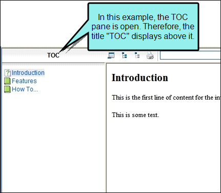
If you generate output using WebHelp or WebHelp Plus, the title of the active accordion bar displays by default in the output, like this:

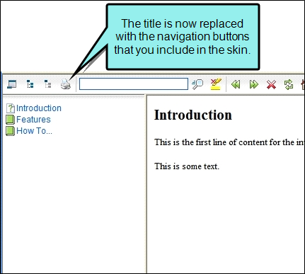
You have the option of excluding this accordion title from the output. This shifts the navigation buttons for the output to the left, like this:

- Click
") to save your work.
to save your work.
What’s Next?
Make sure that you associate the skin with the target. See Associating Skins With Targets.
