 Outputs Supported


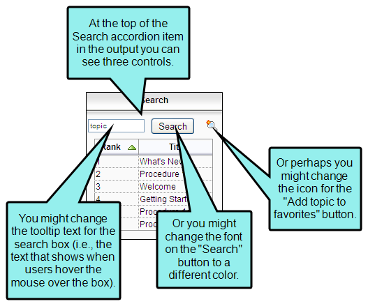
Various controls may be part of the skin in your output, such as buttons, labels, and the input boxes. Usually these controls are displayed within the various accordion items (e.g., the search box, "Search" button, and "Add topic to favorites" button that are shown at the top of the Search accordion item).
Styles for many of the controls are supported only in WebHelp and WebHelp Plus outputs. The controls related to MadCap Feedback are supported only in WebHelp, WebHelp Plus, and Microsoft HTML Help.
How to Specify Style Settings for Controls
- Open a Standard skin.
- Select the Styles tab.
-
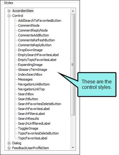
In the Styles section, expand the Control node.

-
Select the item that you want to edit. If you want the setting(s) to be applied to all of the items, select the Control node itself.
The items under this node represent the different kinds of controls that may be found in your output.
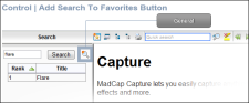
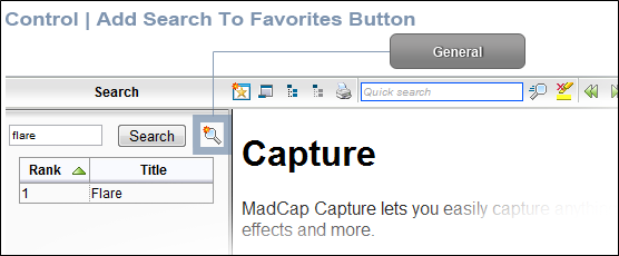
Add Search To Favorites Button
This is the button at the top of the Search pane that lets users add their search string to the Favorites pane.
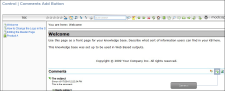
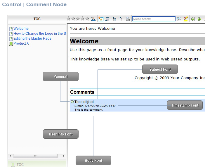
Comment Node
This is the area that shows MadCap Feedback comments in the output. In order to use this feature, you must enable MadCap Feedback.

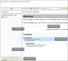
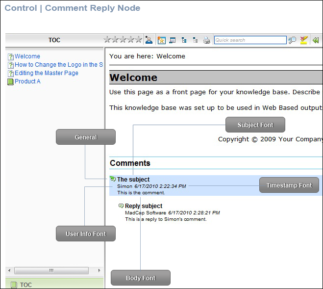
Comment Reply Node
This is the area that shows MadCap Feedback comments that have received replies. In order to use this feature, you must enable MadCap Feedback.
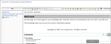
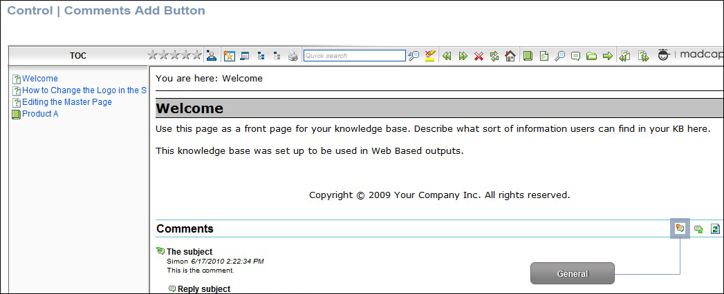
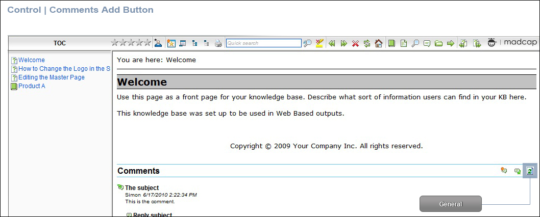
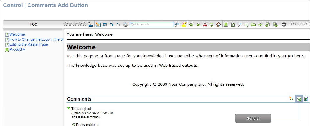
Comments Add Button
Comments Refresh Button
Comments Reply Button
These are buttons at the top of the Comments area that let users add, reply to, and refresh MadCap Feedback comments. In order to use this feature, you must enable MadCap Feedback.

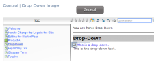
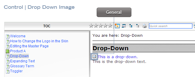
DropDown Image
This is the hotspot image that is used for drop-down effects.
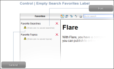
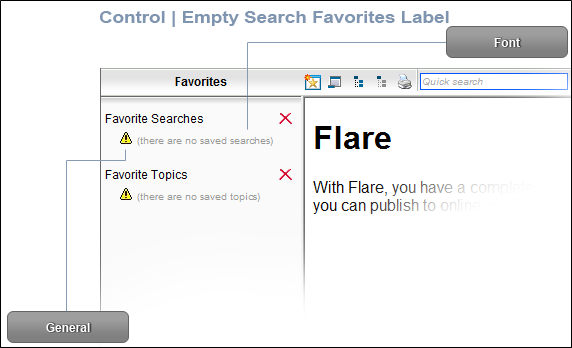
Empty Search Favorites Label
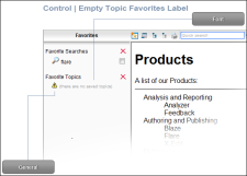
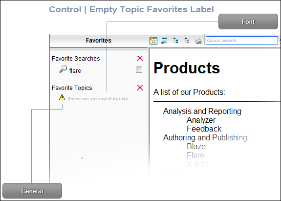
Empty Topic Favorites Label
These are the text labels that users see if they open the Favorites pane and no favorite searches or topics have yet been saved.
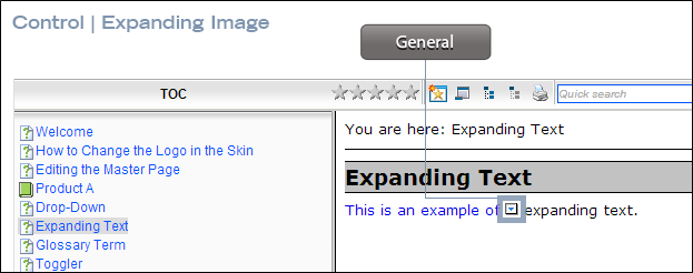
Expanding Image
This is the hotspot image that is used for expanding text effects.

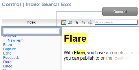
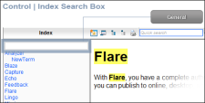
Index Search Box
This is the field in the Index pane where users enter words to search for in the index. You can provide a floating tooltip for this field, which displays when users hover the cursor over it.
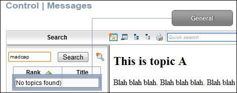
Messages
These are the text labels that users see when certain messages are displayed (e.g., if they search for a term and no topics are found).

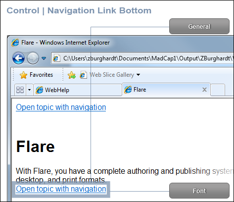
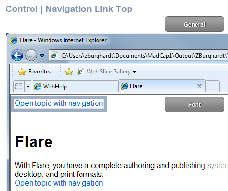
Navigation Link Bottom
Navigation Link Top
These are the navigation links that users may see at the top or bottom of topics if they open those topics as standalone files. In order to add these links to the output, you must enable them on the WebHelp Setup tab of the Skin Editor.


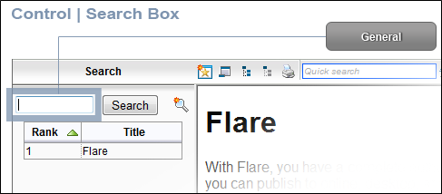
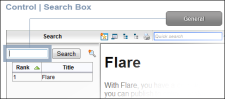
Search Box
This is the field in the Search pane where users enter words to include in a search. You can provide a floating tooltip for this field, which displays when users hover the cursor over it.
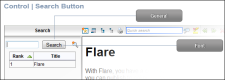
Search Button
This is the button in the Search pane that people use to initiate a search.
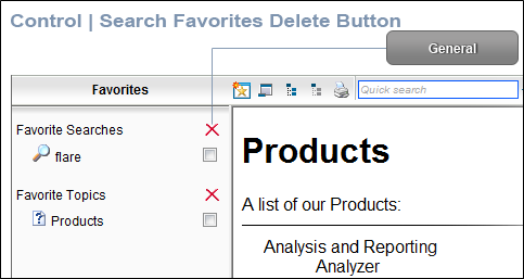
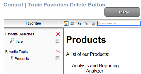
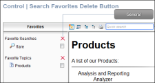
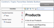
Search Favorites Delete Button
Topic Favorites Delete Button
These are the buttons in the Favorites pane that people use to delete saved search strings or topics.
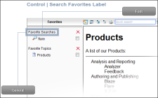
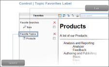
Search Favorites Label
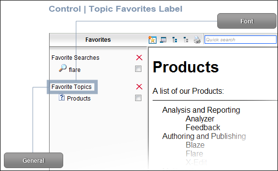
Topic Favorites Label
These are the labels in the Favorites pane that are shown at the top of the favorite searches and topics.
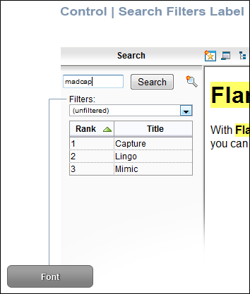
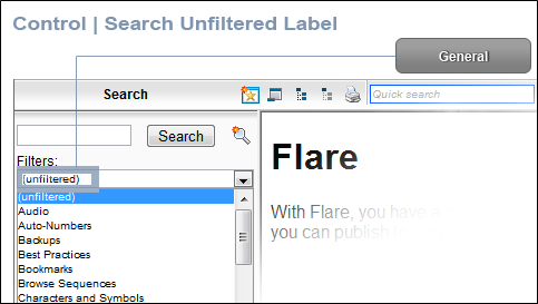
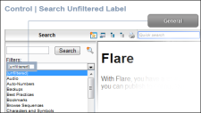
Search Filters Label
Search Unfiltered Label
These are the labels in the Search pane that are used to identify search filters. In order to see these labels in the output, you must include search filters in your project.
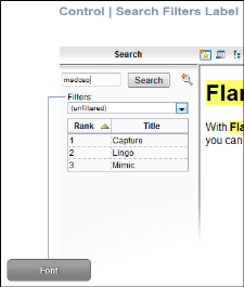
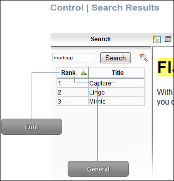
Search Results
These are the labels in the Search pane that are used to identify search results.
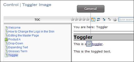
Toggler Image
This is the hotspot image that is used for toggler effects.

- Select the Property Groups or Alphabetical List option to display the properties for the style item.
-
In the Properties section, set the values for the properties that you want modify.
Background Color
To change the background color of the item:
Expand the General property group on the right and change the value in the Background Color field. Click the down arrow to open a color palette window. You can click a color shown, or you can click More colors and select a different color or create a custom color. If you are change the color for a style item that also has a gradient, the gradient properties have precedence over the solid color.
Body Font Color
To change the color of the font used for the body of a MadCap Feedback comment:
Expand the BodyFont property group on the right and change the value in the Body Color field. Click the down arrow to open a color palette window. You can click a color shown, or you can click More colors and select a different color or create a custom color. If you are change the color for a style item that also has a gradient, the gradient properties have precedence over the solid color.
Body Font Family
To select a specific font family (e.g., Arial, Tahoma, Verdana) used for the body of a MadCap Feedback comment:
Expand the BodyFont property group on the right and change the value in the Body Font Family field. From the drop-down, select the font family or font set that you want to use.
Body Font Size
To change the size of the font used for the body of a MadCap Feedback comment:
Expand the BodyFont property group on the right and change the value in the Body Font Size field. Click the down arrow to open a small window. In this window, you can enter the size of the font in the lower-left field (either type a number or use the up and down arrows). You can select the unit of measurement (e.g., pixels, points, centimeters) using the lower-right drop-down arrow.
Body Font Style
To change the style of the font (e.g., make it italic) used for the body of a MadCap Feedback comment:
Expand the BodyFont property group on the right and change the value in the Body Font Style field. Click the down arrow and select either italic or normal.
Body Font Weight
To change the weight of the font (e.g., make it bold) used for the body of a MadCap Feedback comment:
Expand the BodyFont property group on the right and change the value in the Body Font Weight field. Click the down arrow and select either bold or normal.
Collapsed Alt Text
To change the alternate (alt) text that is associated with the item when it is in a collapsed state:
Expand the General property group on the right side of the editor and enter new text in the CollapsedAltText field.
Expanded Alt Text
To change the alternate (alt) text that is associated with the item when it is in an expanded state:
Expand the General property group on the right side of the editor and enter new text in the ExpandedAltText field.
Font Background Color
To change the color of the area behind the font:
Expand the Font property group on the right and change the value in the Background Color field. Click the down arrow to open a color palette window. You can click a color shown, or you can click More colors and select a different color or create a custom color. If you are change the color for a style item that also has a gradient, the gradient properties have precedence over the solid color.
Font Color
To change the color of the font:
Expand the Font property group on the right and change the value in the Color field. Click the down arrow to open a color palette window. You can click a color shown, or you can click More colors and select a different color or create a custom color. If you are change the color for a style item that also has a gradient, the gradient properties have precedence over the solid color.
Font Family
To select a specific font family (e.g., Arial, Tahoma, Verdana):
Expand the Font property group on the right and change the value in the Font Family field. From the drop-down, select the font family or font set that you want to use.
Font Size
To change the size of the font:
Expand the Font property group on the right and change the value in the Font Size field. Click the down arrow to open a small window. In this window, you can enter the size of the font in the lower-left field (either type a number or use the up and down arrows). You can select the unit of measurement (e.g., pixels, points, centimeters) using the lower-right drop-down arrow.
Font Style
To change the style of the font (e.g., make it italic):
Expand the Font property group on the right and change the value in the Font Style field. Click the down arrow and select either italic or normal.
Font Weight
To change the weight of the font (e.g., make it bold):
Expand the Font property group on the right and change the value in the Font Weight field. Click the down arrow and select either bold or normal.
Hover Icon
To select a different icon image to be used when the user hovers the cursor over the item:
Expand the General property group on the right side of the editor and select an image from the Hover Icon field. Click the down arrow in this field and then select Browse for Image to find and select an image file.
Icon
To select a different icon image:
Expand the General property group on the right side of the editor and select an image from the Icon field. Click the down arrow in this field and then select Browse for Image to find and select an image file.
Label
To change the text that appears on the item:
Expand the General property group on the right side of the editor and enter new text in the Label field.
Messages Invalid Token
To change the text for the message that displays when an invalid search is performed:
Expand the General property group on the right side of the editor and enter new text in the Invalid Token field.
Example If a user wants to search for "topics and images," but does not enter the search string correctly (e.g., entering "topics and," leaving off the second term), an invalid token will result.
Messages Loading
To change the text for the message that displays when the search pane is loading data:
Expand the General property group on the right side of the editor and enter new text in the Loading field.
Messages Loading Alternate Text
To change the alternate text for the message that displays when the search pane is loading data—can be used to describe the image being loaded
Expand the General property group on the right side of the editor and enter new text in the Loading Alternate Text field.
Messages No Topics Found
To change the text for the message that displays when no topics are found in a search:
Expand the General property group on the right side of the editor and enter new text in the No Topics Found field.
Messages Quick Search External
To change the text for the message that displays when the "Quick Search" feature is disabled in external topics.
Expand the General property group on the right side of the editor and enter new text in the Quick Search External field.
Note The default message is "Quick search is disabled in external topics." You can modify the message to say whatever you want, or to localize it for your audience.
Messages Quick Search IE 5.5
To change the text for the message informing users that the "Quick Search" feature is disabled in Internet Explorer 5.5 (due to limitations with that browser):
Expand the General property group on the right side of the editor and enter new text in the Quick Search IE 5.5 field.
Note You can modify the message to say whatever you want, or to localize it for your audience.
Messages Remove Highlight IE 5.5
To change the text for the message informing users that the "Search Highlight Removal" feature is disabled in Internet Explorer 5.5 (due to limitations with that browser):
Expand the General property group on the right side of the editor and enter new text in the Remove Highlight IE 5.5 field.
Note You can modify the message to say whatever you want, or to localize it for your audience.
Pressed Icon
To select a different icon image to be used when the item is pressed:
Expand the General property group on the right side of the editor and select an image from the Pressed Icon field. Click the down arrow in this field and then select Browse for Image to find and select an image file.
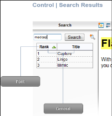
Rank Label
To change the text that appears at the top of the column used to display the ranking of topics found after a search:
Expand the General property group on the right side of the editor and enter new text in the Rank Label field.
Subject Font Color
To change the color of the font used for the subject of a MadCap Feedback comment:
Expand the SubjectFont property group on the right and change the value in the Subject Color field. Click the down arrow to open a color palette window. You can click a color shown, or you can click More colors and select a different color or create a custom color. If you are change the color for a style item that also has a gradient, the gradient properties have precedence over the solid color.
Subject Font Family
To select a specific font family (e.g., Arial, Tahoma, Verdana) used for the subject of a MadCap Feedback comment:
Expand the SubjectFont property group on the right and change the value in the Subject Font Family field. From the drop-down, select the font family or font set that you want to use.
Subject Font Size
To change the size of the font used for the subject of a MadCap Feedback comment:
Expand the SubjectFont property group on the right and change the value in the Subject Font Size field. Click the down arrow to open a small window. In this window, you can enter the size of the font in the lower-left field (either type a number or use the up and down arrows). You can select the unit of measurement (e.g., pixels, points, centimeters) using the lower-right drop-down arrow.
Subject Font Style
To change the style of the font (e.g., make it italic) used for the subject of a MadCap Feedback comment:
Expand the SubjectFont property group on the right and change the value in the Subject Font Style field. Click the down arrow and select either italic or normal.
Subject Font Weight
To change the weight of the font (e.g., make it bold) used for the subject of a MadCap Feedback comment:
Expand the SubjectFont property group on the right and change the value in the Subject Font Weight field. Click the down arrow and select either bold or normal.
Table Summary
To change the text for a table summary, which is used by screen readers to assist with accessibility
Expand the General property group on the right side of the editor and enter new text in the Table Summary field.
Text Image Relation
To select the location of a label in relation to the image used for the item:
Expand the General property group on the right side of the editor and select an option from the Text Image Relation field. You can select any of the following:
- ImageAboveText This displays the button image on top of the label text.
- ImageBeforeText This displays the button image to the left of the label text.
- Overlay This displays the label text and the button image in the same space.
- TextAboveImage This displays the label text on top of the button image.
- TextBeforeImage This displays the label text to the left of the button image.
Time Stamp Font Color
To change the color of the font used for the time stamp in a MadCap Feedback comment:
Expand the TimestampFont property group on the right and change the value in the Timestamp Color field. Click the down arrow to open a color palette window. You can click a color shown, or you can click More colors and select a different color or create a custom color. If you are change the color for a style item that also has a gradient, the gradient properties have precedence over the solid color.
Time Stamp Font Family
To select a specific font family (e.g., Arial, Tahoma, Verdana) used for the time stamp in a MadCap Feedback comment:
Expand the TimestampFont property group on the right and change the value in the Timestamp Font Family field. From the drop-down, select the font family or font set that you want to use.
Time Stamp Font Size
To change the size of the font used for the time stamp in a MadCap Feedback comment:
Expand the TimestampFont property group on the right and change the value in the Timestamp Font Size field. Click the down arrow to open a small window. In this window, you can enter the size of the font in the lower-left field (either type a number or use the up and down arrows). You can select the unit of measurement (e.g., pixels, points, centimeters) using the lower-right drop-down arrow.
Time Stamp Font Style
To change the style of the font (e.g., make it italic) used for the time stamp in a MadCap Feedback comment:
Expand the TimestampFont property group on the right and change the value in the Timestamp Font Style field. Click the down arrow and select either italic or normal.
Time Stamp Font Weight
To change the weight of the font (e.g., make it bold) used for the time stamp in a MadCap Feedback comment:
Expand the TimestampFont property group on the right and change the value in the Timestamp Font Weight field. Click the down arrow and select either bold or normal.
Title Label
To change the text that appears at the top of the column used to display the names of topics found after a search:
Expand the General property group on the right side of the editor and enter new text in the Title Label field.
Tooltip
To change the tooltip text that appears when users hover the cursor over the item:
Expand the General property group on the right side of the editor and enter new text in the Tooltip field.
User Info Font Color
To change the color of the font used for the user information in a MadCap Feedback comment:
Expand the UserInfoFont property group on the right and change the value in the UserInfoColor field. Click the down arrow to open a color palette window. You can click a color shown, or you can click More colors and select a different color or create a custom color. If you are change the color for a style item that also has a gradient, the gradient properties have precedence over the solid color.
User Info Font Family
To select a specific font family (e.g., Arial, Tahoma, Verdana) used for the user information in a MadCap Feedback comment:
Expand the UserInfoFont property group on the right and change the value in the User Info Font Family field. From the drop-down, select the font family or font set that you want to use.
User Info Font Size
To change the size of the font used for the user information in a MadCap Feedback comment:
Expand the UserInfoFont property group on the right and change the value in the User Info Font Size field. Click the down arrow to open a small window. In this window, you can enter the size of the font in the lower-left field (either type a number or use the up and down arrows). You can select the unit of measurement (e.g., pixels, points, centimeters) using the lower-right drop-down arrow.
User Info Font Style
To change the style of the font (e.g., make it italic) used for the user information in a MadCap Feedback comment:
Expand the UserInfoFont property group on the right and change the value in the User Info Font Style field. Click the down arrow and select either italic or normal.
User Info Font Weight
To change the weight of the font (e.g., make it bold) used for the user information in a MadCap Feedback comment:
Expand the UserInfoFont property group on the right and change the value in the User Info Font Weight field. Click the down arrow and select either bold or normal.
- Click
") to save your work.
to save your work.