A couple of media queries (tablet and mobile) are already provided in Flare.
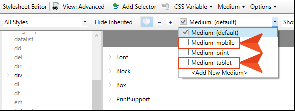
You can create additional media queries from the Stylesheet Editor if you want, but most authors will be able to do everything they need with just the tablet and mobile media queries. The tablet media query is designed to be used on medium-sized screens, such as iPads. The mobile media query is designed to be used on smaller screens, such as smart phones.
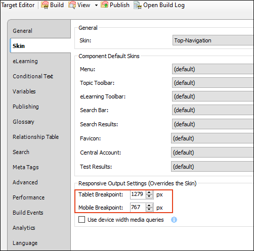
The tablet and mobile media queries are tied to the responsive output settings on the Skin tab of the Target Editor for HTML5 targets. The breakpoints provided in the target determine the point at which your media queries will become active in displaying the different style settings.