Flare Desktop supports the Accessible Rich Internet Applications (ARIA) technical specification from the World Wide Web Consortium. This is helpful for making output more accessible through screen readers.
[Menu Proxy — Headings — Online — Depth3 ]
ARIA Accessibility Labels
For some elements, ARIA information is injected as labels in the code. You can control this label text in a regular skin or skin component (UI Text tab) or a language skin.
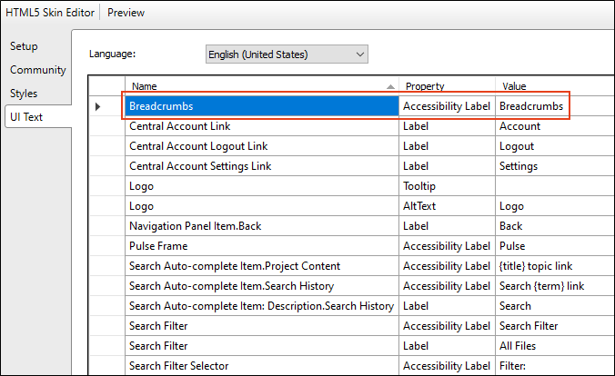
Example You are including breadcrumbs in your output. If you open the skin and select the UI Text tab, you will see a row dedicated to the accessibility label for breadcrumbs.
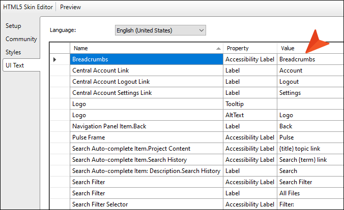
You can change the Value cell to control the text used for screen readers.
If you build the output and look at the code, you will see navigation="role" (which indicates the section of the page is used for navigation) and aria-label="Breadcrumbs" (which indicates the type of navigation and the label text).
ARIA Attributes
There are other elements where ARIA attributes are automatically added in the code.
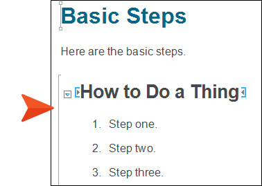
Example You insert a drop-down into a topic.
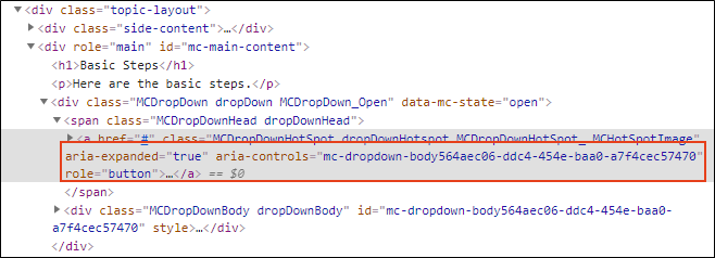
If you build the output and look at the code, you will see aria-expanded="true" (which indicates the drop-down has been clicked). You will also see another attribute for ARIA controls, as well as role="button" (which indicates that the element is a button).
Elements Affected
The following elements can be affected by the ARIA specification:
- Breadcrumbs
- Drop-downs
- Expanding text
- Footnotes
- Glossary expanding text
- Glossary popups
- Logo
- Open Navigation button
- Popup text
- Pulse iframe
- Search button
- Side Navigation menu
- Tables (see Accessibility and Tables)
- Tablet and mobile menu
- Togglers
- Top Navigation menu
- Topic popups
- Topic toolbar buttons
- Tripane main structure
- Tripane navigation tabs


