 Outputs Supported
For HTML5 targets, conditions can be used to make content responsive (e.g., content changes automatically according to the size of the screen, rather than simply based on “include” or “exclude”). Associating conditions with factory media queries (Web, Tablet, Mobile) can help make some content more appropriate or easier to read on different devices.
[Menu Proxy — Headings — Online — Depth3 ]
Features and User Interface Areas Affected
In addition to using this feature in targets, it can also be accessed when working in other areas of the user interface. Following are the features for which you can and cannot set conditions to display by media query:
|
Can Set by Media Query |
Cannot Set by Media Query |
|
|
|
Can Set by Media Query |
|
|
Cannot Set by Media Query |
|
Limitations
Keep the following in mind if you intend to display conditioned content according to media queries:
- This feature does not support all outputs. It works only for HTML5 targets.
- Only factory media queries (Web, Tablet, Mobile) are supported and are controlled by the breakpoints specified in the skin or target. This feature does not support custom media queries.
- Only conditions applied to content are supported. This feature does not support conditions that are applied to folders and files.
How to Set Conditions by Media Query
Following are steps for setting conditions by media query in the Target Editor. The steps are similar if you are working in the XML Editor, Preview window, or Send Files for Review Wizard; the first few steps would vary, depending on the part of the user interface. For links to each full set of steps, see Features and User Interface Areas Affected.
- Open an HTML5 target.
- Click the Conditional Text tab.
-
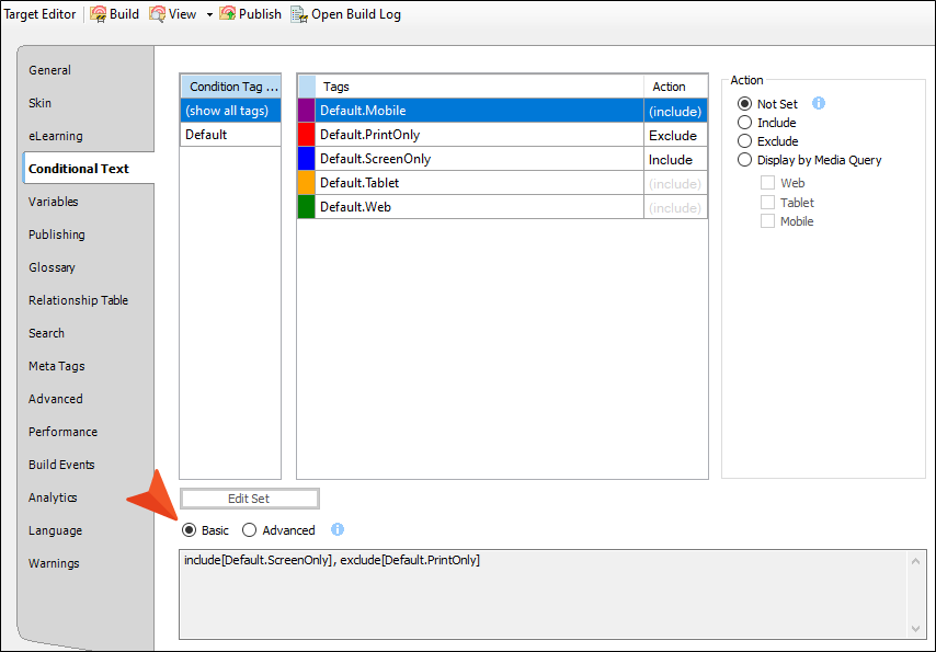
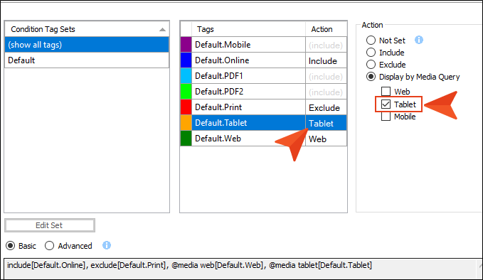
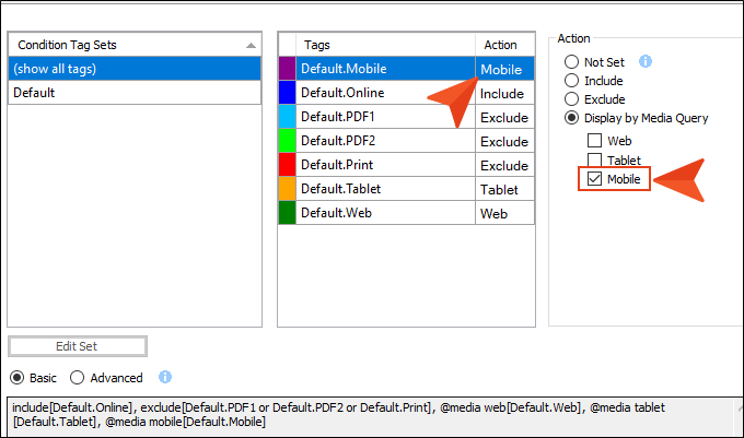
Toward the bottom of the tab, make sure the Basic option is selected.
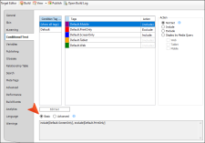
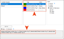
- In the Condition Tag Sets area, you can choose to view tags for all condition tag sets or you can select a specific set. The tags associated with the selected set are shown to the right, with their associated colors. An Action cell appears next to each condition tag. When Basic is selected, the Action cell is shown and the Advanced section below is disabled. In the Tags area, select a condition tag in the grid to set its action. (You can also hold down the SHIFT or CTRL key and choose multiple rows to set the same action on all of them at once.)
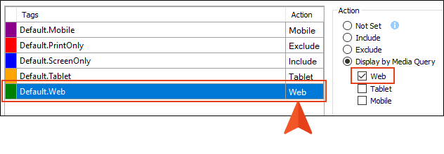
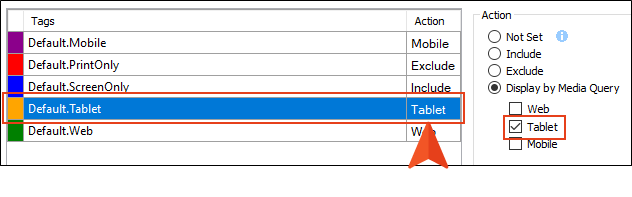
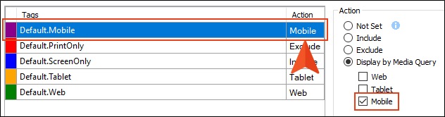
- The Action cell in the grid indicates the current setting for the condition. The text is gray if you have not explicitly chosen an option. Select Display by Media Query. Then choose any of the options below it.
Web The content will display if the user is viewing it on a large screen.
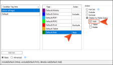
Tablet The content will display if the user is viewing it on a medium screen, such as an iPad.
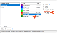
Mobile The content will display if the user is viewing it on a small screen, such as an iPhone.
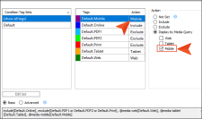
Note If you select all three of the media query check boxes, it has the same effect as choosing the “Include” option.
Note The “Display by Media Query” option is not available unless you are working in an HTML5 target. Other target types do not show this option.
Note The Basic method is the easiest way to display conditions by media query. However, you can also use the Advanced method. If you choose to do so, the markup should look something like the following.
-
Click
") to save your work.
to save your work.


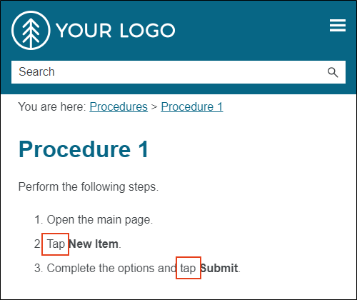
Example You are writing documentation for a cloud-based product, where it is more appropriate to tell users to “click” an option if they are working on a large screen, but to “tap” the option if they are using a tablet or smart phone.
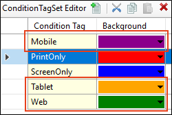
So in a condition tag set, you create three new conditions—one for each of those screen sizes.
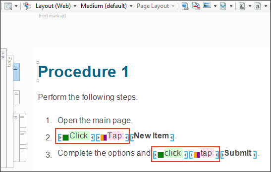
You write a procedure where you need to use to tell users to click or tap something. Therefore, you add both words to the instructions.
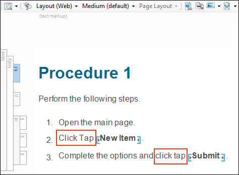
Then you apply the condition you named “Web” to the word “click,” and you apply the “Tablet” and “Mobile” conditions to the word “tap.”
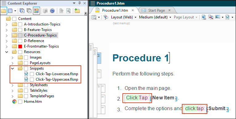
You anticipate that you will need to use these words many times throughout the project, so you create snippets—one holding the uppercase pair of words, and the other holding the lowercase pair. That way, you can just insert the appropriate snippet wherever those words are needed, rather than applying the conditions to text each time.
Next, you open the target and associate each of these conditions with the appropriate media query.
When you generate the online output and view it on a large screen, the word “click” is used.
But when you view the output on a smaller tablet or mobile screen, the word “tap” is used.
What’s Noteworthy?
Note You can set responsive conditions on tables. However, if you also have a table stylesheet applied to the table, responsive conditions only work if they are set on the entire table (i.e., the <table> tag); they do not work if the conditions are set on individual rows, columns, or cells.


