When using responsive layouts, it is important to understand the different systems that are available.
[Menu Proxy — Headings — Online — Depth3 ]
Flare's Responsive Layout System
Flare's system for creating responsive content is possible with its Responsive Layout window pane, which can be opened from the Styles section of the Home ribbon in Flare.

It displays by default on the right side of the interface.

This window pane lets you create a "one-row grid" to hold content. The benefit of putting your content into such a grid is that it allows it to shift and be responsive to screens of different sizes.
 Main Activities
The 12-Column Grid System
Both the Flare and Foundation systems are based on a 12-column grid system (i.e., a row has the potential of using 12 "columns" of content). But keep this very important point in mind:
Responsive content columns are not the same as the columns you are used to with tables. With responsive content, columns are purely used for measuring width (in percentages).
Flare considers the entire width of the screen displaying your output, and it divides this into 12 imaginary columns. The maximum width is 100% of the space, so 12 columns equals 100%. Half the width of the available screen space is 50%, or 6 imaginary columns. One-third of the width is 33.333%, or 4 columns. It is no more complicated than that. Assigning a number of columns in this type of layout is simply a shortcut; it is a quick way to tell Flare how wide a particular area should be.
When you create a new row using the Responsive Layout window pane, it contains a certain number of cells, and you can add more cells to the row as necessary. Then you assign a certain number of imaginary columns to each cell to set its width.

Why is this called a "grid" if it has only one row? Well, it has to do with what the end user perceives when looking at the output. Although each responsive layout consists of only one row (i.e., all of the content is contained within one <div> tag), the widths that you assign to the various cells can cause the layout to look like multiple rows in the output. Therefore, it appears to the end user to be a grid.
The key to this is the fact that for any row, you can exceed 100%. This usually happens when you assign column widths to cells for tablet and mobile screens.
For your large web layouts, you usually want the total number of columns in a row to add up to 100%. However, you can use fewer columns if you want (e.g., you might end up using only 10 columns, or roughly 83% of the space). In fact, there might be times when you use more than 100%, even for the large web view.
But for smaller devices to show the same content, you are likely to exceed 100% for the entire row. When the total width exceeds 12 columns (100%), the next cell moves downward. That way the content can be reconfigured and will be easier to see on a small screen. To the end user, it might look like you're using extra rows to display the same content. But it's actually still just one row, with the extra content shifted downward.

You can also use the Offset field in the Responsive Layout window pane to give any cell a left margin percentage (by assigning a number of columns to it). As far as right margins are concerned, you can accomplish that by editing your stylesheet (see Responsive Layout Styles).
The following graphic illustrates how the 12-column grid system works. Three different layouts are shown with various column (cell width) settings. One layout also uses offset (left margin) settings.

Layout and Media Query Integration
Just as you can specify skin settings for web, tablet, and mobile mediums, you can do the same with responsive layouts. You will see buttons for each medium at the top of the Responsive Layout window pane. Actually, these are more accurately referred to as "media queries," but they are sometimes called by both names.

These are synchronized with the layout and medium settings in the XML Editor. So when you select a particular layout in the XML Editor, the appropriate medium is also selected in both the XML Editor and the Responsive Layout window pane. And if you choose a medium in the Responsive Layout window pane, the corresponding layout and medium are selected in the XML Editor.

So when a particular layout/medium is selected, the settings you apply will be used for that size of screen in the output.
Example For a large screen, you might have a row consisting of three cells, with each cell set to use four columns (33.333% each).

The three cells each use an equal portion of the possible space when shown on a large screen that can handle that much content.
But this is too much for an iPhone. So for your Mobile layout, you tell Flare to use 12 columns in each of those three cells.

As the image above shows, the first cell took up the largest amount of space (12 columns, or 100%), so Flare had to shift the next cell downward. The second cell also used 100% of the space, so Flare had to move the third cell down even farther.
Responsive Layout Styles
If you've used the Foundation framework, you know that there are several styles involved. In the simplified Flare system, there are only a few styles to know about.
When you create a responsive layout in Flare, you are asked to create a new "row" style, or use an existing one. It's called a row style because it controls everything that is going on inside that one-row grid. However, in CSS it is actually a div style.
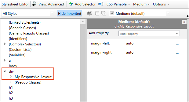
In fact, when you are all done adding cells to the row and assigning columns, you will also end up with multiple complex selectors in your stylesheet. These selectors consist of div styles, using the nth-child pseudo class for each cell.
Example In the following image, we have a responsive layout with three cells, so we have three complex selectors; the number at the end in parentheses represents the order of the cells.
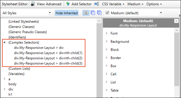
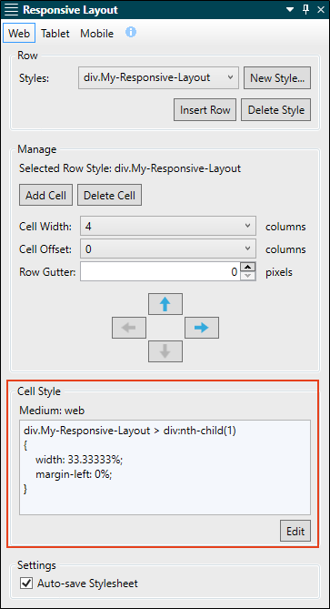
Maybe you want to make formatting adjustments to the second cell in this row style. In that case, you would select div.My-Responsive-Layout > div:nth-child(2) and modify the properties for it on the right side of the editor.
When you click in a cell in the XML Editor, the Responsive Layout window pane will show the relevant complex selector and the definitions for it. You cannot edit this part of the Responsive Layout window pane, but you can copy and paste it elsewhere if necessary. If you click the Edit button below this section, the stylesheet opens and automatically chooses the appropriate selector so that you can edit its properties.
Tip Depending on the type of content you add to your responsive layouts, certain additional styles and settings might be especially useful for you. If you create a grid where the content in each cell is exactly the same size, you're likely to have a much easier time configuring your layout. But if you have different types of content in your cells, or content that requires more space in some cells than others, you might need to use additional styles and properties in your stylesheet. For example, the "height" property can be quite useful to keep all of your cells looking the same. In the Stylesheet Editor, you would expand (Complex Selectors), choose your main selector (e.g., if your layout is named "Grid," you would select div.Grid > div) and then complete the height or other settings to the right.
Foundation and Other Systems
As an alternative to using Flare's Responsive Layout window pane, you can use a third-party framework to create responsive output.
Zurb Foundation (http://foundation.zurb.com/) lets you freely download files such as CSS, HTML, and Javascript in order to take advantage of the responsive output framework they've created. To support responsive content in Flare, a Foundation CSS file has been downloaded and placed in the following location where you installed Flare:
C:\Program Files\MadCap Software\MadCap Flare 20\Flare.app\Resources\WebHelp2\Desktop\Skins\Fluid\Stylesheets\foundation.5.5.0
Note It is recommended that you do not edit the Foundation stylesheet or move it from this location in the application installation folder. However, if you want, you can make a copy of the stylesheet, place it in any Flare project, and make changes to it. Any stylesheets in your project have precedence over any stylesheets located in your Flare installation folder.
There are other frameworks similar to Foundation. Bootstrap may be the most popular alternative. As long as you have a system using valid CSS and HTML, you can use it in Flare. However, Foundation is the only responsive framework where the stylesheet is already included in Flare. To use another system, you would need to download the appropriate CSS files and add them to your Flare project.
Keep in mind that Foundation and other third-party frameworks are not supported in Flare's XML Editor. So topics using these systems will likely not appear in the XML Editor the same way they appear in the output. On the other hand, the system using Flare's Responsive Layout window pane is supported in the XML Editor. Therefore, what you see in the editor is much closer to what you will see when you generate the output.
Also, Flare's Responsive Layout window pane is much more simple than these third-party systems. Although you can do a great deal with these other frameworks, they also require more time and effort to learn how to use them.


