 Outputs Supported


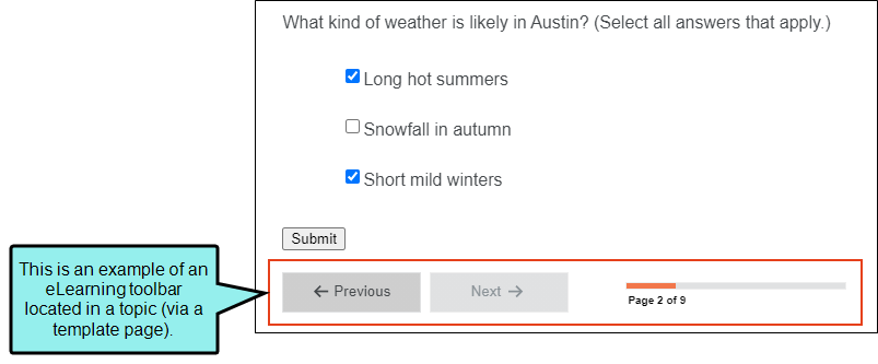
Note eLearning toolbars are supported in HTML5 output only. They are not supported in the other outputs listed above.
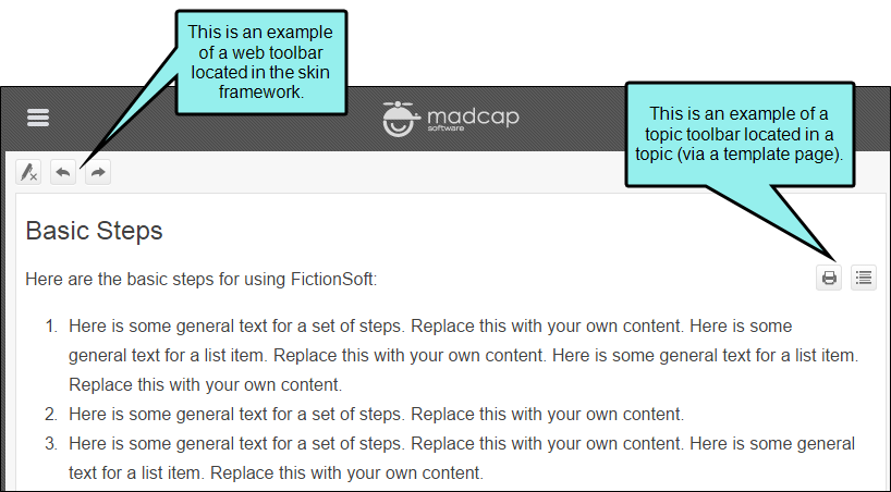
There are three types of toolbars that you can add to your online output—topic, web, and eLearning. A topic toolbar displays buttons in a custom toolbar within the topic content, based on the insertion of a Topic Toolbar proxy. A web toolbar displays buttons within the skin framework. An eLearning toolbar is typically shown at the bottom of topics to guide individuals through an online eLearning course.
Toolbars and Skins
The kinds of toolbars (and sometimes the buttons) that are available depend on the type of skin you are using.
|
Skin Type |
Topic Toolbar |
Web Toolbar |
eLearning Toolbar |
|
|---|---|---|---|---|
|
HTML5 Top Navigation1 |
|
|
|
|
|
HTML5 Side Navigation1 |
|
|
|
|
|
HTML5 Skinless1 |
|
|
|
|
|
HTML5 Tripane2 |
|
|
|
|
|
Standard3 |
|
|
|
|
|
1Side and Top Navigation—as well as skinless outputs—do not use frames, like other outputs do. Therefore, you must use a topic toolbar if you want to display toolbar buttons. 2In an HTML5 Tripane skin, you can configure a web toolbar by using the Toolbar tab. 3Although Pulse is supported in WebHelp and WebHelp Plus targets, you can add Pulse-related buttons (e.g., Edit User Profile, Topic Ratings) only in a WebHelp toolbar. You cannot add them in a topic toolbar. |
||||
Note Although you can insert Topic Toolbar proxies in most of the online outputs, choosing the buttons for the toolbar can be done in the skin for only some outputs. For Microsoft HTML Help output, you can select buttons in the Topic Toolbar proxy only.

