 Outputs Supported


These are navigation elements that you might include in your project (e.g., cross-references, breadcrumbs, keyword links, related topics links, concept links). For most of these elements, you can use the skin style to change the link or prefix text. For cross-references, you can change text as well as formats (i.e., how the link is constructed).
Styles for many of the formats are supported only in WebHelp and WebHelp Plus outputs. The formats related to cross-references are supported in print-based outputs (Adobe PDF, Microsoft Word).
How to Specify Style Settings for Formats
- Open a Standard skin.
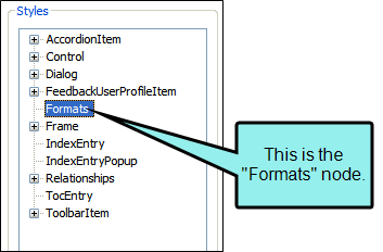
- Select the Styles tab.
-
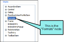
In the Styles section, select the Formats node.
Properties for the following elements are shown on the right side of the tab.
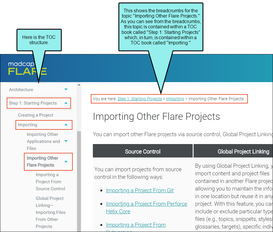
Breadcrumbs
In the output, this is a "trail of breadcrumbs" composed of the table of contents (TOC) entries above the current topic in the TOC hierarchy.
In the skin you can change the prefix text ("You are here") for the breadcrumbs.
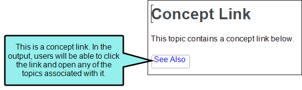
Concept Links
A concept link is a Help control that lets users open topics that you've determined are related to the current topic. It is similar to the related topics link. However, whereas you associate a related topics link with specific individual topics (usually for a one-time use), you associate a concept link with a group of topics (to be reused in different topics). One great benefit of this type of link is that, if you later want to add or delete topics from the group, you only need to do so in one place and the changes are applied to every topic containing that concept link.
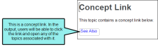
In the skin you can change the text that displays on the link ("See Also").
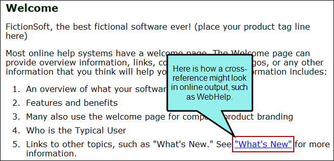
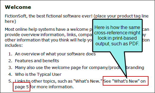
Cross-References
A cross-reference is an automated link that is based on a format with commands. This method of linking saves time because you don't have to type the link text each time, or manage it over time if the destination content changes. Cross-references are recommended when you are linking from one place in your project to another (as opposed to linking to external files or websites).

In the skin you can change the cross-reference format used for either online or print-based output. If you are creating context-sensitive cross-references, use a language skin instead of a regular skin.
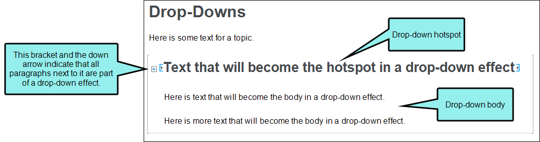
Drop-Down
A drop-down is a feature that lets you click a hotspot to expand and collapse specified content (paragraphs, lists, images, tables, videos, etc.) below it.

In the skin you can change the alternate text for the open and closed images used next to the drop-down.
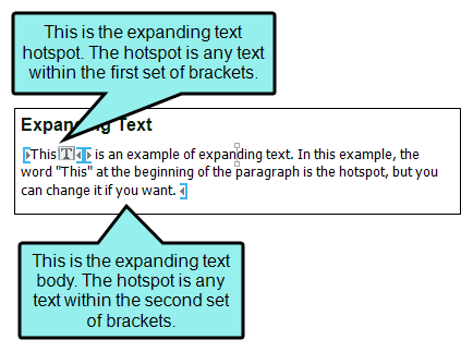
Expanding Text
Expanding text is a feature that lets you click a hotspot to expand and collapse content that appears after it in the same paragraph or other block element.
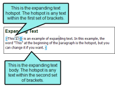
In the skin you can change the alternate text for the open and closed images used next to the expanding text effect.
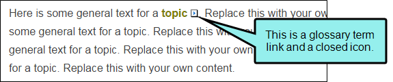
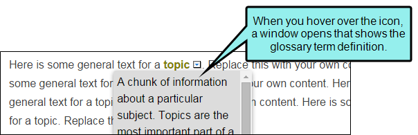
Glossary Term
If you have words and phrases in topics and snippets that are to be included in a glossary, you can turn them into links. A glossary term link lets users access definitions from that location in the output. Glossary term links can display definitions in popups, hyperlinks, or expanding text.
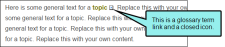
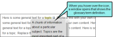
In the skin you can change the alternate text for the open and closed images used next to the glossary term in the output.
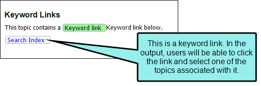
Keyword Links
A keyword link is a Help control that lets you open topics related to the current topic based on index keywords that they share.
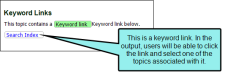
In the skin you can change the text that displays on the link ("Search Index").
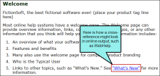
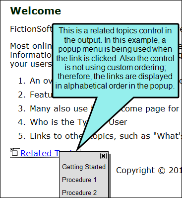
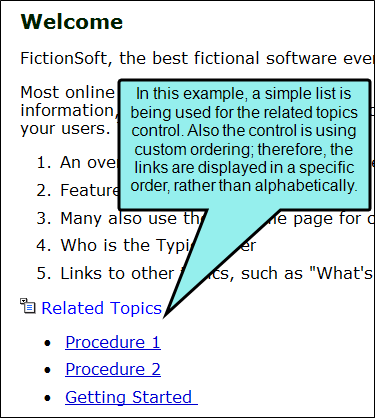
Related Topics
A related topics link is a Help control that provides users with list of links to topics that you've specified as being related to the current topic. This is similar to a concept link. You might use a related topics link if you are applying it to a topic that you want to associate with specific topics but you do not plan to reuse the same link in other topics.
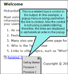
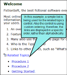
In the skin you can change the text that displays on the link ("Related Topics").
Toggler
A toggler is a feature that lets users click a hotspot to reveal one or more named elements in a topic. A named element (also called the "toggler target") is a chunk of content that can reside anywhere in the topic. When users click the toggler hotspot, the output reveals hidden content elements. When users click the hotspot again, the content is hidden again.
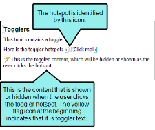
In the skin you can change the alternate text for the open and closed images used next to the toggler effect.
- Select the Property Groups or Alphabetical List option to display the properties for the node.
-
In the Properties section, set the values for the properties that you want modify.
Above Reference
To change the text used when the destination appears above a cross-reference on the same page of print-based output:
Expand the Cross-Reference property group on the right side of the editor and enter new text in the Above Reference field.
Below Reference
To change the text used when the destination appears below a cross-reference on the same page of print-based output:
Expand the Cross-Reference property group on the right side of the editor and enter new text in the Below Reference field.
Breadcrumbs Prefix
To change the text used at the beginning of a trail of breadcrumbs in online output:
Expand the Breadcrumbs property group on the right side of the editor and enter new text in the Breadcrumbs prefix field.
Closed Image Alt Text
To change the alternate text used when the image is closed:
Expand the Drop Down, Expanding Text, Glossary Term, or Toggler property group on the right side of the editor and enter new text in the Closed Image Alt Text field.
Concept Link
To change the text used on a concept link in online output:
Expand the Concept Link property group on the right side of the editor and enter new text in the Link Text field.
Format
To change the command structure of a cross-reference when used in online output:
Expand the Cross-Reference property group on the right side of the editor and enter new text in the Format field, including any format commands.
Format for Print
To change the command structure of a cross-reference when used in print-based output:
Expand the Cross-Reference property group on the right side of the editor and enter new text in the Format for Print field, including any format commands.
Keyword Link
To change the text used on a keyword link in online output:
Expand the Keyword Link property group on the right side of the editor and enter new text in the Link Text field.
On Facing Page Reference
To change the text used when the destination appears on a page adjacent to a cross-reference (e.g., link is on the left page and destination is on the right page) in print-based output:
Expand the Cross-Reference property group on the right side of the editor and enter new text in the On Facing Page Reference field.
On Next Page Reference
To change the text used when the destination appears on the page just after a cross-reference in print-based output:
Expand the Cross-Reference property group on the right side of the editor and enter new text in the On Next Page Reference field.
On Page Reference
To change the text used when the destination appears more than one page away from a cross-reference in print-based output:
Expand the Cross-Reference property group on the right side of the editor and enter new text in the On Page Reference field.
On Previous Page Reference
To change the text used when the destination appears on the page just before a cross-reference in print-based output:
Expand the Cross-Reference property group on the right side of the editor and enter new text in the On Previous Page Reference field.
Open Image Alt Text
To change the alternate text used when the image is open:
- Expand the Drop Down, Expanding Text, Glossary Term, or Toggler property group on the right side of the editor and enter new text in the Open Image Alt Text field.
Related Topics
To change the text used on a related topics link in online output:
Expand the Related Topics property group on the right side of the editor and enter new text in the Link Text field.
- Click
") to save your work.
to save your work.

Note You can also set the format for elements in a regular stylesheet. If you do so, those settings override conflicting settings in the skin.
Note If you want to display the output user interface in a particular language, you can modify styles in a language skin instead of a regular skin.
