 Outputs Supported


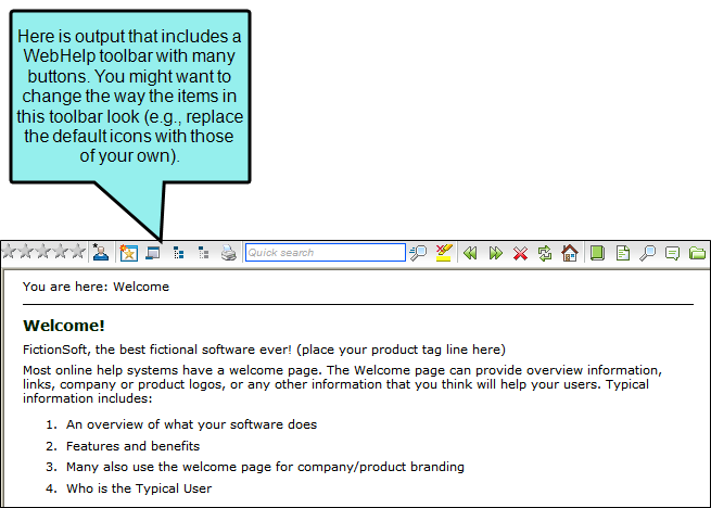
Using a skin, you can modify the appearance of WebHelp toolbars and topic toolbars that you include in your output.
How to Specify Style Settings for Toolbar Items
- Open a Standard skin.
- Select the Styles tab.
-
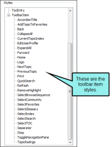
In the Styles section, expand the Toolbar Item node.
-
Select the item that you want to edit. If you want the setting(s) to be applied to all of the items, select the Toolbar Item node itself.
The items under this node represent the different kinds of toolbar items that may be found in your output.
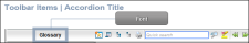
Accordion Title
Displays the name of the accordion item, which is next to the WebHelp toolbar.
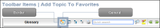
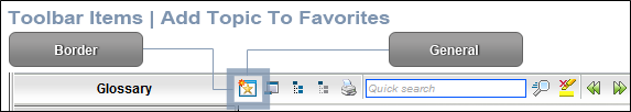
Add Topic to Favorites
Lets users add the active topic to the Favorites pane so that they can quickly access the topic in the future.
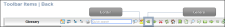
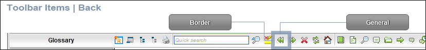
Back
Lets users open the topic that was viewed previously.
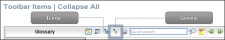
Collapse All
Lets users collapse all elements such as togglers, drop-down effects, and expanding text effects in a topic (if they are expanded).
Current Topic Index
Lets users see the display for the current topic in the sequence. This label is typically used in conjunction with the "Next Topic" and "Previous Topic" buttons when the topic in question exists in a browse sequence. Flare finds the current topic in a browse sequence and display its position in relation to the rest of the topics in that sequence. (The root node is used to determine the count; in other words, if there are "child" topics in the sequence structure under the current topic, they will be included in the count.)

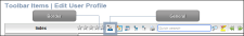
Edit User Profile
Lets users edit their Feedback registration profile settings.
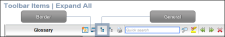
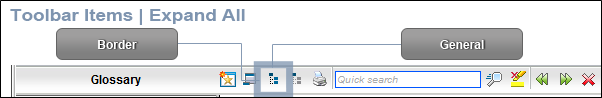
Expand All
Lets users expand all elements such as togglers, drop-down effects, and expanding text effects in a topic (if they are not yet expanded).
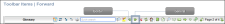
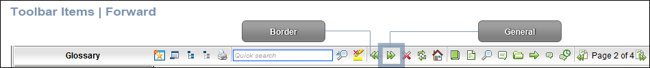
Forward
Lets users open the next topic in a previously viewed sequence.
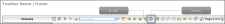
Home
Lets users open a designated home page (such as your company's website).
Logo
Displays a logo.

Next Topic
Lets users open the next topic in the output. If you are using a browse sequence, Flare attempts to find the current topic in a browse sequence and navigate to the next topic from there. If you are using HTML5 Side Navigation, Top Navigation, or skinless output, or if you are not using a browse sequence, Flare looks at the position of the current topic in your table of contents (TOC) and opens the next topic after it.

Previous Topic
Lets users open the previous topic in the output. If you are using a browse sequence, Flare attempts to find the current topic in a browse sequence and navigate to the previous topic from there. If you are using HTML5 Side Navigation, Top Navigation, or skinless output, or if you are not using a browse sequence, Flare looks at the position of the current topic in your table of contents (TOC) and opens the previous topic before it.

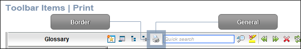
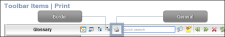
Print
Lets users open the Print dialog so that they can send the open topic to the printer.
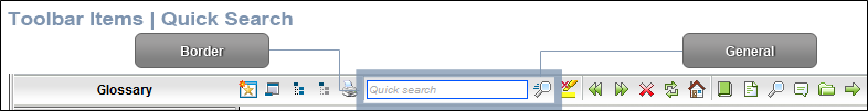
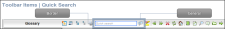
Quick Search
Lets users initiate a search in the active topic for the word or phrase that has been typed in the field next to the button.
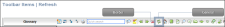
Refresh
Lets users initiate a search in the active topic for the word or phrase that has been typed in the field next to the button.
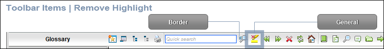
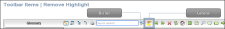
Remove Highlight
After a user performs a quick search in a topic, the search text found in the topic is highlighted. This button lets users turn the highlights off.
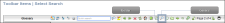
Select Browse Sequence
Lets users open the Browse Sequence feature.

Select Favorites
Lets users open the Favorites feature.

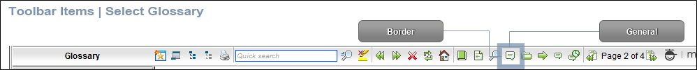
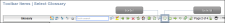
Select Glossary
Lets users open the Glossary feature.
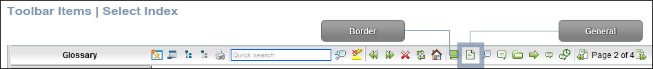
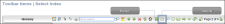
Select Index
Lets users open the Index feature.
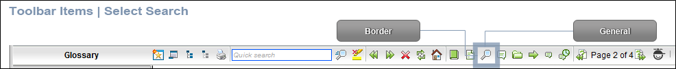
Select Search
Lets users open the Search feature.
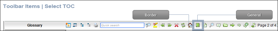
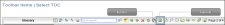
Select TOC
Lets users open the TOC feature.
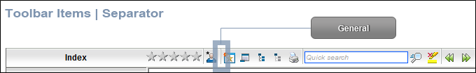
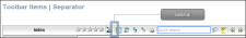
Separator
This is the divider between the toolbar buttons and the navigation pane.
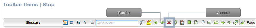
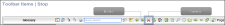
Stop
Lets users prevent a page from downloading file information.
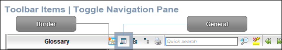
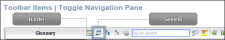
Toggle Navigation pane
Lets users toggle between hiding and showing the navigation pane in the output window.
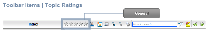
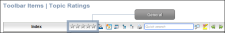
Topic Ratings
Lets users submit ratings for a topic (if you have incorporated your output with MadCap Feedback).
- Select the Property Groups or Alphabetical List option to display the properties for the style item.
-
In the Properties section, set the values for the properties that you want modify.
About Box Alternate Text
To change the alternate text for the logo's "About" box
Expand the General property group on the right side of the editor and enter new text in the About Box Alternate Text field.
Borders
To add or change borders for the item:
Expand the Borders property group on the right and change the value in any of the "Border" fields (e.g., Border Left, Border Right). Click the down arrow to open a small window. In this window, you can enter the width of the border in the lower-left field. You can select the unit of measurement (e.g., pixels, points, centimeters) using the lower-left drop-down arrow.
Control Type
To change the control type for the item (i.e., you can select any type of button that can be added to the toolbar):
Expand the Type property group on the right and select an item in the Control Type field.
Empty Icon
To select a different "empty" icon image for the "Topic Ratings":
Expand the General property group on the right side of the editor and select an image from the Empty Icon field. Click the down arrow in this field and then select Browse for Image to find and select an image file.
By default the button displays five stars. This image represents the area of the button that is not rated (e.g., if readers give the topic "two out of five stars," this image fills the space of the three empty stars).
Font Background Color
To change the color of the area behind the font:
Expand the Font property group on the right and change the value in the Background Color field. Click the down arrow to open a color palette window. You can click a color shown, or you can click More colors and select a different color or create a custom color. If you are change the color for a style item that also has a gradient, the gradient properties have precedence over the solid color.
Font Background Gradient
To change the background color of the item:
Expand the Font property group on the right and change the value in the Background Gradient field to apply a color progression effect. The background changes from one color to another. Click the down arrow to open a small window. In this window, click the down arrow next to the Start field and select a color to use at the beginning of the gradient. Then click the down arrow next to the End field and select the color to use at the end of the gradient. Finally, click the down arrow next to the Style field and select a direction for the gradient effect or choose "solid." Click OK to accept the settings. When you click off the properties field, a small icon is displayed in the field, showing how the effect will look. If you are change the color for a style item that also has a gradient, the gradient properties have precedence over the solid color.
Font Background Gradient Hover
To change the background color of the item when the end user hovers over it:
Expand the Font property group on the right and change the value in the Background Gradient Hover field to apply a color progression effect. The background changes from one color to another. Click the down arrow to open a small window. In this window, click the down arrow next to the Start field and select a color to use at the beginning of the gradient. Then click the down arrow next to the End field and select the color to use at the end of the gradient. Finally, click the down arrow next to the Style field and select a direction for the gradient effect or choose "solid." Click OK to accept the settings. When you click off the properties field, a small icon is displayed in the field, showing how the effect will look. If you are change the color for a style item that also has a gradient, the gradient properties have precedence over the solid color.
Font Background Gradient Pressed
To change the background color of the item when the end user presses it:
Expand the Font property group on the right and change the value in the Background Gradient Pressed field to apply a color progression effect. The background changes from one color to another. Click the down arrow to open a small window. In this window, click the down arrow next to the Start field and select a color to use at the beginning of the gradient. Then click the down arrow next to the End field and select the color to use at the end of the gradient. Finally, click the down arrow next to the Style field and select a direction for the gradient effect or choose "solid." Click OK to accept the settings. When you click off the properties field, a small icon is displayed in the field, showing how the effect will look. If you are change the color for a style item that also has a gradient, the gradient properties have precedence over the solid color.
Font Color
To change the color of the font:
Expand the Font property group on the right and change the value in the Color field. Click the down arrow to open a color palette window. You can click a color shown, or you can click More colors and select a different color or create a custom color. If you are change the color for a style item that also has a gradient, the gradient properties have precedence over the solid color.
Font Family
To select a specific font family (e.g., Arial, Tahoma, Verdana):
Expand the Font property group on the right and change the value in the Font Family field. From the drop-down, select the font family or font set that you want to use.
Font Size
To change the size of the font:
Expand the Font property group on the right and change the value in the Font Size field. Click the down arrow to open a small window. In this window, you can enter the size of the font in the lower-left field (either type a number or use the up and down arrows). You can select the unit of measurement (e.g., pixels, points, centimeters) using the lower-right drop-down arrow.
Font Style
To change the style of the font (e.g., make it italic):
Expand the Font property group on the right and change the value in the Font Style field. Click the down arrow and select either italic or normal.
Font Weight
To change the weight of the font (e.g., make it bold):
Expand the Font property group on the right and change the value in the Font Weight field. Click the down arrow and select either bold or normal.
Full Icon
To select a different "full" icon image for the "Topic Ratings":
Expand the General property group on the right side of the editor and select an image from the Full Icon field. Click the down arrow in this field and then select Browse for Image to find and select an image file.
By default the button displays five stars. This image represents the area of the button that has been rated completely (e.g., if readers give the topic "two out of five stars," this image fills the space of the two stars).
Hover Icon
To select a different icon image to be used when the user hovers the cursor over the item:
Expand the General property group on the right side of the editor and select an image from the Hover Icon field. Click the down arrow in this field and then select Browse for Image to find and select an image file.
Icon
To select a different icon image:
Expand the General property group on the right side of the editor and select an image from the Icon field. Click the down arrow in this field and then select Browse for Image to find and select an image file.
Label
To change the text that appears on the item:
Expand the General property group on the right side of the editor and enter new text in the Label field.
Logo Alternate Text
To change the alternate text for the logo
Expand the General property group on the right side of the editor and enter new text in the Logo Alternate Text field.
On Click
To provide a command for the item when it is clicked by the user:
Expand the Type or General property group on the right and enter a command in the OnClick field.
Example You want to provide a command for an item (e.g., so that clicking the button opens a website). The following command opens the MadCap Software website when a user clicks the button:
Copywindow.open("http://www.madcapsoftware.com");Padding
To add or change padding (space around) the item:
Expand the Font property group on the right and change the value in any of the "Padding" fields (e.g., Padding Left, Padding Right). Click the down arrow to open a small window. In this window, you can enter the amount of padding in the lower-left field (either type a number or use the up and down arrows). You can select the unit of measurement (e.g., pixels, points, centimeters) using the lower-right drop-down arrow.
Pressed Icon
To select a different icon image to be used when the item is pressed:
Expand the General property group on the right side of the editor and select an image from the Pressed Icon field. Click the down arrow in this field and then select Browse for Image to find and select an image file.
Rating Submitted Message
To change the text that appears after users rate a topic:
Expand the General property group on the right side of the editor and enter new text in the Rating Submitted Message field.
Search Box Tooltip
To change the tooltip text that appears when users hover the cursor over the search field:
Expand the General property group on the right side of the editor and enter new text in the Search Box Tooltip field.
Separator Alternate Text
To change the alternate text for the separator
Expand the General property group on the right side of the editor and enter new text in the Separator Alternate Text field.
Show Tooltip
To change the tooltip text that appears when users hover over the "Toggle Navigation Pane" button (when the navigation pane is hidden):
Expand the General property group on the right side of the editor and enter new text in the Show Tooltip field.
Text Image Relation
To select the location of a label in relation to the image used for the item:
Expand the General property group on the right side of the editor and select an option from the Text Image Relation field. You can select any of the following:
- ImageAboveText This displays the button image on top of the label text.
- ImageBeforeText This displays the button image to the left of the label text.
- Overlay This displays the label text and the button image in the same space.
- TextAboveImage This displays the label text on top of the button image.
- TextBeforeImage This displays the label text to the left of the button image.
Tooltip
To change the tooltip text that appears when users hover the cursor over the item:
Expand the General property group on the right side of the editor and enter new text in the Tooltip field.
- Click
") to save your work.
to save your work.


