Various options are available in the Home ribbon for managing content.
|
|
Pastes the selection from the clipboard to the place where the cursor is inserted. |
|
|
Cuts the selection and sends it to the clipboard. |
|
|
Copies the selection and sends it to the clipboard. |
|
|
Deletes the selection. |
|
|
Lets you select a font type (e.g., Arial, Times New Roman), applying it to the content selected in the topic. |
|
|
Lets you select a font size, applying it to the content selected in the topic. |
|
|
Applies bold typeface to the content selected in the topic. |
|
|
Applies italic typeface to the content selected in the topic. |
|
|
Underlines the content selected in the topic. |
|
|
Raises the selected content in the topic above the normal line of text (e.g., X2). |
|
|
Lowers the selected content in the topic below the normal line of text (e.g., X2). |
|
|
Removes local formatting in a selection or even an entire topic. |
|
|
Lets you choose and apply a color to the selected content. |
|
|
Lets you choose and apply a color to the background of the selected content. |
|
|
You can set redacted text on any kind of content (e.g., characters, paragraphs, images, tables). You can do this locally at the font level by highlighting each piece of content |
|
|
Opens the Font Properties dialog, which lets you edit the font properties for topic content directly. |
|
|
Lets you select one of several kinds of bullet or numbered lists, applying it to the selected content. If you want to create a bulleted or numbered list, it is a best practice to limit your selections to the Bullet List and Numbered List options, then rely on list style settings to provide the type of list item automatically depending on its level. For example, for a three-level numbered list, you can place settings on the ol style for the first level, on ol ol for the second level, and on ol ol ol for the third level.
|
|
|
Removes the group tag from a paragraph, thus "outdenting" it. |
|
|
Lets you use a group tag such as <div> to indent content. Another method for indenting content is through the use of margin or padding settings on a style. Note If you click inside a paragraph (rather than at the very beginning) and press Tab or click |
|
|
Lets you apply miscellaneous actions to selected content in a list.
|
|
|
Groups selected items. The Create Group dialog opens, which lets you create a group from selected content and apply one of the following tags to it: <blockquote>, <div>, <fieldset>, <form>. |
|
|
Aligns the selected content to the left. |
|
|
Aligns the selected content in the center. |
|
|
Aligns the selected content to the right. |
|
|
Spaces the selected content so that both the left and right sides are aligned. |
|
|
Resets the alignment of the selected text to the default (inherited) setting. |
|
|
Opens the Paragraph Properties dialog, which lets you edit the paragraph properties for topic content directly. This includes the ability to apply page breaks, column breaks, and widow/orphan control to a paragraph directly. |
|
|
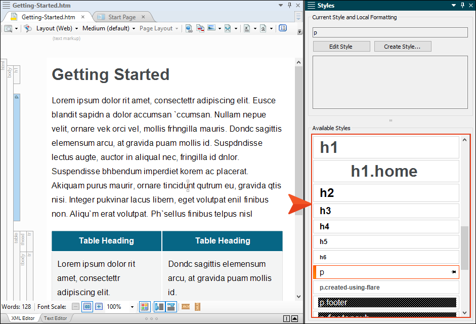
Opens the Styles window pane, which displays styles contained in the stylesheets that are associated with the current topic. The styles that are shown depend on the positioning of your cursor in the topic. For example, if the cursor is highlighting multiple paragraphs or is simply placed somewhere within a paragraph, the paragraph styles are shown in the Styles window pane. If the cursor is highlighting a portion of a paragraph, the character styles are shown. |
|
|
Opens the Responsive Layout window pane, which lets you create single-row grids that allow your content to be responsive. This means that the structure of the content shifts, depending on the size of the screen displaying it. |
|
|
Opens the Formatting window pane, which has two tabs. The Style Inspector tab lets you see the style details for selected content in the open file (e.g., topic, snippet), and even edit those styles if necessary, without having to open the full stylesheet. The Local Properties tab displays local formatting for the selected content in a topic. |
|
|
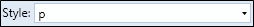
Lets you apply a style to the content selected in the topic. When you attempt to apply a style to content using the Style drop-down in the Home ribbon, the Styles window pane, or the floating Style Picker, previews of the various styles are shown by default. This gives you an idea of how each style looks before you apply it to the content.
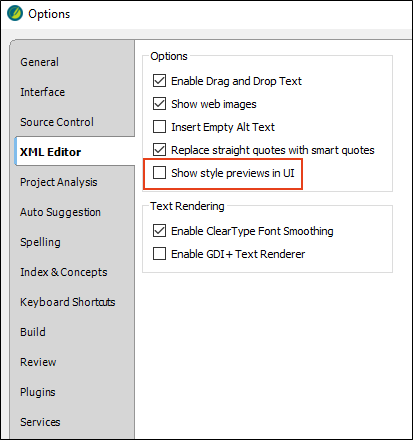
If you prefer not to see style previews in these areas of the user interface, you can open the Options dialog (File > Options) and disable the preview on the XML Editor tab. Remove the check mark from Show style previews in UI.
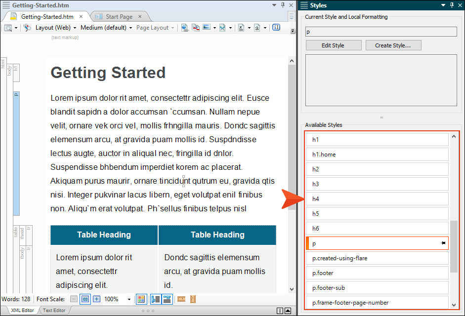
With this option disabled, all of the styles will be presented as plain text when you select them.
Tip It is likely that you will have certain styles that you tend to use more than others. You can pin these styles in various places of the Flare interface so that they are always easily accessible. |
|
|
Opens the Create Style dialog, which lets you create a new style for the content selected in the content file. |
|
|
Opens the Stylesheet Links dialog, which lets you apply one or more stylesheets to the active content file. |
|
|
Opens the Create Snippet dialog, which lets you create a new snippet from the content selected in the topic. |
|
|
Lets you create a micro content file from a topic or snippet. |
|
|
This window pane is used to set attributes for a tag. Attributes let you provide additional information about tagged content and how that content should behave. |
|
|
Opens a dialog that lets you apply conditions to content. |
|
|
Opens the Select Language dialog, which lets you choose a language for the selected content. |
|
|
Opens the Manage Named Elements, which you can use to name content when creating togglers. |
|
|
Opens a submenu, which lets you choose from various options.
|
|
|
Opens the Quick Find widget in the upper-right corner of the open document. This lets you search for text in that document. |
|
|
Opens the Quick Replace widget in the upper-right corner of the open document. This is the same as the Quick Find widget, except that it opens with the replace fields already in view. It lets you search for and replace text in that document. |
|
|
Opens the Find Elements window pane, where you can search for specific elements, tags, styles, and markup in the open document or the entire project. |
|
|
Opens the Properties dialog for the selected item. |


 (at bottom of Font section)


 in the Home ribbon or Text Format toolabar, you will notice that the paragraph is not indented, but rather the Create Group dialog opens, allowing you to select different types of block styles. These styles let you create block-level content in a unique "container" for different purposes.