After making decisions about how you want your Top Navigation output to look and work, you can follow the necessary steps to produce it.
How to Produce Top Navigation Output
- Add a
-
(Optional) You can edit the
Following are a few of the more common adjustments that are made in skins:
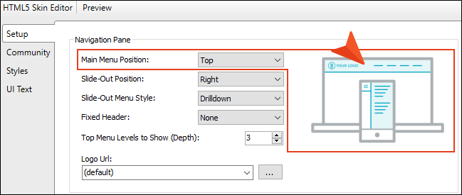
main menu position
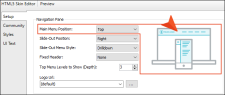
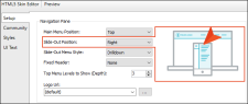
On the Setup tab of the Skin Editor, you can set the main menu position to Top, Left, or Right. This is the primary menu (links to topics) that is based on your TOC when the output is being viewed on a large screen (not tablet or mobile). In a new
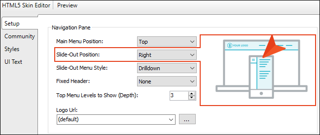
Slide-Out Position
On the Setup tab of the Skin Editor, you can position the pane either on the Left or Right. This is the flyout menu pane that is seen on the side of the output when it is being viewed on a tablet or mobile device, replacing the menu that is seen on larger screens.
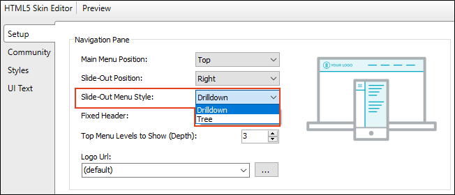
Slide-Out Menu Style
On the Setup tab of the Skin Editor, you can choose the look of the slide-out menu for
You can select a drilldown format. Any item containing sub-items has a double-arrow next to it. When you click on such an item, the entire menu changes, showing only that item and its sub-items.
Alternatively, you have the option of using a tree format instead. With this format, any item containing sub-items has a down arrow next to it. When you click on that item, the sub-items are shown, but the rest of the menu remains in view as well.

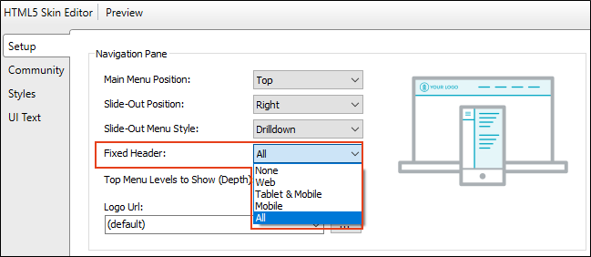
Fixed Header
On the Setup tab of the Skin Editor, you can fix the header portion of the topic so that it stays in place when users scroll down to see more content.

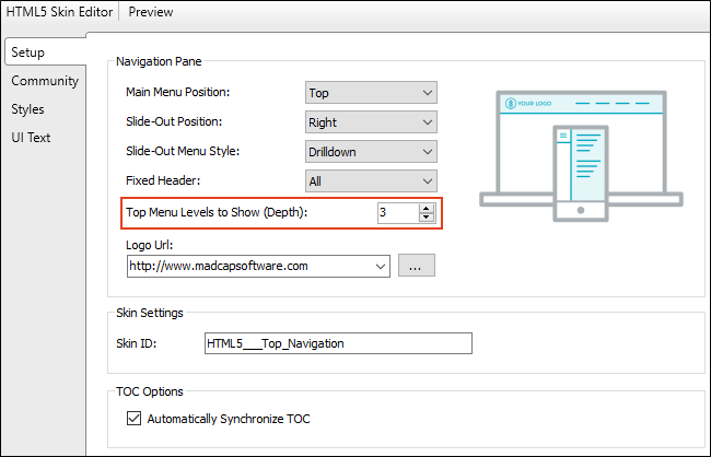
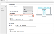
Top Menu Depth
On the Setup tab of the Skin Editor, you can specify how many levels of your TOC items are included in the top menu navigation. The default is 3. It is recommended that you avoid including too many depth levels in the top navigation.
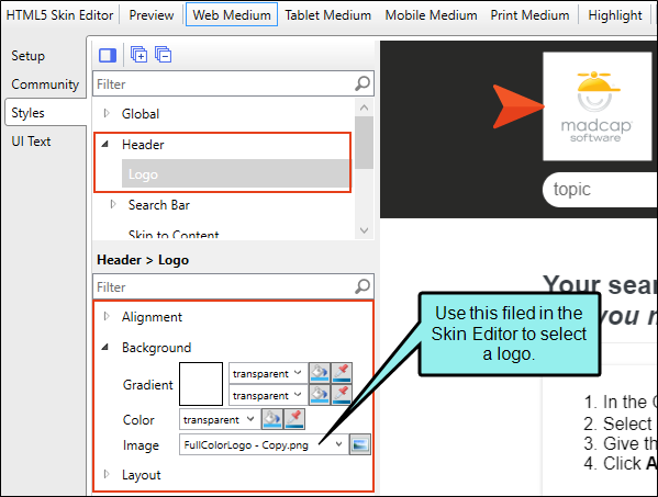
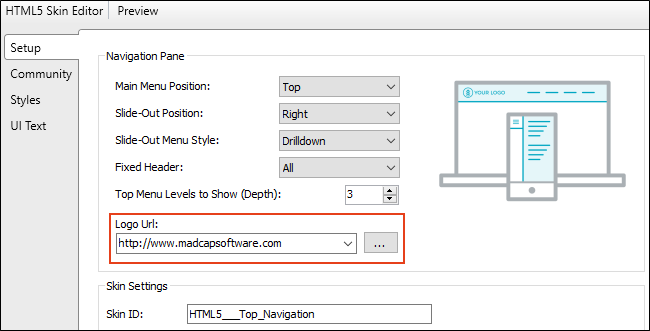
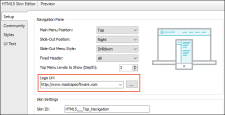
Logo
On the Styles tab of the Skin Editor, you can replace the generic logo with your own (if you have not already done so using the branding feature).

Whatever image you use for your logo, it is automatically set to link to the topic that you've set as the Startup Topic on the General tab of the Target Editor. However, you can select a different topic or even enter the URL to your company's website instead (remember to include http:// at the beginning of the path if you link to a website). This can be done on the Setup tab of the Skin Editor.
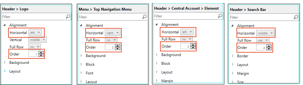
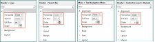
Alignment for Logo, Search Bar, and Menu
There are some flexbox-related options on the Styles tab that let you align the logo, search bar, and menu in the header. These fields called “Full Row” and “Order.”
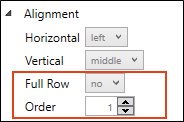
- Full Row This option allows the element to take up all of the space horizontally in the header.
- Order This option determines which element comes first, second, or third in the header. Top Navigation has three elements (logo, search bar, and menu), but Side Navigation has only two (logo and search bar).
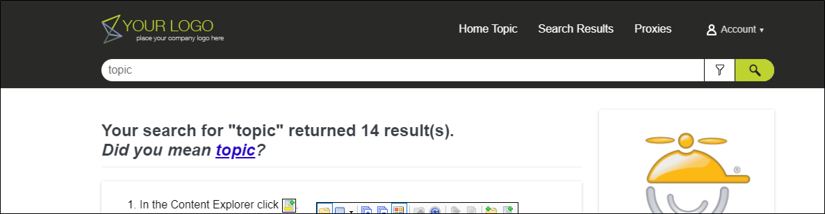
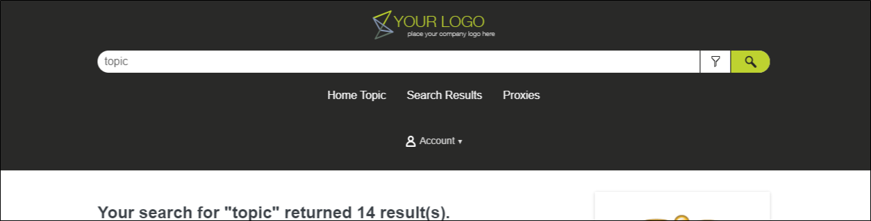
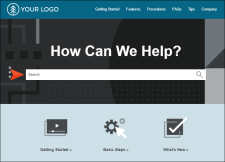
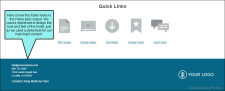
Example You create a new Top Navigation skin. Initially it looks like this:

The logo comes first (Order=1) and is positioned left. The menu is second (Order=2) and is positioned right. The Central account link is third (Order=3). The search bar is fourth (Order=4) and is set to take up a full row.
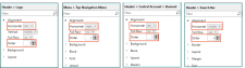
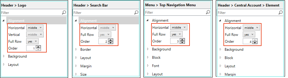
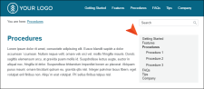
Now maybe you want each element to take up all the space on its row, centered, with the logo first, the search bar second, followed by the menu, and then the Central account link.
In that case, you would change the settings like this:
-
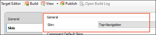
Open your HTML5 target and on the Skin tab, associate the

-
(Optional) By default, the
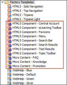
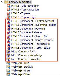
Example In Flare's Top Navigation project templates, we've added Search Bar and Menu components.
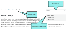
One of the Search Bar skin components is used for a prominent search bar within the Home topic.
The Menu skin component is used for a context-sensitive side menu that displays to the right of topics, showing links to other topics that are next to them in the TOC.
Actually, you can add features such as these in your output without adding skin components. You can do this by inserting the appropriate proxies (see step 11). The skin components are used to create a custom look for the elements, while their related proxies are used to perform the actual generation of the elements. So although adding skin components is an optional step, it is likely that you will want to do it if you decide to add navigation proxies.
For more details about these elements, see Skin Components and Proxies.
-
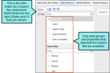
(Optional) In the same way that you can edit a regular skin, you can edit individual skin components. When you open a component to edit it, you will notice that the Skin Editor is slimmed down to show only the properties and fields related to that component.
-
Create a Home topic. This is the first topic shown when users open the output. It is just a regular topic, but you might decide to design it to stand out from the rest of the topics. Make sure to set this topic as your startup topic. You can do this by opening the Target Editor, selecting the General tab, and choosing the topic in the Startup Topic field.
For more details, see Home Topic.
-
(Optional) You can create other topics, including regular topics that contain the bulk of your content.
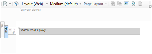
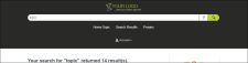
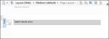
You can also create a special topic to hold generated search results. A
-
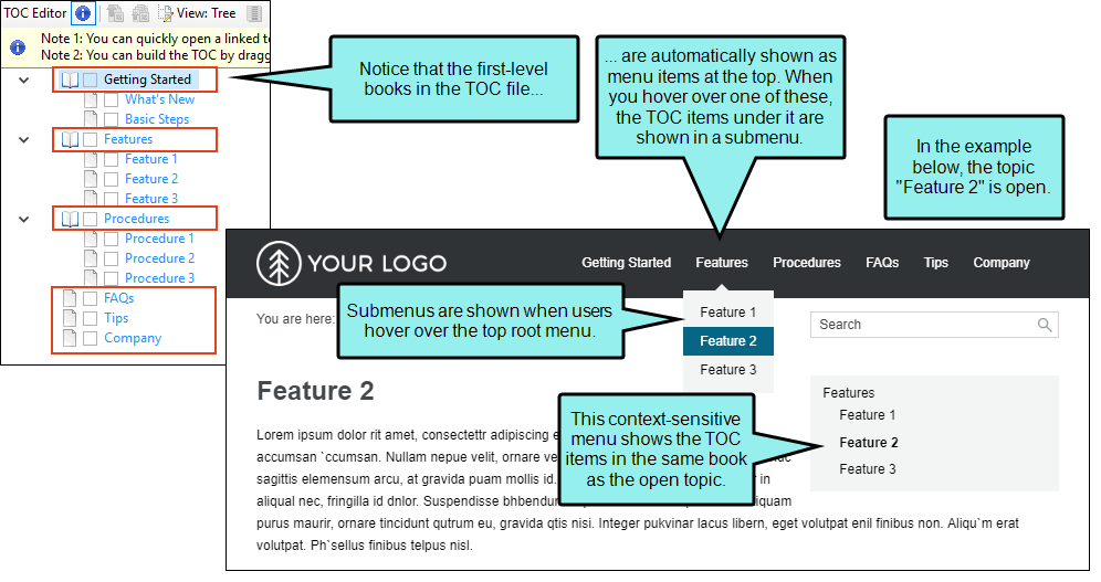
Add topics to a TOC file.
The Top Navigation skin uses the structure and contents of your TOC to populate the menu that appears at the top of topics. In addition, Flare's Top Navigation templates include a template page with a special Menu proxy inserted into it. This proxy creates context-sensitive menus that are displayed on the side of content, displaying links for topics that are located in the same TOC book (as well as the parent and child TOC topics).
Tip Although Flare lets you create books in the TOC file that do not link to anything (i.e., merely using the book to organize the TOC), it is a best practice for
Tip It is standard practice in web design to not include your Home page as a menu text link. The default behavior in
-
(Optional) It is not mandatory to create any template pages in order to have
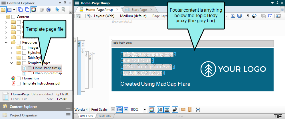
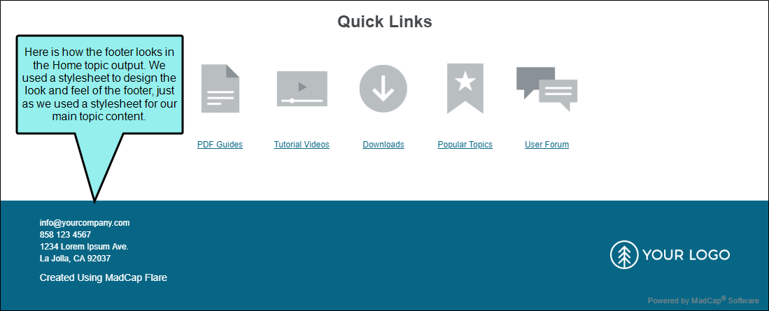
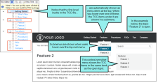
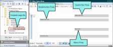
Example In Flare's advanced Top Navigation templates, we wanted to show footer content at the bottom of the Home page, so we created a template page just for that topic, and we added footer content under the Topic Body proxy.
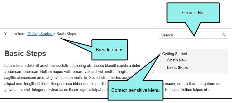
Then on the rest of the topics we wanted breadcrumbs to be displayed above the topic content. So we created a second template page (“Other-Topics.flmsp”) for all of those topics and inserted a Search Bar proxy , a context-sensitive Menu proxy, and a Breadcrumbs proxy above the Topic Body proxy. Even though the Menu proxy was added above the Topic Body proxy, it was styled to display to the right of the topic content, with content wrapping under it.
-
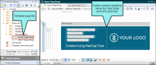
(Optional) You can select a template page on the Advanced tab of your HTML5 target.
This tells Flare that, unless otherwise directed, all topics will use the template page you selected. But if you want to use a second template page, you can open the Properties dialog for a particular topic and point to a different template page. In that case, the template page set in the target is typically the one that the majority of your topics will use. But for the other topic(s) using a different template page, you can override the target setting.
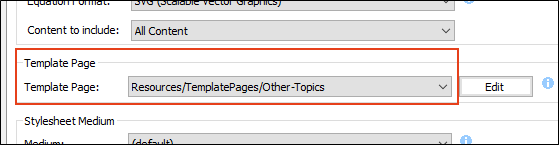
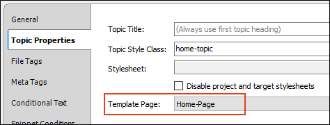
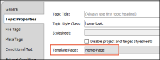
Example In this example, the template page that we want to use for most of our pages in the output is named "Other-Topics." So on the Advanced tab of the Target Editor, we selected it.
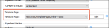
Then we opened the Properties dialog for the Home topic (open topic, then File > Properties). On the Topic Properties tab, we clicked in the Template Page field and selected Home-Page. Now this topic will use the "Home-Page" template page instead of the other one for the rest of the topics.
-
(Optional) You have the option of inserting a variety of proxies (Insert > Proxy > [Name of Proxy]) into your template page(s) and topics. This includes proxies that correspond to the different kinds of skin components you can add to your project (e.g., Menu, Topic Toolbar, Search Bar, Search Results).
For more details, see Skin Components and Proxies.
-
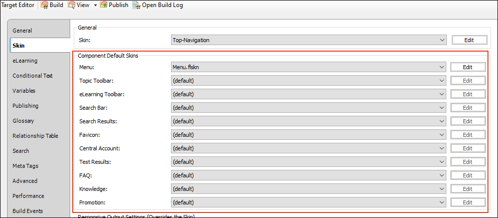
(Optional) If you have added skin components to your project, you can associate them with an entire target or with individual proxies. If one skin component is associated with the target and a different one is associated with a proxy, the one associated with the proxy has precedence.
Target
To associate a skin component with an HTML5 target, open the Skin tab in the Target Editor, then make your selection in the Component Default Skins section
It is not necessary to select anything in these fields, especially if you have only one type of a particular skin component (e.g., one Topic Toolbar component). But if you have more than one type of a skin component (e.g., two Topic Toolbar components), you can choose one of them as the default for all of the topics in the target. Then for the other component(s) of that same type, you can override the target setting by pointing to it in the relevant proxy (see below).
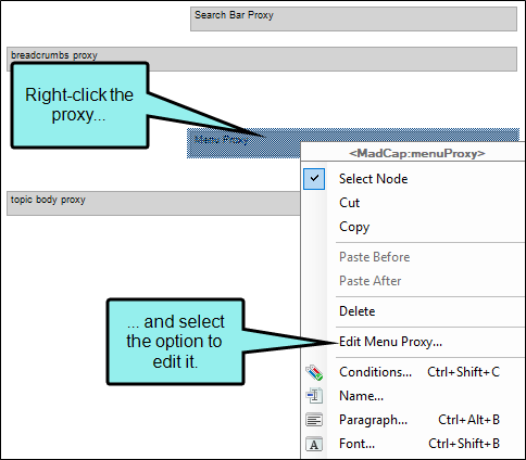
Proxies
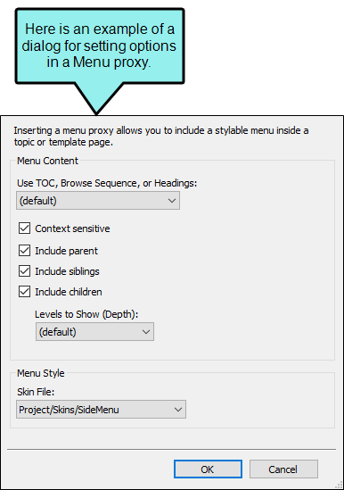
To associate a skin component with a proxy, open the template page or topic where you've inserted the proxy. Then right-click the proxy and use the dialog to choose the skin component. Some proxies have additional settings, such as TOC depth for Menu proxies.


For more information about associating skin components with proxies, see Skin Components and Proxies.
Note It's possible that you will not need skin components in your project at all. If you have not added a skin component but you insert a proxy related to it, Flare will just use the default design from the application.
-
Create and edit stylesheets to control the look of your content in the output.
-
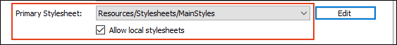
Make sure your stylesheet(s) are associated with the appropriate files.
If you decide to use multiple stylesheets in your project (e.g., one for most topics and a second one for your Home page topic), we recommend that you set your main stylesheet (the one intended for most topics) at the project or target level
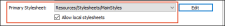
Then associate other topics (e.g., your Home page) with the a different stylesheet
If you are using a separate template page for your Home topic, you will want to associate that template page with the other stylesheet as well.
Note Although it is possible to associate a stylesheet locally with a snippet, the only reason to do this is if you do not have any primary stylesheets in your project. Without a primary stylesheet, a snippet's content will look very plain when you open it. That's because Flare doesn't know which styles to use for it. In order to work in that snippet and apply styles to the content, you will need to associate the snippet with a stylesheet.
-
(Optional) Responsive output is automatically enabled for
When a skin is responsive, the navigation elements are automatically adjusted depending on the size of the screen.
- Tablet Breakpoint Enter the number of pixels for the maximum width of a Tablet view.
- Mobile Breakpoint Enter the number of pixels for the maximum width of a Mobile (or phone) view.
- Use device with media queries Select this option if you want to base the responsive output not merely on the width of the output display, but on its width in the actual device (browser, tablet, or mobile). In other words, if you do not have this option selected and you view the output on a full browser, you can see the tablet and mobile layouts simply by reducing the size of the browser window. But if you select this option and you reduce the width of the browser, the layout will not change to the tablet or mobile formats.