Editing Profiles
When you capture an image, you do so using a profile, which is a collection of settings that are applied to the image in advance. Among other things, a profile lets you select a location for a captured image file, apply a specific kind of border to it, set the DPI (dots per inch), and even resize it automatically.
You can open and edit a profile, specifying options such as the destination, effects, and appearance.
[Menu Proxy — Headings — Online — Depth3 ]

How to Edit a Profile
- Select View > Profiles.
- In the local toolbar, click the down arrow and select the profile that you want to edit. The name of the profile then displays in the local toolbar of the Profiles Editor.
-
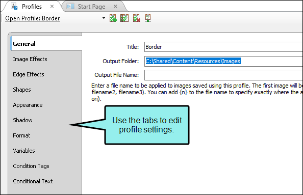
In the Profiles Editor, use the options in the tabs to adjust the settings.
General Tab
- Title Enter a name for the profile.
-
Output Folder Enter the folder location where you want to save the captured images using this profile. Click the Browse button to find and select a folder location where you want to save the images captured with this profile.
Note Capture cannot auto-save images if a linked profile's output folder is set to another user's local directory. To ensure that your images are auto-saved, set linked profiles' output folders to a shared drive.
- Output File Name Enter a file name to be applied to all images captured using this profile. The first image will be saved with that name. Subsequent images will also be saved with that name, along with a unique number (e.g., filename1, filename2, filename3). You can add {n} to the file name to specify exactly where the autonumber should be inserted. For example, if you enter "{n}filename," the images will be saved as 1filename, 2filename, 3filename, and so on.
Image Effects Tab
-
Background Scale Resize the image background by increasing or decreasing the scale number. You can adjust the scale up to three decimal places. For example, the number 1.0 means the image will be shown at 100% of its original size. The number .70 means the image will be shown at 70% of its original size. The number 1.25 means the image will be shown at 125% of its original size. The number 1.255 means the image will be shown at 125.5% of its original size.
Note The background scale setting has a minimum value of 0.100 and a maximum value of 10.000.
Note If the background scale is set to anything other than 1.000, the canvas tools (magic wand, selection rectangle, color fill, pencil, eraser, and flatten) will not be available. Be sure to make changes to the canvas before making adjustments to the background scale.
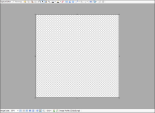
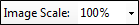
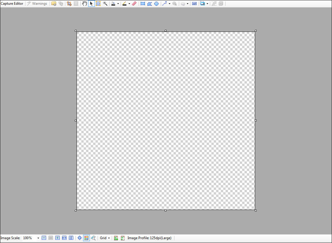
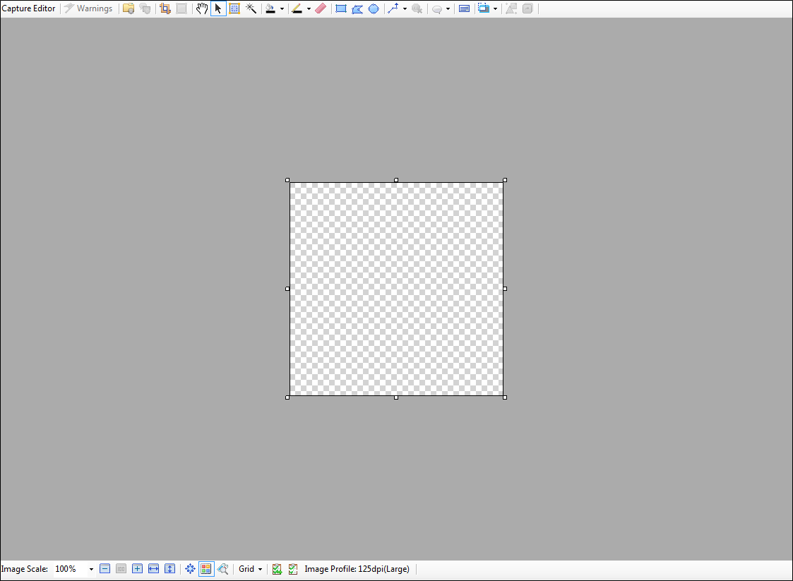
Example
This is a blank Capture canvas. The background is shown at 1.0 scale.
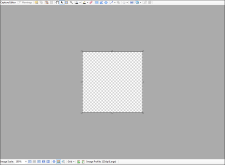
Here the background is shown at 0.5 scale.
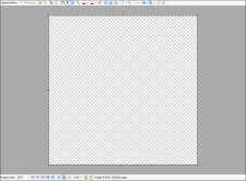
Here the background is shown at 1.125 scale.
- Scale Background To Resize the width and height of the image background by entering the number of pixels. The image will then be shrunk or stretched to that width or height.
- Blur Factor Set the amount of blurriness applied to the image. The blur effect will be seen if you have enabled the effect for an object in the properties dialog.
- Shade Factor Set the amount of shading applied to the image. The shade effect will be seen if you have enabled the effect for an object in the properties dialog.
- Preview Select the appropriate check box(es) to see a preview of the image with the blur and/or shading effect settings applied to it.
Edge Effects Tab
- Edge Effect Select the type of edge effect (e.g., torn).
- Wave Length Set the length of the "waves" for a torn edge effect (in pixels). This changes the width of the torn areas in the effect.
- Wave Height Set the height of the "waves" for a torn edge effect (in pixels). This changes the depth of the torn areas in the effect.
- Edges Click in the check boxes to select the specific edges (top, bottom, left, right) where you'd like the effect to be applied in the image. If a check mark is displayed, the effect will be applied to that edge.
Shapes Tab
Use the space on this tab to add shapes to the profile.
Example
Let's say you want to add your company's logo in the bottom-right corner of each image. In the Profiles Editor, you can select the Shapes tab and insert an image object with the logo.
Or perhaps you want to add copyright text to the bottom of each image. In that case, you can create a text box with the copyright information and position it wherever you want it to display on images. Any image using that profile will display the copyright text on it.
You can use the buttons in the top local toolbar to create shapes. In addition, you can use ribbon or menu options whenever necessary (e.g., select the Edit ribbon and in the Insert section select Insert Image, or use the menu option Insert > Image File to create an image object). You can also use the buttons in the bottom local toolbar to zoom in and out, and perform other tasks.
Top Toolbar

Opens the properties dialog for the selected object. It lets you perform tasks specific to the selected object. For example, if a rectangle is selected, this dialog lets you add shadow effects, add text, and set the color for the object. Opens the properties window pane for the following item types: frame, object, audio object, keyframe, or effect. It lets you perform tasks specific to the selected item. For example, if a rectangle is selected, this window pane lets you add keyframes, text, and set the color for the object. If a keyframe is selected, this window pane lets you modify the transition between the selected keyframe and the next. This window pane is dynamic. Once it is open, it automatically changes to the property type applicable to what you have clicked on. In other words, if you click an object, it changes to the Object Properties window pane. If you click an audio object, it changes to the Sound Properties window pane.

Places a rectangle with points (small circles) around the image, allowing you to select a portion of the image and crop it.

After you insert an image onto your background image, you may need to remove part of that image object. You can therefore crop (cut a portion of) the image object to keep the part you want and discard the part that you don't want. See Cropping Image Objects.

Converts the cursor to Hand mode, which lets you drag areas of an image around. This is useful when you have zoomed in on an image so much that you cannot see all of it in the editor. See Using the Hand Mode.
Note This editing mode can also be accessed by right-clicking anywhere in the Capture Editor and selecting it from the context menu.

Converts the cursor to Select mode, which lets you select any objects or areas in the image.
Note This editing mode can also be accessed by right-clicking anywhere in the Capture Editor and selecting it from the context menu.

Converts the cursor to Rectangle mode, which lets you create a square or rectangle shape by clicking in the image and dragging in any direction. When you release the cursor, the shape is created.
Note This editing mode can also be accessed by right-clicking anywhere in the Capture Editor and selecting it from the context menu.

Converts the cursor to Polygon mode, which lets you create a closed plane shape bounded by three or more line segments. After you select this button, you can click anywhere in the image to identify the starting point for the shape. When you move the cursor, a straight line segment is drawn. If you click the left mouse button, it signifies the end of that line segment and the start of another line segment. When you move the cursor, another straight line segment is drawn. When you double-click, a final line segment joins your starting and ending points, thus closing off the shape.
Note This editing mode can also be accessed by right-clicking anywhere in the Capture Editor and selecting it from the context menu.

Converts the cursor to Oval mode, which lets you create a circle or oval shape by clicking in the image and dragging in any direction. When you release the cursor, the shape is created.
Note This editing mode can also be accessed by right-clicking anywhere in the Capture Editor and selecting it from the context menu.

Opens a submenu, which lets you select various lines to add to your capture.
Selecting a line type converts the cursor to Line mode. You can create a line with or without an arrow at the end (which you can change or remove by double-clicking the line and using the Line Properties dialog). After you select the type of line you want to create, you can click anywhere in the image to identify the starting point for the line. When you move the cursor, a line segment is drawn. If you click the left mouse button, it signifies the end of that line segment and the start of another line segment. When you move the cursor, another line segment is drawn. You can identify the end of the line by double-clicking. If you hold down the SHIFT key when drawing a line, you can use the line tool to easily draw create straight lines and perfect angles.
You can create the following types of lines:
-
Polyline

-
Curved

-
Wave

-
Dashed

-
Zig Zag

Note This editing mode can also be accessed by right-clicking anywhere in the Capture Editor and selecting it from the context menu.

Opens a submenu, which lets you select various graphics that you can add to your capture.
-
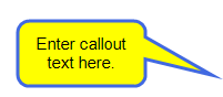
Bubble Converts the cursor to Bubble mode, which lets you create a callout by clicking in the image and dragging a rectangle area. When you release the cursor, a "bubble" shape is created, which consists of a rectangular or square area for holding text and a pointy area for pointing toward an area of the image that you want to explain or emphasize. See Bubble Properties Dialog.
-
Annotation Converts the cursor to Annotation mode, which lets you create a callout by clicking in the image and dragging a rectangle area. When you release the cursor, an "annotation" shape is created, which consists of a bracket area for holding text and a line for pointing toward an area of the image that you want to explain or emphasize.

-
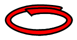
Loop Converts the cursor to Loop mode, which lets you create a "loop" shape by clicking in the image and dragging a rectangle area. When you release the cursor, a loop shape is created. This is a useful shape for circling content that you want to emphasize.
-
Cursor Converts the cursor to Cursor mode, which lets you add a cursor bitmap to the image by clicking in the image and dragging in any direction. When you release the cursor, a cursor is added within a shaded oval shape. You can change the cursor type and adjust the color and transparency of the oval background from the Cursor Properties dialog.

-
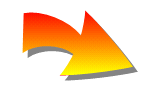
Arrow Converts the cursor to Arrow mode, which lets you create a curvy arrow shape. After you select this button, you can click anywhere in the image to identify the starting point for the arrow. When you move the cursor, a straight line shows where the arrow will be placed. When you release the cursor, an arrow is created.
-
Star Converts the cursor to Star mode, which lets you create a star by clicking in the image and dragging a rectangle area. These stars can have 3–100 sides. When you release the cursor, a star is created.

-
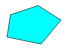
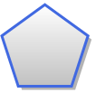
X-Agon Converts the cursor to X-agon mode, which lets you create a polygon by clicking in the image and dragging a rectangle area. These polygons can have 3–100 sides. When you release the cursor, a polygon is created.
Note These editing modes can also be accessed by right-clicking anywhere in the Capture Editor and selecting it from the context menu.

Converts the cursor to Text Rectangle mode, which lets you create a square or rectangle shape with text by clicking in the
Note This editing mode can also be accessed by right-clicking anywhere in the Capture Editor and selecting it from the context menu.

Opens a submenu, which lets you select various effects that you can apply to an object.
- Shade
- Gray Scale Converts the cursor to Gray Scale Effect mode. This lets you create a square or rectangle shape by clicking in the image and dragging in any direction. When you release the cursor, the shape is created (in the case of the "zoom" option, a three-dimensional shape is created). The area inside the shape is displayed in its original color, while the area outside the shape is displayed in gray. If you want to create this effect with other closed-off shapes (e.g., oval, polygon), first draw the shape in the image, then enable the gray scale effect from the Image Effects tab in the properties dialog for that object.
- Blur Converts the cursor to Blur Effect mode. This lets you create a square or rectangle shape by clicking in the image and dragging in any direction. When you release the cursor, the shape is created (in the case of the "zoom" option, a three-dimensional shape is created). The area inside the shape is clear, while the area outside the shape is blurred. You can change the amount of the blurriness from the File Properties. If you want to create this effect with other closed-off shapes (e.g., oval, polygon), first draw the shape in the image, then enable the blur effect from the Image Effects tab in the properties dialog for that object.
- Blur-Inside Converts the cursor to Blur Inside Effect mode. This lets you create a square or rectangle shape by clicking in the image and dragging in any direction. When you release the cursor, the shape is created (in the case of the "zoom" option, a three-dimensional shape is created). The area inside the shape is blurred, while the area outside the shape is clear. You can change the amount of the blurriness from the properties dialog of the shape (Image Effects tab). If you want to create this effect with other closed-off shapes (e.g., oval, polygon), first draw the shape in the image, then enable the blur-inside effect from the Image Effects tab in the properties dialog for that object.
- Zoom

This button is enabled if you have selected more than one object. You can group multiple objects into an object group, which then acts as a single object. And at any point, you can ungroup the objects so that they are separate once again.
Bottom Toolbar
Lets you select a specific percentage to scale the image.

Reduces the scale of the font by 10% each time you click the button.

Resets the scale of the font to 100%.

Increases the scale of the font by 10% each time you click the button.

Scales the image so that its width fits in the Capture Editor.

Scales the image so that its height fits in the Capture Editor.

Shows arrows on each side of an object when you click it. You can then click any of the arrows to set the anchors. This lets you lock the position of the object in place. See Setting Object Anchors.

Shows or hides the colored shading of objects to which condition tags have been applied.
Example Your condition tag has blue associated with it and you have applied this tag to an object. When you click this button to show the indicator, a small blue square is displayed in the object. If more than one condition is applied to the object, the square contains all of the applied condition colors.
Appearance Tab
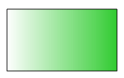
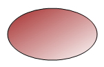
- Background Use this section to set the color for the background of the image. For example, this color will be seen in areas of the image where you have applied a torn edge effect or padding. You can select one of the directional patterns (e.g., Top to Bottom, Left to Right) if you want to create a gradient background that progresses in a certain direction from one color to another.
- Fill Start Click the down arrow to select a color for the start of the background color. If you select a different color for the "fill end," the image background will be displayed as a gradient of colors moving from the start color to the end color.
- Fill End Click the down arrow to select a color for the end of the background color. If you select a different color for the "fill start," the image background will be displayed as a gradient of colors moving from the start color to the end color.
- Border Select the type of border that you'd like to apply to the image.
- Width Set the width of the border for the image (in pixels).
- Color Click the down arrow to select a color for the border of the image.
- Padding Set the amount of space (in pixels) that you would like to create at the edges (left, right, top, bottom) of the image.
- Copy Down After you enter a number in the first padding field (Left), you can click this button to automatically enter the same number in the rest of the fields.
- Canvas Size To change the size of the canvas (the area behind the image, the element that the image rests on), enter the width and height in the fields provided.
- Canvas Auto-Adjust to Include ObjectsSelect this check box to make the canvas automatically resize to include any objects placed or moved outside of the true canvas area. If this box is not checked, the canvas will not adjust to accommodate objects outside of the true canvas area and they will not be displayed as part of your final image.
Shadow Tab
- Enable Shadow Click this check box to add a shadow to images using the profile.
- Left/Right Enter the number of pixels that the shadow will be extended to the right or left of the image. Enter a positive number (e.g., 7) to extend the shadow to the right. Enter a negative number (e.g., -7) to extend the shadow to the left.
- Up/Down Enter the number of pixels that the shadow will be extended below or above the image. Enter a positive number (e.g., 7) to extend the shadow below the image. Enter a negative number (e.g., -7) to extend the shadow above the image.
- Color Click the down arrow to select a color for the shadow. To see advanced color options, select More colors.
- Transparency Enter the percentage of transparency applied to the shadow.
Format Tab
By using the Format tab, you can create single-source images (i.e., create just one image with one group of settings for online output and another group for printed output). See Creating Single-Source Images.
- MediumIf the image is included in a MadCap Flare project, you can select one of the project's style mediums. The format settings you select in the other fields on this tab are then used in Flare outputs associated with that medium. The formatting options for each medium are deactivated by default. Select Enable Format to make selections, including Format, Color Depth, Gray Scale, and Print DPI options.
- Medium Source This field displays the location of the stylesheet associated with the custom medium selected in the Medium field.
- Format Select the file format type for the image. Each file format uses a different compression method. It is a good idea to experiment with the different file formats to determine which best meets your needs in terms of image quality and file size. When you save the image, this file type will automatically be entered in the "Save as type" field. The default format for this field is BMP.
- JPEG Quality Select the quality level for a JPEG image. When a JPEG image is compressed, some of the data for that image is discarded. You can control how much data is lost by entering a number in this field or selecting a number from the drop-down list. The higher the number, the better the image quality but the higher the file size. The lower the number, the worse the image quality but the lower the file size. This field is enabled only if you have selected JPEG from the Format list above.
- Color Depth Select the color depth level for the image. You can either enter a number in the field directly or select a number from the drop-down list (16-bit, 24-bit, or 32-bit). Color depth refers to the number of colors used to display an image. "Highcolor" images use 16-bit color depth. "Truecolor" images use 24-bit or 32-bit color depth. The higher the number, the better the quality, but the larger the file size. For images to be displayed on a computer screen, "truecolor" quality is not usually necessary. The "default" value for this field is 32.
- Gray Scale Select this option if you want to remove all color from the image and display it in gray instead.
-
Print DPI You can select or enter the resolution for the image in terms of DPI (dots per inch). As the name suggests, this determines how many pixels are used to display an image in a given linear inch. The DPI is automatically set for online output when you capture the image, depending on the computer that you are using (usually this is about 96 DPI). However, the DPI setting for printed output often needs to be higher (say, 150 DPI).
Note The Print DPI field is used if you want to use the image in a printed output (e.g., creating a PDF output, inserting the image into a Microsoft Word document). For online output, the resolution is automatically set based on your computer's settings.
Note GIF image files do not support DPI settings. Therefore, if you select GIF as your file type, the Print DPI field is disabled.
- Lock DPI Select this check box to lock the Print DPI setting so it will remain the same even when you change the size of the image. If you do not select this check box, the Print DPI setting will adjust automatically when you make changes to the size, and vice versa.
Variables Tab
Use this tab to enter variables and definitions. If you rename a variable, it is a good idea to do so before inserting it into an object. See Variables.
Condition Tags Tab
Use this tab to enter condition tags and associate them with colors. If you rename a condition tag, it is a good idea to do so before applying that tag to content. See Conditions and Creating Conditions.
Conditional Text Tab
Use this tab to include condition tags with or exclude condition tags from images using the profile. See Associating Conditions With Images.
- Click
 to save your work.
Note You can override the profile settings for an individual file if you want. To do this, simply double-click on the image and complete these same tabs and fields in the File Properties dialog.
What’s Next?
After you edit a profile, you can select it so that it becomes the "current" (or active) profile. Then, when you capture an image, the settings in the profile are applied to the captured image. See Selecting a Profile for Capturing and Capturing Images.