 Outputs Supported


You might perform the following style tasks if you are working in a Standard skin.
[Menu Proxy — Headings — Online — Depth3 ]
Accordion Items
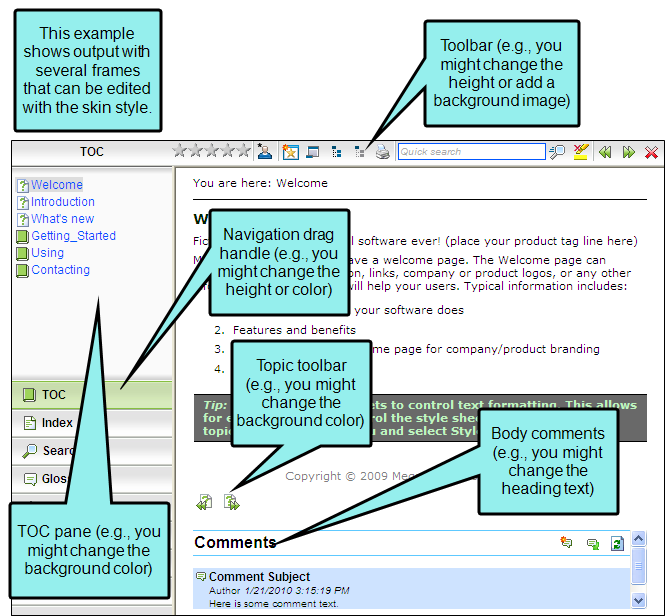
These are the navigation items that display in the output, allowing users to open different elements of your output, such as the table of contents, index, glossary, community (for Pulse), and more. Some of the more common properties you might edit when it comes to accordion items are the icons, text labels, font, and background color. See Accordion Items in Standard Skins.
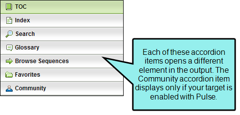
Note In order to see these items in the output, you must make sure they are added to the skin.
Note These styles are supported only in WebHelp and WebHelp Plus outputs.
Controls
These are controls that display in the output, such as various buttons, labels, and the input boxes. Usually these controls are displayed within the various accordion items (e.g., the search box, "Search" button, and "Add topic to favorites" button that are shown at the top of the Search accordion item). Some of the more common properties you might edit when it comes to controls are the icons, text labels, tooltips, font, and background color. See Controls in Standard Skins.
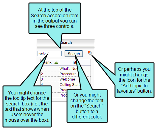
Note In order to see these items in the output, you must make sure they are added to the skin (e.g., you must add accordion items or enable Feedback).
Note Styles for many of the controls are supported only in WebHelp and WebHelp Plus outputs. The controls related to MadCap Feedback are supported only in WebHelp, WebHelp Plus, and Microsoft HTML Help.
Dialogs
These are the dialogs that users might see if you have enabled MadCap Feedback for your output. The dialogs are used for actions such as registering as a Feedback user, adding comments, and replying to comments. Some of the more common properties you might edit when it comes to Feedback dialogs are field and other text labels, font, messages (e.g., email), and background color. See Dialogs in Standard Skins.
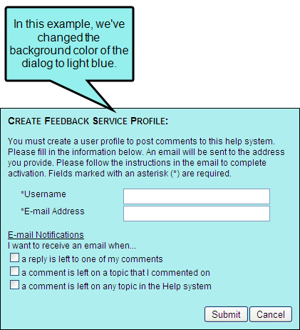
Note In order to see these items in the output, you must enable Feedback with your output.
Note These styles are supported only in WebHelp, WebHelp Plus, and Microsoft HTML Help outputs.
Feedback User Profile Items
These are fields that can be added to the Feedback user profile dialog. The dialog always includes a "Username" and "E-mail Address" field. In addition to those fields, you can add many others by using the Community tab in the Skin Editor. Once you've added the fields, you can edit the skin styles for those items. You can change the field labels, specify whether they should be required, and enter a default value for a field. See Feedback User Profile Items in Standard Skins.
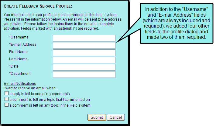
Note In order to see these items in the output, you must enable Feedback with your output and add the necessary fields to the user profile.
Note These styles are supported only in WebHelp, WebHelp Plus, and Microsoft HTML Help outputs.
Formats
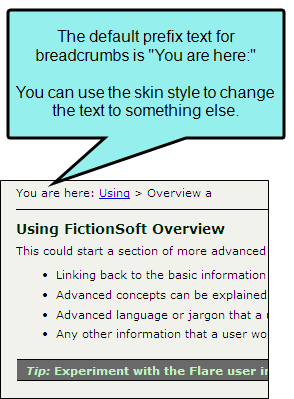
These are navigation elements that you might include in your project (e.g., cross-references, breadcrumbs, keyword links, related topics links, concept links). For most of these elements, you can use the skin style to change the link or prefix text. For cross-references, you can change text as well as formats (i.e., how the link is constructed). See Formats in Standard Skins.
Note In order to see these items in the output, you must include them in your project.
Note Most of these styles are supported only in WebHelp and WebHelp Plus outputs. However, the cross-reference styles are designed for print-based outputs (Adobe PDF, Microsoft Word).
Frames
These are the containers of the navigation items that display in the output when you include elements such as accordion items, toolbars, and Feedback at the end of topics. Some of the more common properties you might edit when it comes to frames are the background and height. See Frames in Standard Skins.
Note In order to see these items in the output, you must include them in your project.
Note Many of these styles are supported only in WebHelp and WebHelp Plus.
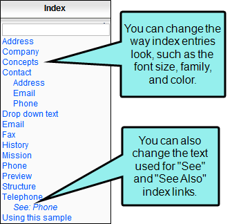
Index Entries
This is the text that users see when they open your index in the output. Some of the more common properties you might edit when it comes to index entries are the font settings, as well as the text used for index links. See Index Entries in Standard Skins.
Note In order to see these items in the output, you must include them in your project.
Note These styles are supported only in WebHelp and WebHelp Plus.
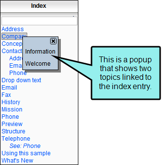
Index Entry Popups
These are the popups that users see when they click an index entry that links to more than one topic. Some of the more common properties you might edit when it comes to index entries are the font settings and background color. See Index Entry Popups in Standard Skins.
Note In order to see these items in the output, you must include an index in your project.
Note These styles are supported only in WebHelp and WebHelp Plus.
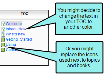
TOC Entries
This is the text that users see when they open your table of contents (TOC) in the output. Some of the more common properties you might edit when it comes to TOC entries are the font settings, as well as icons. See TOC Entries in Standard Skins.
Note In order to see these items in the output, you must include a TOC in your project.
Note These styles are supported only in WebHelp and WebHelp Plus.
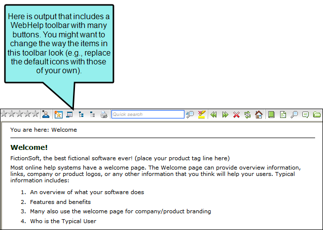
Toolbar Items
These are the buttons and other elements that are part of WebHelp and topic toolbars that you can add to output. Some of the more common properties you might edit when it comes to toolbar items are the icons, font settings, background, borders, and click behavior. See Toolbar Items in Standard Skins.
Note In order to see these items in the output, you must include a WebHelp toolbar or topic toolbar in your project.
Note These styles are supported only in WebHelp and WebHelp Plus.
